In Flutter, buttons can wear different “styles”, and we call these styles shapes! Just like cookies can come in all sorts of shapes—stars, circles, or hearts—Flutter lets you style your buttons however you like. Want your button to look like a pill? Or maybe a star? You’ve got it!
In this article, we’re going to dive into all the cool shapes you can give your buttons in Flutter. Get ready to meet some fun and unique borders!
The Basic Button
Before we dive into the fun world of button shapes, let’s first look at a basic button:
import 'package:flutter/material.dart';

void main() {
  runApp(MyApp());
}

class MyApp extends StatelessWidget {
  const MyApp({super.key});

  @override
  Widget build(BuildContext context) {
    return MaterialApp(
      title: 'Elevated Button Example',
      home: Scaffold(
        appBar: AppBar(title: Text('Elevated Button')),
        body: Center(
          child: ElevatedButton(
            onPressed: () {
              // Action when button is pressed
              print('Button clicked!');
            },
            style: ElevatedButton.styleFrom(
              foregroundColor: Colors.white,
              backgroundColor: Colors.pinkAccent,
            ),
            child: Text('Click Me'),
          ),
        ),
      ),
    );
  }
}
By default, this button has a simple rectangular shape with slightly rounded corners. But the cool thing is, Flutter allows you to change that shape with the style property, specifically using the shape: attribute.

Now, let’s start giving our button some unique styles and shapes.
Button Shape Gallery
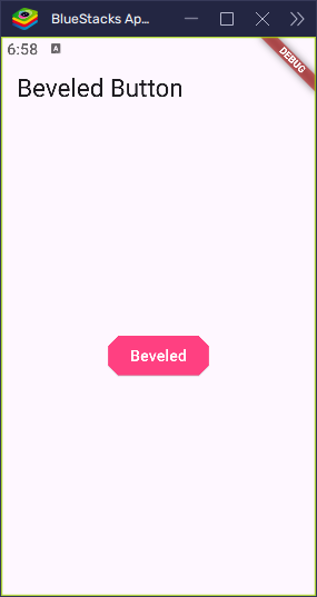
BeveledRectangleBorder
Think of a square where the corners are sliced off at an angle — that’s the look of a BeveledRectangleBorder!
import 'package:flutter/material.dart';

void main() {
  runApp(MyApp());
}

class MyApp extends StatelessWidget {
  const MyApp({super.key});

  @override
  Widget build(BuildContext context) {
    return MaterialApp(
      title: 'Beveled Button Example',
      home: Scaffold(
        appBar: AppBar(title: Text('Beveled Button')),
        body: Center(
          child: ElevatedButton(
            onPressed: () {
              // Action when button is pressed
              print('Beveled Button clicked!');
            },
            style: ElevatedButton.styleFrom(
              foregroundColor: Colors.white,
              backgroundColor: Colors.pinkAccent,
              shape: BeveledRectangleBorder(
                borderRadius: BorderRadius.circular(10),
              ),
            ),
            child: Text('Beveled'),
          ),
        ),
      ),
    );
  }
}
This shape gives your button a sharp, clean edge, making it perfect for apps that want to feel a bit more modern or even a little retro!
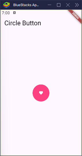
CircleBorder
This one’s simple — a perfect circle! Think of it like a basketball or a round coin.
import 'package:flutter/material.dart';

void main() {
  runApp(MyApp());
}

class MyApp extends StatelessWidget {
  const MyApp({super.key});

  @override
  Widget build(BuildContext context) {
    return MaterialApp(
      title: 'Circle Button Example',
      home: Scaffold(
        appBar: AppBar(title: Text('Circle Button')),
        body: Center(
          child: ElevatedButton(
            onPressed: () {
              // Action when button is pressed
              print('Circle Button clicked!');
            },
            style: ElevatedButton.styleFrom(
              foregroundColor: Colors.white,
              backgroundColor: Colors.pinkAccent,
              shape: CircleBorder(),
              padding: EdgeInsets.all(24), // makes the button round
            ),
            child: Icon(Icons.favorite), // Icon inside the button
          ),
        ),
      ),
    );
  }
}
A CircleBorder is great for buttons that hold icons or small actions, giving them a sleek, minimalist look.
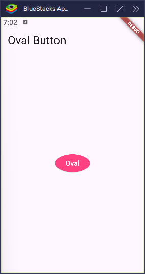
OvalBorder
Picture an egg or a stretched circle — that’s the shape of an OvalBorder.
import 'package:flutter/material.dart';

void main() {
  runApp(MyApp());
}

class MyApp extends StatelessWidget {
  const MyApp({super.key});

  @override
  Widget build(BuildContext context) {
    return MaterialApp(
      title: 'Oval Button Example',
      home: Scaffold(
        appBar: AppBar(title: Text('Oval Button')),
        body: Center(
          child: ElevatedButton(
            onPressed: () {
              // Action when button is pressed
              print('Oval Button clicked!');
            },
            style: ElevatedButton.styleFrom(
              foregroundColor: Colors.white,
              backgroundColor: Colors.pinkAccent,
              shape: OvalBorder(), // Makes the button oval-shaped
            ),
            child: Text('Oval'), // Text inside the button
          ),
        ),
      ),
    );
  }
}
This shape is perfect when you want smooth, curved edges, but don’t want a full circle. It’s a great choice for buttons that need a more elongated, elegant look.
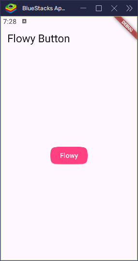
ContinuousRectangleBorder
Imagine soft, flowing corners — like melted butter! That’s the feel of a ContinuousRectangleBorder. It’s smooth and elegant.
import 'package:flutter/material.dart';

void main() {
  runApp(MyApp());
}

class MyApp extends StatelessWidget {
  const MyApp({super.key});

  @override
  Widget build(BuildContext context) {
    return MaterialApp(
      title: 'Flowy Button Example',
      home: Scaffold(
        appBar: AppBar(title: Text('Flowy Button')),
        body: Center(
          child: ElevatedButton(
            onPressed: () {
              // Action when button is pressed
              print('Flowy Button clicked!');
            },
            style: ElevatedButton.styleFrom(
              foregroundColor: Colors.white,
              backgroundColor: Colors.pinkAccent,
              shape: ContinuousRectangleBorder(
                borderRadius: BorderRadius.circular(30), // Soft rounded corners
              ),
            ),
            child: Text('Flowy'), // Text inside the button
          ),
        ),
      ),
    );
  }
}
This shape is perfect for stylish apps that want a modern, sleek look with a touch of smoothness.
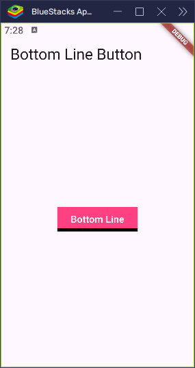
LinearBorder and Friends
LinearBorder lets you shape your button like you’re drawing lines on a box, with the option to pick which sides to adjust. You can shape just the top, bottom, start, or end of the button!
LinearBorder.bottom
import 'package:flutter/material.dart';

void main() {
  runApp(MyApp());
}

class MyApp extends StatelessWidget {
  const MyApp({super.key});

  @override
  Widget build(BuildContext context) {
    return MaterialApp(
      title: 'Bottom Line Button Example',
      home: Scaffold(
        appBar: AppBar(title: Text('Bottom Line Button')),
        body: Center(
          child: ElevatedButton(
            onPressed: () {
              // Action when button is pressed
              print('Bottom Line Button clicked!');
            },
            style: ElevatedButton.styleFrom(
              foregroundColor: Colors.white,
              backgroundColor: Colors.pinkAccent,
              shape: LinearBorder.bottom(
                side: BorderSide(width: 5.0, color: Colors.black),
                size: 1,
              ), // Only bottom edge is shaped
            ),
            child: Text('Bottom Line'), // Text inside the button
          ),
        ),
      ),
    );
  }
}
LinearBorder.top
import 'package:flutter/material.dart';

void main() {
  runApp(MyApp());
}

class MyApp extends StatelessWidget {
  const MyApp({super.key});

  @override
  Widget build(BuildContext context) {
    return MaterialApp(
      title: 'Top Line Button Example',
      home: Scaffold(
        appBar: AppBar(title: Text('Top Line Button')),
        body: Center(
          child: ElevatedButton(
            onPressed: () {
              // Action when button is pressed
              print('Top Line Button clicked!');
            },
            style: ElevatedButton.styleFrom(
              foregroundColor: Colors.white,
              backgroundColor: Colors.pinkAccent,
              shape: LinearBorder.top(
                side: BorderSide(width: 5.0, color: Colors.black),
                size: 1,
              ), // Only top edge is shaped
            ),
            child: Text('Top Line'), // Text inside the button
          ),
        ),
      ),
    );
  }
}
LinearBorder.start and end
These shapes let you control the left or right sides of the button, based on the text direction.
import 'package:flutter/material.dart';

void main() {
  runApp(MyApp());
}

class MyApp extends StatelessWidget {
  const MyApp({super.key});

  @override
  Widget build(BuildContext context) {
    return MaterialApp(
      title: 'Start Side Button',
      home: Scaffold(
        appBar: AppBar(title: Text('Start Side Shape')),
        body: Center(
          child: ElevatedButton(
            onPressed: () {
              // Action when button is pressed
              print('Start Side Button clicked!');
            },
            style: ElevatedButton.styleFrom(
              foregroundColor: Colors.white,
              backgroundColor: Colors.pinkAccent,
              shape: LinearBorder.start(
                side: BorderSide(width: 5.0, color: Colors.black),
                size: 1,
              ), // Shapes the leading edge
            ),
            child: Text('Start Side'),
          ),
        ),
      ),
    );
  }
}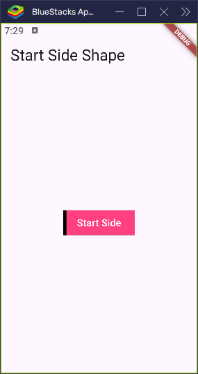
Each of these borders gives you precise control over your button’s edges, letting you customize its look however you like!
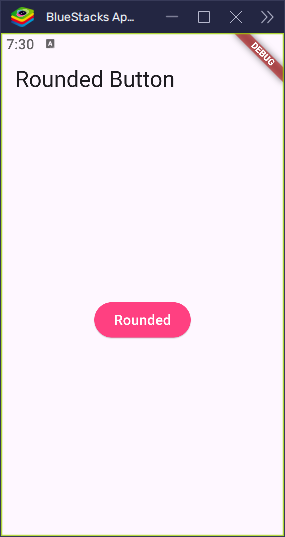
RoundedRectangleBorder
A classic! This shape gives you a rectangle with soft, rounded corners.
import 'package:flutter/material.dart';

void main() {
  runApp(MyApp());
}

class MyApp extends StatelessWidget {
  const MyApp({super.key});

  @override
  Widget build(BuildContext context) {
    return MaterialApp(
      title: 'Rounded Button Demo',
      home: Scaffold(
        appBar: AppBar(title: Text('Rounded Button')),
        body: Center(
          child: ElevatedButton(
            onPressed: () {
              // Do something on press
              print('Rounded button pressed!');
            },
            style: ElevatedButton.styleFrom(
            foregroundColor: Colors.white,
              backgroundColor: Colors.pinkAccent,
              shape: RoundedRectangleBorder(
                borderRadius: BorderRadius.circular(20),
              ),
            ),
            child: Text('Rounded'),
          ),
        ),
      ),
    );
  }
}
It’s simple, friendly, and versatile — perfect for almost any app, giving your buttons a clean, approachable look.
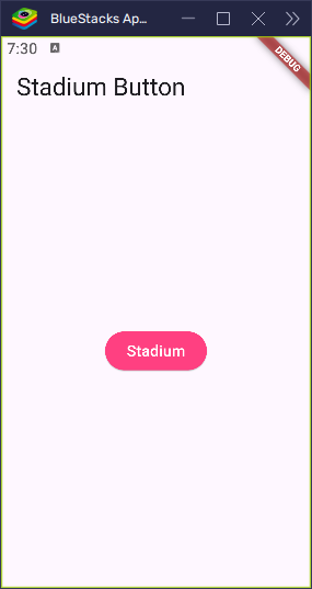
StadiumBorder
Ever seen a pill shape? That’s exactly what a StadiumBorder looks like.
import 'package:flutter/material.dart';

void main() {
  runApp(MyApp());
}

class MyApp extends StatelessWidget {
  const MyApp({super.key});

  @override
  Widget build(BuildContext context) {
    return MaterialApp(
      title: 'Stadium Button Demo',
      home: Scaffold(
        appBar: AppBar(title: Text('Stadium Button')),
        body: Center(
          child: ElevatedButton(
            onPressed: () {
              // Do something when pressed
              print('Stadium button tapped!');
            },
            style: ElevatedButton.styleFrom(
              foregroundColor: Colors.white,
              backgroundColor: Colors.pinkAccent,
              shape: StadiumBorder(),
            ),
            child: Text('Stadium'),
          ),
        ),
      ),
    );
  }
}
With smooth ends and straight sides, this shape is sleek and modern, making it a favorite for many contemporary apps.
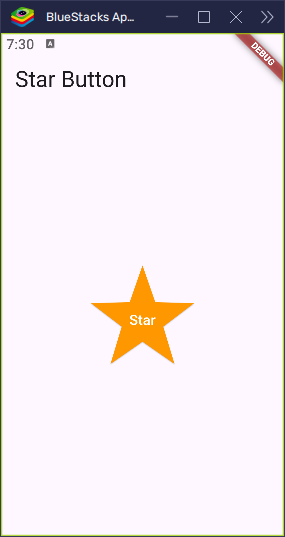
StarBorder
Now things get really fun! StarBorder transforms your button into a star ⭐.
import 'package:flutter/material.dart';

void main() {
  runApp(MyApp());
}

class MyApp extends StatelessWidget {
  const MyApp({super.key});

  @override
  Widget build(BuildContext context) {
    return MaterialApp(
      title: 'Star Button Demo',
      home: Scaffold(
        appBar: AppBar(title: Text('Star Button')),
        body: Center(
          child: ElevatedButton(
            onPressed: () {
              // Action when button is pressed
              print('Star button pressed!');
            },
            style: ElevatedButton.styleFrom(
              shape: StarBorder(),
              padding: EdgeInsets.all(50),
              backgroundColor: Colors.orange,
              foregroundColor: Colors.white,
            ),
            child: Text('Star'),
          ),
        ),
      ),
    );
  }
}
This shape is perfect for adding a playful, eye-catching touch to your app!
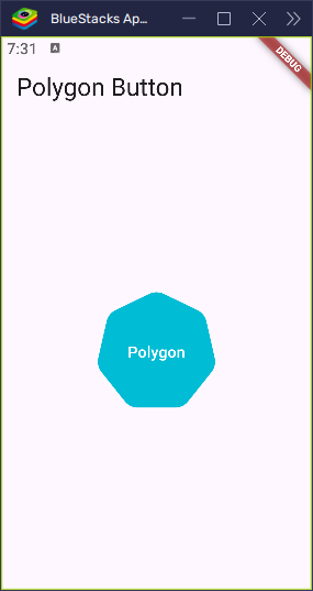
StarBorder.polygon
Want to level up your stars and add more points? Try StarBorder.polygon!
import 'package:flutter/material.dart';

void main() {
  runApp(MyApp());
}

class MyApp extends StatelessWidget {
  const MyApp({super.key});

  @override
  Widget build(BuildContext context) {
    return MaterialApp(
      title: 'Polygon Star Button',
      home: Scaffold(
        appBar: AppBar(title: Text('Polygon Button')),
        body: Center(
          child: ElevatedButton(
            onPressed: () {
              print('Polygon button pressed!');
            },
            style: ElevatedButton.styleFrom(
              shape: StarBorder.polygon(
                sides: 7, // Number of points
                pointRounding: 0.3, // Roundness of the tips
              ),
              padding: EdgeInsets.all(50),
              backgroundColor: Colors.cyan,
              foregroundColor: Colors.white,
            ),
            child: Text('Polygon'),
          ),
        ),
      ),
    );
  }
}
With this, you can control how many points your star has and how rounded the edges are — perfect for creating a unique, custom look.
All Button Shapes in One Place
Want to see all the shapes side by side? Here’s a simple layout that displays all the button shapes in a neat grid:
import 'package:flutter/material.dart';

void main() {
  runApp(MyApp());
}

class MyApp extends StatelessWidget {
  const MyApp({super.key});

  @override
  Widget build(BuildContext context) {
    return MaterialApp(home: ButtonShapeGallery());
  }
}

class ButtonShapeGallery extends StatelessWidget {
  const ButtonShapeGallery({super.key});

  @override
  Widget build(BuildContext context) {
    return Scaffold(
      appBar: AppBar(title: Text('Flutter Button Shapes')),
      body: SingleChildScrollView(
        padding: EdgeInsets.all(12),
        child: Wrap(
          spacing: 10,
          runSpacing: 10,
          children: [
            _buildShapeButton(
              'Beveled',
              BeveledRectangleBorder(borderRadius: BorderRadius.circular(10)),
              Colors.deepPurple,
            ),
            _buildShapeButton('Circle', CircleBorder(), Colors.teal),
            _buildShapeButton('Oval', OvalBorder(), Colors.orange),
            _buildShapeButton(
              'Continuous',
              ContinuousRectangleBorder(
                borderRadius: BorderRadius.circular(30),
              ),
              Colors.indigo,
            ),
            _buildShapeButton(
              'LinearBottom',
              LinearBorder.bottom(
                side: BorderSide(width: 5.0, color: Colors.black),
                size: 1,
              ),
              Colors.red,
            ),
            _buildShapeButton(
              'LinearTop',
              LinearBorder.top(
                side: BorderSide(width: 5.0, color: Colors.black),
                size: 1,
              ),
              Colors.green,
            ),
            _buildShapeButton(
              'LinearStart',
              LinearBorder.start(
                side: BorderSide(width: 5.0, color: Colors.black),
                size: 1,
              ),
              Colors.blueGrey,
            ),
            _buildShapeButton(
              'LinearEnd',
              LinearBorder.end(
                side: BorderSide(width: 5.0, color: Colors.black),
                size: 1,
              ),
              Colors.pink,
            ),
            _buildShapeButton(
              'Rounded',
              RoundedRectangleBorder(borderRadius: BorderRadius.circular(20)),
              Colors.blue,
            ),
            _buildShapeButton('Stadium', StadiumBorder(), Colors.brown),
            _buildShapeButton('Star', StarBorder(), Colors.amber),
            _buildShapeButton(
              'Polygon',
              StarBorder.polygon(sides: 7, pointRounding: 0.4),
              Colors.cyan,
            ),
            _buildShapeButton(
              'Smart',
              RoundedRectangleBorder(borderRadius: BorderRadius.circular(15)),
              Colors.grey,
            ),
          ],
        ),
      ),
    );
  }

  Widget _buildShapeButton(
    String label,
    OutlinedBorder shape,
    Color backgroundColor,
  ) {
    return ElevatedButton(
      onPressed: () {},
      style: ElevatedButton.styleFrom(
        foregroundColor: Colors.white,
        backgroundColor: backgroundColor,
        shape: shape,
        padding: EdgeInsets.symmetric(horizontal: 16, vertical: 12),
      ),
      child: Text(label),
    );
  }
}- Button Layout: The buttons are displayed in a grid using the
Wrapwidget. This allows the buttons to adjust based on the available screen space. - Shape Variety: The
_buildShapeButtonmethod is used to generate each button with its corresponding shape. You get a variety of button shapes such asBeveled,Circle,Oval, and more. - Tap and Test: Tap on each button to see what it looks like with different shapes. It’s a simple way to explore all these cool styles and choose your favorite!
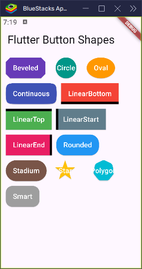
This screen acts as a shape playground, so you can interact with each button and explore how the shapes look and feel. Perfect for experimenting and finding the right style for your app!
Fun with Shapes
Why settle for just one shape when you can have fun mixing and matching? Imagine one screen in your app using star-shaped buttons, and another screen featuring smooth oval buttons. It’s like giving each screen its own personality, and it keeps things fresh and exciting!
You can get creative and let users choose their favorite button shape, like picking a theme. Want to switch from rounded rectangles to stars? Just let them decide, and watch your app transform! This is a great way to make the user experience feel more personal and interactive.
So go ahead—play with different shapes, add some variety, and make your app stand out with fun, dynamic designs. The possibilities are endless!
Conclusion
Flutter offers endless possibilities when it comes to button shapes, giving your app a fresh and fun look. Whether you prefer circles, stars, or classic rectangles, there’s a button shape to match your style. Changing a button’s shape is as simple as picking the right border — kind of like choosing the perfect frame for a photo.
Now, it’s your turn! Get creative and shape your buttons however you like!