When you create apps with Flutter, text is everywhere—titles, labels, buttons, and more. Sometimes, you want your text to stand out. Maybe you want it underlined, crossed out, or even decorated with a colored line. This is where text decoration comes in.
In this article, we’ll learn how to decorate text using Flutter’s Text widget and the TextStyle class. Let’s get started.
What Is Text Decoration in Flutter?
Text decoration means adding lines above, below, or through your text. You’ve probably seen it before:
- Underlines on links.
- Strikethrough on old prices.
- Overlines for styling headers.
Flutter makes this easy with the decoration property in TextStyle.
Using TextStyle with the Text Widget
Flutter’s Text widget has a style property. This is where we use TextStyle to customize how text looks.
Here’s a simple example:
import 'package:flutter/material.dart';

void main() {
  runApp(const MyApp());
}

class MyApp extends StatelessWidget {
  const MyApp({super.key});

  @override
  Widget build(BuildContext context) {
    return MaterialApp(
      home: Scaffold(
        appBar: AppBar(title: Text('Text Decoration')),
        body: Center(
          child: Padding(
            padding: const EdgeInsets.all(12.0),
            child: Text(
              'Hello, world!',
              style: TextStyle(decoration: TextDecoration.underline),
            ),
          ),
        ),
      ),
    );
  }
}
This will show the text “Hello, world!” with an underline.

Applying Text Decorations
You can choose from different types of decorations. Flutter provides three main options:
1. Underline
Adds a line under the text.
import 'package:flutter/material.dart';

void main() {
  runApp(const MyApp());
}

class MyApp extends StatelessWidget {
  const MyApp({super.key});

  @override
  Widget build(BuildContext context) {
    return MaterialApp(
      home: Scaffold(
        appBar: AppBar(title: Text('Text Decoration')),
        body: Center(
          child: Padding(
            padding: const EdgeInsets.all(12.0),
            child: Text(
              'Underlined Text',
              style: TextStyle(decoration: TextDecoration.underline),
            ),
          ),
        ),
      ),
    );
  }
}
2. Strikethrough (Line Through)
Draws a line across the text.
import 'package:flutter/material.dart';

void main() {
  runApp(const MyApp());
}

class MyApp extends StatelessWidget {
  const MyApp({super.key});

  @override
  Widget build(BuildContext context) {
    return MaterialApp(
      home: Scaffold(
        appBar: AppBar(title: Text('Text Decoration')),
        body: Center(
          child: Padding(
            padding: const EdgeInsets.all(12.0),
            child: Text(
              'Strikethrough Text',
              style: TextStyle(decoration: TextDecoration.lineThrough),
            ),
          ),
        ),
      ),
    );
  }
}
3. Overline
Adds a line above the text.
import 'package:flutter/material.dart';

void main() {
  runApp(const MyApp());
}

class MyApp extends StatelessWidget {
  const MyApp({super.key});

  @override
  Widget build(BuildContext context) {
    return MaterialApp(
      home: Scaffold(
        appBar: AppBar(title: Text('Text Decoration')),
        body: Center(
          child: Padding(
            padding: const EdgeInsets.all(12.0),
            child: Text(
              'Overlined Text',
              style: TextStyle(decoration: TextDecoration.overline),
            ),
          ),
        ),
      ),
    );
  }
}
Each of these styles is useful depending on the message you’re trying to show.
Customizing Decoration Appearance
Just adding a line is sometimes not enough. Flutter lets you make your decorations look even better.
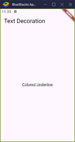
Decoration Color
You can change the color of the line using decorationColor.
import 'package:flutter/material.dart';

void main() {
  runApp(const MyApp());
}

class MyApp extends StatelessWidget {
  const MyApp({super.key});

  @override
  Widget build(BuildContext context) {
    return MaterialApp(
      home: Scaffold(
        appBar: AppBar(title: Text('Text Decoration')),
        body: Center(
          child: Padding(
            padding: const EdgeInsets.all(12.0),
            child: Text(
              'Colored Underline',
              style: TextStyle(
                decoration: TextDecoration.underline,
                decorationColor: Colors.green,
              ),
            ),
          ),
        ),
      ),
    );
  }
}
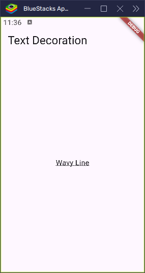
Decoration Style
You can choose how the line looks. For example: solid, dotted, dashed, double, or wavy.
import 'package:flutter/material.dart';

void main() {
  runApp(const MyApp());
}

class MyApp extends StatelessWidget {
  const MyApp({super.key});

  @override
  Widget build(BuildContext context) {
    return MaterialApp(
      home: Scaffold(
        appBar: AppBar(title: Text('Text Decoration')),
        body: Center(
          child: Padding(
            padding: const EdgeInsets.all(12.0),
            child: Text(
              'Wavy Line',
              style: TextStyle(
                decoration: TextDecoration.underline,
                decorationStyle: TextDecorationStyle.wavy,
              ),
            ),
          ),
        ),
      ),
    );
  }
}
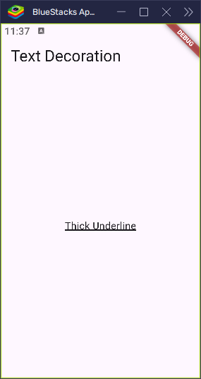
Decoration Thickness
You can make the line thicker or thinner using decorationThickness.
import 'package:flutter/material.dart';

void main() {
  runApp(const MyApp());
}

class MyApp extends StatelessWidget {
  const MyApp({super.key});

  @override
  Widget build(BuildContext context) {
    return MaterialApp(
      home: Scaffold(
        appBar: AppBar(title: Text('Text Decoration')),
        body: Center(
          child: Padding(
            padding: const EdgeInsets.all(12.0),
            child: Text(
              'Thick Underline',
              style: TextStyle(
                decoration: TextDecoration.underline,
                decorationThickness: 3,
              ),
            ),
          ),
        ),
      ),
    );
  }
}
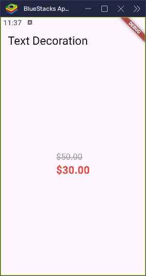
Real-World Example: Discounted Price
Let’s build something more useful—showing a discounted price with a strikethrough on the old price and a new price in red.
import 'package:flutter/material.dart';

void main() {
  runApp(const MyApp());
}

class MyApp extends StatelessWidget {
  const MyApp({super.key});

  @override
  Widget build(BuildContext context) {
    return MaterialApp(
      home: Scaffold(
        appBar: AppBar(title: Text('Text Decoration')),
        body: Center(
          child: Column(
            crossAxisAlignment: CrossAxisAlignment.start,
            mainAxisAlignment: MainAxisAlignment.center,
            children: [
              Text(
                '\$50.00',
                style: TextStyle(
                  decoration: TextDecoration.lineThrough,
                  decorationColor: Colors.grey,
                  decorationThickness: 2,
                  fontSize: 16,
                  color: Colors.grey,
                ),
              ),
              Text(
                '\$30.00',
                style: TextStyle(
                  fontSize: 20,
                  fontWeight: FontWeight.bold,
                  color: Colors.red,
                ),
              ),
            ],
          ),
        ),
      ),
    );
  }
}
This creates a nice price display where the old price is grey and crossed out, and the new price stands out in bold red.
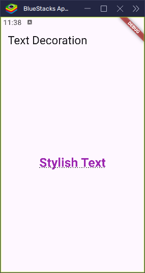
Combining Decorations with Other Styles
You can mix decorations with other text styles like font size, color, or weight:
import 'package:flutter/material.dart';

void main() {
  runApp(const MyApp());
}

class MyApp extends StatelessWidget {
  const MyApp({super.key});

  @override
  Widget build(BuildContext context) {
    return MaterialApp(
      home: Scaffold(
        appBar: AppBar(title: Text('Text Decoration')),
        body: Center(
          child: Padding(
            padding: const EdgeInsets.all(12.0),
            child: Text(
              'Stylish Text',
              style: TextStyle(
                fontSize: 24,
                fontWeight: FontWeight.w600,
                color: Colors.purple,
                decoration: TextDecoration.underline,
                decorationStyle: TextDecorationStyle.dotted,
              ),
            ),
          ),
        ),
      ),
    );
  }
}
This shows large purple text with a dotted underline.
Things to Remember
- Some fonts may not support all decoration styles.
- Very thick decorations can overlap with text if not styled carefully.
- Always test on real devices for best results.
Conclusion
The Text widget in Flutter becomes more powerful when you use TextStyle to decorate your text. Whether it’s underlining a link or striking out an old price, decorations help guide the user’s attention and make your UI feel more polished.
Try experimenting with the different styles and see what fits your app best. And if you want even more control over styling parts of your text, consider checking out the RichText and TextSpan widgets next.