In Flutter, getting things to appear in the right place is important. Imagine you’re placing stickers on a page: you might want a sticker in the center, or in the top-right corner, or somewhere in between. The Align widget is like a tool that helps you position your “stickers” (or widgets) just where you want them on the screen.
Learn C Programming For Free on Windows
A beginner-friendly course that teaches real C programming using a Windows compiler. Learn arrays, pointers, functions, and file handling step by step with practical lessons.
Start Learning C ProgrammingWhat is the Align Widget?
The Align widget helps you position its child widget in a specific spot inside its parent container. It’s like telling Flutter, “I want this widget to be at the center,” or “Put it in the top-right corner.”
The Align widget is a very useful tool when you need more control over where something is placed on the screen.
Basic Usage of the Align Widget
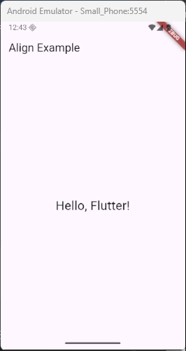
To use the Align widget, you wrap the widget you want to position inside the Align widget. Here’s a simple example where we align a text widget in the center of the screen:
import 'package:flutter/material.dart';

void main() {
  runApp(const MyApp());
}

class MyApp extends StatelessWidget {
  const MyApp({super.key});

  @override
  Widget build(BuildContext context) {
    return MaterialApp(
      home: Scaffold(
        appBar: AppBar(title: Text('Align Example')),
        body: Center(
          child: Align(
            alignment: Alignment.center, // Centers the text
            child: Text('Hello, Flutter!', style: TextStyle(fontSize: 24)),
          ),
        ),
      ),
    );
  }
}
In this case, the text “Hello, Flutter!” will appear right in the center of its parent container. You can change the alignment property to control where the text appears.
Understanding the Alignment Property
The alignment property in the Align widget tells Flutter where to place the child widget. You can choose from several predefined positions.
Here are some common alignments you can use:
Alignment.bottomLeft: Puts the widget in the bottom-left corner.Alignment.bottomCenter: Puts the widget in the center of the bottom side.Alignment.bottomRight: Puts the widget in the bottom-right corner.Alignment.center: Puts the widget exactly in the center.Alignment.centerLeft: Puts the widget in the center of the left side.Alignment.centerRight: Puts the widget in the center of the right side.Alignment.topLeft: Puts the widget in the top-left corner.Alignment.topCenter: Puts the widget in the center of the top side.Alignment.topRight: Puts the widget in the top-right corner.
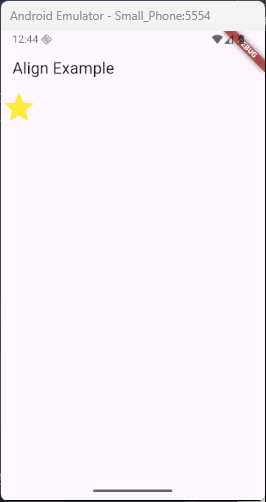
Here’s an example where we align a widget to the top-left:
import 'package:flutter/material.dart';

void main() {
  runApp(const MyApp());
}

class MyApp extends StatelessWidget {
  const MyApp({super.key});

  @override
  Widget build(BuildContext context) {
    return MaterialApp(
      home: Scaffold(
        appBar: AppBar(title: const Text('Align Example')),
        body: Center(
          child: Align(
            alignment: Alignment.topLeft,
            child: Icon(
              Icons.star,
              size: 50, // You can adjust the size of the icon
              color: Colors.yellow, // You can also change the color
            ),
          ),
        ),
      ),
    );
  }
}
In this example, the Icon widget is aligned to the top-left corner of its parent container. You can easily adjust the alignment by changing the value of the alignment property to other options like topCenter, center, or bottomRight for different placements.
Using Fractional Alignment
Sometimes, you might want more precise control over where your widget appears. This is where fractional alignment comes in. With fractional alignment, you can position your widget by percentages. For example, you can position a widget 30% from the left and 50% from the top.
Here’s an example of how to use fractional alignment:
import 'package:flutter/material.dart';
void main() {
runApp(const MyApp());
}
class MyApp extends StatelessWidget {
const MyApp({super.key});
@override
Widget build(BuildContext context) {
return MaterialApp(
home: Scaffold(
appBar: AppBar(title: const Text('FractionalOffset Alignment Example')),
body: Center(
child: Container(
width: 300,
height: 300,
color: Colors.lightBlueAccent,
child: Align(
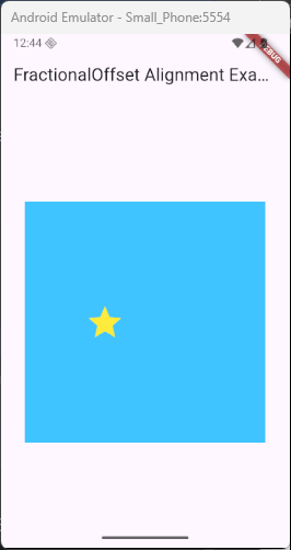
alignment: FractionalOffset(0.3, 0.5),
child: Icon(Icons.star, size: 50, color: Colors.yellow),
),
),
),
),
);
}
}In this case, the star icon will be positioned 30% from the left and 50% from the top of the parent container. This places the icon right in the middle of the top half of the screen. It’s a great way to position widgets with fractional offsets, offering more flexibility than just using predefined alignments.
This technique is useful when you need a more dynamic, non-grid-based positioning for your widgets, allowing for precise control over their placement.
The Alignment of Widgets in Complex Layouts
The Align widget is also great when working with more complex layouts. For example, you might have a Stack widget where multiple items are layered on top of each other. Using Align can help you position items precisely within the stack.
Here’s how you might use the Align widget inside a Stack:
import 'package:flutter/material.dart';
void main() {
runApp(const MyApp());
}
class MyApp extends StatelessWidget {
const MyApp({super.key});
@override
Widget build(BuildContext context) {
return MaterialApp(
home: Scaffold(
appBar: AppBar(title: Text('Align in Stack Example')),
body: Stack(
children: <Widget>[
Align(
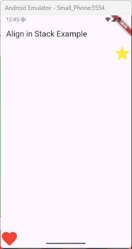
alignment: Alignment.topRight,
child: Icon(Icons.star, size: 50, color: Colors.yellow),
),
Align(
alignment: Alignment.bottomLeft,
child: Icon(Icons.favorite, size: 50, color: Colors.red),
),
],
),
),
);
}
}In this example, one icon will be in the top-right corner, and the other will be in the bottom-left corner. The Stack widget allows for widgets to overlap, and the Align widget helps place each widget exactly where you want it. This allows for a layered effect where both icons are positioned independently within the same space.
Use Cases and Practical Examples
The Align widget is super useful for many things. Here are some practical examples:
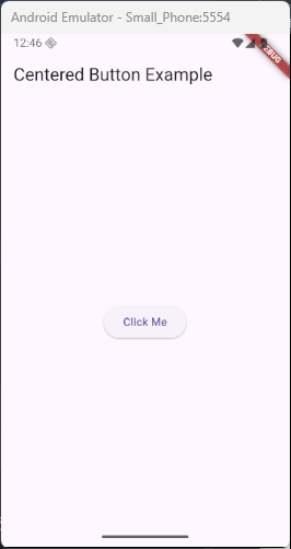
Centering a Button: You can center a button in the middle of the screen.
import 'package:flutter/material.dart';

void main() {
  runApp(const MyApp());
}

class MyApp extends StatelessWidget {
  const MyApp({super.key});

  @override
  Widget build(BuildContext context) {
    return MaterialApp(
      home: Scaffold(
        appBar: AppBar(title: Text('Centered Button Example')),
        body: Align(
          alignment: Alignment.center, // Centers the button
          child: ElevatedButton(
            onPressed: () {
              // Action when the button is pressed
            },
            child: Text('Click Me'),
          ),
        ),
      ),
    );
  }
}
Aligning an Image: Place an image at the top-left corner of a container.
import 'package:flutter/material.dart';

void main() {
  runApp(const MyApp());
}

class MyApp extends StatelessWidget {
  const MyApp({super.key});

  @override
  Widget build(BuildContext context) {
    return MaterialApp(
      home: Scaffold(
        appBar: AppBar(title: Text('Image Aligned Example')),
        body: Align(
          alignment: Alignment.topLeft, // Aligns the image to the top-left
          child: Image.asset(
            'assets/images/cat.jpg',
          ), // Replace with your image path
        ),
      ),
    );
  }
}
In this example, the Image.asset widget is aligned to the top-left corner of the screen using the Align widget.
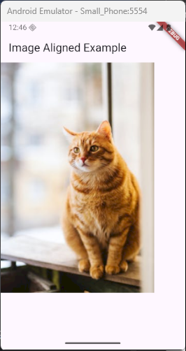
The Image.asset widget loads the image from your assets. Make sure to add the image to your pubspec.yaml file like this:
flutter:
  assets:
    - assets/images/cat.jpg
This will display the image in the top-left corner of the screen.
Conclusion
The Align widget is a powerful tool that gives you control over where widgets appear on the screen. Whether you want something centered, at the top-right, or even at a custom position, the Align widget makes it easy to get the right layout.
Now that you understand how to use it, try playing around with different alignment values and see how your app’s layout changes. Whether you’re building simple screens or complex designs, the Align widget can help you place your widgets exactly where you need them!