Have you ever pressed a button on your phone to play a game or open a message? That tappable area you pressed is similar to an ElevatedButton in Flutter! In Flutter, an ElevatedButton creates a button that appears to float above the screen, making it stand out with a shadow effect, like a real-life button you can press.
Think about being at an arcade, where a big, shiny button on a game machine catches your eye. It’s easy to see and invites you to press it. That’s exactly what an ElevatedButton does in your Flutter app—it stands out and draws attention, making it clear that it’s ready to be tapped.
In Flutter apps, we use ElevatedButton for actions like submitting forms, navigating to other pages, or starting something new. It’s one of the most common and easiest ways to add interactivity to your app.
If you want your app to be more interactive and engaging, let’s learn how to use this powerful button!
What is an ElevatedButton?
An ElevatedButton is a type of button in Flutter that appears to be lifted off the screen, almost like it’s floating. It has a shadow beneath it, giving the impression that it’s raised, which is why it’s called “elevated”.
Imagine you have three types of buttons:
- One that’s flat, like a sticker on paper — that’s a
TextButton. - One that has a border around it, like a picture frame — that’s an
OutlinedButton. - And one that pops up a little with a shadow, like a real button you can press — that’s the
ElevatedButton!
Because of its shadow and 3D effect, the ElevatedButton stands out and is perfect when you want to grab the user’s attention. It’s often used for actions like “Next”, “Submit”, or “Start”. The raised effect makes it clear that the button is clickable, which helps make your app easier and more engaging to use.
Basic Usage
Let’s learn how to use an ElevatedButton in a Flutter app. Think of it like building with LEGO blocks—each line of code connects to create something functional and fun!
Here’s a simple working example:
import 'package:flutter/material.dart';
void main() {
runApp(MyApp());
}
class MyApp extends StatelessWidget {
const MyApp({super.key});
@override
Widget build(BuildContext context) {
return MaterialApp(
home: Scaffold(
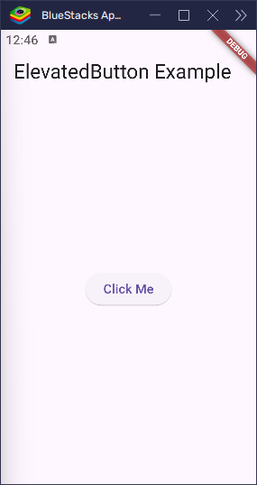
appBar: AppBar(title: Text('ElevatedButton Example')),
body: Center(
child: ElevatedButton(
onPressed: () {
print('Button was pressed!');
},
child: Text('Click Me'),
),
),
),
);
}
}Let’s break this down:
ElevatedButton: This is the button widget that gives us a raised button with a shadow, making it stand out on the screen.onPressed: This is the action that happens when someone taps the button. In this case, it will print “Button was pressed!” to the console. You can think of this like telling Flutter, “When this button is tapped, do this!”child: Text('Click Me'): This defines the text that appears on the button. The text “Click Me” will appear inside the button, telling the user what to do.
So, when you tap the button, Flutter runs the code inside onPressed and shows the message in the console. It’s a simple, yet powerful way to add interactivity to your app!
You can place this button anywhere in your app: center of the screen, inside a form, or next to other buttons. It’s flexible and easy to use!
Customizing an ElevatedButton
Now that you know how to create a basic ElevatedButton, let’s take it a step further and learn how to customize it. Customization is like picking out your favorite clothes—you get to make it your own by changing its color, size, shape, and the space around it!
Flutter provides a tool called styleFrom to help with this. You can think of it like a magic paintbrush that lets you style your button just the way you like.
Here’s a fun example of customizing an ElevatedButton:
import 'package:flutter/material.dart';
void main() {
runApp(MyApp());
}
class MyApp extends StatelessWidget {
const MyApp({super.key});
@override
Widget build(BuildContext context) {
return MaterialApp(
home: Scaffold(
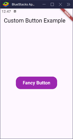
appBar: AppBar(title: Text('Custom Button Example')),
body: Center(
child: ElevatedButton(
onPressed: () {
print('Styled button pressed!');
},
style: ElevatedButton.styleFrom(
backgroundColor: Colors.purple, // Button color
foregroundColor: Colors.white, // Text color
padding: EdgeInsets.symmetric(
horizontal: 30,
vertical: 15, // Space inside the button
),
shape: RoundedRectangleBorder(
borderRadius: BorderRadius.circular(20), // Rounded corners
),
textStyle: TextStyle(
fontSize: 18, // Text size
fontWeight: FontWeight.bold, // Bold text
),
),
child: Text('Fancy Button'), // Button text
),
),
),
);
}
}Let’s break it down:
backgroundColor: This property changes the background color of the button. In this case, we set it to purple.foregroundColor: This changes the text color of the button. Here, we set it to white so the text stands out against the purple background.padding: This adds space inside the button around the text. Think of padding like the fluff inside a pillow that makes it more comfortable. We added 30 horizontally and 15 vertically.shape: This property lets you change the button’s shape. We usedRoundedRectangleBorderto give the button rounded corners. The higher the number, the rounder the corners. In this case, it’s set to 20.textStyle: This allows you to style the text on the button. We made the text bigger (size 18) and bold for emphasis.
By using styleFrom, you can customize your button to fit your app’s design or your own style. Want a big, red button with bold text? You got it! The styleFrom method makes it simple to make your button look just how you want it.
While Flutter also supports deeper styling using ButtonStyle, styleFrom is the easiest and most beginner-friendly way to get started with button customization.
Handling Button Taps
When you tap a button, something cool happens! That’s where the onPressed function comes into play. It tells Flutter, “Hey, when someone presses this button, do something!”
You can make the button do all sorts of things—like showing a message, navigating to a new screen, or performing a fun action.
Let’s start with a simple example where we print something to the console when the button is pressed:
import 'package:flutter/material.dart';

void main() {
  runApp(MyApp());
}

class MyApp extends StatelessWidget {
  const MyApp({super.key});

  @override
  Widget build(BuildContext context) {
    return MaterialApp(
      home: Scaffold(
        appBar: AppBar(title: Text('Button Press Example')),
        body: Center(
          child: ElevatedButton(
            onPressed: () {
              print('You pressed the button!');
            },
            child: Text('Tap Me'),
          ),
        ),
      ),
    );
  }
}
What Happens Here:
- When you tap the “Tap Me” button, Flutter runs the code inside the
onPressedfunction. - The
print()line sends a message to the console that says: “You pressed the button!”
It’s like giving your app a voice. When you tap the button, it responds with a message in the background. This helps you see if the button is working properly!
Adding More Fun: Show a Pop-Up Message
Want to make things a little fancier? Instead of just printing something to the console, you can show a pop-up message to the user. Here’s how to make a message box (also known as a dialog) appear when the button is pressed:
import 'package:flutter/material.dart';
void main() {
runApp(MyApp());
}
class MyApp extends StatelessWidget {
const MyApp({super.key});
@override
Widget build(BuildContext context) {
return MaterialApp(home: AlertDialogExample());
}
}
class AlertDialogExample extends StatelessWidget {
const AlertDialogExample({super.key});
@override
Widget build(BuildContext context) {
return Scaffold(
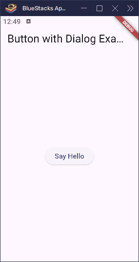
appBar: AppBar(title: Text('Button with Dialog Example')),
body: Center(
child: ElevatedButton(
onPressed: () {
showDialog(
context: context,
builder:
(context) => AlertDialog(
title: Text('Hello!'),
content: Text('You just tapped the button. Great job!'),
),
);
},
child: Text('Say Hello'),
),
),
);
}
}What Happens Here:
- When the “Say Hello” button is pressed, a pop-up message appears on the screen.
- The message box contains a title (“Hello!”) and content (“You just tapped the button. Great job!”).
This is a fun way to show feedback to the user. Instead of just printing something, you’re actively interacting with them on the screen!
To Summarize:
- The
onPressedfunction is the heart of button interaction in Flutter. - You can do simple actions like printing messages or more advanced things like showing dialogs.
- Use these interactions to make your app feel alive and interactive!
Go ahead and experiment—make your app respond to button presses in creative ways!
Real-World Example 1: Submit Button
Let’s say you’re making a fun Flutter app where users can type in their name and then press a button to submit it. That’s a perfect job for an ElevatedButton!
Here’s a small app that shows a text field and a button:
import 'package:flutter/material.dart';
void main() {
runApp(MaterialApp(home: MyFormPage()));
}
class MyFormPage extends StatefulWidget {
const MyFormPage({super.key});
@override
MyFormPageState createState() => MyFormPageState();
}
class MyFormPageState extends State<MyFormPage> {
final nameController = TextEditingController();
@override
Widget build(BuildContext context) {
return Scaffold(
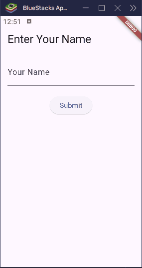
appBar: AppBar(title: Text('Enter Your Name')),
body: Padding(
padding: EdgeInsets.all(16),
child: Column(
children: [
TextField(
controller: nameController,
decoration: InputDecoration(labelText: 'Your Name'),
),
SizedBox(height: 20),
ElevatedButton(
onPressed: () {
final name = nameController.text;
showDialog(
context: context,
builder:
(context) => AlertDialog(
title: Text('Thanks!'),
content: Text('Hello, $name!'),
),
);
},
child: Text('Submit'),
),
],
),
),
);
}
}Let’s walk through what’s happening:
- TextField: This is where the user types their name.
- nameController: This collects whatever the user types.
- ElevatedButton: This is the submit button! When it’s pressed, the app reads the name from the text field and shows it in a message box.
It’s kind of like writing your name on a piece of paper and handing it to someone—they look at it and say, “Hi there!”
In real apps, submit buttons are used for all kinds of things—like sending a message, signing up for something, or logging in. And now you know how to make one in Flutter!
Real-World Example 2: Navigation Button
Imagine you’re in a game, and you press a button to go to the next level. In Flutter, we can do something just like that using a button to navigate to a new screen. It’s like saying, “Hey Flutter, take me somewhere else!”
We use something called Navigator.push to make that happen. Think of it like opening a new page in a storybook.
Here’s how it works:
import 'package:flutter/material.dart';

void main() {
  runApp(MyApp());
}

class MyApp extends StatelessWidget {
  const MyApp({super.key});

  @override
  Widget build(BuildContext context) {
    return MaterialApp(home: HomePage());
  }
}

class HomePage extends StatelessWidget {
  const HomePage({super.key});

  @override
  Widget build(BuildContext context) {
    return Scaffold(
      appBar: AppBar(title: Text('Home')),
      body: Center(
        child: ElevatedButton(
          onPressed: () {
            Navigator.push(
              context,
              MaterialPageRoute(builder: (context) => SecondPage()),
            );
          },
          child: Text('Go to Second Page'),
        ),
      ),
    );
  }
}

class SecondPage extends StatelessWidget {
  const SecondPage({super.key});

  @override
  Widget build(BuildContext context) {
    return Scaffold(
      appBar: AppBar(title: Text('Second Page')),
      body: Center(
        child: Text(
          'Welcome to the second page!',
          textAlign: TextAlign.center,
          style: TextStyle(fontSize: 24),
        ),
      ),
    );
  }
}
Here’s what’s going on:
ElevatedButton: This is our navigation button. When you tap it, something exciting happens!Navigator.push: This is like opening a door to a new screen. It takes you from the current screen (HomePage) to a new one (SecondPage).MaterialPageRoute: This helps Flutter know what page you want to go to.
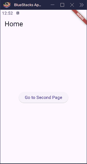
So when someone taps the button, Flutter goes, “Alright! Let’s go to the next page!” and shows the new screen. You can use this for anything—like going from a menu to a game, or from a welcome screen to a sign-up form.
It’s simple, smooth, and super useful!
Conclusion
You’ve just learned all about the ElevatedButton in Flutter—one of the most fun and useful widgets out there.
We started by learning what an ElevatedButton is: a button that looks like it’s popping out of the screen, ready to be tapped. Then, we saw how to use it in your app, how to make it look cool with colors and shapes, and how to make it do things—like showing messages, submitting forms, or going to new screens.
Buttons like these help make your app interactive and exciting. Whether you’re building a game, a quiz, or just a fun app for friends, ElevatedButton is your go-to tool for action!
Now it’s your turn—go ahead and try adding some buttons to your own Flutter app. Make them colorful, make them useful, and most of all, make them yours.