Buttons are a big part of mobile apps. They allow users to take action, like submitting a form, making a purchase, or navigating to another screen. But sometimes, you might not want a button to be clickable right away. For example, you might want a button to stay disabled until the user fills in all the required information. In this article, we’ll learn how to enable and disable buttons in Flutter.
Why Enable and Disable Buttons?
Buttons are used in many places in apps. You might want to disable a button for a few reasons:
- To prevent users from clicking the button before filling out a form.
- To stop users from submitting the same information multiple times.
- To show when the app is working on something (like loading data), so the button is temporarily disabled.
Disabling a button at the right time helps make the app feel more intuitive and gives feedback to users about what they should do next.
Setting Up a Basic Button in Flutter
Before we can enable or disable buttons, let’s set up a basic button in Flutter. The simplest button is the ElevatedButton, which you can use to trigger an action when clicked.
Here’s how to create a basic button:
import 'package:flutter/material.dart';

void main() {
  runApp(const MyApp());
}

class MyApp extends StatelessWidget {
  const MyApp({super.key});

  @override
  Widget build(BuildContext context) {
    return MaterialApp(
      title: 'Buttons',
      home: Scaffold(
        appBar: AppBar(title: Text('Basic Button')),
        body: Center(child: MyButton()),
      ),
    );
  }
}

class MyButton extends StatelessWidget {
  const MyButton({super.key});

  @override
  Widget build(BuildContext context) {
    return ElevatedButton(
      onPressed: () {
        // Show a SnackBar when the button is pressed
        ScaffoldMessenger.of(context).showSnackBar(
          SnackBar(
            content: Text('Button Pressed!'),
            duration: Duration(seconds: 2),
          ),
        );
      },
      child: Text('Click Me'),
    );
  }
}
In this example, we have an ElevatedButton with the text “Click Me”. When clicked, the button shows a SnackBar with the message “Button Pressed!” at the bottom of the screen. This action is controlled by the onPressed property, which runs the code inside it when the button is tapped.
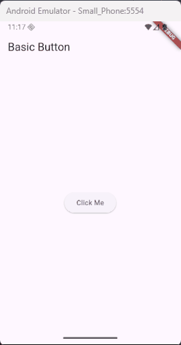
Disabling a Button
Sometimes, you might want to disable a button so the user can’t click it. To do that, you simply set onPressed to null.
Here’s how you disable a button:
import 'package:flutter/material.dart';

void main() {
  runApp(const MyApp());
}

class MyApp extends StatelessWidget {
  const MyApp({super.key});

  @override
  Widget build(BuildContext context) {
    return MaterialApp(
      title: 'Buttons',
      home: Scaffold(
        appBar: AppBar(title: Text('Disabled Button')),
        body: Center(child: MyButton()),
      ),
    );
  }
}

class MyButton extends StatelessWidget {
  const MyButton({super.key});

  @override
  Widget build(BuildContext context) {
    return ElevatedButton(
      onPressed: null, // Disables the button
      child: Text('I am Disabled'),
    );
  }
}
When onPressed is null, the button can’t be clicked. It’s like the button is “turned off.”
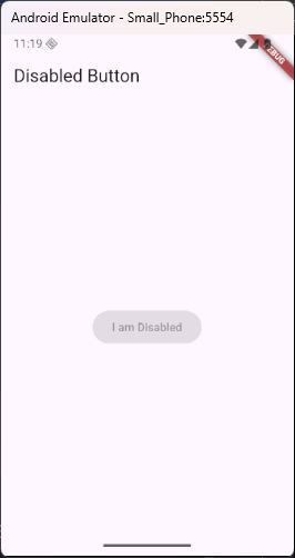
Enabling a Button
To enable the button, you just need to give it an onPressed function again. For example, you might want to enable the button only after the user has typed something into a text field.
Here’s an example of a button that becomes enabled when the user types a message:
import 'package:flutter/material.dart';

void main() {
  runApp(const MyApp());
}

class MyApp extends StatelessWidget {
  const MyApp({super.key});

  @override
  Widget build(BuildContext context) {
    return MaterialApp(home: TextFieldButtonExample());
  }
}

class TextFieldButtonExample extends StatefulWidget {
  const TextFieldButtonExample({super.key});

  @override
  TextFieldButtonExampleState createState() => TextFieldButtonExampleState();
}

class TextFieldButtonExampleState extends State<TextFieldButtonExample> {
  bool _isButtonEnabled = false;

  @override
  Widget build(BuildContext context) {
    return Scaffold(
      appBar: AppBar(title: Text('Enable Button on Text Input')),
      body: Padding(
        padding: const EdgeInsets.all(16.0),
        child: Column(
          children: [
            TextField(
              onChanged: (text) {
                // Enable the button when text is not empty
                setState(() {
                  _isButtonEnabled = text.isNotEmpty;
                });
              },
              decoration: InputDecoration(labelText: 'Enter something'),
            ),
            SizedBox(height: 20),
            ElevatedButton(
              onPressed:
                  _isButtonEnabled
                      ? () {
                        // Only runs when button is enabled
                        // Show a SnackBar when the button is pressed
                        ScaffoldMessenger.of(context).showSnackBar(
                          SnackBar(
                            content: Text('Button Pressed!'),
                            duration: Duration(seconds: 2),
                          ),
                        );
                      }
                      : null, // Disabled if no text
              child: Text('Submit'),
            ),
          ],
        ),
      ),
    );
  }
}
In this example, the button is only enabled when there is text in the TextField. If the text field is empty, the button stays disabled.
Using StatefulWidget to Control Button State
You’ll need to use StatefulWidget to manage the button’s state. This means the button’s state (enabled or disabled) can change over time based on user input or app events.
Here’s an example of using StatefulWidget to control when a button should be enabled or disabled:
import 'package:flutter/material.dart';
void main() {
runApp(const MyApp());
}
class MyApp extends StatelessWidget {
const MyApp({super.key});
@override
Widget build(BuildContext context) {
return MaterialApp(
home: Scaffold(
appBar: AppBar(title: Text('Newsletter Signup')),
body: Padding(
padding: const EdgeInsets.all(16.0),
child: NewsletterForm(),
),
),
);
}
}
class NewsletterForm extends StatefulWidget {
const NewsletterForm({super.key});
@override
State<NewsletterForm> createState() => _NewsletterFormState();
}
class _NewsletterFormState extends State<NewsletterForm> {
final TextEditingController _emailController = TextEditingController();
bool _isButtonEnabled = false;
void _onEmailChanged(String text) {
setState(() {
// Basic email format check
_isButtonEnabled = text.contains('@') && text.contains('.');
});
}
void _submitForm() {
final email = _emailController.text.trim();
ScaffoldMessenger.of(context).showSnackBar(
SnackBar(
content: Text('Thanks for signing up, $email!'),
duration: Duration(seconds: 2),
),
);
// Optionally clear the field
_emailController.clear();
setState(() => _isButtonEnabled = false);
}
@override
Widget build(BuildContext context) {
return Column(
crossAxisAlignment: CrossAxisAlignment.start,
children: [
Text(
'Stay in the loop!',
style: Theme.of(context).textTheme.titleSmall,
),
SizedBox(height: 8),
Text(
'Enter your email to receive updates and news.',
style: TextStyle(color: Colors.grey[700]),
),
SizedBox(height: 20),
TextField(
controller: _emailController,
onChanged: _onEmailChanged,
keyboardType: TextInputType.emailAddress,
decoration: InputDecoration(
labelText: 'Email Address',
border: OutlineInputBorder(),
prefixIcon: Icon(Icons.email),
),
),
SizedBox(height: 16),
SizedBox(
width: double.infinity,
child: ElevatedButton(
onPressed: _isButtonEnabled ? _submitForm : null,
child: Text('Subscribe'),
),
),
],
);
}
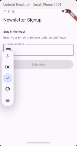
}In this example, the Subscribe button becomes active only when the user enters a valid email address into the text field. The setState method is used to update the button’s enabled state whenever the text changes. This helps make the form feel more interactive and prevents empty or invalid submissions.
Using Conditions to Enable or Disable Buttons
Sometimes, you might want to disable the button based on certain conditions. For example, a button can be disabled when the app is loading or when the user hasn’t completed all the required fields in a form.
Here’s an example of disabling a button while data is being loaded:
import 'package:flutter/material.dart';
void main() {
runApp(const MyApp());
}
class MyApp extends StatelessWidget {
const MyApp({super.key});
@override
Widget build(BuildContext context) {
return MaterialApp(
home: Scaffold(
appBar: AppBar(title: Text('Loading Button Example')),
body: Center(child: LoadingButton()),
),
);
}
}
class LoadingButton extends StatefulWidget {
const LoadingButton({super.key});
@override
State<LoadingButton> createState() => _LoadingButtonState();
}
class _LoadingButtonState extends State<LoadingButton> {
bool isLoading = false;
void _handleSubmit() async {
setState(() {
isLoading = true;
});
// Simulate a network call or saving data
await Future.delayed(Duration(seconds: 2));
setState(() {
isLoading = false;
});
ScaffoldMessenger.of(context).showSnackBar(
SnackBar(content: Text('Data Submitted'), duration: Duration(seconds: 2)),
);
}
@override
Widget build(BuildContext context) {
return ElevatedButton(
onPressed: isLoading ? null : _handleSubmit,
style: ElevatedButton.styleFrom(
padding: EdgeInsets.symmetric(horizontal: 24, vertical: 12),
),
child:
isLoading
? SizedBox(
width: 20,
height: 20,
child: CircularProgressIndicator(
color: Colors.white,
strokeWidth: 2,
),
)
: Text('Submit'),
);
}
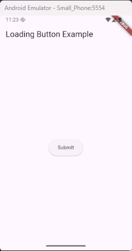
}In this example, while isLoading is set to true, the button is disabled and shows a spinning CircularProgressIndicator instead of the usual button text. This tells the user that something is loading. Once isLoading becomes false, the spinner goes away, and the button becomes clickable again.
Best Practices
When you disable a button, make sure you do it for a good reason. You want to make your app more user-friendly by guiding users through the process. Here are some best practices:
- Prevent multiple submissions: Disable the button after the user submits a form to prevent them from submitting the same data again.
- Indicate loading: Show a loading indicator or change the button’s appearance when data is being fetched.
- Clear instructions: Make sure users know why a button is disabled, such as showing a message or guiding them to complete missing information.
Conclusion
Enabling and disabling buttons in Flutter is a simple yet powerful way to control the flow of your app. Whether you’re preventing multiple submissions, guiding users through a form, or showing loading states, controlling buttons helps make your app more user-friendly. Experiment with these techniques in your Flutter projects to create smooth and interactive user experiences.