When you’re building apps, icons are like little pictures that represent actions, items, or features. For example, a play button icon might start music, and a home icon might take you back to the main screen. Flutter makes it really easy to use icons in your app, whether you want to use built-in ones, create your own, or even use ones from the internet.
What Are Icons in Flutter?
Icons are small pictures that represent something important in your app. They’re great for making your app look nice and help users quickly understand what a button or feature does. For example, a heart icon might mean “like,” and a shopping cart icon could mean “view items.”
Flutter provides a lot of built-in icons that you can easily use in your app. Think of them like stickers in a sticker book, where each sticker represents a different action or item.
Using Built-in Flutter Icons
Flutter has a big collection of built-in icons that you can use. These are part of the Icons class. To use an icon, you just add the Icon widget and tell it which icon you want.
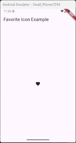
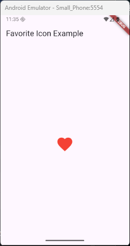
Here’s an example of how to add a heart icon to your app:
import 'package:flutter/material.dart';

void main() {
  runApp(const MyApp());
}

class MyApp extends StatelessWidget {
  const MyApp({super.key});

  @override
  Widget build(BuildContext context) {
    return MaterialApp(
      home: Scaffold(
        appBar: AppBar(title: Text('Favorite Icon Example')),
        body: Center(child: Icon(Icons.favorite)),
      ),
    );
  }
}
This will display the heart icon. You can place this icon anywhere in your app, such as inside a button or next to text.
Customizing Icons
You can change how the icons look by customizing them. For example, you can make an icon bigger, smaller, or change its color.
- Changing Size: You can make the icon bigger or smaller by using the
sizeproperty. - Changing Color: You can also change the color of the icon using the
colorproperty.
Here’s how you can make the heart icon bigger and red:
import 'package:flutter/material.dart';

void main() {
  runApp(const MyApp());
}

class MyApp extends StatelessWidget {
  const MyApp({super.key});

  @override
  Widget build(BuildContext context) {
    return MaterialApp(
      home: Scaffold(
        appBar: AppBar(title: Text('Favorite Icon Example')),
        body: Center(
          child: Icon(
            Icons.favorite,
            size: 50.0, // Makes the icon bigger
            color: Colors.red, // Changes the color to red
          ),
        ),
      ),
    );
  }
}
This will display a big, red heart.
Icon Button Widget
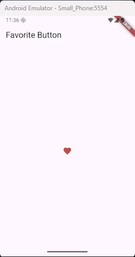
Sometimes you want your icons to be clickable, like a button. For that, you can use the IconButton widget. This is perfect when you want to perform an action when someone taps the icon, like going to another page or showing a message.
Here’s an example where tapping a heart icon shows a message:
import 'package:flutter/material.dart';

void main() {
  runApp(const MyApp());
}

class MyApp extends StatelessWidget {
  const MyApp({super.key});

  @override
  Widget build(BuildContext context) {
    return MaterialApp(home: HeartScreen());
  }
}

class HeartScreen extends StatelessWidget {
  const HeartScreen({super.key});

  @override
  Widget build(BuildContext context) {
    return Scaffold(
      appBar: AppBar(title: Text('Favorite Button')),
      body: Center(
        child: Builder(
          builder: (BuildContext innerContext) {
            // Use innerContext to make sure we’re inside the Scaffold
            return IconButton(
              icon: Icon(Icons.favorite, color: Colors.red),
              onPressed: () {
                ScaffoldMessenger.of(innerContext).showSnackBar(
                  SnackBar(
                    content: Text('Heart icon tapped!'),
                    duration: Duration(seconds: 2),
                  ),
                );
              },
            );
          },
        ),
      ),
    );
  }
}
In this example, when the user taps the heart icon, it prints a message to the console. You can replace onPressed with any action you want to happen, like opening a new screen or changing something in the app.
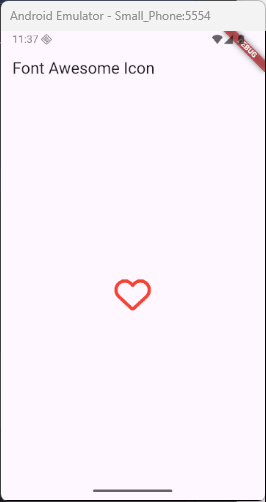
Using Icons from External Packages
If you want even more icons, Flutter lets you use icons from other packages (libraries created by others). For example, you can use icons from FontAwesome or Material Design Icons.
To use an icon from an external package, you first need to add the package to your project by editing the pubspec.yaml file.
Here’s an example of how to add FontAwesome icons:
- Open your
pubspec.yamlfile and add the package:
dependencies:
  flutter:
    sdk: flutter
font_awesome_flutter: ^10.8.0- Install the package by running
flutter pub getin your terminal. - Then, use an icon from the package in your code like this:
import 'package:flutter/material.dart';
import 'package:font_awesome_flutter/font_awesome_flutter.dart';

void main() {
  runApp(const MyApp());
}

class MyApp extends StatelessWidget {
  const MyApp({super.key});

  @override
  Widget build(BuildContext context) {
    return MaterialApp(
      home: Scaffold(
        appBar: AppBar(title: Text('Font Awesome Icon')),
        body: Center(
          child: Icon(FontAwesomeIcons.heart, color: Colors.red, size: 50),
        ),
      ),
    );
  }
}
Now you have a cool heart icon from FontAwesome!
Creating Custom Icons
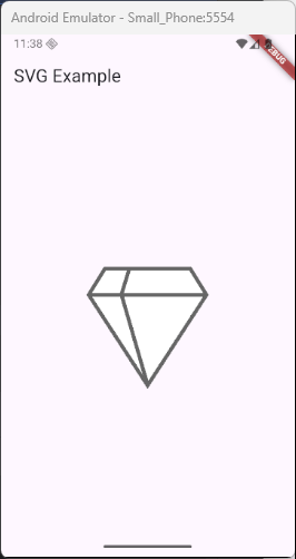
Sometimes, you might want to create your own icon. You can use images or SVGs (a type of image format that scales nicely). Flutter makes it easy to use custom images as icons with the help of the flutter_svg package.
Here’s how you can use a custom SVG icon:
- First, add the
flutter_svgpackage to yourpubspec.yamlfile:
dependencies:
  flutter:
    sdk: flutter
flutter_svg: ^2.0.17- Then, use the SVG icon in your app like this:
import 'package:flutter/material.dart';
import 'package:flutter_svg/flutter_svg.dart';

void main() {
  runApp(const MyApp());
}

class MyApp extends StatelessWidget {
  const MyApp({super.key});

  @override
  Widget build(BuildContext context) {
    return MaterialApp(
      home: Scaffold(
        appBar: AppBar(title: Text('SVG Example')),
        body: Center(
          child: SvgPicture.asset(
            'assets/images/logo.svg',
            width: 150,
            height: 150,
          ),
        ),
      ),
    );
  }
}
Don’t forget to add the image path to your pubspec.yaml:
flutter:
  assets:
    - assets/images/logo.svg
This will show your SVG logo centered on the screen. With this, you can use any custom SVG image as an icon—perfect for logos, badges, or unique illustrations that need to stay sharp on any screen size!
Best Practices for Using Icons in Flutter
Here are some helpful tips when using icons in your Flutter app:
- Choose the right icon: Make sure the icon matches the action or item it represents. For example, use a shopping cart icon for the shopping page, not for a profile page.
- Consistency: Keep your icon style consistent throughout the app. Use the same color, size, and style to create a unified design.
- Visibility: Make sure your icons are easy to see. Use high-contrast colors and make sure the size is big enough for people to tap easily. You can also check if your app is accessible to users with color blindness.
Conclusion
Icons are an important part of any app, making it easier for users to understand what actions they can take. Flutter makes it super simple to use built-in icons, customize them, and even create your own icons with images or SVGs.
With just a little creativity, you can use icons to make your app look beautiful and function smoothly. So, whether you use a heart icon for “favorites” or a shopping cart for “buy,” Flutter’s got you covered!