Radio buttons are a great way to allow users to choose only one option from a list of options. They are commonly used for single-choice selections, like picking a gender or a payment method. In this article, we’ll explore how to use radio buttons in Flutter, how to manage their selection, and how to customize their appearance.
What is a Radio Button?
A radio button is a small circular button that allows the user to choose one option from a set. When a user selects one radio button, all other options in the group become unselected. Flutter provides the Radio widget to easily create radio buttons.
In Flutter, radio buttons are represented by the Radio widget, and you manage their selection using the groupValue property.
Basic Radio Button Example
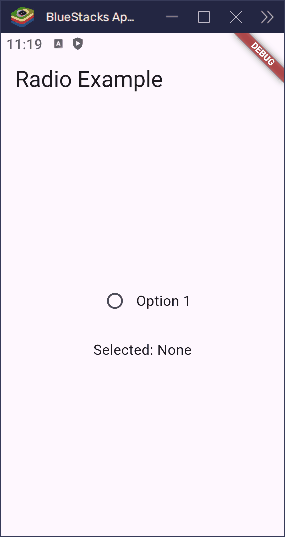
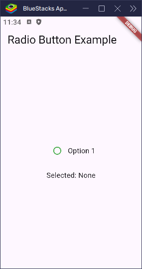
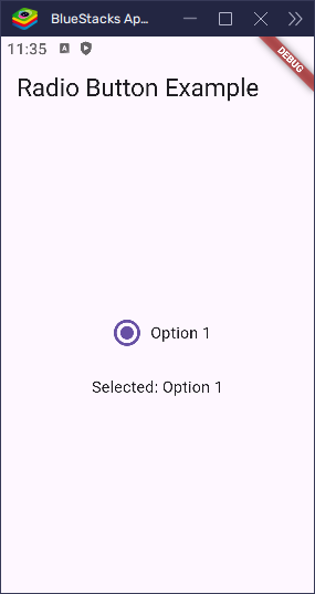
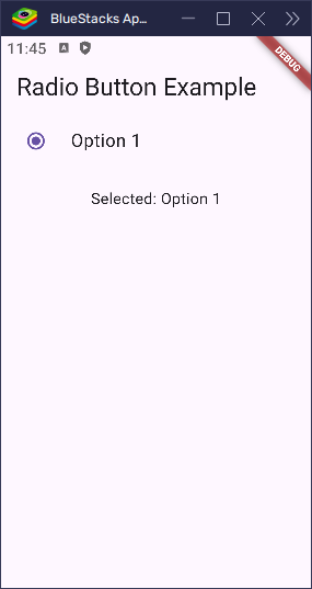
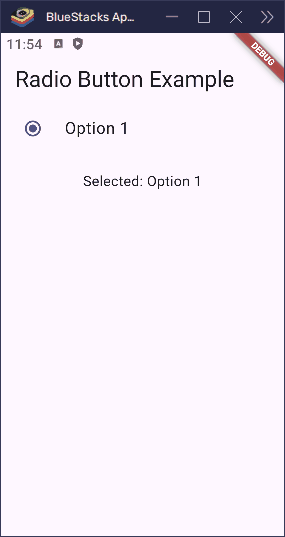
To get started, let’s first see how to create a basic radio button in Flutter. We’ll use a StatefulWidget because the selection can change, and we need to update the UI based on that.
import 'package:flutter/material.dart';

void main() => runApp(const MyApp());

class MyApp extends StatelessWidget {
  const MyApp({super.key});

  @override
  Widget build(BuildContext context) {
    return const MaterialApp(home: RadioButtonExample());
  }
}

class RadioButtonExample extends StatefulWidget {
  const RadioButtonExample({super.key});

  @override
  State<RadioButtonExample> createState() => _RadioButtonState();
}

class _RadioButtonState extends State<RadioButtonExample> {
  int? _selectedValue;

  @override
  Widget build(BuildContext context) {
    return Scaffold(
      appBar: AppBar(title: const Text('Radio Example')),
      body: Center(
        child: Column(
          mainAxisAlignment: MainAxisAlignment.center,
          children: [
            Row(
              mainAxisSize: MainAxisSize.min,
              children: [
                Radio<int>(
                  value: 1,
                  groupValue: _selectedValue,
                  onChanged: (value) {
                    setState(() {
                      _selectedValue = value;
                    });
                  },
                ),
                const Text('Option 1'),
              ],
            ),
            const SizedBox(height: 20),
            Text('Selected: ${_selectedValue == 1 ? "Option 1" : "None"}'),
          ],
        ),
      ),
    );
  }
}
Here, the value is the number for this radio button. The groupValue is the currently selected number. When the user taps this button, the onChanged function sets the selected value.
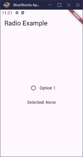
Making the Radio Button Toggleable
By default, a radio button stays selected once it’s chosen — the user can’t “unselect” it by tapping it again. But what if you want the user to be able to toggle it off by tapping the same option twice?
Flutter gives us a built-in way to do this using the toggleable property.
Here’s how you use it:
import 'package:flutter/material.dart';

void main() => runApp(const MyApp());

class MyApp extends StatelessWidget {
  const MyApp({super.key});

  @override
  Widget build(BuildContext context) {
    return const MaterialApp(home: RadioButtonExample());
  }
}

class RadioButtonExample extends StatefulWidget {
  const RadioButtonExample({super.key});

  @override
  State<RadioButtonExample> createState() => _RadioButtonState();
}

class _RadioButtonState extends State<RadioButtonExample> {
  int? _selectedValue;

  @override
  Widget build(BuildContext context) {
    return Scaffold(
      appBar: AppBar(title: const Text('Radio Example')),
      body: Center(
        child: Column(
          mainAxisAlignment: MainAxisAlignment.center,
          children: [
            Row(
              mainAxisSize: MainAxisSize.min,
              children: [
                Radio<int>(
                  value: 1,
                  groupValue: _selectedValue,
                  toggleable: true, // allows unselecting
                  onChanged: (value) {
                    setState(() {
                      _selectedValue = value;
                    });
                  },
                ),
                const Text('Option 1'),
              ],
            ),
            const SizedBox(height: 20),
            Text('Selected: ${_selectedValue == 1 ? "Option 1" : "None"}'),
          ],
        ),
      ),
    );
  }
}
What does toggleable: true do?
- When it’s
false(the default), tapping a selected radio button does nothing. - When it’s
true, tapping the selected button unselects it (sets thegroupValuetonull).
This is helpful if you want to let users undo their selection or leave the choice optional.
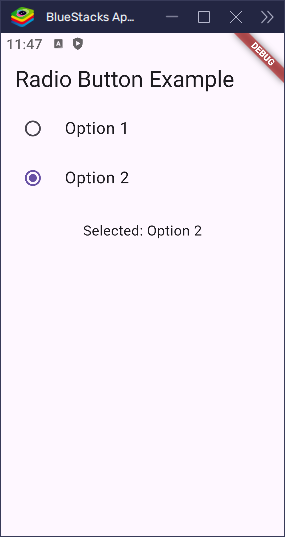
Handling Multiple Radio Buttons
When you have multiple radio buttons, it’s essential that they share the same groupValue. This ensures that only one radio button can be selected at a time. For example:
import 'package:flutter/material.dart';

void main() => runApp(const MyApp());

class MyApp extends StatelessWidget {
  const MyApp({super.key});

  @override
  Widget build(BuildContext context) {
    return const MaterialApp(home: RadioButtonsExample());
  }
}

class RadioButtonsExample extends StatefulWidget {
  const RadioButtonsExample({super.key});

  @override
  State<RadioButtonsExample> createState() => _RadioButtonsExampleState();
}

class _RadioButtonsExampleState extends State<RadioButtonsExample> {
  int? _selectedValue;

  @override
  Widget build(BuildContext context) {
    return Scaffold(
      appBar: AppBar(title: const Text('Radio Buttons Example')),
      body: Center(
        child: Column(
          mainAxisAlignment: MainAxisAlignment.center,
          children: [
            Row(
              mainAxisSize: MainAxisSize.min,
              children: [
                Radio<int>(
                  value: 1,
                  groupValue: _selectedValue,
                  onChanged: (value) {
                    setState(() {
                      _selectedValue = value;
                    });
                  },
                ),
                const Text('Option 1'),
              ],
            ),
            Row(
              mainAxisSize: MainAxisSize.min,
              children: [
                Radio<int>(
                  value: 2,
                  groupValue: _selectedValue,
                  onChanged: (value) {
                    setState(() {
                      _selectedValue = value;
                    });
                  },
                ),
                const Text('Option 2'),
              ],
            ),
            Row(
              mainAxisSize: MainAxisSize.min,
              children: [
                Radio<int>(
                  value: 3,
                  groupValue: _selectedValue,
                  onChanged: (value) {
                    setState(() {
                      _selectedValue = value;
                    });
                  },
                ),
                const Text('Option 3'),
              ],
            ),
            const SizedBox(height: 20),
            Text(
              'Selected: ${_selectedValue == 1
                  ? "Option 1"
                  : _selectedValue == 2
                  ? "Option 2"
                  : _selectedValue == 3
                  ? "Option 3"
                  : "None"}',
              style: const TextStyle(fontSize: 16, fontWeight: FontWeight.bold),
            ),
          ],
        ),
      ),
    );
  }
}
This creates three radio buttons. Because they all share the same groupValue (__selectedValue), selecting one will automatically unselect the others.
value: This is the unique value for each radio button (1, 2, or 3).groupValue: This is the value that is currently selected. All radio buttons in the group should compare to this value.onChanged: This runs when the user taps a radio button. It updates__selectedValueso the correct option is selected.
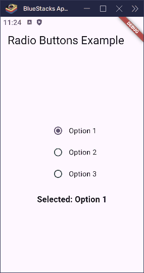
Here’s what happens when a user taps one of the options:
- If they tap Option 1,
__selectedValuebecomes1. - If they tap Option 2,
__selectedValuebecomes2. - If they tap Option 3,
__selectedValuebecomes3.
Because the buttons all check against the same groupValue, only one can be active at a time. Flutter takes care of updating the UI, so everything stays in sync.
Customizing the Radio Button
Flutter radio buttons are easy to change to match your app’s look. You can adjust their color and size to make them stand out or blend in.
Changing the Selected Color
To change the color when a radio button is selected, use the activeColor property:
import 'package:flutter/material.dart';
void main() => runApp(const MyApp());
class MyApp extends StatelessWidget {
const MyApp({super.key});
@override
Widget build(BuildContext context) {
return const MaterialApp(home: RadioButtonExample());
}
}
class RadioButtonExample extends StatefulWidget {
const RadioButtonExample({super.key});
@override
State<RadioButtonExample> createState() => _RadioButtonState();
}
class _RadioButtonState extends State<RadioButtonExample> {
int? _selectedValue;
@override
Widget build(BuildContext context) {
return Scaffold(
appBar: AppBar(title: const Text('Radio Button Example')),
body: Center(
child: Column(
mainAxisAlignment: MainAxisAlignment.center,
children: [
Row(
mainAxisSize: MainAxisSize.min,
children: [
Radio<int>(
value: 1,
groupValue: _selectedValue,
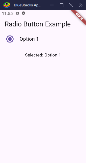
activeColor: Colors.green, // Selected color
onChanged: (value) {
setState(() {
_selectedValue = value;
});
},
),
const Text('Option 1'),
],
),
const SizedBox(height: 20),
Text('Selected: ${_selectedValue == 1 ? "Option 1" : "None"}'),
],
),
),
);
}
}This turns the selected circle green instead of the default blue.

You can also use fillColor to set a custom color using WidgetStatePropertyAll. This gives you more control over different states:
import 'package:flutter/material.dart';

void main() => runApp(const MyApp());

class MyApp extends StatelessWidget {
  const MyApp({super.key});

  @override
  Widget build(BuildContext context) {
    return const MaterialApp(home: RadioButtonExample());
  }
}

class RadioButtonExample extends StatefulWidget {
  const RadioButtonExample({super.key});

  @override
  State<RadioButtonExample> createState() => _RadioButtonState();
}

class _RadioButtonState extends State<RadioButtonExample> {
  int? _selectedValue;

  @override
  Widget build(BuildContext context) {
    return Scaffold(
      appBar: AppBar(title: const Text('Radio Button Example')),
      body: Center(
        child: Column(
          mainAxisAlignment: MainAxisAlignment.center,
          children: [
            Row(
              mainAxisSize: MainAxisSize.min,
              children: [
                Radio<int>(
                  value: 1,
                  groupValue: _selectedValue,
                  fillColor: WidgetStatePropertyAll(Colors.green),
                  onChanged: (value) {
                    setState(() {
                      _selectedValue = value;
                    });
                  },
                ),
                const Text('Option 1'),
              ],
            ),
            const SizedBox(height: 20),
            Text('Selected: ${_selectedValue == 1 ? "Option 1" : "None"}'),
          ],
        ),
      ),
    );
  }
}
Tip:
activeColoris simple and works great for most cases. UsefillColorwhen you want more detailed control.
Changing the Size of the Radio Button
If you want to make your radio button larger or smaller, wrap it with Transform.scale. This changes its size without affecting how it works.
import 'package:flutter/material.dart';

void main() => runApp(const MyApp());

class MyApp extends StatelessWidget {
  const MyApp({super.key});

  @override
  Widget build(BuildContext context) {
    return const MaterialApp(home: RadioButtonExample());
  }
}

class RadioButtonExample extends StatefulWidget {
  const RadioButtonExample({super.key});

  @override
  State<RadioButtonExample> createState() => _RadioButtonState();
}

class _RadioButtonState extends State<RadioButtonExample> {
  int? _selectedValue;

  @override
  Widget build(BuildContext context) {
    return Scaffold(
      appBar: AppBar(title: const Text('Radio Button Example')),
      body: Center(
        child: Column(
          mainAxisAlignment: MainAxisAlignment.center,
          children: [
            Row(
              mainAxisSize: MainAxisSize.min,
              children: [
                Transform.scale(
                  scale: 1.5, // Makes it 1.5x bigger
                  child: Radio<int>(
                    value: 1,
                    groupValue: _selectedValue,
                    onChanged: (value) {
                      setState(() {
                        _selectedValue = value;
                      });
                    },
                  ),
                ),
                const Text('Option 1'),
              ],
            ),
            const SizedBox(height: 20),
            Text('Selected: ${_selectedValue == 1 ? "Option 1" : "None"}'),
          ],
        ),
      ),
    );
  }
}
This is useful if the default size feels too small for your app or if you want to make it easier to tap.
Disabling a Radio Button
Sometimes, you might want to show a radio button that can’t be selected. For example, maybe an option isn’t available yet. You can do this by setting the onChanged property to null.
When onChanged is null, the radio button becomes disabled—it looks faded and doesn’t respond to taps.
import 'package:flutter/material.dart';

void main() => runApp(const MyApp());

class MyApp extends StatelessWidget {
  const MyApp({super.key});

  @override
  Widget build(BuildContext context) {
    return const MaterialApp(home: RadioButtonExample());
  }
}

class RadioButtonExample extends StatefulWidget {
  const RadioButtonExample({super.key});

  @override
  State<RadioButtonExample> createState() => _RadioButtonState();
}

class _RadioButtonState extends State<RadioButtonExample> {
  int? _selectedValue;

  @override
  Widget build(BuildContext context) {
    return Scaffold(
      appBar: AppBar(title: const Text('Radio Button Example')),
      body: Center(
        child: Column(
          mainAxisAlignment: MainAxisAlignment.center,
          children: [
            Row(
              mainAxisSize: MainAxisSize.min,
              children: [
                Radio<int>(
                  value: 1,
                  groupValue: _selectedValue,
                  onChanged: null, // This disables the button
                ),
                const Text('Option 1', style: TextStyle(color: Colors.grey)),
              ],
            ),
            const SizedBox(height: 20),
            Text('Selected: ${_selectedValue == 1 ? "Option 1" : "None"}'),
          ],
        ),
      ),
    );
  }
}
Tip: A disabled radio button is still visible, but users can’t interact with it.
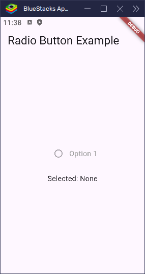
This is a simple way to show that a choice exists but can’t be picked right now.
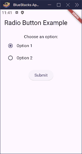
Radio Buttons in Forms
Radio buttons are perfect for forms when you want users to pick just one option—like choosing a payment method or selecting a plan.
You can use them in your app’s form and get the selected value when the user taps a button. Here’s a simple example of how to handle that:
import 'package:flutter/material.dart';

void main() => runApp(const MyApp());

class MyApp extends StatelessWidget {
  const MyApp({super.key});

  @override
  Widget build(BuildContext context) {
    return const MaterialApp(home: RadioButtonExample());
  }
}

class RadioButtonExample extends StatefulWidget {
  const RadioButtonExample({super.key});

  @override
  State<RadioButtonExample> createState() => _RadioButtonExampleState();
}

class _RadioButtonExampleState extends State<RadioButtonExample> {
  final _formKey = GlobalKey<FormState>();
  int? _selectedValue;

  @override
  Widget build(BuildContext context) {
    return Scaffold(
      appBar: AppBar(title: const Text('Radio Button Example')),
      body: Padding(
        padding: const EdgeInsets.all(16.0),
        child: Form(
          key: _formKey,
          child: Column(
            children: [
              const Text('Choose an option:'),
              Row(
                children: [
                  Radio<int>(
                    value: 1,
                    groupValue: _selectedValue,
                    onChanged: (value) {
                      setState(() {
                        _selectedValue = value;
                      });
                    },
                  ),
                  const Text('Option 1'),
                ],
              ),
              Row(
                children: [
                  Radio<int>(
                    value: 2,
                    groupValue: _selectedValue,
                    onChanged: (value) {
                      setState(() {
                        _selectedValue = value;
                      });
                    },
                  ),
                  const Text('Option 2'),
                ],
              ),
              const SizedBox(height: 20),
              ElevatedButton(
                onPressed: () {
                  final selectedText =
                      _selectedValue == null
                          ? 'No option selected'
                          : 'Selected value: Option $_selectedValue';
                  ScaffoldMessenger.of(
                    context,
                  ).showSnackBar(SnackBar(content: Text(selectedText)));
                },
                child: const Text('Submit'),
              ),
            ],
          ),
        ),
      ),
    );
  }
}
When the user taps the “Submit” button, this code checks which radio button was selected and prints that value. You can also use this value to send data to a server or save it in your app.
Using RadioListTile for Cleaner UI
While the Radio widget is great, it can get a bit messy when you have to pair it with a Text widget and manage spacing. Flutter offers a more convenient option called RadioListTile.
What is RadioListTile?
RadioListTile is a widget that combines a radio button, a label (title), and even an optional subtitle — all in one neat row. It makes your UI cleaner and easier to manage, especially when displaying multiple options.
Example: Basic RadioListTile
Here’s how to use it:
import 'package:flutter/material.dart';

void main() => runApp(const MyApp());

class MyApp extends StatelessWidget {
  const MyApp({super.key});

  @override
  Widget build(BuildContext context) {
    return const MaterialApp(home: RadioButtonExample());
  }
}

class RadioButtonExample extends StatefulWidget {
  const RadioButtonExample({super.key});

  @override
  State<RadioButtonExample> createState() => _RadioButtonState();
}

class _RadioButtonState extends State<RadioButtonExample> {
  int? _selectedValue;

  @override
  Widget build(BuildContext context) {
    return Scaffold(
      appBar: AppBar(title: const Text('Radio Button Example')),
      body: Center(
        child: Column(
          children: [
            RadioListTile<int>(
              title: Text('Option 1'),
              value: 1,
              groupValue: _selectedValue,
              onChanged: (value) {
                setState(() {
                  _selectedValue = value;
                });
              },
            ),
            const SizedBox(height: 20),
            Text('Selected: ${_selectedValue == 1 ? "Option 1" : "None"}'),
          ],
        ),
      ),
    );
  }
}
This creates a list-style option with a radio button and label. When the user taps anywhere on the tile — not just the radio button — it selects the option.
Multiple RadioListTiles Example
Here’s how you can use multiple RadioListTiles:
import 'package:flutter/material.dart';

void main() => runApp(const MyApp());

class MyApp extends StatelessWidget {
  const MyApp({super.key});

  @override
  Widget build(BuildContext context) {
    return const MaterialApp(home: RadioButtonExample());
  }
}

class RadioButtonExample extends StatefulWidget {
  const RadioButtonExample({super.key});

  @override
  State<RadioButtonExample> createState() => _RadioButtonState();
}

class _RadioButtonState extends State<RadioButtonExample> {
  int? _selectedValue;

  @override
  Widget build(BuildContext context) {
    return Scaffold(
      appBar: AppBar(title: const Text('Radio Button Example')),
      body: Center(
        child: Column(
          children: [
            RadioListTile<int>(
              title: Text('Option 1'),
              value: 1,
              groupValue: _selectedValue,
              onChanged: (value) {
                setState(() {
                  _selectedValue = value;
                });
              },
            ),
            RadioListTile<int>(
              title: Text('Option 2'),
              value: 2,
              groupValue: _selectedValue,
              onChanged: (value) {
                setState(() {
                  _selectedValue = value;
                });
              },
            ),
            const SizedBox(height: 20),
            Text(
              'Selected: ${_selectedValue == 1 ? "Option 1" : (_selectedValue == 2 ? "Option 2" : "None")}',
            ),
          ],
        ),
      ),
    );
  }
}
This will display two labeled options that behave just like the basic radio buttons — but look neater and are easier to tap.
Customizing RadioListTile
You can make RadioListTile look the way you want by changing its properties.
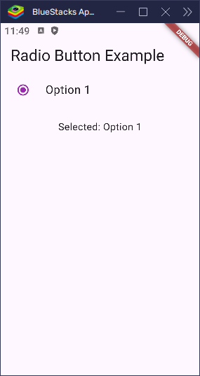
Change Active Color
You can change the color of the selected radio button using the activeColor property. For example, this makes the radio button turn purple when it’s selected:
import 'package:flutter/material.dart';

void main() => runApp(const MyApp());

class MyApp extends StatelessWidget {
  const MyApp({super.key});

  @override
  Widget build(BuildContext context) {
    return const MaterialApp(home: RadioButtonExample());
  }
}

class RadioButtonExample extends StatefulWidget {
  const RadioButtonExample({super.key});

  @override
  State<RadioButtonExample> createState() => _RadioButtonState();
}

class _RadioButtonState extends State<RadioButtonExample> {
  int? _selectedValue;

  @override
  Widget build(BuildContext context) {
    return Scaffold(
      appBar: AppBar(title: const Text('Radio Button Example')),
      body: Center(
        child: Column(
          children: [
            RadioListTile<int>(
              title: Text('Option 1'),
              value: 1,
              groupValue: _selectedValue,
              activeColor: Colors.purple, // Use purple when selected
              onChanged: (value) {
                setState(() {
                  _selectedValue = value;
                });
              },
            ),
            const SizedBox(height: 20),
            Text('Selected: ${_selectedValue == 1 ? "Option 1" : "None"}'),
          ],
        ),
      ),
    );
  }
}
Now, when the user taps this option, the circle will fill with purple instead of the default blue.
Add a Subtitle
You can easily add a subtitle below the main title of a RadioListTile using the subtitle property. Here’s how to add extra information under the title:
import 'package:flutter/material.dart';

void main() => runApp(const MyApp());

class MyApp extends StatelessWidget {
  const MyApp({super.key});

  @override
  Widget build(BuildContext context) {
    return const MaterialApp(home: RadioButtonExample());
  }
}

class RadioButtonExample extends StatefulWidget {
  const RadioButtonExample({super.key});

  @override
  State<RadioButtonExample> createState() => _RadioButtonState();
}

class _RadioButtonState extends State<RadioButtonExample> {
  int? _selectedValue;

  @override
  Widget build(BuildContext context) {
    return Scaffold(
      appBar: AppBar(title: const Text('Radio Button Example')),
      body: Center(
        child: Column(
          children: [
            RadioListTile<int>(
              title: Text('Option 1'),
              subtitle: Text(
                'This is extra info',
              ), // Adds extra info under the title
              value: 1,
              groupValue: _selectedValue,
              onChanged: (value) {
                setState(() {
                  _selectedValue = value;
                });
              },
            ),
            const SizedBox(height: 20),
            Text('Selected: ${_selectedValue == 1 ? "Option 1" : "None"}'),
          ],
        ),
      ),
    );
  }
}
Now, when you display this, the radio button will show the main title along with some extra information underneath it.

Change Radio Button Position
By default, the radio button appears on the left side of the tile. You can move it to the right using the controlAffinity property.
import 'package:flutter/material.dart';

void main() => runApp(const MyApp());

class MyApp extends StatelessWidget {
  const MyApp({super.key});

  @override
  Widget build(BuildContext context) {
    return const MaterialApp(home: RadioButtonExample());
  }
}

class RadioButtonExample extends StatefulWidget {
  const RadioButtonExample({super.key});

  @override
  State<RadioButtonExample> createState() => _RadioButtonState();
}

class _RadioButtonState extends State<RadioButtonExample> {
  int? _selectedValue;

  @override
  Widget build(BuildContext context) {
    return Scaffold(
      appBar: AppBar(title: const Text('Radio Button Example')),
      body: Center(
        child: Column(
          children: [
            RadioListTile<int>(
              title: Text('Option 1'),
              value: 1,
              groupValue: _selectedValue,
              controlAffinity:
                  ListTileControlAffinity.trailing, // move to right
              onChanged: (value) {
                setState(() {
                  _selectedValue = value;
                });
              },
            ),
            const SizedBox(height: 20),
            Text('Selected: ${_selectedValue == 1 ? "Option 1" : "None"}'),
          ],
        ),
      ),
    );
  }
}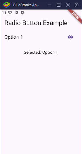
Here are the available values for controlAffinity:
leading: shows the radio button on the left (default on Android).trailing: shows the radio button on the right (default on iOS).platform: uses the platform’s default position.
Make the Radio Button Toggleable
You can make a RadioListTile toggleable by setting the toggleable property to true. By default, this is set to false, meaning once a radio button is selected, it cannot be deselected. When set to true, the user can tap the radio button again to unselect it, making it behave more like a checkbox.
Here’s how you can make it toggleable:
import 'package:flutter/material.dart';

void main() => runApp(const MyApp());

class MyApp extends StatelessWidget {
  const MyApp({super.key});

  @override
  Widget build(BuildContext context) {
    return const MaterialApp(home: RadioButtonExample());
  }
}

class RadioButtonExample extends StatefulWidget {
  const RadioButtonExample({super.key});

  @override
  State<RadioButtonExample> createState() => _RadioButtonState();
}

class _RadioButtonState extends State<RadioButtonExample> {
  int? _selectedValue;

  @override
  Widget build(BuildContext context) {
    return Scaffold(
      appBar: AppBar(title: const Text('Radio Button Example')),
      body: Center(
        child: Column(
          children: [
            RadioListTile<int>(
              title: Text('Option 1'),
              value: 1,
              groupValue: _selectedValue,
              toggleable: true, // Allows the radio button to be unchecked
              onChanged: (value) {
                setState(() {
                  _selectedValue = value;
                });
              },
            ),
            const SizedBox(height: 20),
            Text('Selected: ${_selectedValue == 1 ? "Option 1" : "None"}'),
          ],
        ),
      ),
    );
  }
}
In this example, the radio button can be unchecked by tapping the selected option again. When the user taps on an option, it checks that option, and if it’s already selected, it unchecks it by setting __selectedValue to null.
This allows a more flexible, checkbox-like behavior while maintaining the radio button’s general structure and purpose.
Adjust the Size of the Radio Button
You can easily make the radio button bigger or smaller by using the radioScaleFactor property. This changes the size of just the radio circle — not the whole tile. For example, if you want to make it 1.5 times bigger than the default size, you can do this:
import 'package:flutter/material.dart';

void main() => runApp(const MyApp());

class MyApp extends StatelessWidget {
  const MyApp({super.key});

  @override
  Widget build(BuildContext context) {
    return const MaterialApp(home: RadioButtonExample());
  }
}

class RadioButtonExample extends StatefulWidget {
  const RadioButtonExample({super.key});

  @override
  State<RadioButtonExample> createState() => _RadioButtonState();
}

class _RadioButtonState extends State<RadioButtonExample> {
  int? _selectedValue;

  @override
  Widget build(BuildContext context) {
    return Scaffold(
      appBar: AppBar(title: const Text('Radio Button Example')),
      body: Center(
        child: Column(
          children: [
            RadioListTile<int>(
              title: Text('Option 1'),
              value: 1,
              groupValue: _selectedValue,
              radioScaleFactor: 1.5, // Make the radio button 1.5x bigger
              onChanged: (value) {
                setState(() {
                  _selectedValue = value;
                });
              },
            ),
            const SizedBox(height: 20),
            Text('Selected: ${_selectedValue == 1 ? "Option 1" : "None"}'),
          ],
        ),
      ),
    );
  }
}
This is great when you want the radio button to be easier to tap, especially on touch screens or for users who need larger UI elements. You can also make it smaller by using a value like 0.8 instead.
With all these customizations, you can make RadioListTile look and behave just the way you want. Whether you’re changing the color, size, or making it toggleable, Flutter gives you the tools to match your app’s style and make it easy for users to interact with your options.
Conclusion
Radio buttons in Flutter make it easy to let users pick one option from a list. With the Radio and RadioListTile widgets, you can build clean and interactive forms, settings pages, and more.
- Use
groupValueto keep track of the selected option. - Customize the look using properties like
activeColor, andradioScaleFactor. - Group multiple radio buttons by giving them the same
groupValue. - Disable a radio button by setting its
onChangedtonull.
Flutter gives you simple tools to create radio buttons that work just the way you want — clear, flexible, and easy to use.