In Flutter, the Wrap widget is like a smart container that knows how to handle items when there’s not enough space. Imagine placing some buttons or tags in a row — if they don’t all fit, a regular Row will overflow and show an error. But with Wrap, Flutter will automatically move the extra items to the next line. No fuss!
So, what is Wrap?
The Wrap widget lets you lay out widgets horizontally or vertically, and it will wrap them to the next line or column when needed. It’s super useful when you’re working with dynamic content or want your layout to look good on different screen sizes.
Why Use Wrap Instead of Row or Column?
Row and Column are great for simple layouts. But if your content might grow and overflow — like a list of tags, buttons, or images — they’re not flexible. That’s where Wrap shines! It adjusts the layout so everything fits nicely without breaking the UI.
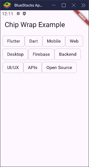
A common use case for Wrap is displaying tags or chips:
import 'package:flutter/material.dart';

void main() => runApp(const MyApp());

class MyApp extends StatelessWidget {
  const MyApp({super.key});

  @override
  Widget build(BuildContext context) {
    return const MaterialApp(home: ChipWrapExample());
  }
}

class ChipWrapExample extends StatelessWidget {
  const ChipWrapExample({super.key});

  @override
  Widget build(BuildContext context) {
    return Scaffold(
      appBar: AppBar(title: const Text('Chip Wrap Example')),
      body: Padding(
        padding: const EdgeInsets.all(8.0),
        child: Wrap(
          children: const [
            Chip(label: Text('Flutter')),
            Chip(label: Text('Dart')),
            Chip(label: Text('Mobile')),
            Chip(label: Text('Web')),
            Chip(label: Text('Desktop')),
            Chip(label: Text('Firebase')),
            Chip(label: Text('Backend')),
            Chip(label: Text('UI/UX')),
            Chip(label: Text('APIs')),
            Chip(label: Text('Open Source')),
          ],
        ),
      ),
    );
  }
}
If all the chips don’t fit in one row, they will automatically move to the next line. Clean, simple, and responsive!
In the rest of this article, we’ll explore how to use Wrap, how to customize it, and how to make it work perfectly in your apps.
Basic Structure of Wrap
The Wrap widget in Flutter is a great way to display a series of widgets that automatically move to the next line if they don’t fit in the available space. It’s perfect for cases where you need flexible layouts, like displaying tags, buttons, or chips that need to adjust based on the screen size.
How to Create a Wrap Widget
Creating a Wrap is easy! You just need to put the widgets you want to display inside it. Here’s an example where we display some buttons:
import 'package:flutter/material.dart';

void main() => runApp(const MyApp());

class MyApp extends StatelessWidget {
  const MyApp({super.key});

  @override
  Widget build(BuildContext context) {
    return const MaterialApp(home: ChipWrapExample());
  }
}

class ChipWrapExample extends StatelessWidget {
  const ChipWrapExample({super.key});

  @override
  Widget build(BuildContext context) {
    return Scaffold(
      appBar: AppBar(title: const Text('Chip Wrap Example')),
      body: Padding(
        padding: const EdgeInsets.all(8.0),
        child: Wrap(
          children: [
            ElevatedButton(onPressed: () {}, child: Text('Button 1')),
            ElevatedButton(onPressed: () {}, child: Text('Button 2')),
            ElevatedButton(onPressed: () {}, child: Text('Button 3')),
            ElevatedButton(onPressed: () {}, child: Text('Button 4')),
            ElevatedButton(onPressed: () {}, child: Text('Button 5')),
            ElevatedButton(onPressed: () {}, child: Text('Button 6')),
          ],
        ),
      ),
    );
  }
}
In this example:
- The
Wrapwidget automatically arranges the buttons in a row. - If there isn’t enough space on the screen, the buttons will move to the next line, keeping everything neatly organized.
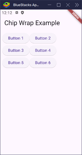
This is especially useful in cases where you want to display a list of items (like buttons or tags) that should fit neatly on any screen size without overflowing.
How Wrap Arranges Children
The Wrap widget in Flutter automatically arranges its children widgets, allowing them to break into new lines when there’s no more space in the current row. This makes Wrap a great choice for responsive layouts where items should flow naturally without overlapping or overflowing.
Line Breaks and Automatic Wrapping
When you place multiple widgets inside a Wrap, it will try to fit them in a row. However, if there’s not enough space on the current line, the Wrap will automatically move the next widget to the next line. This is perfect for creating flexible layouts that adapt to different screen sizes.
Difference Between Wrap, Row, and Column
Row: ARowwidget places children in a single horizontal line. If there’s not enough space, it will cause overflow (widgets go off the screen).Column: AColumnwidget places children in a single vertical line. LikeRow, it won’t wrap, so it can overflow if the space is limited.Wrap: UnlikeRowandColumn,Wrapautomatically moves its children to the next line or column when the available space is filled, preventing overflow.
Easy Analogy: Books on a Shelf
Imagine you’re putting books on a shelf. If the shelf is full, you don’t keep forcing books onto the same shelf. Instead, you move the next books to the next shelf. In the same way, Wrap automatically shifts items to the next row or column when the current space is full.
Direction: Horizontal vs Vertical
The Wrap widget lets you control the direction in which its children are arranged. You can either place them in a horizontal line (default) or stack them vertically. This is controlled by the direction property.
direction: Axis.horizontal (Default)
By default, the Wrap widget arranges its children horizontally. This means the widgets will be placed in a row, and if they run out of space, they will automatically wrap to the next row.
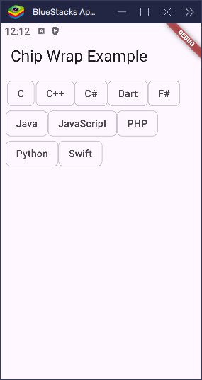
Real-world Use Case for Horizontal Direction
Imagine you’re designing a row of tags or buttons in a shopping app, and you want them to wrap when there are too many to fit on one line. This is when Wrap with direction: Axis.horizontal comes in handy. It will allow your tags or buttons to move to the next row when the screen width is filled, ensuring a neat, responsive layout.
import 'package:flutter/material.dart';
void main() => runApp(const MyApp());
class MyApp extends StatelessWidget {
const MyApp({super.key});
@override
Widget build(BuildContext context) {
return const MaterialApp(home: ChipWrapExample());
}
}
class ChipWrapExample extends StatelessWidget {
const ChipWrapExample({super.key});
@override
Widget build(BuildContext context) {
return Scaffold(
appBar: AppBar(title: const Text('Chip Wrap Example')),
body: Padding(
padding: const EdgeInsets.all(8.0),
child: Wrap(
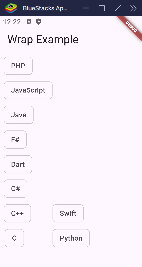
direction: Axis.horizontal,
children: [
Chip(label: Text('C')),
Chip(label: Text('C++')),
Chip(label: Text('C#')),
Chip(label: Text('Dart')),
Chip(label: Text('F#')),
Chip(label: Text('Java')),
Chip(label: Text('JavaScript')),
Chip(label: Text('PHP')),
Chip(label: Text('Python')),
Chip(label: Text('Swift')),
// More chips here...
],
),
),
);
}
}In this example, if the screen is too narrow to fit all the chips, the extra chips will automatically wrap to the next row.
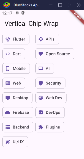
direction: Axis.vertical
With direction: Axis.vertical, the Wrap widget arranges its children vertically. This means the widgets will stack on top of each other, and once there’s no more space vertically, the next item will move to the next column.
Real-world Use Case for Vertical Direction
A great example for using Wrap with direction: Axis.vertical is a grid of items, like images or small profile pictures. This layout is useful when you want items to be displayed in columns and wrap when there’s not enough vertical space to fit them all.
import 'package:flutter/material.dart';

void main() => runApp(const MyApp());

class MyApp extends StatelessWidget {
  const MyApp({super.key});

  @override
  Widget build(BuildContext context) {
    return const MaterialApp(home: ChipWrapExample());
  }
}

class ChipWrapExample extends StatelessWidget {
  const ChipWrapExample({super.key});

  @override
  Widget build(BuildContext context) {
    return Scaffold(
      appBar: AppBar(title: const Text('Vertical Chip Wrap')),
      body: Padding(
        padding: const EdgeInsets.all(8.0),
        child: Wrap(
          direction: Axis.vertical,
          spacing: 8.0,
          runSpacing: 8.0,
          children: const [
            Chip(
              avatar: Icon(Icons.flutter_dash, size: 20),
              label: Text('Flutter'),
            ),
            Chip(avatar: Icon(Icons.code, size: 20), label: Text('Dart')),
            Chip(
              avatar: Icon(Icons.phone_android, size: 20),
              label: Text('Mobile'),
            ),
            Chip(avatar: Icon(Icons.web, size: 20), label: Text('Web')),
            Chip(
              avatar: Icon(Icons.desktop_windows, size: 20),
              label: Text('Desktop'),
            ),
            Chip(avatar: Icon(Icons.cloud, size: 20), label: Text('Firebase')),
            Chip(avatar: Icon(Icons.storage, size: 20), label: Text('Backend')),
            Chip(
              avatar: Icon(Icons.design_services, size: 20),
              label: Text('UI/UX'),
            ),
            Chip(avatar: Icon(Icons.api, size: 20), label: Text('APIs')),
            Chip(
              avatar: Icon(Icons.favorite, size: 20),
              label: Text('Open Source'),
            ),
            Chip(avatar: Icon(Icons.computer, size: 20), label: Text('AI')),
            Chip(avatar: Icon(Icons.shield, size: 20), label: Text('Security')),
            Chip(
              avatar: Icon(Icons.language, size: 20),
              label: Text('Web Dev'),
            ),
            Chip(
              avatar: Icon(Icons.integration_instructions, size: 20),
              label: Text('DevOps'),
            ),
            Chip(
              avatar: Icon(Icons.extension, size: 20),
              label: Text('Plugins'),
            ),
          ],
        ),
      ),
    );
  }
}
In this case, if the vertical space is filled, the next chips will be placed in the next column.
Visual Layout Examples
- Horizontal Wrap: Imagine a list of buttons that you want to place in a row, but they wrap to the next line when the screen width gets too small.
- Vertical Wrap: Now think of a column of icons that stacks on top of each other, wrapping into a new column when the screen height is exceeded.
By using direction, you can easily control how your items are displayed and wrapped, depending on whether you want a horizontal or vertical layout.
Main Axis and Cross Axis Alignment
The Wrap widget offers powerful alignment options to control how its children are positioned. These alignments work on two axes:
- Main axis: The axis along which the children are laid out (horizontal or vertical).
- Cross axis: The axis that is perpendicular to the main axis.
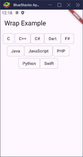
Alignment: Main Axis
The alignment property controls how children are aligned along the main axis (either horizontally or vertically). This property affects how the children are placed in a row (if horizontal) or a column (if vertical).
The possible values for alignment are:
WrapAlignment.start: Aligns the children to the start of the main axis (default).WrapAlignment.center: Centers the children along the main axis.WrapAlignment.end: Aligns the children to the end of the main axis.WrapAlignment.spaceBetween: Distributes the children evenly with the first child at the start and the last at the end.WrapAlignment.spaceAround: Distributes the children evenly with equal space around them.WrapAlignment.spaceEvenly: Distributes the children evenly with equal space between them.
import 'package:flutter/material.dart';
void main() => runApp(const MyApp());
class MyApp extends StatelessWidget {
const MyApp({super.key});
@override
Widget build(BuildContext context) {
return const MaterialApp(home: ChipWrapExample());
}
}
class ChipWrapExample extends StatelessWidget {
const ChipWrapExample({super.key});
@override
Widget build(BuildContext context) {
return Scaffold(
appBar: AppBar(title: const Text('Wrap Example')),
body: Padding(
padding: const EdgeInsets.all(8.0),
child: Wrap(
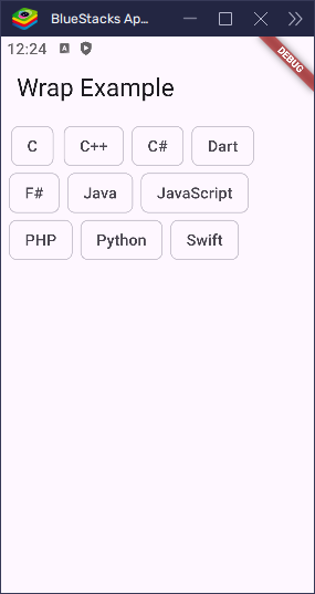
alignment:
WrapAlignment.center, // Align items in the center horizontally
children: [
Chip(label: Text('C')),
Chip(label: Text('C++')),
Chip(label: Text('C#')),
Chip(label: Text('Dart')),
Chip(label: Text('F#')),
Chip(label: Text('Java')),
Chip(label: Text('JavaScript')),
Chip(label: Text('PHP')),
Chip(label: Text('Python')),
Chip(label: Text('Swift')),
// More chips here...
],
),
),
);
}
}In this example, all the Chip widgets will be centered along the horizontal axis, meaning they will be grouped in the middle of the available space.
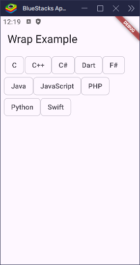
Alignment: Cross Axis (Run Alignment)
The runAlignment property controls how the entire row or column (a “run”) is aligned along the cross axis (the axis perpendicular to the main axis). This is helpful when you have multiple lines of children and want to adjust how the rows are placed.
The possible values for runAlignment are:
WrapAlignment.start: Aligns runs to the start of the cross axis.WrapAlignment.center: Centers runs along the cross axis.WrapAlignment.end: Aligns runs to the end of the cross axis.WrapAlignment.spaceBetween: Distributes runs evenly with space between them.WrapAlignment.spaceAround: Adds space around each run.WrapAlignment.spaceEvenly: Distributes runs evenly with equal space between them.
import 'package:flutter/material.dart';

void main() => runApp(const MyApp());

class MyApp extends StatelessWidget {
  const MyApp({super.key});

  @override
  Widget build(BuildContext context) {
    return const MaterialApp(home: ChipWrapExample());
  }
}

class ChipWrapExample extends StatelessWidget {
  const ChipWrapExample({super.key});

  @override
  Widget build(BuildContext context) {
    return Scaffold(
      appBar: AppBar(title: const Text('Wrap Example')),
      body: Padding(
        padding: const EdgeInsets.all(8.0),
        child: Wrap(
          runAlignment: WrapAlignment.spaceBetween, // Space out the rows evenly
          children: [
            Chip(label: Text('C')),
            Chip(label: Text('C++')),
            Chip(label: Text('C#')),
            Chip(label: Text('Dart')),
            Chip(label: Text('F#')),
            Chip(label: Text('Java')),
            Chip(label: Text('JavaScript')),
            Chip(label: Text('PHP')),
            Chip(label: Text('Python')),
            Chip(label: Text('Swift')),
            // More chips here...
          ],
        ),
      ),
    );
  }
}
Here, the Chip widgets will be spaced out evenly, with equal space between each row (run).
- Main Axis Alignment: If the
Wrapis arranged horizontally, this affects how the children are positioned left to right (or right to left). For example, usingcenterwill place the items in the middle of the horizontal space, whilespaceEvenlywill evenly distribute them across the entire width. - Cross Axis Alignment (Run Alignment): If the
Wraphas multiple rows (because the children don’t fit in one line), this property controls how those rows (runs) are positioned vertically (if the direction is horizontal) or horizontally (if the direction is vertical). UsingspaceBetweenwill spread the rows apart with space between them.
Spacing Between Children
The Wrap widget provides two key properties to manage the space between its children:
spacing: Controls the space between items (children) within the same run (row or column).runSpacing: Controls the space between different runs (rows or columns).
These properties allow for fine-grained control over the layout of items in a Wrap widget, making it easy to adjust the spacing both within a row and between rows.
spacing: Space Between Items in the Same Run
The spacing property determines how much space there is between each child within the same row or column. For instance, if you want a gap between each item horizontally (or vertically), you can use spacing to set the desired amount of space.
runSpacing: Space Between Different Runs
The runSpacing property determines the space between multiple runs (rows or columns). If your Wrap widget contains enough children to create multiple rows (in horizontal direction) or columns (in vertical direction), runSpacing controls the space between these rows or columns.
import 'package:flutter/material.dart';

void main() => runApp(const MyApp());

class MyApp extends StatelessWidget {
  const MyApp({super.key});

  @override
  Widget build(BuildContext context) {
    return const MaterialApp(home: ChipWrapExample());
  }
}

class ChipWrapExample extends StatelessWidget {
  const ChipWrapExample({super.key});

  @override
  Widget build(BuildContext context) {
    return Scaffold(
      appBar: AppBar(title: const Text('Wrap Example')),
      body: Padding(
        padding: const EdgeInsets.all(8.0),
        child: Wrap(
          spacing: 8.0, // Space between children in the same row
          runSpacing: 12.0, // Space between rows (runs)
          children: [
            Chip(label: Text('C')),
            Chip(label: Text('C++')),
            Chip(label: Text('C#')),
            Chip(label: Text('Dart')),
            Chip(label: Text('F#')),
            Chip(label: Text('Java')),
            Chip(label: Text('JavaScript')),
            Chip(label: Text('PHP')),
            Chip(label: Text('Python')),
            Chip(label: Text('Swift')),
            // More chips here...
          ],
        ),
      ),
    );
  }
}
How Both Affect Layout
spacing: This will add an 8-pixel gap between eachChipwidget horizontally, as they are placed in the same row.runSpacing: If the number ofChipwidgets exceeds the width of the screen and wraps to the next line (run), there will be a 12-pixel gap between the rows of chips.
Imagine the Wrap contains five Chip widgets:
- Without spacing: The items will be placed directly next to each other in a row, and if the row is full, the next row will start directly below, with no space between them.
- With
spacing: EachChipwill have 8 pixels of space between it and the next one in the same row. - With
runSpacing: When the first row fills and wraps to the next row, there will be a 12-pixel gap between the first row and the second row.
By using both spacing and runSpacing, you can achieve a well-spaced and visually appealing layout for your Wrap widgets. These properties give you the flexibility to adjust the space between items both within and between rows, making your layout more adaptable to different screen sizes.
Vertical Direction (Only for Vertical Wraps)
The verticalDirection property in the Wrap widget controls the order in which children are placed when the Wrap is set to a vertical layout (direction: Axis.vertical). It determines whether the children should be placed from top to bottom or from bottom to top.
verticalDirection: Control the Vertical Order
VerticalDirection.down(default): This is the default behavior, where the children are placed from top to bottom, just like a standard list of items stacking vertically.VerticalDirection.up: This reverses the default behavior, and the children are placed starting from the bottom and move upwards.
Why Use VerticalDirection.up?
Using VerticalDirection.up can be particularly useful when you want items to appear in reverse order. This might be beneficial for scenarios such as:
- Chat applications, where the latest message appears at the bottom and new messages come up to the top.
- Infinite scroll systems where items load and appear from the bottom.
import 'package:flutter/material.dart';

void main() => runApp(const MyApp());

class MyApp extends StatelessWidget {
  const MyApp({super.key});

  @override
  Widget build(BuildContext context) {
    return const MaterialApp(home: ChipWrapExample());
  }
}

class ChipWrapExample extends StatelessWidget {
  const ChipWrapExample({super.key});

  @override
  Widget build(BuildContext context) {
    return Scaffold(
      appBar: AppBar(title: const Text('Wrap Example')),
      body: Padding(
        padding: const EdgeInsets.all(8.0),
        child: Wrap(
          direction: Axis.vertical, // Stack children vertically
          verticalDirection: VerticalDirection.up, // Start from the bottom
          spacing: 8.0, // Space between items
          children: [
            Chip(label: Text('C')),
            Chip(label: Text('C++')),
            Chip(label: Text('C#')),
            Chip(label: Text('Dart')),
            Chip(label: Text('F#')),
            Chip(label: Text('Java')),
            Chip(label: Text('JavaScript')),
            Chip(label: Text('PHP')),
            Chip(label: Text('Python')),
            Chip(label: Text('Swift')),
            // More chips here...
          ],
        ),
      ),
    );
  }
}
In this example, the Wrap widget will start placing the Chip widgets from the bottom of the available space and will place the following items above the previous ones. This is the reverse of how VerticalDirection.down would behave, where items are placed starting from the top and stacking downwards.
By using verticalDirection: VerticalDirection.up, you can create vertical layouts where the items appear in the reverse order, offering more flexibility for your design needs.
Cross Axis Alignment with WrapCrossAlignment
The crossAxisAlignment property in the Wrap widget controls how children are aligned within each run (a “run” refers to a line of items that fits in the available space before wrapping to the next line). This is useful for aligning children within their respective rows or columns.
crossAxisAlignment: Align Children in Each Run
WrapCrossAlignment.start: Aligns the children to the start of the cross axis (top for horizontal wraps, left for vertical wraps).WrapCrossAlignment.center: Aligns the children to the center of the cross axis.WrapCrossAlignment.end: Aligns the children to the end of the cross axis (bottom for horizontal wraps, right for vertical wraps).WrapCrossAlignment.baseline: Aligns children along their baselines (only for horizontal wraps, and children must have text to align to the baseline).
Works with Horizontal Wraps
The crossAxisAlignment property is especially effective when your Wrap widget is set to horizontal (direction: Axis.horizontal), allowing you to control how items align vertically within their row.
Example Showing Alignment Differences
Here’s an example demonstrating the differences between the various WrapCrossAlignment options:
import 'package:flutter/material.dart';

void main() => runApp(const MyApp());

class MyApp extends StatelessWidget {
  const MyApp({super.key});

  @override
  Widget build(BuildContext context) {
    return const MaterialApp(home: ChipWrapExample());
  }
}

class ChipWrapExample extends StatelessWidget {
  const ChipWrapExample({super.key});

  @override
  Widget build(BuildContext context) {
    return Scaffold(
      appBar: AppBar(title: const Text('Wrap Example')),
      body: Padding(
        padding: const EdgeInsets.all(8.0),
        child: Wrap(
          direction: Axis.horizontal, // Wrap children horizontally
          crossAxisAlignment:
              WrapCrossAlignment.center, // Align children to the center
          spacing: 8.0,
          children: [
            Chip(label: Text('C')),
            Chip(label: Text('C++')),
            Chip(label: Text('C#')),
            Chip(label: Text('Dart')),
            Chip(label: Text('F#')),
            Chip(label: Text('Java')),
            Chip(label: Text('JavaScript')),
            Chip(label: Text('PHP')),
            Chip(label: Text('Python')),
            Chip(label: Text('Swift')),
            // More chips here...
          ],
        ),
      ),
    );
  }
}
In this example, the Wrap widget will arrange the Chip widgets horizontally, and all chips will be centered along the vertical axis of their row.
Alignment Variations
start: The children are aligned at the top of the row.center: The children are centered vertically within the row.end: The children are aligned at the bottom of the row.baseline: If the children contain text, they will be aligned along their baselines.
Visual Example of crossAxisAlignment Options:
- start: Chips will align to the top of the available space.
- center: Chips will align vertically in the center.
- end: Chips will align to the bottom of the available space.
- baseline: Chips with text will align based on their text baselines (if applicable).
By adjusting crossAxisAlignment, you can fine-tune the alignment of children within their rows, offering greater control over how your items appear in your layout.
Real-World Examples
The Wrap widget shines when you want your layout to automatically adjust based on available space. Instead of overflowing or getting squished, the children simply move to the next line or column. Let’s look at some real-world ways you can use Wrap in your Flutter apps.
Wrapping Chips, Tags, or Buttons
If you’re showing categories, filters, or any clickable tags, a Wrap is perfect. It prevents overflow and keeps your UI clean:
import 'package:flutter/material.dart';
void main() => runApp(const MyApp());
class MyApp extends StatelessWidget {
const MyApp({super.key});
@override
Widget build(BuildContext context) {
return const MaterialApp(home: ChipWrapExample());
}
}
class ChipWrapExample extends StatelessWidget {
const ChipWrapExample({super.key});
@override
Widget build(BuildContext context) {
return Scaffold(
appBar: AppBar(title: const Text('Wrap Example')),
body: Padding(
padding: const EdgeInsets.all(16.0),
child: Wrap(
spacing: 8.0,
runSpacing: 4.0,
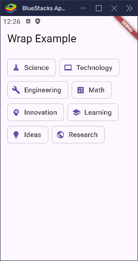
children: const [
Chip(avatar: Icon(Icons.science, size: 20), label: Text('Science')),
Chip(
avatar: Icon(Icons.computer, size: 20),
label: Text('Technology'),
),
Chip(
avatar: Icon(Icons.build, size: 20),
label: Text('Engineering'),
),
Chip(avatar: Icon(Icons.calculate, size: 20), label: Text('Math')),
Chip(
avatar: Icon(Icons.psychology, size: 20),
label: Text('Innovation'),
),
Chip(avatar: Icon(Icons.school, size: 20), label: Text('Learning')),
Chip(avatar: Icon(Icons.lightbulb, size: 20), label: Text('Ideas')),
Chip(avatar: Icon(Icons.public, size: 20), label: Text('Research')),
],
),
),
);
}
}This makes the chips wrap into multiple rows if they don’t fit on one line—great for responsive designs.
Creating Photo Galleries or Grids
You can also use Wrap to create simple photo or image layouts that adjust to screen size:
import 'package:flutter/material.dart';
void main() => runApp(const MyApp());
class MyApp extends StatelessWidget {
const MyApp({super.key});
@override
Widget build(BuildContext context) {
return const MaterialApp(home: PhotoWrapExample());
}
}
class PhotoWrapExample extends StatelessWidget {
const PhotoWrapExample({super.key});
@override
Widget build(BuildContext context) {
return Scaffold(
appBar: AppBar(title: const Text('Wrap - Photo Grid')),
body: Padding(
padding: const EdgeInsets.all(16.0),
child: Wrap(
spacing: 8.0,
runSpacing: 8.0,
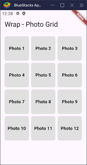
children: List.generate(12, (index) {
return Container(
width: 90,
height: 90,
decoration: BoxDecoration(
color: Colors.grey[300],
borderRadius: BorderRadius.circular(8),
),
child: Center(
child: Text(
'Photo ${index + 1}',
style: const TextStyle(fontWeight: FontWeight.bold),
),
),
);
}),
),
),
);
}
}This creates a lightweight photo grid that adjusts itself based on the device’s width.
Adapting Layout on Smaller Screens
When designing for phones or tablets, Wrap is a great tool to keep content from getting cramped or overflowing. For example, you can use it to wrap buttons neatly instead of stacking them manually:
import 'package:flutter/material.dart';
void main() => runApp(const MyApp());
class MyApp extends StatelessWidget {
const MyApp({super.key});
@override
Widget build(BuildContext context) {
return const MaterialApp(home: ButtonWrapExample());
}
}
class ButtonWrapExample extends StatelessWidget {
const ButtonWrapExample({super.key});
@override
Widget build(BuildContext context) {
return Scaffold(
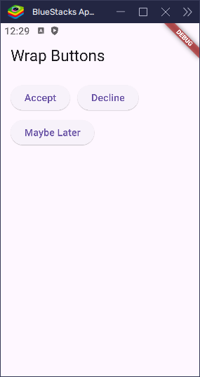
appBar: AppBar(title: const Text('Wrap Buttons')),
body: Padding(
padding: const EdgeInsets.all(16.0),
child: Wrap(
spacing: 12,
runSpacing: 8,
children: [
ElevatedButton(onPressed: () {}, child: const Text('Accept')),
ElevatedButton(onPressed: () {}, child: const Text('Decline')),
ElevatedButton(onPressed: () {}, child: const Text('Maybe Later')),
],
),
),
);
}
}The buttons will adjust and wrap onto the next line if there’s not enough horizontal space, giving your layout a flexible and polished look.
The Wrap widget makes your app feel more responsive and user-friendly, especially when you’re dealing with dynamic content or varying screen sizes. Whether it’s text, buttons, images, or anything else—you can count on Wrap to keep things tidy.
Wrap vs Row/Column vs Flow
Flutter gives you several layout widgets to organize children — like Wrap, Row, Column, and Flow. Each has its own purpose, and choosing the right one makes your layout simpler and more efficient.
When to Use Each
| Widget | Best For | Automatically Wraps? | Easy to Use? |
|---|---|---|---|
Row | Lining up items horizontally in a single line | ❌ No | ✅ Yes |
Column | Stacking items vertically | ❌ No | ✅ Yes |
Wrap | Placing items that should wrap to a new line | ✅ Yes | ✅ Yes |
Flow | Advanced, custom layouts (manual positioning) | ✅ Yes (custom) | ❌ No |
Quick Decision Guide
- Use
Rowwhen all your items can fit horizontally, and you want a simple layout. - Use
Columnwhen you want to stack items vertically, and space isn’t tight. - Use
Wrapwhen you want your layout to adjust and move items to the next row or column automatically. Great for tags, chips, buttons, and responsive UIs. - Use
Flowwhen you need full control over where and how each widget is placed — usually for complex or animated layouts.
If you’re showing items that might not all fit in a single line — like a list of tags, photos, or dynamic content — Wrap is your friend. It’s easier than Flow and more flexible than Row or Column when dealing with space.
Common Mistakes and Tips
Using the Wrap widget in Flutter is pretty straightforward, but there are a few common mistakes that can trip you up. Here are some simple tips to help you avoid those problems and make the most of Wrap.
Don’t Use Expanded Inside a Wrap
Expanded only works inside Flex-based widgets like Row or Column. If you try to use Expanded inside a Wrap, you’ll get an error. That’s because Wrap doesn’t know how to divide space like Row or Column do.
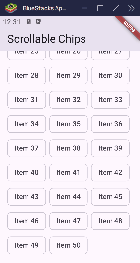
Use SingleChildScrollView for Overflowing Content
If your Wrap has a lot of items and doesn’t fit on the screen, it may overflow and cause layout issues. To fix this, wrap your Wrap in a SingleChildScrollView to make the content scrollable:
import 'package:flutter/material.dart';

void main() => runApp(const MyApp());

class MyApp extends StatelessWidget {
  const MyApp({super.key});

  @override
  Widget build(BuildContext context) {
    return const MaterialApp(home: ChipWrapScrollExample());
  }
}

class ChipWrapScrollExample extends StatelessWidget {
  const ChipWrapScrollExample({super.key});

  @override
  Widget build(BuildContext context) {
    return Scaffold(
      appBar: AppBar(title: const Text('Scrollable Chips')),
      body: SingleChildScrollView(
        padding: const EdgeInsets.all(16.0),
        child: Wrap(
          spacing: 8.0,
          runSpacing: 8.0,
          children: List.generate(
            50,
            (index) => Chip(label: Text('Item ${index + 1}')),
          ),
        ),
      ),
    );
  }
}
This lets users scroll through all items without layout problems.
Performance Tips for Large Lists
- Avoid adding too many widgets inside a
Wrapif you can help it. - If you’re dealing with a long list of items (like over 100), consider using
ListViewor aGridViewinstead, since those are optimized for large sets of data.
By keeping these tips in mind, you can use Wrap smoothly and avoid some common frustrations.
Conclusion
The Wrap widget is a powerful tool in Flutter that helps you build layouts that automatically adjust to available space. Unlike Row or Column, Wrap knows how to handle overflow by moving items to the next line — just like wrapping words in a paragraph.
It’s perfect for building dynamic and responsive UIs, such as tag lists, button groups, or image galleries that adjust to screen size. You can control direction, spacing, alignment, and even the order of items to get the exact layout you want.
To get the most out of Wrap, remember:
- Use it when items might not all fit in one line.
- Adjust
spacing,runSpacing, andalignmentfor fine-tuned layouts. - Don’t use
ExpandedinsideWrap— useSizedBoxor fixed sizes instead.
Give it a try in forms, filters, or any layout where things need to wrap naturally. With just a little practice, you’ll find Wrap to be a simple but super handy widget in your Flutter toolbox.