JavaFX is a powerful and versatile library for building desktop applications with a rich user interface. Among its many features, JavaFX provides a straightforward way to create radio buttons, which are essential for presenting users with options and allowing them to make a single choice from a set of mutually exclusive options. In this article, we’ll explore JavaFX RadioButtons and learn how to use them effectively in your JavaFX applications.
Learn C Programming For Free on Windows
A beginner-friendly course that teaches real C programming using a Windows compiler. Learn arrays, pointers, functions, and file handling step by step with practical lessons.
Start Learning C ProgrammingUnderstanding Radio Buttons
Radio buttons are a type of user interface component that allow users to select one option from a group of options. The key characteristic of radio buttons is that only one option can be selected at a time. When one radio button is selected, any previously selected radio button in the same group will be deselected automatically.
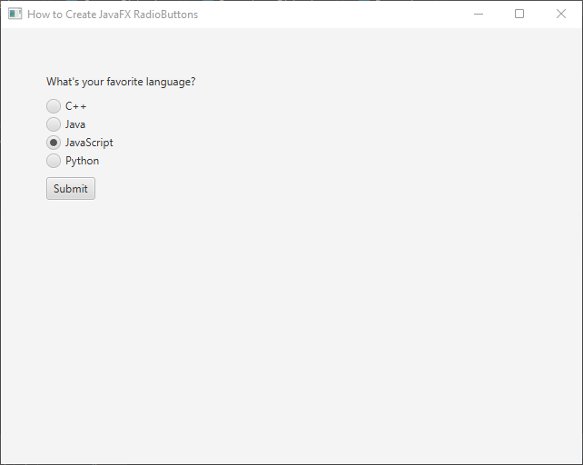
Imagine a scenario where you want users to choose their favorite programming language from a list of options such as Java, Python, C++, and JavaScript. Radio buttons are perfect for this purpose as they ensure that only one language can be chosen at a time.
Creating a JavaFX RadioButton
Let’s dive into the code and see how easy it is to create a JavaFX RadioButton in your application:
import javafx.application.Application;
import javafx.geometry.Insets;
import javafx.scene.Scene;
import javafx.scene.control.*;
import javafx.scene.layout.*;
import javafx.stage.Stage;

public class Main extends Application {

    private final BorderPane parent = new BorderPane();

    @Override
    public void start(Stage stage) throws Exception {
        this.setupStage(stage);
    }

    @Override
    public void init() throws Exception {
        super.init();
        this.buildUI();
    }

    private void buildUI() {

        VBox optionSelector = new OptionSelector(
                new String[]{"C++", "Java", "JavaScript", "Python"},
                "JavaScript", // Default selected option
                "What's your favorite language?" // Prompt label
        );

        optionSelector.setPadding(new Insets(50.0));

        this.parent.setCenter(optionSelector);

    }

    private void setupStage(Stage stage) {

        Scene scene = new Scene(this.parent, 640.0, 480.0);

        // Set the stage title
        stage.setTitle("How to Create JavaFX RadioButtons");

        // Set the stage scene
        stage.setScene(scene);

        // Center the stage on the screen
        stage.centerOnScreen();

        // Show the stage on the screen
        stage.show();

    }

}

class OptionSelector extends VBox {

    public OptionSelector(String[] options, String defaultOption, String label) {

        // Add 5px spacing between nodes
        super(10);

        // Add a prompt Label to the options selector
        this.getChildren().addAll(new VBox(new Label(label)));

        // Create a ToggleGroup for the RadioButtons
        ToggleGroup group = new ToggleGroup();

        // Create a container to house the option buttons,
        // Add 3px spacing between buttons
        VBox optionsContainer = new VBox(3);

        for (String option: options) {

            // Create RadioButton
            RadioButton optionButton = new RadioButton(option);

            // Set the ToggleGroup
            optionButton.setToggleGroup(group);

            // Set the default selected option
            if(option.equalsIgnoreCase(defaultOption))
                group.selectToggle(optionButton);

            // Add option button to the options container
            optionsContainer.getChildren().addAll(optionButton);

        }

        // Create a submit button
        Button submit = new Button("Submit");

        // Add submit button action handler
        submit.setOnAction(actionEvent -> {

            // Get selected option button
            RadioButton optionButton = (RadioButton) group.getSelectedToggle();

            // Get and print the text on the button
            System.out.println("The selected option is " + optionButton.getText());

        });

        // Add the options container to the options selector
        this.getChildren().addAll(optionsContainer);

        // Add submit button to the options selector
        this.getChildren().addAll(new VBox(submit));

    }

}
Handling RadioButton Selection
To respond to user interactions with the RadioButtons, you can add an event handler to the ToggleGroup or listen for changes in the selected property of each RadioButton.
Adding an Event Handler to the ToggleGroup
When you have a group of RadioButtons that are part of the same ToggleGroup, you can add a single event handler to the ToggleGroup itself. This event handler will be triggered whenever the selection within the group changes.
// Handling RadioButton selection using ToggleGroup
group.selectedToggleProperty().addListener((observable, oldSelected, newSelected) -> {

    if (newSelected != null) {

        RadioButton selectedRadioButton = (RadioButton) newSelected;
        System.out.println("Selected language: " + selectedRadioButton.getText());

    }

});
Listen for Changes in the Selected Property of RadioButtons
Alternatively, you can add individual listeners to each RadioButton’s selectedProperty(). This approach allows you to have separate event handling logic for each RadioButton if needed.
// Add listeners to the selectedProperty of each RadioButton
javaRadioButton.selectedProperty().addListener((observable, oldValue, newValue) -> {

    if (newValue) {

        // Add custom actions when Java is selected.
        System.out.println("Java Selected");

    }

});

pythonRadioButton.selectedProperty().addListener((observable, oldValue, newValue) -> {

    if (newValue) {

        // Add custom actions when Python is selected.
        System.out.println("Python Selected");

    }

});

cppRadioButton.selectedProperty().addListener((observable, oldValue, newValue) -> {

    if (newValue) {

        // Add custom actions when C++ is selected.
        System.out.println("C++ Selected");

    }

});

jsRadioButton.selectedProperty().addListener((observable, oldValue, newValue) -> {

    if (newValue) {

        // Add custom actions when JavaScript is selected.
        System.out.println("JavaScript Selected");

    }

});
Event Handler using setOnAction
You can also use the setOnAction method to add an event handler directly to each RadioButton. This approach is suitable when you want to define specific actions for individual RadioButtons.
EventHandler<ActionEvent> radioButtonHandler = event -> {

    RadioButton selectedRadioButton = (RadioButton) event.getSource();

    String selectedLanguage = selectedRadioButton.getText();

    // Add custom actions based on the selected RadioButton
    System.out.println("Selected Language: " + selectedLanguage);

};

javaRadioButton.setOnAction(radioButtonHandler);
pythonRadioButton.setOnAction(radioButtonHandler);
cppRadioButton.setOnAction(radioButtonHandler);
jsRadioButton.setOnAction(radioButtonHandler);
Both methods achieve the same result, but the choice between them depends on the complexity of your application and the level of customization required for each RadioButton’s event handling logic. Using the ToggleGroup event handler is more suitable when the actions to be taken are the same for all RadioButtons in the group. On the other hand, individual listeners for each RadioButton are beneficial when different RadioButtons need to trigger distinct actions. That’s there if you ever need it, but we won’t delve into the details of those approaches. Instead, we’ll continue using the group.getSelectedToggle() method to retrieve the selected language inside the submit button handler.
Customizing RadioButton
JavaFX RadioButton provides various customization options to enhance the user experience. Some common properties that can be adjusted include:
Adding Graphics to RadioButton
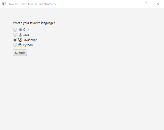
In addition to text, you can add graphical elements to RadioButtons using the setGraphic(Node graphic) method. This allows you to create more visually engaging options for users to select from. Let’s modify our previous example to include icons alongside the text for each RadioButton:
import javafx.application.Application;
import javafx.geometry.Insets;
import javafx.scene.Scene;
import javafx.scene.control.*;
import javafx.scene.image.Image;
import javafx.scene.image.ImageView;
import javafx.scene.layout.*;
import javafx.stage.Stage;

public class Main extends Application {

    private final BorderPane parent = new BorderPane();

    @Override
    public void start(Stage stage) throws Exception {
        this.setupStage(stage);
    }

    @Override
    public void init() throws Exception {
        super.init();
        this.buildUI();
    }

    private void buildUI() {

        VBox optionSelector = new OptionSelector(
                new String[]{"C++", "Java", "JavaScript", "Python"},
                "JavaScript", // Default selected option
                "What's your favorite language?" // Prompt label
        );

        optionSelector.setPadding(new Insets(50.0));

        this.parent.setCenter(optionSelector);

    }

    private void setupStage(Stage stage) {

        Scene scene = new Scene(this.parent, 640.0, 480.0);

        // Set the stage title
        stage.setTitle("How to Create JavaFX RadioButtons");

        // Set the stage scene
        stage.setScene(scene);

        // Center the stage on the screen
        stage.centerOnScreen();

        // Show the stage on the screen
        stage.show();

    }

}

class OptionSelector extends VBox {

    public OptionSelector(String[] options, String defaultOption, String label) {

        // Add 5px spacing between nodes
        super(10);

        // Add a prompt Label to the options selector
        this.getChildren().addAll(new VBox(new Label(label)));

        // Create a ToggleGroup for the RadioButtons
        ToggleGroup group = new ToggleGroup();

        // Create a container to house the option buttons,
        // Add 3px spacing between buttons
        VBox optionsContainer = new VBox(3);

        for (String option: options) {

            // Create RadioButton
            RadioButton optionButton = new RadioButton(option);

            // Load and set icon for RadioButton
            if(option.toLowerCase().startsWith("c"))
                optionButton.setGraphic(new ImageView(new Image("cpp.png")));
            else
                optionButton.setGraphic(new ImageView(new Image(option.toLowerCase() + ".png")));

            // Set the ToggleGroup
            optionButton.setToggleGroup(group);

            // Set the default selected option
            if(option.equalsIgnoreCase(defaultOption))
                group.selectToggle(optionButton);

            // Add option button to the options container
            optionsContainer.getChildren().addAll(optionButton);

        }

        // Create a submit button
        Button submit = new Button("Submit");

        // Add submit button action handler
        submit.setOnAction(actionEvent -> {

            // Get selected option button
            RadioButton optionButton = (RadioButton) group.getSelectedToggle();

            // Get and print the text on the button
            System.out.println("The selected option is " + optionButton.getText());

        });

        // Add the options container to the options selector
        this.getChildren().addAll(optionsContainer);

        // Add submit button to the options selector
        this.getChildren().addAll(new VBox(submit));

    }

}
Applying CSS Styles to RadioButton
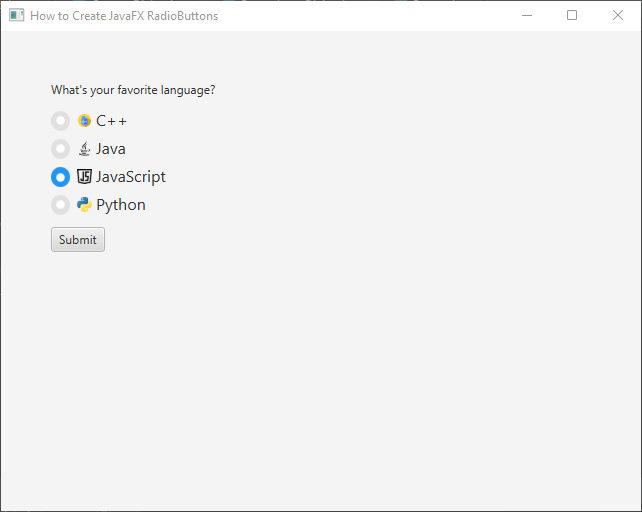
JavaFX allows you to apply CSS styles to RadioButtons, giving you the ability to change colors, fonts, and other visual aspects. This ensures that the RadioButtons blend seamlessly with the overall theme of your application. To do this, you need to create a CSS file (e.g., styles.css) and apply it to your JavaFX application.
/* Custom styles for RadioButtons */
.radio-button {
    -fx-font-size: 16px;
}

.radio-button:selected .radio {
    -fx-background-color: #2196F3;
    -fx-background-radius: 50%;
}

.radio-button:selected .radio > .dot {
    -fx-background-color: #FFFFFF;
}

.radio-button .radio {
    -fx-background-color: #E0E0E0;
    -fx-background-radius: 50%;
}

.radio-button .radio > .dot {
    -fx-background-color: #FFFFFF;
    -fx-padding: 4px;
    -fx-background-radius: 50%;
}
Let’s explain each part of the CSS:
- .radio-button: This class defines the general appearance of the RadioButton, setting the font size for the text inside the RadioButton.
- .radio-button:selected .radio: This rule targets the radio button when it is selected. In this case, we change the background color to a shade of blue (#2196F3) and give it a circular shape by setting the background radius to 50%.
- .radio-button:selected .radio > .dot: This rule targets the dot (indicator) inside the selected RadioButton. We set its background color to white (#FFFFFF).
- .radio-button .radio: This rule defines the appearance of the unselected RadioButton. We set its background color to a light gray (#E0E0E0) and give it a circular shape with a background radius of 50%.
- .radio-button .radio > .dot: This rule targets the dot inside the unselected RadioButton. We set its background color to white (#FFFFFF) and add a slight padding to separate it from the circular background.
import javafx.application.Application;
import javafx.geometry.Insets;
import javafx.scene.Scene;
import javafx.scene.control.*;
import javafx.scene.image.Image;
import javafx.scene.image.ImageView;
import javafx.scene.layout.*;
import javafx.stage.Stage;

public class Main extends Application {

    private final BorderPane parent = new BorderPane();

    @Override
    public void start(Stage stage) throws Exception {
        this.setupStage(stage);
    }

    @Override
    public void init() throws Exception {
        super.init();
        this.buildUI();
    }

    private void buildUI() {

        VBox optionSelector = new OptionSelector(
                new String[]{"C++", "Java", "JavaScript", "Python"},
                "JavaScript", // Default selected option
                "What's your favorite language?" // Prompt label
        );

        optionSelector.setPadding(new Insets(50.0));

        this.parent.setCenter(optionSelector);

    }

    private void setupStage(Stage stage) {

        Scene scene = new Scene(this.parent, 640.0, 480.0);

        // Load the style sheet
        scene.getStylesheets().addAll("styles.css");

        // Set the stage title
        stage.setTitle("How to Create JavaFX RadioButtons");

        // Set the stage scene
        stage.setScene(scene);

        // Center the stage on the screen
        stage.centerOnScreen();

        // Show the stage on the screen
        stage.show();

    }

}

class OptionSelector extends VBox {

    public OptionSelector(String[] options, String defaultOption, String label) {

        // Add 5px spacing between nodes
        super(10);

        // Add a prompt Label to the options selector
        this.getChildren().addAll(new VBox(new Label(label)));

        // Create a ToggleGroup for the RadioButtons
        ToggleGroup group = new ToggleGroup();

        // Create a container to house the option buttons,
        // Add 3px spacing between buttons
        VBox optionsContainer = new VBox(3);

        for (String option: options) {

            // Create RadioButton
            RadioButton optionButton = new RadioButton(option);

            // Load and set icon for RadioButton
            if(option.toLowerCase().startsWith("c"))
                optionButton.setGraphic(new ImageView(new Image("cpp.png")));
            else
                optionButton.setGraphic(new ImageView(new Image(option.toLowerCase() + ".png")));

            // Set the ToggleGroup
            optionButton.setToggleGroup(group);

            // Set the default selected option
            if(option.equalsIgnoreCase(defaultOption))
                group.selectToggle(optionButton);

            // Add option button to the options container
            optionsContainer.getChildren().addAll(optionButton);

        }

        // Create a submit button
        Button submit = new Button("Submit");

        // Add submit button action handler
        submit.setOnAction(actionEvent -> {

            // Get selected option button
            RadioButton optionButton = (RadioButton) group.getSelectedToggle();

            // Get and print the text on the button
            System.out.println("The selected option is " + optionButton.getText());

        });

        // Add the options container to the options selector
        this.getChildren().addAll(optionsContainer);

        // Add submit button to the options selector
        this.getChildren().addAll(new VBox(submit));

    }

}
Save the styles.css file in the same package as your Java class (Main). Also, make sure to include the appropriate icon images (e.g., java.png, python.png, and cpp.png) in the same package.
Best Practices
- To ensure an optimal user experience, consider the following best practices when working with RadioButtons:
- Limit the number of RadioButtons in a group to a reasonable amount. Too many options can overwhelm users.
- Provide clear and concise labels for each RadioButton, avoiding ambiguity.
- Use appropriate layout and spacing to make the RadioButton group visually appealing and easy to interact with.
Conclusion
In this article, we explored the JavaFX RadioButton control and learned how to create and use radio buttons in a JavaFX application. Radio buttons are a fundamental component in any application that requires users to make a single choice from a set of options. With JavaFX’s easy-to-use RadioButton class, you can create intuitive and user-friendly interfaces for your desktop applications.
Remember that JavaFX offers a range of styling and customization options, allowing you to adapt the appearance of radio buttons to match your application’s design. Experiment with different layouts and styles to create a seamless and engaging user experience.
I hope you found this code informative and useful. If you would like to receive more content, please consider subscribing to our newsletter!
