In modern user interface design, providing contextual information to users has become a crucial aspect of creating intuitive and user-friendly applications. JavaFX, a rich set of libraries for building desktop applications in Java, offers various tools to create visually appealing and interactive user interfaces. One of these tools is the JavaFX Popover, which allows developers to display contextual content in a floating overlay, enhancing the overall user experience.
What is a Popover?
A Popover is a UI component that pops up near a specified target node, displaying additional information or content. It is similar to a Tooltip but has additional capabilities, such as displaying custom content and responding to user interactions. A Popover typically appears in response to a user action, like a mouse click or hover, and can be easily dismissed by clicking outside the Popover.
JavaFX Popover Library
While JavaFX does not have a built-in Popover component, developers have created several libraries and custom implementations to add this functionality to their applications. In this article, we will use the ControlsFX library as an example.
The ControlsFX library offers a simple and easy-to-use Popover implementation for JavaFX applications. You can include this library in your project via Maven, Gradle, or directly by adding the JAR file.
Creating the Popover
Let’s start with a basic example of a Popover that displays simple text content when a button is clicked.
import javafx.application.Application;
import javafx.scene.Scene;
import javafx.scene.control.*;
import javafx.scene.layout.*;
import javafx.stage.Stage;
import org.controlsfx.control.PopOver;

public class Main extends Application {

    private final BorderPane parent = new BorderPane();

    @Override
    public void start(Stage stage) throws Exception {
        this.setupStage(stage);
    }

    @Override
    public void init() throws Exception {
        super.init();
        this.buildUI();
    }

    private void buildUI() {

        Button button = new Button("Show Popover");

        PopOver popover = new PopOver(new Label("Hello, I'm a Popover!"));

        button.setOnAction(e -> popover.show(button));

        // Add the Button to the BorderPane layout manager
        this.parent.setCenter(button);

    }

    private void setupStage(Stage stage) {

        Scene scene = new Scene(this.parent, 640.0, 480.0);

        // Set the stage title
        stage.setTitle("JavaFX Popover: Enhancing UI with Contextual Information");

        // Set the stage scene
        stage.setScene(scene);

        // Center the stage on the screen
        stage.centerOnScreen();

        // Show the stage on the screen
        stage.show();

    }

}
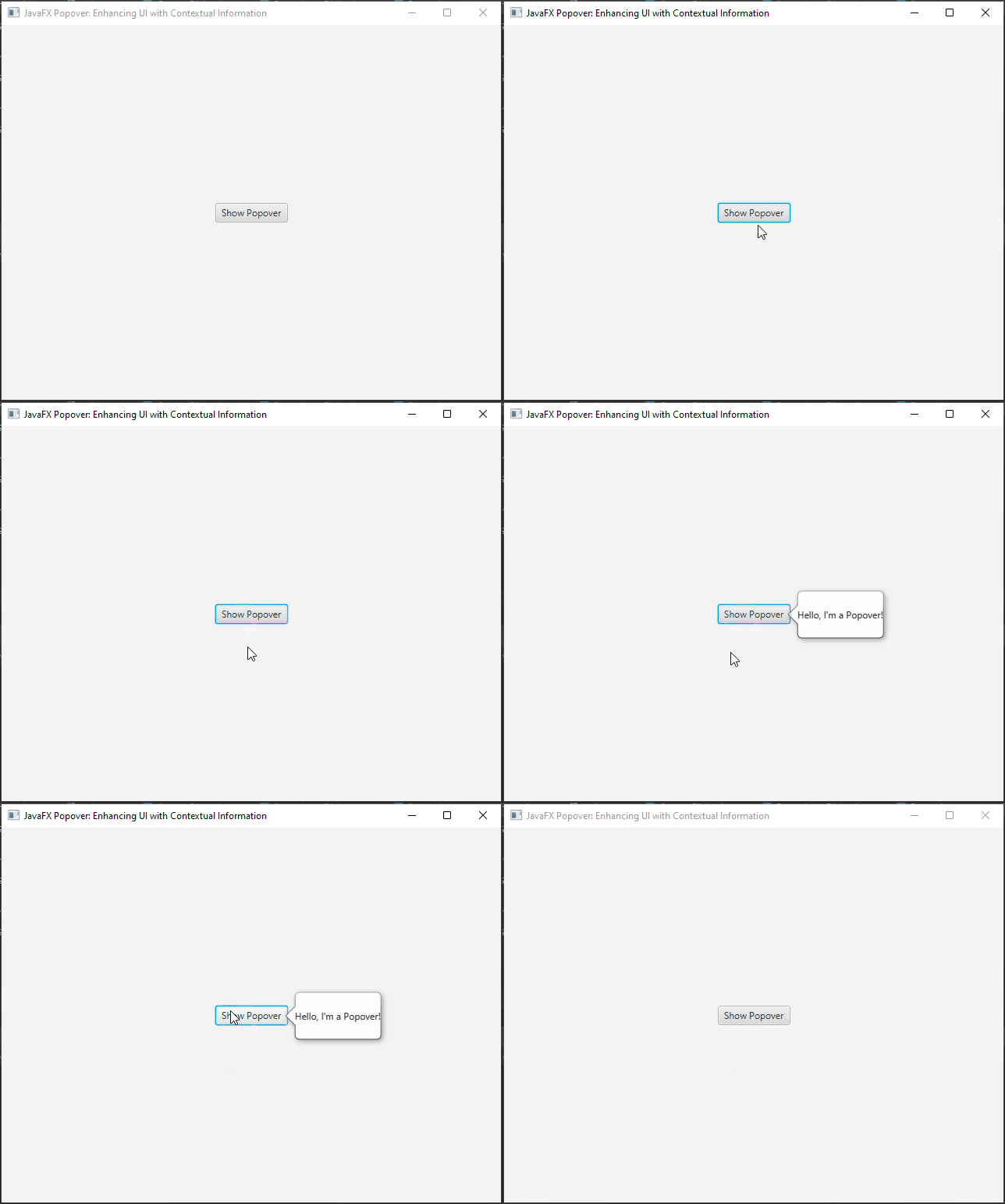
In this example, we create a simple JavaFX application with a button labeled “Show Popover.” When the button is clicked, the Popover is displayed near the button with the content “Hello, I’m a Popover!”.
Custom Content Popover
The content of a Popover is not limited to simple labels. You can use any JavaFX Node as the content, allowing for complex layouts and interactions. For instance, you can add forms, tables, or even other Popovers as content.
import javafx.application.Application;
import javafx.geometry.Insets;
import javafx.scene.Scene;
import javafx.scene.control.*;
import javafx.scene.layout.*;
import javafx.stage.Stage;
import org.controlsfx.control.PopOver;

public class Main extends Application {

    private final BorderPane parent = new BorderPane();

    @Override
    public void start(Stage stage) throws Exception {
        this.setupStage(stage);
    }

    @Override
    public void init() throws Exception {
        super.init();
        this.buildUI();
    }

    private void buildUI() {

        Button button = new Button("Show Popover");

        VBox content = new VBox();

        content.setSpacing(10);

        content.setPadding(new Insets(10));

        content.getChildren().addAll(
                new Label("Name:"),
                new TextField(),
                new Label("Email:"),
                new TextField(),
                new Button("Submit")
        );

        PopOver popover = new PopOver(content);

        button.setOnAction(e -> popover.show(button));

        // Add the Button to the BorderPane layout manager
        this.parent.setCenter(button);

    }

    private void setupStage(Stage stage) {

        Scene scene = new Scene(this.parent, 640.0, 480.0);

        // Set the stage title
        stage.setTitle("JavaFX Popover: Enhancing UI with Contextual Information");

        // Set the stage scene
        stage.setScene(scene);

        // Center the stage on the screen
        stage.centerOnScreen();

        // Show the stage on the screen
        stage.show();

    }

}

Auto-Hide and Auto-Close
Popovers can automatically hide when the user clicks outside of them or when they lose focus. You can control this behavior using the setAutoHide and setAutoFix methods.
import javafx.application.Application;
import javafx.scene.Scene;
import javafx.scene.control.*;
import javafx.scene.layout.*;
import javafx.stage.Stage;
import org.controlsfx.control.PopOver;

public class Main extends Application {

    private final BorderPane parent = new BorderPane();

    @Override
    public void start(Stage stage) throws Exception {
        this.setupStage(stage);
    }

    @Override
    public void init() throws Exception {
        super.init();
        this.buildUI();
    }

    private void buildUI() {

        Button button = new Button("Show Popover");

        PopOver popover = new PopOver(new Label("Hello, I'm a Popover!"));

        // Hide when clicked outside the Popover
        popover.setAutoHide(true);

        // Hide when the owner node loses focus
        popover.setAutoFix(true);

        button.setOnAction(e -> popover.show(button));

        // Add the Button to the BorderPane layout manager
        this.parent.setCenter(button);

    }

    private void setupStage(Stage stage) {

        Scene scene = new Scene(this.parent, 640.0, 480.0);

        // Set the stage title
        stage.setTitle("JavaFX Popover: Enhancing UI with Contextual Information");

        // Set the stage scene
        stage.setScene(scene);

        // Center the stage on the screen
        stage.centerOnScreen();

        // Show the stage on the screen
        stage.show();

    }

}
Event Handlers
You can add event handlers to the Popover to perform actions when it shows, hides, or is hidden.
import javafx.application.Application;
import javafx.scene.Scene;
import javafx.scene.control.*;
import javafx.scene.layout.*;
import javafx.stage.Stage;
import org.controlsfx.control.PopOver;

public class Main extends Application {

    private final BorderPane parent = new BorderPane();

    @Override
    public void start(Stage stage) throws Exception {
        this.setupStage(stage);
    }

    @Override
    public void init() throws Exception {
        super.init();
        this.buildUI();
    }

    private void buildUI() {

        Button button = new Button("Show Popover");

        PopOver popover = new PopOver(new Label("Hello, I'm a Popover!"));

        popover.setOnShowing(event -> System.out.println("Popover is showing!"));
        popover.setOnHiding(event -> System.out.println("Popover is hiding!"));
        popover.setOnHidden(event -> System.out.println("Popover is hidden!"));

        button.setOnAction(e -> popover.show(button));

        // Add the Button to the BorderPane layout manager
        this.parent.setCenter(button);

    }

    private void setupStage(Stage stage) {

        Scene scene = new Scene(this.parent, 640.0, 480.0);

        // Set the stage title
        stage.setTitle("JavaFX Popover: Enhancing UI with Contextual Information");

        // Set the stage scene
        stage.setScene(scene);

        // Center the stage on the screen
        stage.centerOnScreen();

        // Show the stage on the screen
        stage.show();

    }

}
Conclusion
Popovers provide a versatile and user-friendly way to display additional information and custom content in your desktop applications. They offer more flexibility compared to traditional tooltips and can enhance the user experience by providing interactive and context-sensitive information. You can experiment with various customization options to match the Popover’s appearance to your application’s design.
In this article, we explored the basics of using JavaFX Popovers and provided some examples: a simple text-based Popover and a more complex one with custom content. Now, armed with this knowledge, you can start integrating Popovers into your JavaFX applications to create a more interactive and engaging user interface.
I hope you found this code informative and useful. If you would like to receive more content, please consider subscribing to our newsletter!

