Have you ever seen a button with a picture and some text on it? Like a play button with a triangle icon, or a send button with a little paper plane next to the word “Send”? That’s what we call an Icon ElevatedButton in Flutter!
It’s just like a regular ElevatedButton, but with an icon (a small picture) sitting next to the text. The icon helps people understand what the button does—even before they read the words!
Think of it like this:
If a normal button is like a label,
then an Icon ElevatedButton is like a label with a cool sticker next to it!
Here are some fun examples you’ve probably seen:
- A play button with a ▶ icon to start music or a video
- A send button with a ➣ icon to send a message
- A call button with a 📞 icon to make a phone call
Adding icons makes your app easier to use and more fun to look at. It’s like adding signs to your app so people don’t get lost.
What Makes It Special?
An Icon ElevatedButton is like a regular ElevatedButton but with an extra superpower: an icon!
Let’s compare it to a regular button first:
- A regular
ElevatedButtonis great because it stands out and looks cool with its raised style. But it only has text, like a label on a box. It’s easy to tap, but sometimes, you might want to make it even clearer about what it does.
Now, when you add an icon, it’s like putting a little picture next to the button’s text. This makes it easier for people to understand what the button does at a glance—even before they read the text! It’s like a shortcut to understanding.
For example:
- A button with a paper plane icon (➣) tells you, “Ah, this button is for sending something!”
- A button with a heart icon (❤️) might say, “I like this!” or “Favorite this item!”
Think of it like a sign on a door:
- A plain door might say “Room A”, but a door with a picture of a coffee cup tells you instantly, “Ah, this is the coffee room!” The icon is like that helpful sign.
Adding an icon makes your button even more friendly and understandable—especially when you want to give the user a little extra clue about what’s happening.
Basic Usage
Let’s jump right into how we can use an Icon ElevatedButton in Flutter! The cool thing is, it’s super simple to add both an icon and text to a button. We use a special type of ElevatedButton called ElevatedButton.icon.
Here’s a basic example:
import 'package:flutter/material.dart';
void main() {
runApp(MyApp());
}
class MyApp extends StatelessWidget {
const MyApp({super.key});
@override
Widget build(BuildContext context) {
return MaterialApp(
home: Scaffold(
appBar: AppBar(title: Text('ElevatedButton with Icon')),
body: Center(
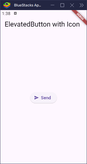
child: ElevatedButton.icon(
onPressed: () {
print('Button pressed!');
},
icon: Icon(Icons.send),
label: Text('Send'),
),
),
),
);
}
}Let’s break this down:
icon: This is where we add the picture that will appear on the button. In our example, we used the send icon (Icons.send), which looks like a paper plane ➣. It tells the user, “This button is for sending something!”label: This is the text that will appear next to the icon. In this case, the text is “Send”, which matches what the icon is for. The label helps explain exactly what will happen when the user taps the button.
So, when you tap the button:
- The paper plane icon shows up next to the word “Send”.
- The
onPressedfunction runs (which prints something to the console in our example, but you can make it do anything!).
In this way, combining an icon with text makes the button clearer and easier for users to understand what will happen when they tap it.
Customizing the Look
You can customize the appearance of your Icon ElevatedButton to make it stand out even more. Whether you want to change the icon, colors, size, shape, or spacing, it’s all possible with Flutter’s styleFrom method.
The great thing is, styleFrom lets you customize your button easily. You can change the background color, text color, icon size, and even how rounded the button is!
Let’s look at how we can use styleFrom to change the appearance of the Icon ElevatedButton.
import 'package:flutter/material.dart';
void main() {
runApp(MyApp());
}
class MyApp extends StatelessWidget {
const MyApp({super.key});
@override
Widget build(BuildContext context) {
return MaterialApp(
home: Scaffold(
appBar: AppBar(title: Text('ElevatedButton with Icon')),
body: Center(
child: ElevatedButton.icon(
onPressed: () {
print('Custom Button Pressed!');
},
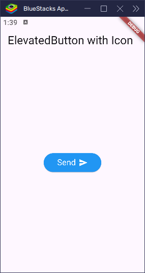
icon: Icon(
Icons.send, // Icon for the button (can change to any other icon)
),
label: Text('Send'),
style: ElevatedButton.styleFrom(
backgroundColor: Colors.blue, // Button background color
foregroundColor: Colors.white, // Button foreground color
padding: EdgeInsets.symmetric(
horizontal: 30,
vertical: 10,
), // Padding inside button
shape: RoundedRectangleBorder(
borderRadius: BorderRadius.circular(
300,
), // Rounded corners for the button
),
textStyle: TextStyle(
fontSize: 16, // Text size
),
iconColor: Colors.white, // Icon color
iconSize: 20, // Icon size
iconAlignment: IconAlignment.end, // Align the icon to the end
),
),
),
),
);
}
}Let’s break this down:
icon: We are using the send icon (Icons.send), which gives a clear visual cue that this button is for sending something.label: The text “Send” is used here, matching the icon’s purpose.backgroundColor: The button’s background color is set to blue, making the button vibrant and easy to spot.foregroundColor: The icon and text are both set to white so that they stand out against the blue background.padding: The padding inside the button is set with horizontal padding of 30 and vertical padding of 10. This provides comfortable spacing within the button.shape: The button has rounded corners with a border radius of 300, giving it a smooth, modern look.textStyle: The text size is set to 16, making it a readable size for most screens.iconColor: The icon color is set to white, keeping the icon in sync with the text.iconSize: The icon size is set to 20, making it large enough to be visible but not overwhelming.iconAlignment: The icon is aligned to the end of the button usingIconAlignment.end, making the text and icon appear on opposite sides of the button. By default, this is set toIconAlignment.start, which places the icon to the left of the text.
With these customizations, your Icon ElevatedButton looks visually appealing and is easier to understand. Customizing buttons this way helps make your app more user-friendly and professional!
Handling Button Presses
In Flutter, every button needs a little action when it’s tapped. That’s where the onPressed function comes in. The onPressed function is what you use to define what happens when the user taps the button.
For example, when you tap a button, you might want to print something to the console, show a message, or even change the screen. It’s like the button saying, “When you tap me, here’s what I’ll do!”
Let’s see how we can add an action to our Icon ElevatedButton.
import 'package:flutter/material.dart';
void main() {
runApp(MyApp());
}
class MyApp extends StatelessWidget {
const MyApp({super.key});
@override
Widget build(BuildContext context) {
return MaterialApp(
home: Scaffold(
appBar: AppBar(title: Text('ElevatedButton with Icon')),
body: Center(
child: ElevatedButton.icon(
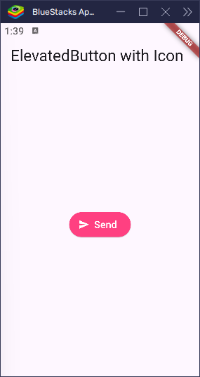
onPressed: () {
print('Icon Button Pressed!');
},
icon: Icon(
Icons.send, // Icon for the button (can change to any other icon)
),
label: Text('Send'),
style: ElevatedButton.styleFrom(
foregroundColor: Colors.white,
backgroundColor: Colors.pinkAccent,
),
),
),
),
);
}
}onPressed: This is the action that will happen when the button is pressed. In this case, when the button is tapped, it prints the message"Icon Button Pressed!"to the console. It’s a simple way to test the button’s functionality.- The
printstatement: When you tap the button, the text"Icon Button Pressed!"shows up in your console. It’s a fun way to see that your button is working and can help in debugging while developing your app.
You can replace the print statement with any action you want. For instance, you could show a dialog or navigate to a new screen when the button is pressed. The possibilities are endless!
Handling button presses like this is a core part of making interactive Flutter apps! It’s how you get your app to respond to what the user does.
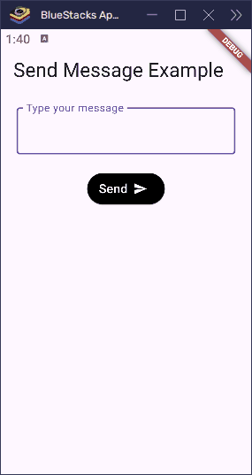
Real-World Example: Send Message Button
Let’s build a fun and useful UI—a Send Message button that works like a mini chat app! We’ll make a text field where the user can type something, and an Icon ElevatedButton labeled “Send” that will collect the input and display it when pressed.
This is great for things like comments, chatting, or sending feedback in your app.
import 'package:flutter/material.dart';

void main() {
  runApp(MyApp());
}

class MyApp extends StatelessWidget {
  const MyApp({super.key});

  @override
  Widget build(BuildContext context) {
    return MaterialApp(home: SendMessageScreen());
  }
}

class SendMessageScreen extends StatefulWidget {
  const SendMessageScreen({super.key});

  @override
  SendMessageScreenState createState() => SendMessageScreenState();
}

class SendMessageScreenState extends State<SendMessageScreen> {
  final TextEditingController _controller = TextEditingController();
  String _message = '';

  void _sendMessage() {
    setState(() {
      _message = _controller.text;
      _controller.clear(); // clear the input after sending
    });
  }

  @override
  Widget build(BuildContext context) {
    return Scaffold(
      appBar: AppBar(title: Text('Send Message Example')),
      body: Padding(
        padding: const EdgeInsets.all(20.0),
        child: Column(
          children: [
            TextField(
              controller: _controller,
              decoration: InputDecoration(
                labelText: 'Type your message',
                border: OutlineInputBorder(),
              ),
            ),
            SizedBox(height: 20),
            ElevatedButton.icon(
              onPressed: _sendMessage,
              icon: Icon(Icons.send),
              label: Text('Send'),
              style: ElevatedButton.styleFrom(
                backgroundColor: Colors.black,
                foregroundColor: Colors.white,
                iconAlignment: IconAlignment.end,
              ),
            ),
            SizedBox(height: 30),
            if (_message.isNotEmpty)
              Text('You sent: $_message', style: TextStyle(fontSize: 18)),
          ],
        ),
      ),
    );
  }
}- We created a screen with a text input box and an Icon ElevatedButton.
- When the user types something and taps Send, the app:
- Gets the input using
_controller.text - Shows the message below the button
- Clears the input so it’s ready for the next message
- Gets the input using
This is how real apps collect and handle input from users!
It’s a simple but powerful way to make your Flutter app feel alive and interactive.
Bonus: Icon Only Button
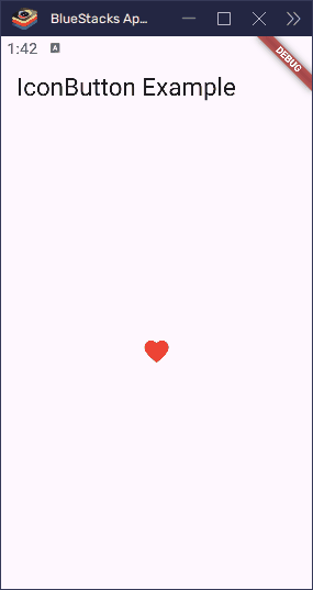
Sometimes, you may want a button that’s just an icon without any text. Maybe you want to add a close button or a favorite button with just a heart icon, like ❤️. This is where an Icon Only Button comes in!
How to Create an Icon Only Button
To create a button with just an icon, we can use the IconButton widget instead of ElevatedButton.icon. The IconButton is designed for situations like this—when you only need an icon without any label.
Here’s an example of how to make a button with just an icon:
import 'package:flutter/material.dart';

void main() {
  runApp(MyApp());
}

class MyApp extends StatelessWidget {
  const MyApp({super.key});

  @override
  Widget build(BuildContext context) {
    return MaterialApp(
      home: Scaffold(
        appBar: AppBar(title: Text('IconButton Example')),
        body: Center(
          child: IconButton(
            icon: Icon(Icons.favorite),
            onPressed: () {
              print('Favorite button pressed!');
            },
            iconSize: 30,
            color: Colors.red, // Icon color
          ),
        ),
      ),
    );
  }
}icon: This is where we place the icon. In this case, we used the heart icon (Icons.favorite).onPressed: This is where we define the action that will happen when the button is tapped. Here, it simply prints"Favorite button pressed!"to the console.iconSize: You can adjust the size of the icon to make it bigger or smaller.color: Set the color of the icon, which can be customized as needed (in this case, we used red).
Comparing ElevatedButton.icon and IconButton
ElevatedButton.icon: This is used when you want a button with both an icon and text. It gives you a raised button that stands out, perfect for actions like Send, Save, or Submit. The text and icon appear together on the button.IconButton: This is a simple button that only contains an icon. It’s perfect for smaller, clickable elements like close buttons, favorite buttons, or any action where you want just the icon to be visible.
Key Differences
| Feature | ElevatedButton.icon | IconButton |
|---|---|---|
| Text | Has text and an icon together | Only an icon |
| Appearance | Raised button with elevation | Flat button, no elevation |
| Use Case | For actions that need both an icon and text | For simple, icon-only buttons (like close, favorite, etc.) |
In summary, if you need a button with both an icon and text, use ElevatedButton.icon. But if you just need a simple icon to perform an action, IconButton is your go-to!
Conclusion
We’ve explored a lot about ElevatedButton.icon in Flutter, and here’s a quick recap:
ElevatedButton.iconis a special type of button that combines text and an icon to make it more understandable and user-friendly.- Adding an icon to your button makes it instantly clear what the button does—like using a send icon (➣) for sending a message or a favorite heart ❤️ for marking something as liked.
- You can customize the look of the button, from changing the icon size and alignment to setting the background color and shapes with the
styleFrommethod.
Icon buttons make your app more interactive and visually appealing, while helping users understand the purpose of each action faster.
Now, it’s your turn! Try using ElevatedButton.icon in your own Flutter apps to enhance the user experience. Whether you’re building a send message button or a favorite button, you can easily make your buttons clearer and more engaging with just a few lines of code!