In Flutter, the Row widget helps you place widgets side by side in a horizontal line. It’s perfect for buttons, icons, text, or anything you want to place in a row. But it’s more than just putting items next to each other—you can control how they align, how much space they take, and how they respond when space runs out.
In this guide, we’ll explore the Row widget in detail with simple examples, and show how to handle common layout problems like overflow.
What Is the Row Widget?
A Row arranges its children horizontally, from left to right (or right to left depending on the text direction). Each child is a widget, and you can place as many as you want—as long as they fit!
Here’s a simple example that puts an icon and text next to each other:
import 'package:flutter/material.dart';
void main() => runApp(const MyApp());
class MyApp extends StatelessWidget {
const MyApp({super.key});
@override
Widget build(BuildContext context) {
return MaterialApp(
title: 'Row Widget',
home: Scaffold(
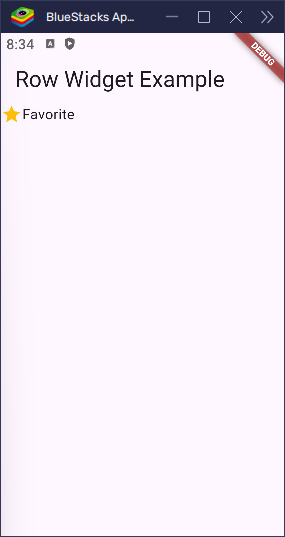
appBar: AppBar(title: Text('Row Widget Example')),
body: Row(
children: [Icon(Icons.star, color: Colors.amber), Text('Favorite')],
),
),
);
}
}This creates a horizontal row showing a star icon followed by the word “Favorite”.
Main Axis vs Cross Axis
Understanding how alignment works in Row means knowing the two axes:
- Main Axis (Horizontal) – the direction the children are placed (left to right).
- Cross Axis (Vertical) – the opposite direction (top to bottom).
We use different properties to control alignment along each axis.
mainAxisAlignment – Aligning Horizontally
This controls how the children are aligned horizontally.
Let’s say you want to spread icons evenly across the row:
import 'package:flutter/material.dart';
void main() => runApp(const MyApp());
class MyApp extends StatelessWidget {
const MyApp({super.key});
@override
Widget build(BuildContext context) {
return MaterialApp(
title: 'Row Widget',
home: Scaffold(
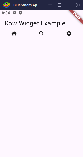
appBar: AppBar(title: Text('Row Widget Example')),
body: Row(
mainAxisAlignment: MainAxisAlignment.spaceAround,
children: [
Icon(Icons.home),
Icon(Icons.search),
Icon(Icons.settings),
],
),
),
);
}
}
Here’s what each option does:
start: Aligns children to the left.end: Aligns to the right.center: Centers them.spaceBetween: Equal space between, no space at ends.spaceAround: Equal space before, between, and after.spaceEvenly: Equal space everywhere.
crossAxisAlignment – Aligning Vertically
This controls how children are aligned along the vertical axis.
In the example below, one widget is taller than the other. We use start to align them both at the top.
import 'package:flutter/material.dart';
void main() => runApp(const MyApp());
class MyApp extends StatelessWidget {
const MyApp({super.key});
@override
Widget build(BuildContext context) {
return MaterialApp(
title: 'Row Widget',
home: Scaffold(
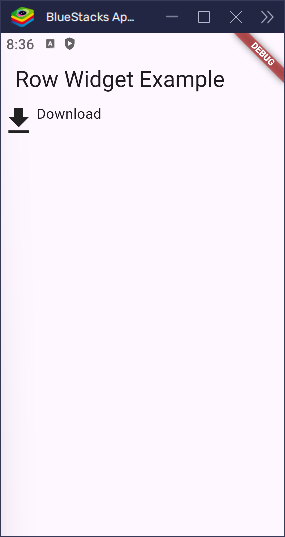
appBar: AppBar(title: Text('Row Widget Example')),
body: Row(
crossAxisAlignment: CrossAxisAlignment.start,
children: [Icon(Icons.download, size: 40), Text('Download')],
),
),
);
}
}
Options include:
start: Aligns at the top.center: Centers vertically.end: Aligns at the bottom.stretch: Fills the vertical space of the row.baseline: Aligns text with a shared baseline (requiresTextwidgets with same style).
mainAxisSize – Control Row Width
By default, a row stretches to fill all the horizontal space. But if you only want it to be as wide as needed, use mainAxisSize.
import 'package:flutter/material.dart';
void main() => runApp(const MyApp());
class MyApp extends StatelessWidget {
const MyApp({super.key});
@override
Widget build(BuildContext context) {
return MaterialApp(
title: 'Row Widget',
home: Scaffold(
appBar: AppBar(title: Text('Row Widget Example')),
body: Row(
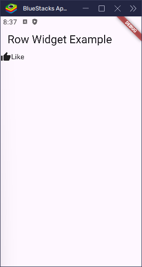
mainAxisSize: MainAxisSize.min,
children: [Icon(Icons.thumb_up), Text('Like')],
),
),
);
}
}MainAxisSize.min: The row only takes as much space as needed.MainAxisSize.max: The row stretches across the available width (default).
This sets how much horizontal space the row should take:
textDirection – Changing Child Order
Sometimes you want to flip the order of children. You can use textDirection for that:
import 'package:flutter/material.dart';
void main() => runApp(const MyApp());
class MyApp extends StatelessWidget {
const MyApp({super.key});
@override
Widget build(BuildContext context) {
return MaterialApp(
title: 'Row Widget',
home: Scaffold(
appBar: AppBar(title: Text('Row Widget Example')),
body: Row(
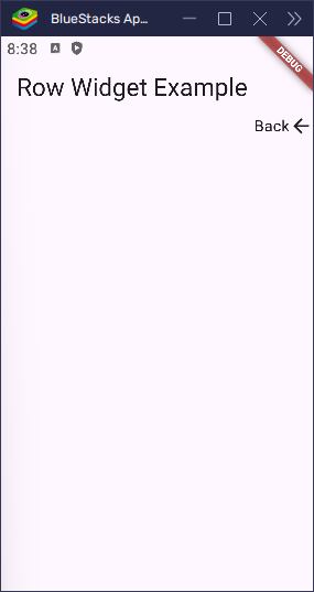
textDirection: TextDirection.rtl,
children: [Icon(Icons.arrow_back), Text('Back')],
),
),
);
}
}Now the text comes first, followed by the icon, because the row is reversed right-to-left.
verticalDirection – Change Vertical Start Point
This controls whether “top” is really the top, or if the row should align from the bottom up.
import 'package:flutter/material.dart';
void main() => runApp(const MyApp());
class MyApp extends StatelessWidget {
const MyApp({super.key});
@override
Widget build(BuildContext context) {
return MaterialApp(
title: 'Row Widget',
home: Scaffold(
appBar: AppBar(title: Text('Row Widget Example')),
body: Row(
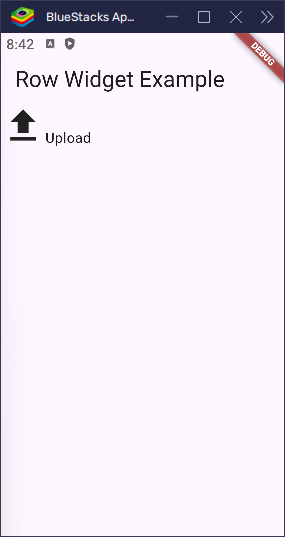
crossAxisAlignment: CrossAxisAlignment.start,
verticalDirection: VerticalDirection.up,
children: [Icon(Icons.upload, size: 50), Text('Upload')],
),
),
);
}
}With VerticalDirection.up, the top becomes the bottom, so start aligns at the bottom.
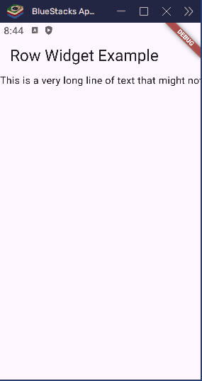
Handling Overflow in a Row
Rows can overflow when the content is too wide for the screen. Here’s a simple overflow problem:
import 'package:flutter/material.dart';
void main() => runApp(const MyApp());
class MyApp extends StatelessWidget {
const MyApp({super.key});
@override
Widget build(BuildContext context) {
return MaterialApp(
title: 'Row Widget',
home: Scaffold(
appBar: AppBar(title: Text('Row Widget Example')),
body: Row(
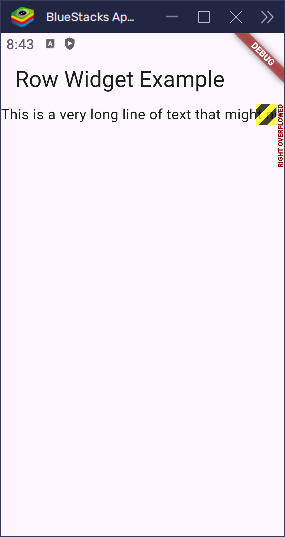
children: [
Text('This is a very long line of text that might not fit'),
Icon(Icons.more_horiz),
],
),
),
);
}
}If this content doesn’t fit the screen width, you’ll get a RenderFlex overflow error. Let’s fix that.
Solution 1: Make the Row Scrollable
Wrap the Row with SingleChildScrollView and set scroll direction to horizontal:
import 'package:flutter/material.dart';

void main() => runApp(const MyApp());

class MyApp extends StatelessWidget {
  const MyApp({super.key});

  @override
  Widget build(BuildContext context) {
    return MaterialApp(
      title: 'Row Widget',
      home: Scaffold(
        appBar: AppBar(title: Text('Row Widget Example')),
        body: SingleChildScrollView(
          scrollDirection: Axis.horizontal,
          child: Row(
            children: [
              Text('This is a very long line of text that might not fit'),
              Icon(Icons.more_horiz),
            ],
          ),
        ),
      ),
    );
  }
}
Now the row becomes scrollable left-to-right when there isn’t enough space.
Solution 2: Use Expanded or Flexible
If you want the row’s children to share or stretch into available space, wrap them with Expanded or Flexible.
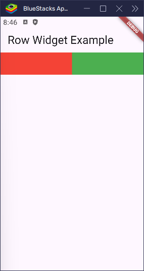
Expanded – Take All Available Space
Expanded makes a widget take up all the remaining space in the row. Here’s a simple example:
import 'package:flutter/material.dart';

void main() => runApp(const MyApp());

class MyApp extends StatelessWidget {
  const MyApp({super.key});

  @override
  Widget build(BuildContext context) {
    return MaterialApp(
      title: 'Row Widget',
      home: Scaffold(
        appBar: AppBar(title: Text('Row Widget Example')),
        body: Row(
          children: [
            Expanded(child: Container(height: 50, color: Colors.red)),
            Expanded(child: Container(height: 50, color: Colors.green)),
          ],
        ),
      ),
    );
  }
}
Each child takes equal space inside the row. Expanded uses all available width.
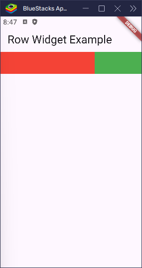
You can also change how much space each takes using the flex property:
import 'package:flutter/material.dart';

void main() => runApp(const MyApp());

class MyApp extends StatelessWidget {
  const MyApp({super.key});

  @override
  Widget build(BuildContext context) {
    return MaterialApp(
      title: 'Row Widget',
      home: Scaffold(
        appBar: AppBar(title: Text('Row Widget Example')),
        body: Row(
          children: [
            Expanded(flex: 2, child: Container(height: 50, color: Colors.red)),
            Expanded(
              flex: 1,
              child: Container(height: 50, color: Colors.green),
            ),
          ],
        ),
      ),
    );
  }
}
Now the red container takes 2 parts, green takes 1 part, so the red one is twice as wide.
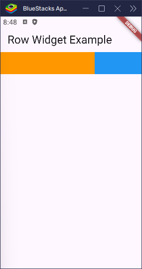
Flexible – Similar to Expanded, But Less Strict
Use Flexible when you want the child to take up space if it can, but allow it to be smaller if needed.
import 'package:flutter/material.dart';

void main() => runApp(const MyApp());

class MyApp extends StatelessWidget {
  const MyApp({super.key});

  @override
  Widget build(BuildContext context) {
    return MaterialApp(
      title: 'Row Widget',
      home: Scaffold(
        appBar: AppBar(title: Text('Row Widget Example')),
        body: Row(
          children: [
            Flexible(
              flex: 2,
              child: Container(height: 50, color: Colors.orange),
            ),
            Flexible(flex: 1, child: Container(height: 50, color: Colors.blue)),
          ],
        ),
      ),
    );
  }
}
This behaves like Expanded, but allows children to size themselves within limits.
Spacing Between Widgets
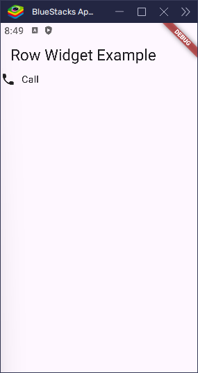
To add space manually between widgets, use SizedBox:
import 'package:flutter/material.dart';

void main() => runApp(const MyApp());

class MyApp extends StatelessWidget {
  const MyApp({super.key});

  @override
  Widget build(BuildContext context) {
    return MaterialApp(
      title: 'Row Widget',
      home: Scaffold(
        appBar: AppBar(title: Text('Row Widget Example')),
        body: Row(
          children: [Icon(Icons.phone), SizedBox(width: 10), Text('Call')],
        ),
      ),
    );
  }
}
This adds 10 pixels of space between the icon and text.
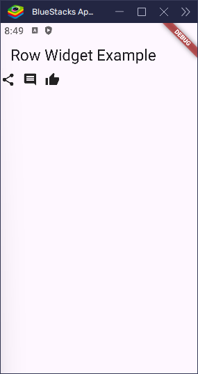
If you’re using a newer Flutter version, you can use the spacing attribute directly:
import 'package:flutter/material.dart';

void main() => runApp(const MyApp());

class MyApp extends StatelessWidget {
  const MyApp({super.key});

  @override
  Widget build(BuildContext context) {
    return MaterialApp(
      title: 'Row Widget',
      home: Scaffold(
        appBar: AppBar(title: Text('Row Widget Example')),
        body: Row(
          spacing: 12,
          children: [
            Icon(Icons.share),
            Icon(Icons.comment),
            Icon(Icons.thumb_up),
          ],
        ),
      ),
    );
  }
}
This adds uniform spacing between all children, making your code cleaner.
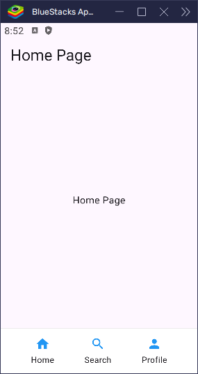
Real-World Example: Simple Bottom Bar
Here’s how you might use a Row for a bottom navigation bar:
import 'package:flutter/material.dart';

void main() => runApp(const MyApp());

class MyApp extends StatelessWidget {
  const MyApp({super.key});

  @override
  Widget build(BuildContext context) {
    return MaterialApp(
      title: 'Custom Bottom Nav',
      debugShowCheckedModeBanner: false,
      home: const HomePage(),
    );
  }
}

class HomePage extends StatelessWidget {
  const HomePage({super.key});

  @override
  Widget build(BuildContext context) {
    return Scaffold(
      appBar: AppBar(title: Text('Home Page')),
      body: const Center(child: Text('Home Page')),
      bottomNavigationBar: Container(
        padding: const EdgeInsets.symmetric(vertical: 12),
        decoration: BoxDecoration(
          color: Colors.white,
          border: Border(top: BorderSide(color: Colors.grey.shade300)),
        ),
        child: Row(
          mainAxisAlignment: MainAxisAlignment.spaceEvenly,
          children: const [
            NavItem(icon: Icons.home, label: 'Home'),
            NavItem(icon: Icons.search, label: 'Search'),
            NavItem(icon: Icons.person, label: 'Profile'),
          ],
        ),
      ),
    );
  }
}

class NavItem extends StatelessWidget {
  final IconData icon;
  final String label;

  const NavItem({super.key, required this.icon, required this.label});

  @override
  Widget build(BuildContext context) {
    return InkWell(
      onTap: () {
        // Handle tap here
      },
      borderRadius: BorderRadius.circular(12),
      child: Column(
        mainAxisSize: MainAxisSize.min,
        children: [
          Icon(icon, color: Colors.blue),
          const SizedBox(height: 4),
          Text(label, style: const TextStyle(fontSize: 12)),
        ],
      ),
    );
  }
}
This is a basic layout for a bottom navigation bar with evenly spaced icons.
Common Pitfalls
- Overflow error: Happens when content doesn’t fit. Use scroll,
Expanded, orFlexible. - Wrong alignment: Remember
mainAxisAlignmentis horizontal, andcrossAxisAlignmentis vertical. - Forgetting spacing: Use
SizedBoxorspacingto avoid widgets looking stuck together.
Conclusion
The Row widget in Flutter is powerful for creating horizontal layouts. It gives you full control over alignment, spacing, sizing, and overflow behavior. Whether you’re building a simple toolbar or a complex layout with dynamic widths, Row can handle it—especially when combined with Expanded, Flexible, and scroll views.
Take time to play with alignment options, flex factors, and spacing to build clean and responsive UIs!