The Column widget is one of the most used layout tools in Flutter. It helps you place widgets in a vertical line — one on top of the other — just like stacking building blocks. Whether you’re designing a login screen, a profile layout, or a menu list, the Column makes it easy to organize widgets from top to bottom.
Learn C Programming For Free on Windows
A beginner-friendly course that teaches real C programming using a Windows compiler. Learn arrays, pointers, functions, and file handling step by step with practical lessons.
Start Learning C ProgrammingIn this article, we’ll explore everything you need to know about the Column widget — from basic use to advanced layout control using alignment, spacing, and direction.
What is the Column Widget?
A Column arranges its children vertically. It’s the opposite of a Row, which lays them out horizontally. The Column lets you control how your widgets stack, how much space they take, and how they align inside their parent.
Basic Example
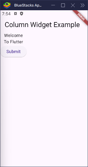
Here’s a simple example of a Column in action:
import 'package:flutter/material.dart';

void main() => runApp(const MyApp());

class MyApp extends StatelessWidget {
  const MyApp({super.key});

  @override
  Widget build(BuildContext context) {
    return MaterialApp(
      title: 'Column Widget',
      home: Scaffold(
        appBar: AppBar(title: Text('Column Widget Example')),
        body: Column(
          children: [
            Text('Welcome'),
            Text('To Flutter'),
            ElevatedButton(onPressed: () {}, child: Text('Submit')),
          ],
        ),
      ),
    );
  }
}
This code displays three widgets stacked from top to bottom.
Main Axis and Cross Axis
To understand alignment, we need to understand axes:
- Main Axis (Vertical): This is the top-to-bottom direction of the column.
- Cross Axis (Horizontal): This is the left-to-right direction.
Flutter gives us tools to align children on both axes: mainAxisAlignment and crossAxisAlignment.
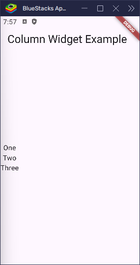
mainAxisAlignment – Vertical Spacing
This controls how the children are spaced vertically.
import 'package:flutter/material.dart';

void main() => runApp(const MyApp());

class MyApp extends StatelessWidget {
  const MyApp({super.key});

  @override
  Widget build(BuildContext context) {
    return MaterialApp(
      title: 'Column Widget',
      home: Scaffold(
        appBar: AppBar(title: Text('Column Widget Example')),
        body: Column(
          mainAxisAlignment: MainAxisAlignment.center,
          children: [Text('One'), Text('Two'), Text('Three')],
        ),
      ),
    );
  }
}
The children are centered vertically in the column’s space.
Other options:
start: Aligns at the top.end: Aligns at the bottom.spaceBetween: Equal space between each child.spaceAround: Space before, between, and after.spaceEvenly: Equal space all around.
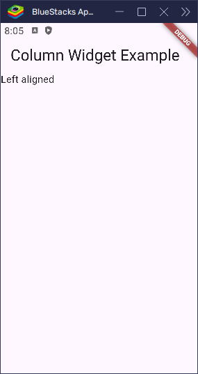
crossAxisAlignment – Horizontal Alignment
This controls how children are aligned horizontally.
import 'package:flutter/material.dart';

void main() => runApp(const MyApp());

class MyApp extends StatelessWidget {
  const MyApp({super.key});

  @override
  Widget build(BuildContext context) {
    return MaterialApp(
      title: 'Column Widget',
      home: Scaffold(
        appBar: AppBar(title: Text('Column Widget Example')),
        body: Column(
          crossAxisAlignment: CrossAxisAlignment.start,
          children: [Text('Left aligned')],
        ),
      ),
    );
  }
}
Other values include:
center: Align to the center horizontally.end: Align to the right.stretch: Expand to fill width.baseline: Align by text baseline (used withtextBaseline).
A Column only becomes as wide as its biggest child. So if all the children are small, the column stays narrow. That means if you try to align things to the center or end, you might not notice any change—because the column itself is still small!
To make alignment work the way you want, you can give the column more space. One way to do that is by wrapping it with a SizedBox and setting a custom width.
But if you use CrossAxisAlignment.stretch, the column will stretch to fill the whole width.
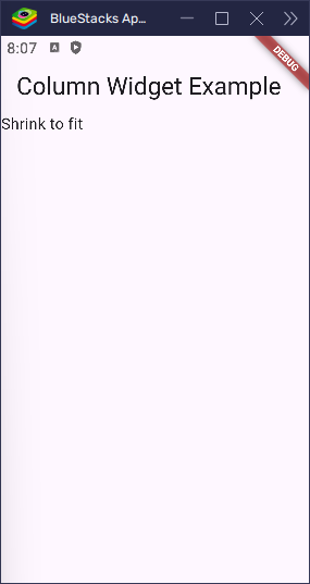
mainAxisSize – Full Height or Wrap Content
Use mainAxisSize to control how tall the column should be:
MainAxisSize.max(default): Fills the parent’s height.MainAxisSize.min: Shrinks to fit its children.
Example:
import 'package:flutter/material.dart';

void main() => runApp(const MyApp());

class MyApp extends StatelessWidget {
  const MyApp({super.key});

  @override
  Widget build(BuildContext context) {
    return MaterialApp(
      title: 'Column Widget',
      home: Scaffold(
        appBar: AppBar(title: Text('Column Widget Example')),
        body: Column(
          mainAxisSize: MainAxisSize.min,
          children: [Text('Shrink to fit')],
        ),
      ),
    );
  }
}
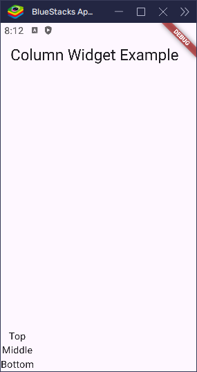
verticalDirection – Reverse the Order
By default, a column lays out children from top to bottom. But you can flip that using verticalDirection.
import 'package:flutter/material.dart';

void main() => runApp(const MyApp());

class MyApp extends StatelessWidget {
  const MyApp({super.key});

  @override
  Widget build(BuildContext context) {
    return MaterialApp(
      title: 'Column Widget',
      home: Scaffold(
        appBar: AppBar(title: Text('Column Widget Example')),
        body: Column(
          verticalDirection: VerticalDirection.up,
          children: [Text('Bottom'), Text('Middle'), Text('Top')],
        ),
      ),
    );
  }
}
Now, the first widget appears at the bottom and the last at the top.
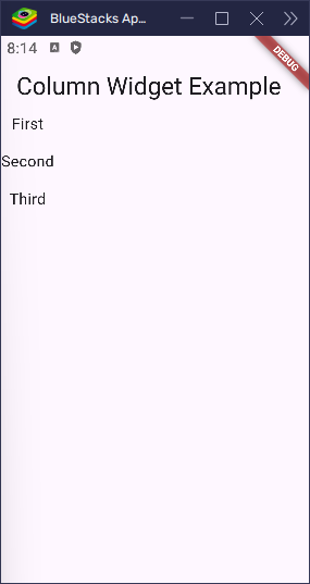
Spacing Between Children
The Column widget supports the spacing attribute, which allows you to add equal space between the children without manually inserting SizedBox widgets. This is a much simpler way to add consistent space between widgets inside a Column.
import 'package:flutter/material.dart';

void main() => runApp(const MyApp());

class MyApp extends StatelessWidget {
  const MyApp({super.key});

  @override
  Widget build(BuildContext context) {
    return MaterialApp(
      title: 'Column Widget',
      home: Scaffold(
        appBar: AppBar(title: Text('Column Widget Example')),
        body: Column(
          spacing: 16.0, // 16 pixels of space between children
          children: [Text('First'), Text('Second'), Text('Third')],
        ),
      ),
    );
  }
}
Manually Using SizedBox for Spacing
If you need more control, you can still manually add spacing using SizedBox. Here’s how:
import 'package:flutter/material.dart';

void main() => runApp(const MyApp());

class MyApp extends StatelessWidget {
  const MyApp({super.key});

  @override
  Widget build(BuildContext context) {
    return MaterialApp(
      title: 'Column Widget',
      home: Scaffold(
        appBar: AppBar(title: Text('Column Widget Example')),
        body: Column(
          children: [
            Text('First'),
            SizedBox(height: 16), // 16 pixels of vertical space
            Text('Second'),
            SizedBox(height: 16),
            Text('Third'),
          ],
        ),
      ),
    );
  }
}
The SizedBox widget is a great way to control the space between individual children when the built-in spacing property isn’t available or when you need specific spacing between only certain widgets.
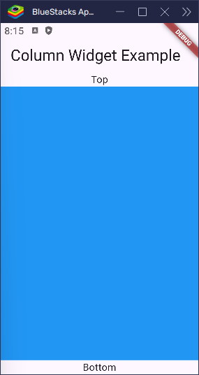
Expanded and Flexible
Want some children to stretch and fill space? Use Expanded or Flexible.
import 'package:flutter/material.dart';

void main() => runApp(const MyApp());

class MyApp extends StatelessWidget {
  const MyApp({super.key});

  @override
  Widget build(BuildContext context) {
    return MaterialApp(
      title: 'Column Widget',
      home: Scaffold(
        appBar: AppBar(title: Text('Column Widget Example')),
        body: Column(
          children: [
            Text('Top'),
            Expanded(child: Container(color: Colors.blue)),
            Text('Bottom'),
          ],
        ),
      ),
    );
  }
}
The blue container stretches to fill all extra space.
Use Flexible when you want to stretch if possible, but allow the child to wrap its size too.
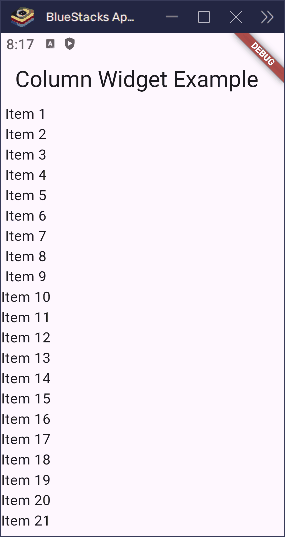
Column in a Scrollable Layout
If you have many children and the screen isn’t tall enough, you’ll get an overflow error. Fix it by wrapping the column in a SingleChildScrollView:
import 'package:flutter/material.dart';

void main() => runApp(const MyApp());

class MyApp extends StatelessWidget {
  const MyApp({super.key});

  @override
  Widget build(BuildContext context) {
    return MaterialApp(
      title: 'Column Widget',
      home: Scaffold(
        appBar: AppBar(title: Text('Column Widget Example')),
        body: SingleChildScrollView(
          child: Column(
            children: [for (int i = 1; i <= 50; i++) Text('Item $i')],
          ),
        ),
      ),
    );
  }
}
This allows vertical scrolling.
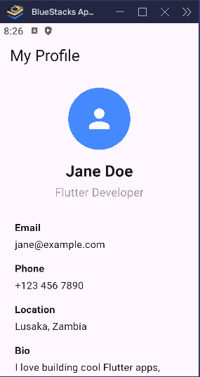
Real-World Example: Profile Layout
import 'package:flutter/material.dart';

void main() => runApp(const MyApp());

class MyApp extends StatelessWidget {
  const MyApp({super.key});

  @override
  Widget build(BuildContext context) {
    return MaterialApp(
      title: 'Profile Page',
      debugShowCheckedModeBanner: false,
      home: const ProfilePage(),
    );
  }
}

class ProfilePage extends StatelessWidget {
  const ProfilePage({super.key});

  @override
  Widget build(BuildContext context) {
    return Scaffold(
      appBar: AppBar(title: const Text('My Profile')),
      body: SingleChildScrollView(
        padding: const EdgeInsets.all(24.0),
        child: Column(
          crossAxisAlignment: CrossAxisAlignment.start,
          children: [
            Center(
              child: Column(
                children: const [
                  CircleAvatar(
                    radius: 50.0,
                    backgroundColor: Colors.blueAccent,
                    child: Icon(Icons.person, size: 50.0, color: Colors.white),
                  ),
                  SizedBox(height: 16.0),
                  Text(
                    'Jane Doe',
                    style: TextStyle(
                      fontSize: 22.0,
                      fontWeight: FontWeight.bold,
                    ),
                  ),
                  SizedBox(height: 4.0),
                  Text(
                    'Flutter Developer',
                    style: TextStyle(fontSize: 16.0, color: Colors.grey),
                  ),
                ],
              ),
            ),
            const SizedBox(height: 32.0),
            const Text('Email', style: TextStyle(fontWeight: FontWeight.bold)),
            const SizedBox(height: 4.0),
            const Text('jane@example.com'),
            const SizedBox(height: 16.0),
            const Text('Phone', style: TextStyle(fontWeight: FontWeight.bold)),
            const SizedBox(height: 4.0),
            const Text('+123 456 7890'),
            const SizedBox(height: 16.0),
            const Text(
              'Location',
              style: TextStyle(fontWeight: FontWeight.bold),
            ),
            const SizedBox(height: 4.0),
            const Text('Lusaka, Zambia'),
            const SizedBox(height: 16.0),
            const Text('Bio', style: TextStyle(fontWeight: FontWeight.bold)),
            const SizedBox(height: 4.0),
            const Text(
              'I love building cool Flutter apps, playing basketball, and solving problems with code. '
              'In my free time, I enjoy playing chess and hanging out with animals!',
            ),
            const SizedBox(height: 32.0),
            Center(
              child: ElevatedButton.icon(
                onPressed: () {},
                icon: const Icon(Icons.edit),
                label: const Text('Edit Profile'),
              ),
            ),
          ],
        ),
      ),
    );
  }
}
Common Mistakes
- Overflow Errors: Wrap
ColumninSingleChildScrollViewwhen content is too tall. - Misusing Alignment:
mainAxisAlignmentis for vertical spacing;crossAxisAlignmentis for horizontal. - Spacing Confusion:
spacingonly works with newer Flutter versions. For older versions, useSizedBox.
Conclusion
The Column widget is a must-have for any Flutter layout. It gives you full control over vertical positioning and alignment. You can adjust how items are spaced, stretch children with Expanded, reverse layout with verticalDirection, and even build responsive designs by combining it with other layout widgets.
To recap:
- Use
mainAxisAlignmentto control vertical spacing. - Use
crossAxisAlignmentto control horizontal alignment. - Use
verticalDirectionto flip the layout direction. - Add spacing using
SizedBoxor thespacingattribute in newer Flutter versions.
Once you understand Column, you’re on your way to mastering Flutter UI.