Images bring apps to life. From logos and photos to icons, they help users connect with your app and make it more enjoyable to use. In Flutter, a simple way to show images is by using asset images — pictures stored directly in your app’s files..
In this article, you’ll learn how to add and display asset images in Flutter, step by step, with easy examples you can follow and try out yourself.
What Are Asset Images?
Asset images are like the illustrations in a storybook—they stay the same and are part of the book from the start. In Flutter, asset images are pictures bundled with your app. Since they’re built in, there’s no need for an internet connection to load them.
Flutter works well with popular image formats like:
.png– perfect for crisp images with transparent backgrounds.jpg– great for regular photos.gif– supports simple animations (use them wisely to keep things smooth)
Adding Images to Your Project
Before Flutter can display an image, it needs to know where to find it.
Step 1: Add Your Image File
First, create a folder named assets/images in your project. Then, place your image file inside that folder. It should look something like this:
your_project/
├── assets/
│   └── images/
│       └── image1.jpg
Step 2: Register the Image in pubspec.yaml
Next, open your pubspec.yaml file and tell Flutter about your image by adding this under the flutter: section:
flutter:
  assets:
    - assets/images/image1.jpg
Want to include every image in the folder? You can do that too:
flutter:
  assets:
    - assets/images/
And that’s it! Flutter now knows where your images live.
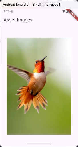
Displaying an Asset Image
To show an image in your app, use the Image.asset() widget. Think of it like placing a photo into a frame on your screen.
Here’s a simple example:
import 'package:flutter/material.dart';

void main() {
  runApp(MyApp());
}

class MyApp extends StatelessWidget {
  const MyApp({super.key});

  @override
  Widget build(BuildContext context) {
    return MaterialApp(
      title: 'Images',
      home: Scaffold(
        appBar: AppBar(title: Text('Asset Images')),
        body: Center(child: PhotoFrame()),
      ),
    );
  }
}

class PhotoFrame extends StatelessWidget {
  const PhotoFrame({super.key});

  @override
  Widget build(BuildContext context) {
    return Center(
      child: Column(
        mainAxisAlignment: MainAxisAlignment.center,
        children: [
          Image.asset('assets/images/image1.jpg'),
        ],
      ),
    );
  }
}
You can also customize how the image looks by adding a few properties:
Image.asset(
  'assets/images/image1.jpg',
  width: 200,
  height: 200,
  fit: BoxFit.cover,
)widthandheightset the size of the image.fitcontrols how the image fills the space.
For example,BoxFit.coverfills the box while keeping the image’s shape without stretching it.
This gives you full control over how your image appears in your app!
Understanding the fit Property
When you display an image in Flutter, the image might not match the size of the space you give it. The fit property tells Flutter how to resize the image to fit its container. It’s like deciding how a photo should sit in a frame—stretch it, crop it, or leave space around it?
The fit property uses values from the BoxFit enum. Let’s explore the most common ones:
BoxFit.fill
This stretches the image to completely fill the box—even if it means changing the shape.
Image.asset(
  'assets/images/image1.jpg',
  width: 200,
  height: 200,
  fit: BoxFit.fill,
)- Fills the box exactly
- May distort the image
BoxFit.contain
Fits the entire image inside the box without changing its shape. You might see extra space around the image.
Image.asset(
  'assets/images/image1.jpg',
  width: 200,
  height: 200,
  fit: BoxFit.contain,
)- Keeps image shape
- May leave empty space
BoxFit.cover
Fills the box while keeping the image’s shape, but it might crop parts of the image.
Image.asset(
  'assets/images/image1.jpg',
  width: 200,
  height: 200,
  fit: BoxFit.cover,
)- Perfect for backgrounds or profile images
- Some parts might be cut off
BoxFit.fitWidth
Scales the image to match the width of the box. The height adjusts to keep the shape.
Image.asset(
  'assets/images/image1.jpg',
  width: 200,
  fit: BoxFit.fitWidth,
)- Good for banners
- Might overflow vertically
BoxFit.fitHeight
Scales the image to match the height of the box. The width adjusts to keep the shape.
Image.asset(
  'assets/images/image1.jpg',
  height: 200,
  fit: BoxFit.fitHeight,
)- Great for tall layouts
- Might overflow horizontally
BoxFit.none
The image keeps its original size. If it’s larger than the box, parts may be hidden.
Image.asset(
  'assets/images/image1.jpg',
  width: 100,
  height: 100,
  fit: BoxFit.none,
)- No scaling
- Can cause cropping if the image is too big
BoxFit.scaleDown
Acts like contain, but only shrinks images if they’re too big. Smaller ones stay the same.
Image.asset(
  'assets/images/image1.jpg',
  width: 100,
  height: 100,
  fit: BoxFit.scaleDown,
)- Only shrinks large images
- Leaves small ones as-is
Each BoxFit option gives you control over how your image looks in its space. Try them out to see what fits your app best!
Choosing the Right fit
Not sure which fit to use? Here’s a quick guide to help you pick the right one:
- Use
coverwhen you want the image to fill the space completely, even if some parts get cropped. - Use
containwhen showing the whole image is more important than filling the space. - Use
fillwhen the image must stretch to match the box exactly—shape doesn’t matter. - Use
nonewhen you want the image to stay at its original size, no resizing at all.
Understanding the fit property gives you better control over how your images look. It’s a simple tool that can make your app feel polished and professional.
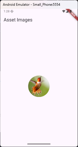
Real-World Example 1: Profile Picture Widget
Imagine you’re making a profile screen and need to show the user’s picture in a nice, round frame. Flutter makes this easy with the CircleAvatar widget.
import 'package:flutter/material.dart';

void main() {
  runApp(MyApp());
}

class MyApp extends StatelessWidget {
  const MyApp({super.key});

  @override
  Widget build(BuildContext context) {
    return MaterialApp(
      title: 'Images',
      home: Scaffold(
        appBar: AppBar(title: Text('Asset Images')),
        body: Center(child: PhotoFrame()),
      ),
    );
  }
}

class PhotoFrame extends StatelessWidget {
  const PhotoFrame({super.key});

  @override
  Widget build(BuildContext context) {
    return Center(
      child: Column(
        mainAxisAlignment: MainAxisAlignment.center,
        children: [
          CircleAvatar(
            radius: 50,
            backgroundImage: AssetImage('assets/images/image1.jpg'),
          ),
        ],
      ),
    );
  }
}
This gives your image a clean, circular frame—just like profile photos in most apps. It looks polished and works great for user accounts.
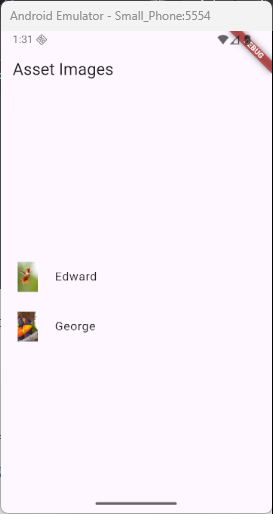
Real-World Example 2: Image in a ListTile
Let’s say you’re building a contact list or a settings screen where each item needs a picture and a name. The ListTile widget is perfect for this kind of layout.
import 'package:flutter/material.dart';

void main() {
  runApp(MyApp());
}

class MyApp extends StatelessWidget {
  const MyApp({super.key});

  @override
  Widget build(BuildContext context) {
    return MaterialApp(
      title: 'Images',
      home: Scaffold(
        appBar: AppBar(title: Text('Asset Images')),
        body: Center(child: PhotoFrame()),
      ),
    );
  }
}

class PhotoFrame extends StatelessWidget {
  const PhotoFrame({super.key});

  @override
  Widget build(BuildContext context) {
    return Center(
      child: Column(
        mainAxisAlignment: MainAxisAlignment.center,
        children: [
          ListTile(
            leading: Image.asset(
              'assets/images/image1.jpg',
              width: 40,
              height: 40,
            ),
            title: Text('Edward'),
          ),
          SizedBox(height: 10.0),
          ListTile(
            leading: Image.asset(
              'assets/images/image2.jpg',
              width: 40,
              height: 40,
            ),
            title: Text('George'),
          ),
        ],
      ),
    );
  }
}
This setup is great for showing a small image next to some text—just like in contact lists, settings menus, or chat apps. It keeps things tidy and easy to read.
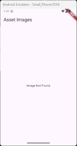
Handling Errors Gracefully
Sometimes, you might run into an issue where the image path is incorrect or you forget to add it in pubspec.yaml. No worries! You can use the errorBuilder to show a friendly message if something goes wrong, helping your app stay reliable.
Here’s how to do it:
import 'package:flutter/material.dart';

void main() {
  runApp(MyApp());
}

class MyApp extends StatelessWidget {
  const MyApp({super.key});

  @override
  Widget build(BuildContext context) {
    return MaterialApp(
      title: 'Images',
      home: Scaffold(
        appBar: AppBar(title: Text('Asset Images')),
        body: Center(child: PhotoFrame()),
      ),
    );
  }
}

class PhotoFrame extends StatelessWidget {
  const PhotoFrame({super.key});

  @override
  Widget build(BuildContext context) {
    return Center(
      child: Column(
        mainAxisAlignment: MainAxisAlignment.center,
        children: [
          Image.asset(
            'assets/images/missing.png',
            errorBuilder: (context, error, stackTrace) {
              return Text('Image Not Found');

              // Or use an icon instead of text
              // return Icon(size: 45, Icons.supervised_user_circle);
            },
          ),
        ],
      ),
    );
  }
}
With this approach, if the image is missing or fails to load, the app will display a clear error message (or an icon). It helps you handle issues gracefully and makes it easier to fix problems without crashing the app.
Tips and Best Practices
Here are a few smart habits to help you work more efficiently with asset images:
- Optimize image sizes: Keep images small to ensure your app runs fast.
- Organize images in folders: Group similar images in folders like
icons/,backgrounds/, orprofile_pics/to stay organized. - Use descriptive file names: Name your images clearly, such as
logo_dark.pngoravatar_bob.jpg, to make it easy to identify them later.
Staying organized will save you time and effort as your app grows!
Conclusion
Asset images are a simple but powerful way to enhance the look of your Flutter app. In this guide, you’ve learned how to:
- Add images to your project
- Display them using
Image.asset - Handle errors and customize image layout
- Create real-world examples like profile pictures and lists
Now it’s your turn to try adding images to your own app. Start small, experiment, and watch your app come to life with stunning visuals!