When building user interfaces in Flutter, sometimes we want our widgets to share space nicely. That’s where the Flexible widget comes in. It helps your widgets grow or shrink to fit the available space — but only if they need to. It gives layout freedom without forcing anything.
In this article, we’ll explore what the Flexible widget does, how its flex and fit properties work, and when you should use it.
What Is the Flexible Widget?
The Flexible widget wraps a child and tells it:
“You can take space if it’s available, but I won’t force you to fill it”.
This makes Flexible useful when a widget should only take more space when needed. It works inside layout widgets like Row, Column, or Flex.
When Should You Use Flexible?
Use Flexible when:
- You want a widget to use space only if necessary
- You don’t want to force a widget to expand
- You are building a layout using
Row,Column, orFlex
Think of it like sitting on a bench with a friend. You both sit comfortably. If your friend needs more room, you slide over a bit. That’s what Flexible does — it lets widgets adjust to fit.
Understanding the flex Property
The flex property controls how much space a Flexible widget can take compared to other Flexible widgets.
By default, flex is set to 1. If two Flexible widgets both have flex: 1, they will share the space equally. If one has flex: 2, it takes twice as much space as the other.
import 'package:flutter/material.dart';
void main() => runApp(const MyApp());
class MyApp extends StatelessWidget {
const MyApp({super.key});
@override
Widget build(BuildContext context) {
return MaterialApp(
title: 'Flexible Widget',
home: Scaffold(
appBar: AppBar(title: Text('Flexible Widget')),
body: Row(
children: [
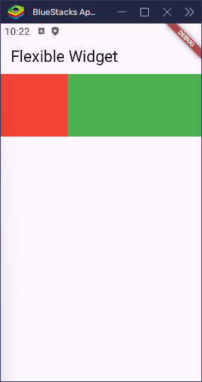
Flexible(flex: 1, child: Container(height: 100, color: Colors.red)),
Flexible(
flex: 2,
child: Container(height: 100, color: Colors.green),
),
],
),
),
);
}
}In this example, the red box takes 1 part, and the green box takes 2 parts of the total space. That means the green box will be twice as wide as the red one.
Understanding the fit Property
The fit property controls how the child behaves inside the Flexible space.
There are two values:
FlexFit.loose(default): The child can choose how big it wants to be.FlexFit.tight: The child must fill all the space it gets.
Let’s see how they behave with an example.
import 'package:flutter/material.dart';
void main() => runApp(const MyApp());
class MyApp extends StatelessWidget {
const MyApp({super.key});
@override
Widget build(BuildContext context) {
return MaterialApp(
title: 'Flexible Widget',
home: Scaffold(
appBar: AppBar(title: Text('Flexible Widget')),
body: Row(
children: [
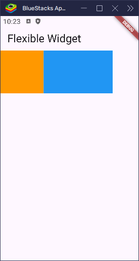
Flexible(
fit: FlexFit.loose, // child chooses size
child: Container(width: 100, height: 100, color: Colors.orange),
),
Flexible(
fit: FlexFit.tight, // child fills available space
child: Container(width: 100, height: 100, color: Colors.blue),
),
],
),
),
);
}
}In this example, the orange box keeps its 100-pixel width because FlexFit.loose allows it to choose its own size. The blue box expands to fill all remaining space because FlexFit.tight tells it to stretch and occupy every bit of available room.
Flexible vs Expanded
Here’s something important to know:
Expanded(child: someWidget)is exactly the same as:
Flexible(fit: FlexFit.tight, child: someWidget)So when you use Expanded, you’re really using a Flexible widget with a tight fit. Use Flexible when you want more control — for example, when one widget should fill space and another should keep its natural size.
Use Flexible if you want more control over how your child behaves.
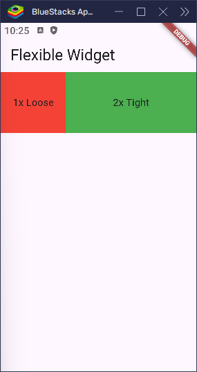
import 'package:flutter/material.dart';

void main() => runApp(const MyApp());

class MyApp extends StatelessWidget {
  const MyApp({super.key});

  @override
  Widget build(BuildContext context) {
    return MaterialApp(
      title: 'Flexible Widget',
      home: Scaffold(
        appBar: AppBar(title: Text('Flexible Widget')),
        body: Row(
          children: [
            Flexible(
              flex: 1,
              fit: FlexFit.loose,
              child: Container(
                height: 100,
                color: Colors.red,
                child: const Center(child: Text('1x Loose')),
              ),
            ),
            Flexible(
              flex: 2,
              fit: FlexFit.tight,
              child: Container(
                height: 100,
                color: Colors.green,
                child: const Center(child: Text('2x Tight')),
              ),
            ),
          ],
        ),
      ),
    );
  }
}
This layout shows two boxes:
- The red box has
flex: 1andloosefit, so it takes 1 part of the space but keeps its own width. - The green box has
flex: 2andtightfit, so it takes 2 parts and stretches to fill its area.
Conclusion
Flexibleis useful when you want a widget to adapt to available space without forcing it to expand.- The
flexvalue decides how space is shared between widgets. - The
fitvalue decides whether the child fills the space (tight) or chooses its own size (loose). Expandedis just a shortcut forFlexiblewithfit: FlexFit.tight.
Use Flexible when building responsive, adaptive layouts where you want to give widgets room to breathe — but only when they need it.