When building user interfaces in Flutter, spacing is super important. Just like a room feels better when furniture isn’t all crammed together, your app looks and works better when widgets have some breathing room. That’s where the SizedBox widget shines—it’s one of the simplest and most helpful tools for creating clean, well-spaced layouts.
In this article, we’ll explore how SizedBox works and how you can use it to make your UI look more organized and user-friendly.
What Is the SizedBox Widget?
A SizedBox is like an invisible box you can add to your layout. You can give it a specific height, width, or both. Think of it like placing a shoebox between two toys on a shelf to keep them from bumping into each other — it adds space without showing anything.
You can also wrap another widget inside a SizedBox to control how big that widget should be. It’s a simple way to manage size and spacing without extra decoration or complexity.
Basic Usage of SizedBox
There are two simple ways to use a SizedBox in your layout:
a) As a Spacer
You can use SizedBox by itself to create empty space between widgets. It’s like putting an invisible block in your layout.
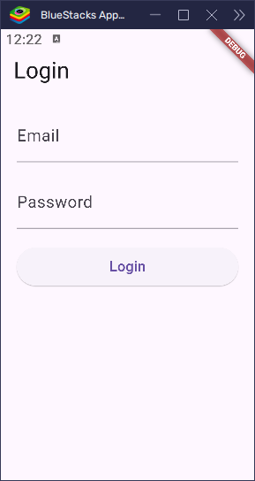
Example: Spacing Between Form Fields in a Login Screen
import 'package:flutter/material.dart';

void main() {
  runApp(const MyApp());
}

class MyApp extends StatelessWidget {
  const MyApp({super.key});

  @override
  Widget build(BuildContext context) {
    return MaterialApp(
      title: 'SizedBox Demo',
      home: const LoginPage(),
    );
  }
}

class LoginPage extends StatelessWidget {
  const LoginPage({super.key});

  @override
  Widget build(BuildContext context) {
    return Scaffold(
      appBar: AppBar(title: const Text('Login')),
      body: Padding(
        padding: const EdgeInsets.all(20),
        child: Column(
          crossAxisAlignment: CrossAxisAlignment.stretch,
          children: [
            const TextField(decoration: InputDecoration(labelText: 'Email')),
            const SizedBox(height: 16), // Space between fields
            const TextField(
              decoration: InputDecoration(labelText: 'Password'),
              obscureText: true,
            ),
            const SizedBox(height: 24), // Space before button
            SizedBox(
              height: 48,
              child: ElevatedButton(
                onPressed: () {},
                child: const Text('Login'),
              ),
            ),
          ],
        ),
      ),
    );
  }
}
In this example, SizedBox adds vertical space between the email and password fields, as well as between the password field and the login button. By setting height to 16 and 24, you can easily control the gaps in your layout, making it look cleaner and more organized.
If you want to push things apart sideways, simply use the width instead. For example:
SizedBox(width: 10)This will add 10 pixels of horizontal space, giving your widgets some breathing room and helping to arrange them more comfortably in the layout.
b) To Set Size for a Widget
You can also use SizedBox to control the size of a widget. Just wrap the widget inside a SizedBox and set the desired width and height.
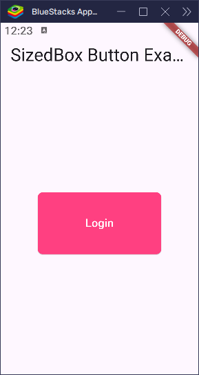
Example: Fixed-Size Button
import 'package:flutter/material.dart';

void main() {
  runApp(const MyApp());
}

class MyApp extends StatelessWidget {
  const MyApp({super.key});

  @override
  Widget build(BuildContext context) {
    return MaterialApp(
      title: 'SizedBox Button Example',
      theme: ThemeData(primarySwatch: Colors.blue),
      home: const HomePage(),
    );
  }
}

class HomePage extends StatelessWidget {
  const HomePage({super.key});

  @override
  Widget build(BuildContext context) {
    return Scaffold(
      appBar: AppBar(title: const Text('SizedBox Button Example')),
      body: Center(
        child: SizedBox(
          width: 200, // Set width to 200 pixels
          height: 100, // Set height to 100 pixels
          child: ElevatedButton(
            style: ButtonStyle(
              // Define the button style
              foregroundColor: WidgetStateProperty.all(
                Colors.white,
              ), // Text color
              backgroundColor: WidgetStateProperty.all(
                Colors.pinkAccent,
              ), // Button color
              shape: WidgetStateProperty.all(
                RoundedRectangleBorder(
                  borderRadius: BorderRadius.circular(8), // Rounded corners
                ),
              ),
            ),
            onPressed: () {
              // Add functionality when the button is clicked
              ScaffoldMessenger.of(
                context,
              ).showSnackBar(const SnackBar(content: Text('Button Pressed')));
            },
            child: const Text('Login'),
          ),
        ),
      ),
    );
  }
}
In this example, the button is made exactly 200 pixels wide and 100 pixels tall—no more, no less. This ensures that the button remains a consistent size across your app, making your layout more predictable and organized. It’s especially useful when you need uniformity in button sizes or any other widget, like in the SizedBox widget, which wraps the ElevatedButton and fixes its dimensions.
SizedBox vs Padding vs Spacer
It can be a bit tricky to differentiate between SizedBox, Padding, and Spacer. Here’s a simple way to think about each:
- SizedBox: Adds a fixed amount of space or sets a widget’s exact size. It’s like placing a block of wood on a shelf to create a specific gap.
- Padding: Adds space inside a widget, around its content. Think of it like putting soft padding inside a box to prevent items from touching the edges.
- Spacer: Fills available space flexibly. Imagine a spring that stretches to push elements apart as much as needed.
Use SizedBox when you need precise control over the amount of space or when you want to define a widget’s exact size.
Using SizedBox with No Child
When you don’t provide a child to the SizedBox, it simply acts as empty space in your layout:
Column(
  children: [
    Text('Above'),
    SizedBox(height: 30), // Adds 30 pixels of space
    Text('Below'),
  ],
)
In this example, SizedBox adds 30 pixels of vertical space between the two text widgets. It’s a straightforward and effective way to create spacing. You can use the width property in a similar way for horizontal spacing.
Using SizedBox with a Child
When you wrap a widget inside a SizedBox, you can control how big that widget appears:
SizedBox(
  width: 150,
  height: 150,
  child: Image.asset('assets/images/image.png'),
)
In this example, even if the image is larger than 150×150, it will be displayed inside a box with those exact dimensions. This is particularly useful when you want to ensure consistent sizes for widgets throughout your app.
Special Constructors
Flutter provides a few special ways to use SizedBox that make it even more versatile. Let’s explore these constructors:
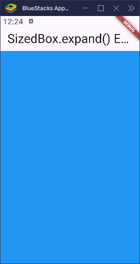
SizedBox.expand()
The SizedBox.expand() constructor makes the widget fill all available space in its parent. It’s like a liquid that spreads out and fills every corner of the container.
import 'package:flutter/material.dart';

void main() {
  runApp(const MyApp());
}

class MyApp extends StatelessWidget {
  const MyApp({super.key});

  @override
  Widget build(BuildContext context) {
    return MaterialApp(
      home: Scaffold(
        appBar: AppBar(title: const Text('SizedBox.expand() Example')),
        body: Center(
          child: SizedBox.expand(
            child: Container(color: Colors.blue), // Container fills all available space
          ),
        ),
      ),
    );
  }
}
In this example, the SizedBox.expand() makes the Container fill the entire available space inside the parent widget, just like water filling a container.
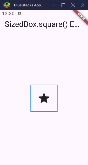
SizedBox.square()
The SizedBox.square() constructor creates a square-shaped box where both the height and width are equal. You can specify the size with the dimension property.
import 'package:flutter/material.dart';

void main() {
  runApp(const MyApp());
}

class MyApp extends StatelessWidget {
  const MyApp({super.key});

  @override
  Widget build(BuildContext context) {
    return MaterialApp(
      home: Scaffold(
        appBar: AppBar(title: const Text('SizedBox.square() Example')),
        body: Center(
          child: SizedBox.square(
            dimension: 100, // Box is 100x100
            child: Container(
              decoration: BoxDecoration(
                border: Border.all(
                  color: Colors.blue,
                  width: 2,
                ), // Add a blue border
              ),
              child: const Icon(
                Icons.star,
                size: 50,
              ), // Icon inside the square box
            ),
          ),
        ),
      ),
    );
  }
}
Here, SizedBox.square() creates a 100×100 square box, and the Icon is centered within that square. This is useful for creating uniform shapes like avatars or icons.
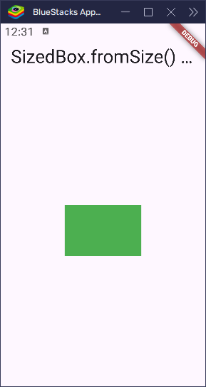
SizedBox.fromSize()
The SizedBox.fromSize() constructor allows you to create a SizedBox from an existing Size object, giving you more flexibility when working with dynamic sizes.
import 'package:flutter/material.dart';

void main() {
  runApp(const MyApp());
}

class MyApp extends StatelessWidget {
  const MyApp({super.key});

  @override
  Widget build(BuildContext context) {
    return MaterialApp(
      home: Scaffold(
        appBar: AppBar(title: const Text('SizedBox.fromSize() Example')),
        body: Center(
          child: SizedBox.fromSize(
            size: Size(120, 80), // Custom size
            child: Container(color: Colors.green), // Container with custom size
          ),
        ),
      ),
    );
  }
}
In this example, SizedBox.fromSize() creates a box with a custom size (120x80), and the Container is displayed inside it. This constructor is great when you already have a Size object and want to reuse it in a layout.
SizedBox.shrink()
The SizedBox.shrink() constructor creates a box that takes up no space at all. It’s like an invisible widget that doesn’t affect the layout—but it still keeps its place in the widget tree.
This is useful when you want to include a widget in your code but not show it on the screen. It lets you hide something without breaking the layout.
import 'package:flutter/material.dart';

void main() {
  runApp(const MyApp());
}

class MyApp extends StatelessWidget {
  const MyApp({super.key});

  @override
  Widget build(BuildContext context) {
    return MaterialApp(
      home: Scaffold(
        appBar: AppBar(title: const Text('SizedBox.shrink() Example')),
        body: Center(
          child: SizedBox.shrink(
            child: Container(
              color: Colors.red,
              width: 100,
              height: 100,
            ), // This container is inside, but SizedBox.shrink hides it
          ),
        ),
      ),
    );
  }
}
What’s Going On?
SizedBox.shrink()makes itself as small as possible—basically invisible.- Even though there’s a
Containerinside (which normally takes space), it won’t be shown because the parentSizedBox.shrink()gives it no room to grow. - This is handy if you want to hide a widget completely but still keep it in your widget tree—for example, when toggling visibility based on a condition.
Tip
If you want the child to still take up space sometimes, you can wrap the SizedBox.shrink() in an if statement or use a ternary like this:
isVisible ? myWidget : SizedBox.shrink()This lets you show or hide a widget without messing up your layout.
These special constructors give you flexibility in how you use SizedBox, whether you’re filling all available space, ensuring a square shape, or using a predefined size.
Best Practices
To make the most of SizedBox, here are some helpful tips:
- Use
SizedBoxfor Spacing: Instead of using an emptyContainer()to add space, useSizedBox(height: 10)orSizedBox(width: 10). It’s simpler and clearer when you just need to create space between widgets. - Great for
RowandColumn:SizedBoxworks perfectly inRowandColumnwidgets to create neat, consistent gaps between elements. It’s an easy way to maintain a clean and organized layout. - Don’t Overuse It: While
SizedBoxis handy, too many of them can clutter your layout. Instead, consider usingSpacer()for flexible gaps orPaddingfor internal spacing. This keeps your layout more flexible and less rigid.
By following these simple guidelines, you can use SizedBox effectively to keep your UI clean and easy to manage.
Conclusion
The SizedBox widget may seem simple, but it’s a powerful tool for managing space and sizes in your Flutter layouts. Whether you’re adding space between widgets or setting precise sizes, SizedBox helps keep your UI neat and organized.
By mastering SizedBox, you can easily improve the structure of your app, making it more visually appealing and user-friendly. Start experimenting with SizedBox in your projects, and you’ll quickly see how it helps give your app some breathing room, leading to a cleaner and more polished design.