
Flutter is a tool made by Google that helps you create apps for phones, websites, and computers—all from one set of code. Instead of writing separate code for each type of device, Flutter lets you do it all in one place.
The secret to Flutter is widgets. They are like building blocks for your app. Everything you see in a Flutter app, like buttons, text, and images, is a widget.
In this article, we’ll explore basic widgets, create simple layouts, understand two types of widgets (stateful and stateless), and learn how to handle user input like typing and button clicks. We’ll also look at common layout widgets and some smart tips for making your apps work smoothly.
By the end, you’ll have a solid understanding of Flutter widgets and be ready to build your own apps.
Understanding Widgets in Flutter
What Are Widgets?
Widgets are the building blocks of a Flutter app. Everything you see on the screen — like text, buttons, and images — is a widget. Even bigger parts of an app, like a menu or a whole page, are made up of smaller widgets working together.
Why Are Widgets Important?
Widgets help Flutter create apps quickly and efficiently. They are lightweight, meaning they don’t take up much space or slow things down. Flutter organizes widgets in a tree-like structure, called the widget tree. This tree helps Flutter understand how to display everything on the screen.
By combining different widgets, you can build cool and interactive apps with just a little bit of code.
Basic Widgets in Flutter
Flutter gives you many ready-to-use widgets to help build your app. Here are some of the most common ones.
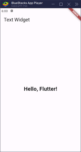
Text Widget
The Text widget is used to show words (or display text) on the screen.
import 'package:flutter/material.dart';

void main() => runApp(const MyApp());

class MyApp extends StatelessWidget {

  const MyApp({super.key});

  @override
  Widget build(BuildContext context) {

    return MaterialApp(

      home: Scaffold(
        appBar: AppBar(title: const Text('Text Widget')),
        body: const Center(
          child: Text(
              'Hello, Flutter!',
              style: TextStyle(fontSize: 24, fontWeight: FontWeight.bold)
          ),
        ),
      ),

    );

  }
}
This will display “Hello, Flutter!” in bold with a font size of 24. It is commonly used to show labels, messages, or any other text in an app.
Container Widget
The Container widget helps with layout and styling. It can add space around a widget, change colors, and more.
import 'package:flutter/material.dart';

void main() => runApp(const MyApp());

class MyApp extends StatelessWidget {

  const MyApp({super.key});

  @override
  Widget build(BuildContext context) {

    return MaterialApp(

      home: Scaffold(
        appBar: AppBar(title: const Text('Container Widget')),
        body: Center(
          child: Container(
            padding: const EdgeInsets.all(16),
            margin: const EdgeInsets.all(16),
            color: Colors.blue,
            child: const Text('Hello, Flutter!', style: TextStyle(color: Colors.white)),
          ),
        ),
      ),

    );

  }
}
In this example, the Container has:
- Padding (space inside) of 16 pixels
- Margin (space outside) of 16 pixels
- A blue background
- A text widget that says “Hello, Flutter!” in white
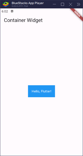
Container is great for making your UI look organized and colorful.
Row and Column Widgets
The Row and Column widgets help arrange other widgets in a straight line.
Rowplaces widgets side by side (horizontally).Columnplaces widgets one below the other (vertically).
Here’s an example of a Column:
import 'package:flutter/material.dart';

void main() => runApp(const MyApp());

class MyApp extends StatelessWidget {

  const MyApp({super.key});

  @override
  Widget build(BuildContext context) {

    return MaterialApp(

      home: Scaffold(
        appBar: AppBar(title: const Text('Column Widget')),
        body: const Center(
          child: Column(
            children: [
              Text('Item 1'),
              Text('Item 2'),
              Text('Item 3'),
            ],
          ),
        ),
      ),

    );

  }
}
This stacks the three Text widgets on top of each other.
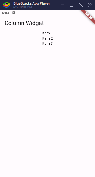
A Row works the same way but arranges items left to right instead of top to bottom. These widgets help organize your app’s layout.
Code Examples for Basic Widgets
Here’s a simple example showing some basic widgets in Flutter:
import 'package:flutter/material.dart';

void main() => runApp(const MyApp());

class MyApp extends StatelessWidget {

  const MyApp({super.key});

  @override
  Widget build(BuildContext context) {

    return MaterialApp(

      home: Scaffold(
        appBar: AppBar(title: const Text('Basic Widgets')),
        body: Center(
          child: Column(
            mainAxisAlignment: MainAxisAlignment.center,
            children: [
              const Text('Hello, Flutter!', style: TextStyle(fontSize: 24, fontWeight: FontWeight.bold)),
              Container(
                padding: const EdgeInsets.all(16),
                margin: const EdgeInsets.all(16),
                color: Colors.blue,
                child: const Text(
                    'Hello, Flutter!',
                    style: TextStyle(color: Colors.white)
                ),
              ),
            ],
          ),
        ),
      ),

    );

  }
}
Here’s a simple Flutter app with some basic widgets. Here’s what each part does:
mainfunction: This is the starting point of the app. It tells Flutter to run the app withMyApp.MyAppclass: This is a special widget that tells the app what to show. It gives the app a basic design usingMaterialApp.Scaffoldwidget: It sets up the basic look of the app. It includes a top bar (calledAppBar) with the title “Basic Widgets” and a main section where the content goes.Centerwidget: This centers everything inside it, so the content will be in the middle of the screen.Columnwidget: This arranges things vertically, one below the other. In this case, it arranges the text and the container.Textwidget: It shows the words “Hello, Flutter!” in bold and big size.Containerwidget: It adds some space around the text, a blue background, and some padding to make everything look neat.
![Flutter Widgets [Basic Widgets]](https://coderscratchpad.com/wp-content/uploads/2025/03/Flutter-Widgets-101-Image-4.png)
This app shows how to put things together to make your app look nice and organized.
Building a Simple Layout
Combining Widgets to Create a Layout
You can combine different widgets to create more complex layouts. Think of it like stacking blocks on top of each other. By placing widgets inside each other, you build something bigger, called a “widget tree.” This tree is what Flutter uses to create and display your app’s user interface.
For example, you can put a Text widget inside a Container widget, or a Column inside a Row. Each widget can hold other widgets, and together they form your app’s design.
Code Example: Simple Layout with Basic Widgets
Here’s an example of a simple layout using basic widgets:
import 'package:flutter/material.dart';

void main() => runApp(const MyApp());

class MyApp extends StatelessWidget {

  const MyApp({super.key});

  @override
  Widget build(BuildContext context) {

    return MaterialApp(
      home: Scaffold(
        appBar: AppBar(title: const Text('Simple Layout')),
        body: Center(
          child: Column(
            mainAxisAlignment: MainAxisAlignment.center,
            children: [

              const Text(
                  'Hello, Flutter!',
                  style: TextStyle(fontSize: 24, fontWeight: FontWeight.bold)
              ),

              Container(
                padding: const EdgeInsets.all(16),
                margin: const EdgeInsets.all(16),
                color: Colors.blue,
                child: const Text(
                    'Hello, Flutter!',
                    style: TextStyle(color: Colors.white)),
              ),

              const Row(
                mainAxisAlignment: MainAxisAlignment.center,
                children: [
                  Icon(Icons.star, color: Colors.yellow),
                  Icon(Icons.star, color: Colors.yellow),
                  Icon(Icons.star, color: Colors.yellow),
                ],
              ),

            ],
          ),
        ),
      ),
    );

  }

}
In this example, the Row widget arranges its children (the star icons) in a horizontal line. Each Icon widget shows a star icon in yellow.
The Column widget is used to arrange its children (the Text and Container widgets) in a vertical line. By combining the Row and Column widgets, we create a layout that has both horizontal and vertical arrangements, making the design more complex and flexible.
In simpler terms:
- The
Columnstacks things on top of each other. - The
Rowlines things up next to each other.
![Flutter Widgets [Simple Layout]](https://coderscratchpad.com/wp-content/uploads/2025/03/Flutter-Widgets-101-Image-5.png)
This is how you can build more interesting and organized layouts in Flutter.
Stateful and Stateless Widgets
Understanding Stateless Widgets
Stateless widgets are like simple objects that don’t change once they’re created. They are used when the content is fixed and doesn’t change over time.
For example, here’s a basic stateless widget:
import 'package:flutter/material.dart';

void main() => runApp(const MyApp());

class MyApp extends StatelessWidget {

  const MyApp({super.key});

  @override
  Widget build(BuildContext context) {

    return MaterialApp(

      home: Scaffold(
        appBar: AppBar(title: const Text('Stateless Widget')),
        body: const Center(
          child: MyStatelessWidget(),
          ),
        ),

    );

  }

}

class MyStatelessWidget extends StatelessWidget {

  const MyStatelessWidget({super.key});

  @override
  Widget build(BuildContext context) {
    return const Text('I am a stateless widget');
  }

}
In this example, MyStatelessWidget is a stateless widget that simply displays some text: “I am a stateless widget.” Since it doesn’t need to remember anything or change based on user actions, it’s perfect for static things like labels or simple instructions on the screen.
To sum up:
- Stateless widgets don’t change their appearance after being created.
- They’re useful for things like text labels, icons, or other fixed content that doesn’t update.
![Flutter Widgets [Stateless]](https://coderscratchpad.com/wp-content/uploads/2025/03/Flutter-Widgets-101-Image-6.png)
Understanding Stateful Widgets
Stateful widgets are used when the content of the widget needs to change over time. These widgets can hold “state” (information) that can change based on actions like button presses or user input. This makes them perfect for dynamic content that updates.
Here’s an example of a simple stateful widget:
import 'package:flutter/material.dart';

void main() => runApp(const MyApp());

class MyApp extends StatelessWidget {

  const MyApp({super.key});

  @override
  Widget build(BuildContext context) {

    return MaterialApp(

      home: Scaffold(
        appBar: AppBar(title: const Text('Stateful Widget')),
        body: const Center(
          child: MyStatefulWidget(),
          ),
        ),

    );

  }

}

class MyStatefulWidget extends StatefulWidget {

  const MyStatefulWidget({super.key});

  @override
  MyStatefulWidgetState createState() => MyStatefulWidgetState();

}

class MyStatefulWidgetState extends State<MyStatefulWidget> {

  int _counter = 0;

  void _incrementCounter() {

    setState(() {
      _counter++;
    });

  }

  @override
  Widget build(BuildContext context) {

    return Column(

      children: [
        Text('Counter: $_counter'),
        ElevatedButton(
          onPressed: _incrementCounter,
          child: const Text('Increment'),
        ),
      ],

    );

  }
}
MyStatefulWidget is a special widget that can remember things, like a counter. It has two parts: the main widget (MyStatefulWidget) and its state (MyStatefulWidgetState).
![Flutter Widgets [Stateful]](https://coderscratchpad.com/wp-content/uploads/2025/03/Flutter-Widgets-101-Image-1.gif)
The counter starts at 0, and when you press the button, it adds 1 to the counter. The widget updates and shows the new number. This happens because the widget has a memory of its own, which allows it to change when you interact with it. The ElevatedButton is what you press to make the counter go up.
Code Examples for Stateful and Stateless Widgets
Here’s an example combining both stateful and stateless widgets:
import 'package:flutter/material.dart';

void main() => runApp(const MyApp());

class MyApp extends StatelessWidget {

  const MyApp({super.key});

  @override
  Widget build(BuildContext context) {

    return MaterialApp(
      home: Scaffold(
        appBar: AppBar(title: const Text('Stateful and Stateless Widgets')),
        body: const Center(
          child: MyStatefulWidget(),
        ),
      ),
    );
  }
}

class MyStatefulWidget extends StatefulWidget {

  const MyStatefulWidget({super.key});

  @override
  MyStatefulWidgetState createState() => MyStatefulWidgetState();

}

class MyStatefulWidgetState extends State<MyStatefulWidget> {
  int _counter = 0;

  void _incrementCounter() {

    setState(() {
      _counter++;
    });

  }

  @override
  Widget build(BuildContext context) {

    return Column(
      mainAxisAlignment: MainAxisAlignment.center,
      children: [
        Text('Counter: $_counter'),
        ElevatedButton(
          onPressed: _incrementCounter,
          child: const Text('Increment'),
        ),
      ],
    );

  }
}
This example shows how stateful and stateless widgets can work together in a Flutter app. Here’s a simple explanation:
- The
MyAppwidget is stateless, which means it doesn’t change. It just provides the layout, including the app bar and theMyStatefulWidget. - The
MyStatefulWidgetis stateful, meaning it can change over time. In this case, it manages a counter, starting at 0. - When you press the button, the
_incrementCountermethod updates the counter, and the UI is refreshed usingsetState().
![Flutter Widgets [Stateless & Stateful]](https://coderscratchpad.com/wp-content/uploads/2025/03/Flutter-Widgets-101-Image-2.gif)
In short, the stateless widget creates the structure of the app, while the stateful widget handles dynamic changes, like updating the counter.
Handling User Input
Using TextField Widget
The TextField widget is used when you want to get text input from the user. For example, you might want to let users type their name, email, or a message.
import 'package:flutter/material.dart';

void main() => runApp(const MyApp());

class MyApp extends StatelessWidget {

  const MyApp({super.key});

  @override
  Widget build(BuildContext context) {

    return MaterialApp(

      home: Scaffold(
        appBar: AppBar(title: const Text('Input Widget')),
        body: const Padding(
          padding: EdgeInsets.all(12.0),
          child: Center(
            child: TextField(
              decoration: InputDecoration(
                border: OutlineInputBorder(),
                labelText: 'Enter your name',
              ),
            ),
          ),
        ),
      ),
    );

  }
}
What It Does:
- Text Field: It’s the box where users can type.
- Decoration: This makes the text field look nicer. It can have things like:
- A border around it (so it looks like a box).
- A label inside, like ‘Enter your name’, to guide the user.
![Flutter Widgets [Input]](https://coderscratchpad.com/wp-content/uploads/2025/03/Flutter-Widgets-101-Image-3.gif)
This widget is a simple way to collect text from the user in your app.
Handling Button Presses with ElevatedButton
The ElevatedButton widget is used to create a button that can be pressed by the user. When pressed, the button can perform an action, such as showing a message or changing something on the screen.
Here’s a simple example:
import 'package:flutter/material.dart';

void main() => runApp(const MyApp());

class MyApp extends StatelessWidget {

  const MyApp({super.key});

  @override
  Widget build(BuildContext context) {

    return MaterialApp(

      home: Scaffold(
        appBar: AppBar(title: const Text('Button Widget')),
        body: Center(
          child: ElevatedButton(
            onPressed: () {
              print('Button pressed');
            },
            child: const Text('Press Me'),
          ),
        ),
      ),
    );

  }
}
What’s happening here?
- ElevatedButton: This is the button itself. When you press the button, something happens!
- onPressed: This part is like telling the button, “Hey, when you are pressed, do this!” In this example, it prints the message “Button pressed” to the console.
- child: This is the label inside the button. It shows the word “Press Me” on the button, telling the user what to do.
So, when you press the button, it will show a message in the console saying, “Button pressed”. You can change the code inside the onPressed function to do other things, like change the text, show a new screen, or even play a sound!
![Flutter Widgets [Button]](https://coderscratchpad.com/wp-content/uploads/2025/03/Flutter-Widgets-101-Image-4.gif)
This button is useful when you want the user to do something, like clicking a button to submit a form or get more information.
Code Examples for Handling User Input
Here’s an example that shows how to handle user input with a TextField and a button press using an ElevatedButton. This is useful when you want to take input from the user, like asking for their name, and let them press a button to do something.
import 'package:flutter/material.dart';

void main() => runApp(const MyApp());

class MyApp extends StatelessWidget {

  const MyApp({super.key});

  @override
  Widget build(BuildContext context) {

    return MaterialApp(

      home: Scaffold(
        appBar: AppBar(title: const Text('Handling User Input')),
        body: const Padding(
          padding: EdgeInsets.all(16.0),
          child: InputForm(),
        ),
      ),

    );

  }
}

class InputForm extends StatefulWidget {

  const InputForm({super.key});

  @override
  InputFormState createState() => InputFormState();

}

class InputFormState extends State<InputForm> {

  // Variable to store the entered text
  String _userInput = '';

  // Controller to get the text from the TextField
  final TextEditingController _controller = TextEditingController();

  void _updateText() {

    setState(() {
      _userInput = _controller.text; // Store the text entered in TextField
    });

  }

  @override
  Widget build(BuildContext context) {

    return Column(

      children: [

        // TextField to capture user input
        TextField(
          controller: _controller, // Attach controller to capture text
          decoration: const InputDecoration(
            border: OutlineInputBorder(),
            labelText: 'Enter your name',
          ),
        ),

        const SizedBox(height: 20),

        // Button to trigger action
        ElevatedButton(
          onPressed: _updateText, // Update text when button is pressed
          child: const Text('Press Me'),
        ),

        const SizedBox(height: 20),

        // Display the entered text below the button
        Text(
          _userInput.isEmpty ? 'Please enter text' : 'Hello, $_userInput!',
          style: const TextStyle(fontSize: 20, fontWeight: FontWeight.bold),
        ),

      ],

    );

  }

}
What’s Happening Here?
- TextField: This is where the user can type in their name or any other text. The text field has a label that says “Enter your name”, so the user knows what to type. It also has a border around it, making it easy to see and interact with.
- SizedBox: This widget adds space between the different parts of the layout. In this example, it separates the
TextFieldfrom the button and also adds space between the button and the text displayed below it. This makes everything look neat and clean! - ElevatedButton: This button can be pressed by the user. When the button is pressed, the app gets the text from the
TextFieldand updates the text below the button. If the user has typed something in theTextField, it will show a message like “Hello, [name]!”, using the name they typed. If theTextFieldis empty, it shows “Please enter text”.
![Flutter Widget [Input Handling]](https://coderscratchpad.com/wp-content/uploads/2025/03/Flutter-Widgets-101-Image-5.gif)
This example shows how to take input from the user, and when the user presses a button, you can update the screen to display the entered text. It’s great for creating forms or interactive areas in your app where users provide information.
Common Layout Widgets
Flutter has many layout widgets that help you organize and arrange the UI elements in your app. Here are a few common ones:
ListView
The ListView widget in Flutter is perfect for creating a scrollable list of items. You can add different types of widgets inside the ListView to create an interactive list. It’s especially useful when you have a lot of items, and you want the user to be able to scroll through them.
Here’s an example of using ListView to display a list of items:
import 'package:flutter/material.dart';

void main() => runApp(const MyApp());

class MyApp extends StatelessWidget {

  const MyApp({super.key});

  @override
  Widget build(BuildContext context) {

    return MaterialApp(

      home: Scaffold(
        appBar: AppBar(title: const Text('ListView Widget')),
        body: Center(
          child: ListView(
            children: const [
              ListTile(
                leading: Icon(Icons.map),
                title: Text('Map'),
              ),
              ListTile(
                leading: Icon(Icons.photo_album),
                title: Text('Album'),
              ),
              ListTile(
                leading: Icon(Icons.phone),
                title: Text('Phone'),
              ),
            ],
          ),
        ),
      ),

    );

  }
}
What’s Happening Here?
- ListView: This is the parent widget that makes the list scrollable. It contains multiple items that will be displayed one after the other.
- ListTile: Each
ListTilerepresents a single item in the list. It contains two main parts:
- leading: This shows an icon next to the item. In this example, we use icons like
Icons.map,Icons.photo_album, andIcons.phone. - title: This is the text displayed next to the icon, representing the item (e.g., ‘Map’, ‘Album’, ‘Phone’).
![Flutter Widgets [ListView]](https://coderscratchpad.com/wp-content/uploads/2025/03/Flutter-Widgets-101-Image-7.png)
The ListView widget automatically makes the list scrollable, so if you have too many items to fit on the screen, the user can simply scroll through them. This makes it a very useful widget for displaying lists of data, such as contacts, photos, or any other kind of information.
GridView
The GridView widget in Flutter is used to create a scrollable grid of items, which is great when you want to display multiple items in a structured, grid-like layout. It’s especially useful for things like photo galleries, product listings, or anything that requires multiple items to be arranged in rows and columns.
Here’s an example of using GridView to display a grid with two columns and four items:
import 'package:flutter/material.dart';

void main() => runApp(const MyApp());

class MyApp extends StatelessWidget {

  const MyApp({super.key});

  @override
  Widget build(BuildContext context) {

    return MaterialApp(

      home: Scaffold(
        appBar: AppBar(title: const Text('GridView Widget')),
        body: Center(
          child: GridView.count(
            crossAxisCount: 2,
            children: List.generate(4, (index) {
              return Center(
                child: Text(
                  'Item $index',
                  style: Theme.of(context).textTheme.headlineSmall,
                ),
              );
            }),
          )
        ),
      ),

    );

  }
}
What’s Happening Here?
- GridView.count: This widget creates a grid with a specific number of columns. In this case,
crossAxisCount: 2means there will be two columns in the grid. - List.generate: This method creates a list of 4 items, each represented by a
Textwidget. The text is generated dynamically using theindexparameter, which gives each item a unique label like ‘Item 0’, ‘Item 1’, etc. - Center: The
Centerwidget is used to center theTextwidgets within each grid cell.
The result is a grid that displays four items, two in each row. The GridView automatically makes the grid scrollable, so users can swipe to see more items if there are more than what fits on the screen.
![Flutter Widgets [GridView]](https://coderscratchpad.com/wp-content/uploads/2025/03/Flutter-Widgets-101-Image-8.png)
This is an excellent way to present data in a structured grid format!
Stack
The Stack widget in Flutter is used to place widgets on top of each other, allowing for overlapping elements. This is perfect for creating designs where elements need to be layered, like cards with icons on top, or creating custom layouts where positioning matters.
Here’s an example that shows how to use Stack to overlay a red container on top of a blue one:
import 'package:flutter/material.dart';

void main() => runApp(const MyApp());

class MyApp extends StatelessWidget {

  const MyApp({super.key});

  @override
  Widget build(BuildContext context) {

    return MaterialApp(

      home: Scaffold(
        appBar: AppBar(title: const Text('GridView Widget')),
        body: Center(
          child: Stack(
            children: [
              Container(color: Colors.blue, width: 100, height: 100),
              Positioned(
                top: 10,
                left: 10,
                child: Container(color: Colors.red, width: 50, height: 50),
              ),
            ],
          ),
        ),
      ),

    );

  }
}
What’s Happening Here?
- Stack: The
Stackwidget allows us to layer its child widgets on top of each other. The first child (a blue container) will appear at the bottom, and the second child (a red container) will be placed on top of it. - Container (blue): The first container is blue, and it’s 100×100 pixels in size. This acts as the background layer.
- Positioned: The
Positionedwidget allows us to control the position of the red container relative to the stack’s boundary. In this case, it’s placed 10 pixels from the top and 10 pixels from the left of the stack. - Container (red): The red container is smaller (50×50 pixels) and is positioned over the blue container using the
Positionedwidget.
The result is a red container sitting inside the blue one, with some space between them. The Stack widget makes it easy to create complex layouts by simply layering widgets in a specific order and using Positioned to control where each widget goes.
![Flutter Widgets [Stack]](https://coderscratchpad.com/wp-content/uploads/2025/03/Flutter-Widgets-101-Image-9.png)
Best Practices for Working with Widgets
When developing in Flutter, widgets are the building blocks of your application. To ensure that your app is efficient, maintainable, and user-friendly, it’s important to follow some best practices while working with widgets. Below are some key best practices to keep in mind:
Reusing Widgets
Reusing widgets in Flutter is a great way to keep your code clean, organized, and maintainable. When you create reusable components, you avoid repeating the same code multiple times, which makes your app easier to update and maintain.
Here’s an example of how you can create and reuse a simple widget:
class MyReusableWidget extends StatelessWidget {

  final String text;

  const MyReusableWidget(this.text, {super.key});

  @override
  Widget build(BuildContext context) {
    return Text(text, style: const TextStyle(fontSize: 18));
  }

}
In this example:
MyReusableWidgetis a reusable stateless widget that takes aStringas input (via the constructor) and displays it in aTextwidget.- By passing different strings to
MyReusableWidget, you can reuse this widget throughout your app, ensuring consistency and reducing the need to duplicate code.
Why Reuse Widgets?
- Code Cleanliness: It reduces clutter and duplication, making your codebase cleaner and easier to navigate.
- Maintainability: If you need to change something about the way your widgets look or behave, you only need to do it in one place.
- Consistency: Reusing widgets ensures a consistent look and feel throughout the app, as all instances of the widget will have the same behavior and appearance.
Example of Reusing the Widget:
Here’s an example of reusing the widget:
import 'package:flutter/material.dart';

void main() => runApp(const MyApp());

class MyApp extends StatelessWidget {

  const MyApp({super.key});

  @override
  Widget build(BuildContext context) {
    return MaterialApp(
      home: Scaffold(
        appBar: AppBar(title: const Text('Reusable Widget Example')),
        body: const Center(
          child: Column(
            children: [
              MyReusableWidget('Hello, World!'),
              MyReusableWidget('Welcome to Flutter!'),
              MyReusableWidget('Enjoy building apps!'),
            ],
          ),
        ),
      ),
    );
  }
}
In this case, we use MyReusableWidget three times, each time with a different string, to display different messages on the screen. This is much cleaner than writing separate Text widgets for each message.
By reusing widgets in your Flutter app, you’ll improve both the performance and the maintainability of your code.
Keeping Widgets Simple
When working with Flutter, it’s important to keep your widgets simple and focused on a single responsibility. This practice makes your code more readable, maintainable, and easier to debug. By ensuring each widget does one thing well, you also make it reusable in different parts of your app.
Why Keep Widgets Simple?
- Readability: Simple widgets are easier to understand. If someone new looks at your code, they can quickly figure out what a widget does.
- Maintainability: When a widget has a single responsibility, it’s easier to modify or fix it without affecting other parts of the app.
- Reusability: Simple widgets can be reused in different places, making your code more efficient and consistent.
- Debugging: Small, focused widgets are easier to test and debug. If something goes wrong, you can narrow down the issue faster.
Example of a Simple Widget
class WelcomeMessage extends StatelessWidget {

  final String message;

  const WelcomeMessage(this.message, {super.key});

  @override
  Widget build(BuildContext context) {

    return Text(
      message,
      style: const TextStyle(fontSize: 20, fontWeight: FontWeight.bold),
    );

  }

}
In this example:
WelcomeMessageis a simple widget that takes amessageas input and displays it in aTextwidget.- This widget has a single responsibility: displaying a message with some styling.
Example of Using Simple Widgets
Here’s an example of how you can use simple widgets effectively in your Flutter app. In this example, we’ll create a WelcomeMessage widget and use it multiple times in the app’s body.
import 'package:flutter/material.dart';

void main() => runApp(const MyApp());

class MyApp extends StatelessWidget {

  const MyApp({super.key});

  @override
  Widget build(BuildContext context) {

    return MaterialApp(
      home: Scaffold(
        appBar: AppBar(title: const Text('Simple Widgets Example')),
        body: const Center(
          child: Column(
            children: [
              WelcomeMessage('Hello, User!'),
              WelcomeMessage('Welcome to the Flutter world!'),
              WelcomeMessage('Enjoy coding and have fun!'),
            ],
          ),
        ),
      ),
    );

  }
}

class WelcomeMessage extends StatelessWidget {

  final String message;

  const WelcomeMessage(this.message, {super.key});

  @override
  Widget build(BuildContext context) {

    return Text(
      message,
      style: const TextStyle(fontSize: 20, fontWeight: FontWeight.bold),
    );

  }

}
What’s Happening Here?
WelcomeMessageWidget: This widget takes a string (message) and displays it as bold text with a font size of 20. It’s focused on a single task: displaying a message. This is a simple and reusable widget.- Using
WelcomeMessage: In theMyAppwidget, we useWelcomeMessagemultiple times, passing different messages each time. This shows how a simple widget can be reused throughout your app.
![Flutter Widget [Simple Widget]](https://coderscratchpad.com/wp-content/uploads/2025/03/Flutter-Widgets-101-Image-10.png)
By keeping the WelcomeMessage widget simple, we can easily use it wherever we need to display a message, without worrying about adding extra logic or complexity. This approach makes the code more readable and maintainable.
What Makes a Widget Simple?
- Single Responsibility: A widget should do only one thing. For example, a
Textwidget should just display text, not also handle logic or other tasks. - Small Size: If a widget becomes too large, consider breaking it down into smaller widgets. Each small widget should be easy to understand on its own.
- Clear Naming: Name your widgets clearly, so it’s obvious what they do. For example,
WelcomeMessagetells you that it’s about displaying a welcome message.
By focusing on simplicity and a single responsibility, you will create a more organized, efficient, and maintainable Flutter app.
Avoiding Overly Nested Widgets
To make your code more readable and maintainable, it’s a good idea to avoid deeply nested widgets. When you find yourself nesting widgets too much, consider breaking down the layout into smaller, reusable methods or custom widgets.
Here’s an example:
import 'package:flutter/material.dart';

void main() => runApp(const MyApp());

class MyApp extends StatelessWidget {

  const MyApp({super.key});

  @override
  Widget build(BuildContext context) {

    return MaterialApp(
      home: Scaffold(
        appBar: AppBar(title: const Text('Complex Widget Example')),
        body: const MyComplexWidget(),
        ),
    );

  }

}

class MyComplexWidget extends StatelessWidget {

  const MyComplexWidget({super.key});

  @override
  Widget build(BuildContext context) {

    return Column(
      children: [
        buildHeader(),
        buildContent(),
        buildFooter(),
      ],
    );

  }

  Widget buildHeader() {
    return const Text('Header');
  }

  Widget buildContent() {
    return const Text('Content');
  }

  Widget buildFooter() {
    return const Text('Footer');
  }

}
What’s Happening Here?
- Breaking Down the Layout: Instead of building everything directly in the
buildmethod ofMyComplexWidget, we create separate helper methods (buildHeader,buildContent, andbuildFooter) to build different parts of the layout. - Simplicity: Each method is focused on a single task (displaying a text widget), making the code cleaner and easier to follow.
- Maintainability: If you need to change the header, content, or footer, you can easily do so by editing just one method. This approach keeps the widget simple and modular, improving code maintainability.
![Flutter Widgets [Complex Widget]](https://coderscratchpad.com/wp-content/uploads/2025/03/Flutter-Widgets-101-Image-11.png)
By avoiding overly nested widgets and breaking the layout into smaller parts, you make your code more organized and easier to manage.
Conclusion
In this article, we explored the fundamentals of Flutter widgets. We began by understanding the role of widgets in building apps. From there, we covered basic widgets, creating simple layouts, working with stateful and stateless widgets, handling user input, and using common layout widgets.
Additionally, we discussed best practices for working with widgets, such as reusing them, keeping them simple, and avoiding overly nested widgets. These practices help ensure your code remains clean, maintainable, and efficient.
The concepts and examples shared here provide a solid starting point for working with Flutter widgets. The possibilities, however, are endless. I encourage you to experiment further—try mixing and matching different widgets, exploring more advanced features, and customizing your UI. Don’t hesitate to dive into state management techniques and user input handling to make your applications stand out and be more interactive.
Additional Resources
To continue your journey with Flutter, here are some additional resources that will help you expand your knowledge and skills:
- Flutter YouTube Channel: The official Flutter YouTube channel offers a variety of tutorials, talks, and event videos. It’s a great place to stay updated on new features and best practices. Flutter YouTube Channel
- Flutter Community: Join the Flutter community on platforms like Reddit, Stack Overflow, and the Flutter Dev Discord to ask questions, share knowledge, and learn from other developers. Flutter Community
- Flutter by Example: A site dedicated to learning Flutter through practical, hands-on examples. Flutter by Example
- Udemy Courses: Many Udemy courses provide in-depth Flutter tutorials, ranging from beginner to advanced topics. Flutter Courses on Udemy
By using these resources, you can dive deeper into Flutter, explore new techniques, and keep growing as a Flutter developer.
![C++ Operator Overloading: The Array New Operator (new[])](https://coderscratchpad.com/wp-content/uploads/2024/05/Wordpress-blog-1200-x-600-px-8-2-1024x512.webp)