User interfaces play a pivotal role in modern software development, and creating intuitive ways for users to interact with data is crucial. JavaFX, a popular framework for building rich graphical user interfaces in Java applications, empowers developers to craft sophisticated UIs with ease. As applications evolve, the need for more advanced and user-friendly input components arises. This is where the ControlsFX library steps in, offering a plethora of custom controls to enhance user experience. In this article, we’ll delve into one such control: the JavaFX ControlsFX RangeSlider. We will explore how this innovative control facilitates range selection, making it a valuable addition to your JavaFX toolkit. Through comprehensive code examples, we’ll demonstrate how to leverage the power of RangeSlider to provide users with seamless range selection capabilities.
Whether it’s selecting date ranges, price intervals, or any scenario where defining a range is essential, the RangeSlider can elevate the user experience by offering a visual and intuitive method of range specification. Join us as we uncover the various aspects of the ControlsFX RangeSlider and learn how to integrate it into your JavaFX applications effectively.
What is ControlsFX RangeSlider?
A RangeSlider is a UI control that allows users to select a range of values within a given range. It consists of two thumb controls that can be moved to define the lower and upper bounds of the selected range. This control is particularly useful in scenarios where users need to specify a range, such as selecting a date range, filtering numerical data etc.
Features of RangeSlider
The ControlsFX RangeSlider comes with a variety of features that make it a powerful tool for range selection:
- Range Selection: The primary feature of the RangeSlider is its ability to select a range of values between two thumbs.
- Value Labels: Labels can be displayed at the thumbs, showing the selected values.
- Listeners: RangeSlider provides listeners that can be used to track changes in the selected range.
- Direction: RangeSlider can be oriented horizontally or vertically, depending on the application’s layout.
- Tick Marks: It supports tick marks to indicate specific values on the range.
Setting Up ControlsFX
To use the ControlsFX RangeSlider in your JavaFX application, you need to add the ControlsFX library to your project. You can include it as a Maven or Gradle dependency, or manually download the JAR file from the ControlsFX GitHub repository and add it to your project’s classpath.
Using ControlsFX RangeSlider
Let’s walk through an example of using the RangeSlider in a JavaFX application. In this scenario, we’ll create a simple range selection tool for selecting a range of prices.
import javafx.application.Application;
import javafx.geometry.Insets;
import javafx.scene.Scene;
import javafx.scene.layout.*;
import javafx.stage.Stage;
import org.controlsfx.control.*;

public class Main extends Application {

    private final BorderPane parent = new BorderPane();

    @Override
    public void init() throws Exception {
        super.init();
        this.buildUI();
    }

    private void buildUI() {

        // Create the RangeSlider
        RangeSlider rangeSlider = new RangeSlider(0, 100, 20, 80);

        rangeSlider.setBlockIncrement(5);
        rangeSlider.setShowTickLabels(true);
        rangeSlider.setShowTickMarks(true);

        // Add a 10px padding to the BorderPane
        this.parent.setPadding(new Insets(10));

        // Add the RangeSlider to the BorderPane
        this.parent.setCenter(rangeSlider);

    }

    @Override
    public void start(Stage stage) throws Exception {
        this.setupStage(stage);
    }

    private void setupStage(Stage stage) {

        Scene scene = new Scene(this.parent, 640, 480);

        // Set the stage title
        stage.setTitle("JavaFX ControlsFX RangeSlider: Enhancing Range Selection");

        // Set the stage scene
        stage.setScene(scene);

        // Center the stage on the screen
        stage.centerOnScreen();

        // Show the stage on the screen
        stage.show();

    }

}
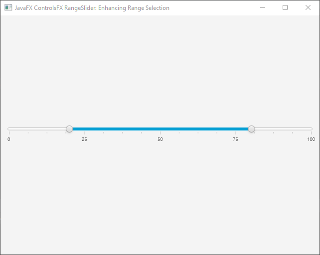
In this example, we create a basic JavaFX application that showcases the RangeSlider control. We set the initial range limits to 0 and 100, with a selected range between 20 and 80. We enable tick marks and labels for better visualization, representing values along the RangeSlider. The setBlockIncrement() method defines the step size when dragging the thumbs.
RangeSlider Features and Customization
The ControlsFX RangeSlider offers various features and customization options to enhance user experience. Here are some notable ones:
Orientation
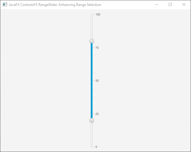
The RangeSlider can be displayed horizontally or vertically by setting the orientation.
import javafx.application.Application;
import javafx.geometry.Insets;
import javafx.geometry.Orientation;
import javafx.scene.Scene;
import javafx.scene.layout.*;
import javafx.stage.Stage;
import org.controlsfx.control.*;

public class Main extends Application {

    private final BorderPane parent = new BorderPane();

    @Override
    public void init() throws Exception {
        super.init();
        this.buildUI();
    }

    private void buildUI() {

        // Create the RangeSlider
        RangeSlider rangeSlider = new RangeSlider(0, 100, 20, 80);

        rangeSlider.setBlockIncrement(5);
        rangeSlider.setShowTickLabels(true);
        rangeSlider.setShowTickMarks(true);

        // Add a 10px padding to the BorderPane
        this.parent.setPadding(new Insets(10));

        // Change the RangeSlider orientation
        rangeSlider.setOrientation(Orientation.VERTICAL);

        // Add the RangeSlider to the BorderPane
        this.parent.setCenter(rangeSlider);

    }

    @Override
    public void start(Stage stage) throws Exception {
        this.setupStage(stage);
    }

    private void setupStage(Stage stage) {

        Scene scene = new Scene(this.parent, 640, 480);

        // Set the stage title
        stage.setTitle("JavaFX ControlsFX RangeSlider: Enhancing Range Selection");

        // Set the stage scene
        stage.setScene(scene);

        // Center the stage on the screen
        stage.centerOnScreen();

        // Show the stage on the screen
        stage.show();

    }

}
Changing Range
You can programmatically set or retrieve the selected range using the lowValue and highValue properties.
import javafx.application.Application;
import javafx.geometry.Insets;
import javafx.scene.Scene;
import javafx.scene.layout.*;
import javafx.stage.Stage;
import org.controlsfx.control.*;

public class Main extends Application {

    private final BorderPane parent = new BorderPane();

    @Override
    public void init() throws Exception {
        super.init();
        this.buildUI();
    }

    private void buildUI() {

        // Create the RangeSlider
        RangeSlider rangeSlider = new RangeSlider(0, 100, 20, 80);

        rangeSlider.setBlockIncrement(5);

        rangeSlider.setShowTickLabels(true);
        rangeSlider.setShowTickMarks(true);

        // Add a 10px padding to the BorderPane
        this.parent.setPadding(new Insets(10));

        // Get the selected range
        double lowValue = rangeSlider.getLowValue();
        double highValue = rangeSlider.getHighValue();

        // Print the range to the console
        System.out.printf("{min: %.2f, max: %.2f}%n", lowValue, highValue);

        // Set the range
        rangeSlider.setLowValue(10);
        rangeSlider.setHighValue(90);

        // Add the RangeSlider to the BorderPane
        this.parent.setCenter(rangeSlider);

    }

    @Override
    public void start(Stage stage) throws Exception {
        this.setupStage(stage);
    }

    private void setupStage(Stage stage) {

        Scene scene = new Scene(this.parent, 640, 480);

        // Set the stage title
        stage.setTitle("JavaFX ControlsFX RangeSlider: Enhancing Range Selection");

        // Set the stage scene
        stage.setScene(scene);

        // Center the stage on the screen
        stage.centerOnScreen();

        // Show the stage on the screen
        stage.show();

    }

}
Listeners
Attach listeners to respond to range changes, allowing you to take actions based on user interaction.
import javafx.application.Application;
import javafx.geometry.Insets;
import javafx.scene.Scene;
import javafx.scene.layout.*;
import javafx.stage.Stage;
import org.controlsfx.control.*;

public class Main extends Application {

    private final BorderPane parent = new BorderPane();

    @Override
    public void init() throws Exception {
        super.init();
        this.buildUI();
    }

    private void buildUI() {

        // Create the RangeSlider
        RangeSlider rangeSlider = new RangeSlider(0, 100, 20, 80);

        rangeSlider.setBlockIncrement(5);

        rangeSlider.setShowTickLabels(true);
        rangeSlider.setShowTickMarks(true);

        // Add a 10px padding to the BorderPane
        this.parent.setPadding(new Insets(10));

        // Attach a ChangeListener to the low value property
        // For this example, we print the new low value to the console
        rangeSlider.lowValueProperty().addListener((observable, oldValue, newValue)
                -> System.out.println("Low value changed: " + newValue));

        // Attach a ChangeListener to the high value property
        // For this example, we print the new high value to the console
        rangeSlider.highValueProperty().addListener((observable, oldValue, newValue)
                -> System.out.println("High value changed: " + newValue));

        // Add the RangeSlider to the BorderPane
        this.parent.setCenter(rangeSlider);

    }

    @Override
    public void start(Stage stage) throws Exception {
        this.setupStage(stage);
    }

    private void setupStage(Stage stage) {

        Scene scene = new Scene(this.parent, 640, 480);

        // Set the stage title
        stage.setTitle("JavaFX ControlsFX RangeSlider: Enhancing Range Selection");

        // Set the stage scene
        stage.setScene(scene);

        // Center the stage on the screen
        stage.centerOnScreen();

        // Show the stage on the screen
        stage.show();

    }

}
Conclusion
The ControlsFX RangeSlider is a valuable addition to any JavaFX application that requires range selection functionality. Whether you’re building data visualization tools, date range pickers, or any other scenario where users need to specify a range, the RangeSlider can streamline your UI design and enhance user experience. By following the installation steps and exploring the provided code examples, you can easily integrate the ControlsFX RangeSlider into your JavaFX projects and unlock its powerful capabilities. Remember to check the ControlsFX RangeSlider documentation for more advanced customization options and features.
I hope you found this code informative and useful. If you would like to receive more content, please consider subscribing to our newsletter!
