In the world of graphic design and user interface development, creating realistic visual effects is an essential component to engage and captivate users. One such effect that plays a crucial role in enhancing the aesthetics of your JavaFX applications is the JavaFX Shadow Effect. This effect allows you to generate captivating shadows and glows, adding depth and dimension to your user interfaces. In this article, we’ll explore the intricacies of the JavaFX Shadow Effect, understand how to use it effectively, and create an example application to demonstrate its power.
Understanding the Shadow Effect
At its core, the JavaFX Shadow Effect is an effect that creates a monochrome duplicate of an input with blurry edges. This effect is primarily used along with its default black color for the purpose of combining it with the original to create a shadow. Additionally, it can be used with a light color and combined with an original to create a glow effect. The DropShadow effect is a utility effect that automatically combines this Shadow effect with an original graphic, simplifying the process of adding a shadow to an existing scene graph Node with a single effect.
Properties of the JavaFX Shadow Effect
- Blur Type: The blurType property determines the type of blur applied to the shadow. JavaFX offers different blur types, such as ONE_PASS_BOX, TWO_PASS_BOX, THREE_PASS_BOX, and GAUSSIAN. You can easily change the blur type by binding it to a ComboBox or setting it programmatically.
- Color: The color property defines the color of the shadow. By default, it’s black, but you can set it to any color you desire. You can bind this property to a ColorPicker or set it programmatically.
- Width, Height, and Radius: These properties control the size and intensity of the shadow. You can bind them to sliders or set their values programmatically to achieve the desired effect.
Example: Shadow Effect Application
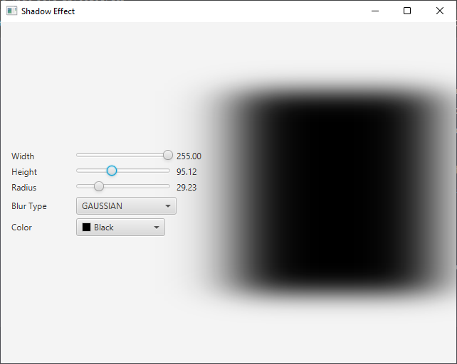
To get a better grasp of how the JavaFX Shadow Effect can be used in practice, let’s explore a simple example. Below is a JavaFX application that demonstrates the effect:
import javafx.application.Application;
import javafx.geometry.Insets;
import javafx.geometry.Pos;
import javafx.scene.Scene;
import javafx.scene.effect.Shadow;
import javafx.scene.image.Image;
import javafx.scene.image.ImageView;
import javafx.scene.layout.BorderPane;
import javafx.stage.Stage;

public class ShadowEffectExampleApp extends Application {

    private static final double WIDTH = 640;
    private static final double HEIGHT = 480;

    /* The parent layout manager */
    private final BorderPane parent = new BorderPane();

    @Override
    public void start(Stage stage) throws Exception {

        Scene scene = new Scene(this.parent, WIDTH, HEIGHT);

        // Sets the stage title
        stage.setTitle("Shadow Effect");

        // Set the stage scene
        stage.setScene(scene);

        // Center stage on screen
        stage.centerOnScreen();

        // Show stage on screen
        stage.show();

    }

    @Override
    public void init() throws Exception {
        super.init();

        Image image = new Image("scorpion.jpg");

        ImageView imageView = new ImageView(image);
        imageView.setPreserveRatio(true);
        imageView.setFitWidth(280);

        // Create the Shadow Effect
        Shadow shadow = new Shadow();

        // Create the Control Panel for the Shadow Effect
        ShadowControlPanel controlPanel = new ShadowControlPanel(shadow);

        // Apply the Shadow Effect to the ImageView
        imageView.setEffect(shadow);

        /* Add the ImageView to the BorderPane center region */
        this.parent.setCenter(imageView);
        BorderPane.setAlignment(imageView, Pos.CENTER_LEFT);
        BorderPane.setMargin(imageView, new Insets(20));

        /* Add the ShadowControlPanel to the BorderPane left region */
        this.parent.setLeft(controlPanel);

    }

}
In this example, we create a JavaFX application with a simple user interface. We load an image and apply the Shadow effect to it, giving the image a shadowed appearance. The result is a visually appealing image with a subtle shadow effect.
The Shadow Control Panel
The ShadowControlPanel is a custom JavaFX component that allows users to control the parameters of the shadow effect. It provides options to adjust the blur type, color, width, height, and radius of the shadow. Here’s the code for the ShadowControlPanel:
import javafx.beans.property.DoubleProperty;
import javafx.collections.FXCollections;
import javafx.collections.ObservableList;
import javafx.geometry.Insets;
import javafx.geometry.Pos;
import javafx.scene.Node;
import javafx.scene.control.ColorPicker;
import javafx.scene.control.ComboBox;
import javafx.scene.control.Label;
import javafx.scene.control.Slider;
import javafx.scene.effect.BlurType;
import javafx.scene.effect.Shadow;
import javafx.scene.layout.HBox;
import javafx.scene.layout.VBox;
import javafx.scene.paint.Color;

public class ShadowControlPanel extends VBox {

    public ShadowControlPanel(Shadow shadow) {
        super(5);

        // Create BlurTypes Collection
        ObservableList<BlurType> blurTypes = FXCollections.observableArrayList(
                BlurType.values()
        );

        // Create BlurType ComboBox, and provide the created BlurTypes
        ComboBox<BlurType> blurTypeComboBox = new ComboBox<>(blurTypes);
        blurTypeComboBox.getSelectionModel().selectFirst(); // Select the first BlurType

        // Bind the Shadow blurTypeProperty to the ComboBox valueProperty
        shadow.blurTypeProperty().bind(blurTypeComboBox.valueProperty());

        // Create the HBox to arrange the Label, and BlurType ComboBox
        HBox blurTypeContainer = this.createLabeledNode(5, blurTypeComboBox, "Blur Type");

        // Create the ColorPicker, and set BLACK as the default color
        ColorPicker colorPicker = new ColorPicker(Color.BLACK);

        // Create the HBox to arrange the Label, and the ColorPicker
        HBox colorContainer = this.createLabeledNode( 13, colorPicker, "Color" );

        // Bind the Shadow colorProperty to the ColorPicker valueProperty
        shadow.colorProperty().bind(colorPicker.valueProperty());

        // Create a VBox to arrange Sliders, the BlurType ComboBox, and the ColorPicker
        this.getChildren().addAll(
                this.createLabeledBoundSlider(shadow.widthProperty(), "Width", 0, 255, 21),
                this.createLabeledBoundSlider(shadow.heightProperty(),"Height",0, 255, 21),
                this.createLabeledBoundSlider(shadow.radiusProperty(), "Radius",0, 127, 10),
                blurTypeContainer,
                colorContainer
        );

        this.setAlignment(Pos.CENTER_LEFT);
        this.setPadding(new Insets(15));

    }

    private HBox createLabeledBoundSlider(DoubleProperty property, String label, double min, double max, double defaultValue) {

        Slider slider = new Slider(min, max, defaultValue);
        property.bind(slider.valueProperty());

        Label value = new Label();
        value.setMinWidth(50);

        // Format the slider value with two decimal places
        value.textProperty().bind(slider.valueProperty().asString("%.2f"));

        Label lblLabel = new Label(String.format("%-20s", label));
        lblLabel.setMinWidth(80);
        lblLabel.setAlignment(Pos.CENTER_RIGHT);

        // Create the HBox to arrange UI components
        return new HBox(5, lblLabel, slider, value);

    }

    private HBox createLabeledNode(double spacing, Node node, String label) {

        HBox container = new HBox(
                spacing,
                new Label(String.format("%-20s", label)),
                node
        );

        container.setAlignment(Pos.CENTER_LEFT);

        return container;

    }

}
The ShadowControlPanel class provides controls for adjusting the parameters of the Shadow Effect, including width, height, radius, blur type, and color. This makes it easy for users to interactively fine-tune the shadow effect to their preferences.

Conclusion
The JavaFX Shadow Effect is a powerful tool for adding depth and dimension to your Java applications. With its ability to create shadows and glows, as well as its customizable properties, it enhances the visual appeal of your user interfaces. By following the example provided in this article, you can easily integrate the Shadow Effect into your JavaFX applications and create stunning, visually appealing UIs.
I hope you found this article informative and useful. If you would like to receive more content, please consider subscribing to our newsletter.


