JavaFX, a powerful platform for building rich desktop applications, offers a plethora of built-in controls that enable developers to create intuitive and interactive user interfaces. However, when you need specialized or advanced controls, third-party libraries like ControlsFX come to the rescue. ControlsFX is an open-source library that extends the JavaFX controls palette with additional and customizable UI components. Among these components, the ToggleSwitch control stands out as an elegant and practical way to implement toggle functionality. In this article, we will delve into the world of ToggleSwitch control in ControlsFX, complete with code examples to demonstrate its usage.
Introducing ToggleSwitch
The ToggleSwitch control is a part of the ControlsFX library, which extends JavaFX with additional controls and utilities. It’s a UI component that represents a two-state toggle switch, often used to enable or disable certain features or options in an application. The ToggleSwitch displays a graphical representation of its current state, allowing users to easily understand and interact with it.
Getting Started
To begin using the ToggleSwitch control from ControlsFX, you’ll need to include the ControlsFX library in your JavaFX project. You can do this by adding the ControlsFX JAR file to your project’s classpath. You can download the JAR file from the ControlsFX website or include it through a dependency management system like Maven or Gradle.
Once you have the library set up, you can start integrating the ToggleSwitch control into your application. Below, we’ll walk through the process with code examples.
Creating a Simple ToggleSwitch
Let’s start by creating a basic ToggleSwitch control and adding it to a JavaFX scene. Here’s an example:
import javafx.application.Application;
import javafx.scene.Scene;
import javafx.scene.layout.*;
import javafx.stage.Stage;
import org.controlsfx.control.ToggleSwitch;

public class Main extends Application {

    private final BorderPane parent = new BorderPane();

    @Override
    public void start(Stage stage) throws Exception {
        this.setupStage(stage);
    }

    @Override
    public void init() throws Exception {
        super.init();
        this.buildUI();
    }

    private void buildUI() {

        ToggleSwitch toggleSwitch = new ToggleSwitch();

        toggleSwitch.setText("Enable Feature");

        // Enable feature
        toggleSwitch.setSelected(true);

        // Add the ToggleSwitch to the BorderPane layout manager
        this.parent.setCenter(toggleSwitch);

    }

    private void setupStage(Stage stage) {

        Scene scene = new Scene(this.parent, 800, 600);

        // Set the stage title
        stage.setTitle("ToggleSwitch Control");

        // Set the stage scene
        stage.setScene(scene);

        // Center the stage on the screen
        stage.centerOnScreen();

        // Show the stage on the screen
        stage.show();

    }

}
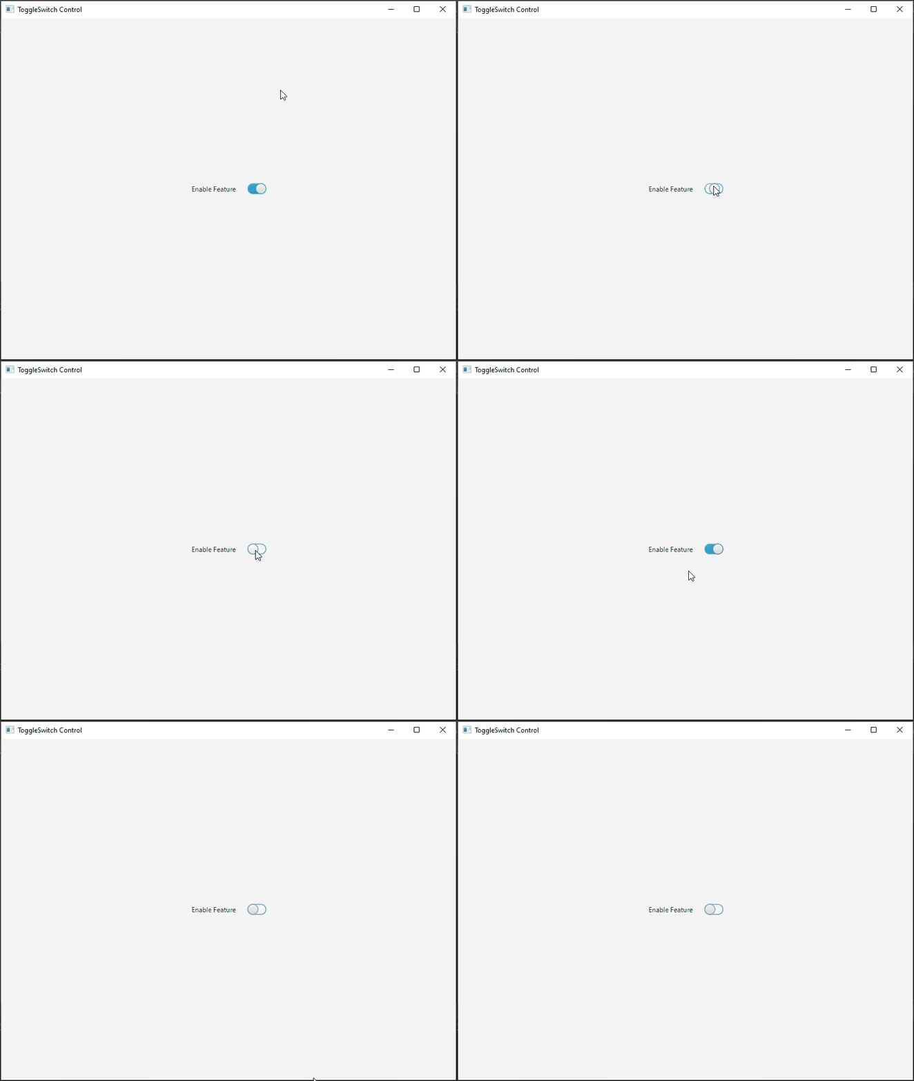
In this example, we’ve created a basic JavaFX application that displays a ToggleSwitch in the center of the scene. When you run the application, you’ll see the ToggleSwitch control that can be toggled between the on and off states.
Responding to ToggleSwitch State Changes
To make the ToggleSwitch functional, you’ll want to react to changes in its state (on or off). You can add an event listener to capture these state changes and perform actions accordingly. Here’s how you can do that:
import javafx.application.Application;
import javafx.geometry.Pos;
import javafx.scene.Scene;
import javafx.scene.control.Label;
import javafx.scene.layout.*;
import javafx.stage.Stage;
import org.controlsfx.control.ToggleSwitch;

public class Main extends Application {

    private final BorderPane parent = new BorderPane();

    @Override
    public void start(Stage stage) throws Exception {
        this.setupStage(stage);
    }

    @Override
    public void init() throws Exception {
        super.init();
        this.buildUI();
    }

    private void buildUI() {

        ToggleSwitch toggleSwitch = new ToggleSwitch();

        Label label = new Label("Feature Disabled");

        toggleSwitch.setText("Enable Feature");

        // Attach a listener to the ToggleSwitch
        toggleSwitch.selectedProperty().addListener((observable, oldValue, newValue) -> {

            if (newValue) {
                label.setText("Feature Enabled");
            } else {
                label.setText("Feature Disabled");
            }

        });

        // Add the ToggleSwitch and the Label to the VBox container
        VBox container = new VBox(15, toggleSwitch, label);
        container.setAlignment(Pos.CENTER);

        // Add the container VBox to the BorderPane layout manager
        this.parent.setCenter(container);

    }

    private void setupStage(Stage stage) {

        Scene scene = new Scene(this.parent, 800, 600);

        // Set the stage title
        stage.setTitle("ToggleSwitch Control");

        // Set the stage scene
        stage.setScene(scene);

        // Center the stage on the screen
        stage.centerOnScreen();

        // Show the stage on the screen
        stage.show();

    }

}
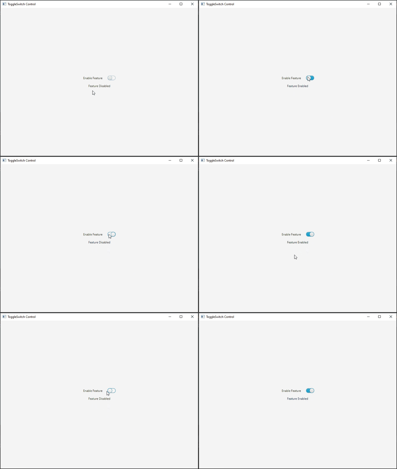
In this example, we’ve created a simple JavaFX application that displays a ToggleSwitch, and a Label. The Label conveys the status of the feature, indicating whether it is enabled or not. The ToggleSwitch has a text label and a listener attached to its selectedProperty(). The listener updates the content of the Label based on the state changes of the ToggleSwitch, accurately reflecting whether the feature is currently enabled or disabled.
Conclusion
The ToggleSwitch control from the ControlsFX library offers an elegant and user-friendly way to implement toggling functionality in your JavaFX applications. It’s a valuable addition to your UI toolkit. By following the examples provided in this article, you can quickly integrate and utilize the ToggleSwitch control to enhance the user experience in your JavaFX applications.
Sources:
I hope you found this code informative and useful. If you would like to receive more content, please consider subscribing to our newsletter!


