In every app, layout matters. Whether you’re placing a button, showing a message, or displaying a picture, sometimes you just want it centered nicely on the screen. That’s where Flutter’s Center widget comes in.
In this article, we’ll explore what the Center widget does, how to use it, how widthFactor and heightFactor affect layout, and see real code examples that you can run and learn from.
What is the Center Widget?
The Center widget is one of the simplest and most useful widgets in Flutter. It places its child widget in the center of its parent, both horizontally and vertically. It’s a shortcut for:
Align(
  alignment: Alignment.center,
  child: ...,
)
Basic Syntax
Here’s how the Center widget is used:
Center(
  child: YourWidget(),
)
You can also add optional widthFactor and heightFactor to control the size of the Center widget itself.
Example 1: Centering Text
Let’s start with a simple example that centers a text message in the middle of the screen.
import 'package:flutter/material.dart';
void main() => runApp(const MyApp());
class MyApp extends StatelessWidget {
const MyApp({super.key});
@override
Widget build(BuildContext context) {
return MaterialApp(
title: 'Center Widget',
home: Scaffold(
appBar: AppBar(title: Text('Center Widget Example')),
body: Center(
child: Text('Hello, Flutter!', style: TextStyle(fontSize: 24)),
),
),
);
}
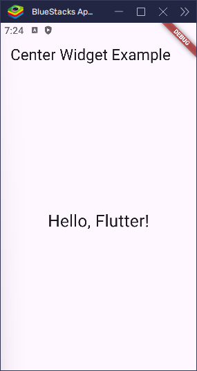
}The Text widget is placed in the center of the screen. Center takes full width and height by default, so the child appears in the middle.
Understanding widthFactor and heightFactor
By default, Center takes up all the space it can. But you can change that using the widthFactor and heightFactor properties. These values multiply the child’s width and height to define the size of the Center widget itself.
When would you use this?
- When you don’t want the
Centerto fill all the available space. - To create tighter or custom-sized centering.
Example 2: Using widthFactor and heightFactor
import 'package:flutter/material.dart';

void main() => runApp(const MyApp());

class MyApp extends StatelessWidget {
  const MyApp({super.key});

  @override
  Widget build(BuildContext context) {
    return MaterialApp(
      title: 'Center Widget',
      home: Scaffold(
        appBar: AppBar(title: Text('Center Widget Example')),
        body: Center(
          child: Container(
            color: Colors.grey[300],
            child: Center(
              widthFactor: 2,
              heightFactor: 2,
              child: Container(width: 100, height: 100, color: Colors.blue),
            ),
          ),
        ),
      ),
    );
  }
}
In this example, the blue box is 100×100 in size. The Center widget around it uses widthFactor: 2 and heightFactor: 2, so it becomes 200×200 — double the size of its child.
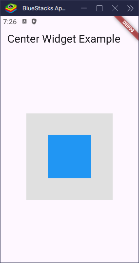
But here’s the thing: the Center itself is invisible. Without something to show its size, you wouldn’t see its 200×200 area on screen.
That’s why we wrap it in a Container with a light gray color. The gray background helps us see the space that the Center actually takes up.
So, the outer Container is just there to make the Center‘s size visible. It’s like using a highlighter to show the area that the Center covers.
Centering Icons or Images
You can center any widget, not just text. Here’s an example with an icon:
import 'package:flutter/material.dart';
void main() => runApp(const MyApp());
class MyApp extends StatelessWidget {
const MyApp({super.key});
@override
Widget build(BuildContext context) {
return MaterialApp(
title: 'Center Widget',
home: Scaffold(
appBar: AppBar(title: Text('Center Widget Example')),
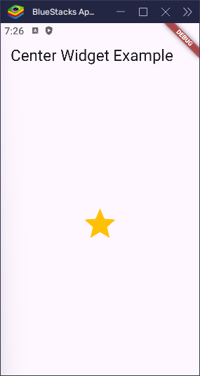
body: Center(child: Icon(Icons.star, size: 60, color: Colors.amber)),
),
);
}
}
Center in Columns or Rows
You can also use Center inside a Column or Row. Here’s how it behaves:
import 'package:flutter/material.dart';
void main() => runApp(const MyApp());
class MyApp extends StatelessWidget {
const MyApp({super.key});
@override
Widget build(BuildContext context) {
return MaterialApp(
title: 'Center Widget',
home: Scaffold(
appBar: AppBar(title: Text('Center Widget Example')),
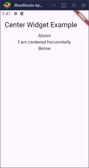
body: Center(
child: Column(
children: [
Text('Above'),
Text('I am centered horizontally'),
Text('Below'),
],
),
),
),
);
}
}In a Column, the Center widget only centers its child horizontally, because a Column arranges its children from top to bottom. The Center helps horizontally, but if you want the entire content of the column to be centered on the screen, you’ll need more control.
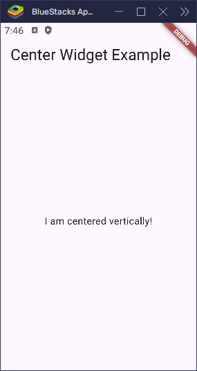
Vertically Centering in a Column
To center vertically inside a Column, use mainAxisAlignment:
import 'package:flutter/material.dart';

void main() => runApp(const MyApp());

class MyApp extends StatelessWidget {
  const MyApp({super.key});

  @override
  Widget build(BuildContext context) {
    return MaterialApp(
      title: 'Center Widget',
      home: Scaffold(
        appBar: AppBar(title: Text('Center Widget Example')),
        body: Center(
          child: Column(
            mainAxisAlignment: MainAxisAlignment.center,
            children: [Text('I am centered vertically!')],
          ),
        ),
      ),
    );
  }
}
mainAxisAlignment controls how children are placed along the main axis (vertical in a column). Setting it to center puts the children in the vertical center of the screen.
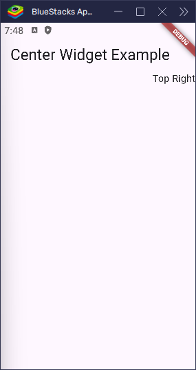
Center vs Align
Use Align when you want to place something in a different corner or edge. Use Center for middle placement.
import 'package:flutter/material.dart';

void main() => runApp(const MyApp());

class MyApp extends StatelessWidget {
  const MyApp({super.key});

  @override
  Widget build(BuildContext context) {
    return MaterialApp(
      title: 'Center Widget',
      home: Scaffold(
        appBar: AppBar(title: Text('Center Widget Example')),
        body: Align(alignment: Alignment.topRight, child: Text('Top Right')),
      ),
    );
  }
}
Limitations of Center
- Can only hold one child
- Doesn’t support padding or margin directly
- Doesn’t resize the child widget
Wrap it with Padding or Container if you want more space or styling.
Best Practices
- Use
Centerto make your UI layout cleaner - Add
widthFactororheightFactoronly when needed - Combine with
Container,Column, orPaddingfor better control
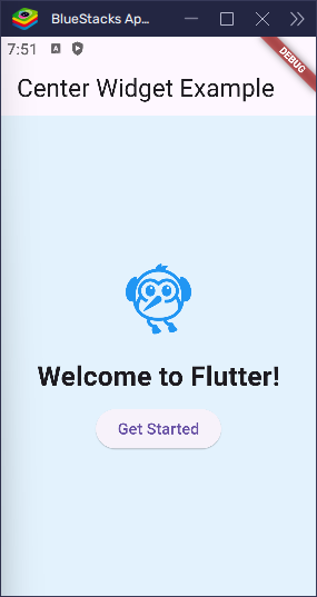
Real World UI: Welcome Screen
Let’s build a small welcome screen with a centered layout:
import 'package:flutter/material.dart';

void main() => runApp(const MyApp());

class MyApp extends StatelessWidget {
  const MyApp({super.key});

  @override
  Widget build(BuildContext context) {
    return MaterialApp(
      title: 'Center Widget',
      home: Scaffold(
        appBar: AppBar(title: Text('Center Widget Example')),
        backgroundColor: Colors.blue[50],
        body: Center(
          child: Column(
            mainAxisAlignment: MainAxisAlignment.center,
            children: [
              Icon(Icons.flutter_dash, size: 80, color: Colors.blue),
              SizedBox(height: 20),
              Text(
                'Welcome to Flutter!',
                style: TextStyle(fontSize: 24, fontWeight: FontWeight.bold),
              ),
              SizedBox(height: 10),
              ElevatedButton(onPressed: () {}, child: Text('Get Started')),
            ],
          ),
        ),
      ),
    );
  }
}
This shows a centered icon, title, and button. The whole column is centered in the screen using Center.
Conclusion
The Center widget is simple but powerful. It helps you place any widget right in the middle of its parent. With widthFactor and heightFactor, you can control how much space the Center itself takes up.
Now that you’ve seen how it works, go ahead and try centering different widgets in your Flutter apps. It’s a small widget, but it makes your layouts look sharp and balanced.