When building user interfaces in Flutter, it’s common to need multiple widgets to share space equally or in a flexible way. That’s where the Expanded widget shines.
In this article, we’ll explore what the Expanded widget does, how to use it, and how it behaves inside a Column or Row. We’ll also cover the flex property, best practices, and common mistakes to avoid.
What Is the Expanded Widget?
The Expanded widget lets a child of a Row, Column, or Flex widget fill up the remaining available space.
You can think of Expanded like this: “Let this widget grow to fill up as much space as it can, based on the available room and how many other Expanded widgets are around”.
Basic Example
Let’s say we have a row with two containers. One has a fixed width, and the other should take up all the remaining space. Here’s how to achieve that using Expanded:
import 'package:flutter/material.dart';
void main() => runApp(const MyApp());
class MyApp extends StatelessWidget {
const MyApp({super.key});
@override
Widget build(BuildContext context) {
return MaterialApp(
title: 'Expanded Widget',
home: Scaffold(
appBar: AppBar(title: Text('Expanded Widget')),
body: Row(
children: [
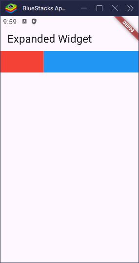
Container(width: 100, height: 50, color: Colors.red),
Expanded(child: Container(height: 50, color: Colors.blue)),
],
),
),
);
}
}In this example, the red container has a fixed width of 100 pixels, while the blue container takes up the remaining horizontal space, thanks to the Expanded widget.
import 'package:flutter/material.dart';
void main() => runApp(const MyApp());
class MyApp extends StatelessWidget {
const MyApp({super.key});
@override
Widget build(BuildContext context) {
return MaterialApp(
title: 'Expanded Widget',
home: Scaffold(
appBar: AppBar(title: Text('Expanded Widget')),
body: Row(
children: [
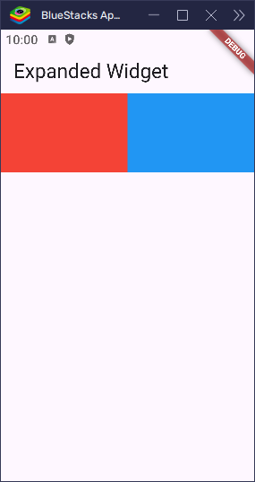
Expanded(child: Container(color: Colors.red, height: 100)),
Expanded(child: Container(color: Colors.blue, height: 100)),
],
),
),
);
}
}This makes both containers share the horizontal space equally. Since there are two Expanded widgets, they each take up half of the Row.
How It Works
The parent widget (like Row or Column) controls the direction. Expanded tells its child: “Take up as much space as possible in that direction”.
- In a
Row, the direction is horizontal. - In a
Column, the direction is vertical.
Expanded forces its child to expand to fill the available space.
Using the flex Property
You can control how space is divided using the flex property. By default, flex is 1. A higher number means the widget gets more space compared to others.
Let’s see what happens when we have multiple Expanded widgets:
import 'package:flutter/material.dart';
void main() => runApp(const MyApp());
class MyApp extends StatelessWidget {
const MyApp({super.key});
@override
Widget build(BuildContext context) {
return MaterialApp(
title: 'Expanded Widget',
home: Scaffold(
appBar: AppBar(title: Text('Expanded Widget')),
body: Row(
children: [
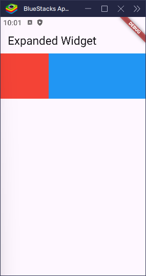
Expanded(flex: 1, child: Container(color: Colors.red, height: 100)),
Expanded(
flex: 2,
child: Container(color: Colors.blue, height: 100),
),
],
),
),
);
}
}In this case, the red box gets 1 part and the blue box gets 2 parts of the space. So the blue box is twice as wide as the red one.
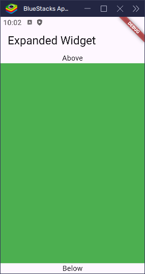
Expanded in a Column
Let’s look at Expanded inside a Column, where it grows vertically:
import 'package:flutter/material.dart';

void main() => runApp(const MyApp());

class MyApp extends StatelessWidget {
  const MyApp({super.key});

  @override
  Widget build(BuildContext context) {
    return MaterialApp(
      title: 'Expanded Widget',
      home: Scaffold(
        appBar: AppBar(title: Text('Expanded Widget')),
        body: Column(
          children: [
            Text('Above'),
            Expanded(child: Container(color: Colors.green)),
            Text('Below'),
          ],
        ),
      ),
    );
  }
}
Here, the green box expands to fill the space between the top and bottom text widgets.
Expanded vs Flexible
Both Expanded and Flexible are used to make children of a Row, Column, or Flex widget share available space. However, there’s a key difference in how much control they give to their child.
Expanded
- Forces its child to take all the available space along the main axis (horizontal in a
Row, vertical in aColumn). - The child must fill the space, even if it doesn’t need that much room.
Flexible
- Allows the child to take as much space as it needs, up to the available space.
- If the child has a set width or height, it will respect that size but can still grow or shrink as needed.
- It won’t force the child to stretch if the child can fit without doing so.
Example Comparison
Imagine you have two boxes inside a Row. One is Flexible, and the other is Expanded. Here’s what will happen:
- The
Flexiblechild, with a width of 100, stays at 100 if there’s enough space. - If the space is tight, the
Flexiblechild can shrink or expand to fit. - The
Expandedchild, on the other hand, always stretches to fill up all the remaining space.
import 'package:flutter/material.dart';

void main() => runApp(const MyApp());

class MyApp extends StatelessWidget {
  const MyApp({super.key});

  @override
  Widget build(BuildContext context) {
    return MaterialApp(
      title: 'Expanded Widget',
      home: Scaffold(
        appBar: AppBar(title: Text('Expanded Widget')),
        body: Row(
          children: [
            Flexible(flex: 1, child: Container(width: 50, color: Colors.red)),
            Expanded(flex: 1, child: Container(width: 50, color: Colors.blue)),
          ],
        ),
      ),
    );
  }
}
In this example, the red box is wrapped in a Flexible widget and has a fixed width of 50. Since Flexible doesn’t force its child to stretch, the red box maintains its width.
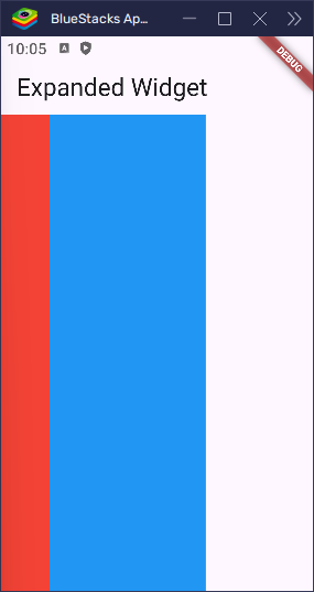
The blue box, however, is wrapped in an Expanded widget. Despite having a width of 50, the Expanded widget forces the box to stretch and take up all the remaining horizontal space, while still leaving room for the Flexible widget to grow if needed. As a result, the blue box ignores its fixed width and expands to fill the rest of the row.
So in short:
- Use
Expandedwhen you want the widget to fill up all remaining space. - Use
Flexiblewhen the widget can grow or shrink, but doesn’t have to.
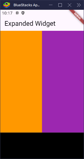
Nested Expanded Widgets
You can nest Expanded inside another Column or Row, just be careful about how much space you are giving at each level.
Here’s an example:
import 'package:flutter/material.dart';

void main() => runApp(const MyApp());

class MyApp extends StatelessWidget {
  const MyApp({super.key});

  @override
  Widget build(BuildContext context) {
    return MaterialApp(
      title: 'Expanded Widget',
      home: Scaffold(
        appBar: AppBar(title: Text('Expanded Widget')),
        body: Column(
          children: [
            Expanded(
              child: Row(
                children: [
                  Expanded(child: Container(color: Colors.orange)),
                  Expanded(child: Container(color: Colors.purple)),
                ],
              ),
            ),
            Container(height: 100, color: Colors.black),
          ],
        ),
      ),
    );
  }
}
This layout gives half the screen to a row with two equal boxes, and the bottom box stays fixed at 100 pixels.
Common Error: Expanded Needs Flex Parent
You can only use Expanded inside a Row, Column, or Flex. If you put it somewhere else, you’ll get an error:
Incorrect use of ParentDataWidget.
Typically, Expanded widgets are placed directly inside Flex widgets.
This error occurs when you use Expanded outside of a Row, Column, or Flex. To fix it, ensure that the direct parent of the Expanded widget is one of these flex-based widgets.
When Not to Use Expanded
Avoid using Expanded:
- Inside a
SingleChildScrollView(unless wrapped inside a fixed-height widget likeSizedBox). - Outside of
Row,Column, orFlex. - If your layout doesn’t require flexible sizing.
Conclusion
The Expanded widget is a simple yet powerful tool for creating responsive layouts in Flutter. It enables you to fill available space in a Row, Column, or Flex, and the flex property allows you to control how that space is shared among multiple children.
When you need more control over space allocation — for instance, when a widget can grow or shrink as needed but doesn’t have to — you can use Flexible instead.
Once you understand how Expanded works, designing your UI becomes much easier, and your apps will look cleaner and behave more predictably across various screen sizes.