Labels are an essential component in any graphical user interface (GUI) application. They provide information or descriptions about other components, helping users navigate and understand the interface. In JavaFX, labels offer a wide range of customization options and text effects to make your application visually appealing and engaging. This article explores various ways to customize JavaFX labels and apply text effects.
Basic Label Customization
Before diving into the more advanced aspects, let’s start with the basics of customizing JavaFX Labels. The Label class provides a wide range of properties that can be modified to achieve the desired visual appearance. These properties include font, text color, background color, alignment, padding, and more.
Changing Font
To change the font of a Label, you can utilize the setFont() method and provide an instance of the Font class. The Font class offers extensive options to select the desired font family, size, and style.
Here’s an example of setting the font for a Label:
import javafx.application.Application;
import javafx.scene.Scene;
import javafx.scene.control.Label;
import javafx.scene.layout.StackPane;
import javafx.scene.text.Font;
import javafx.stage.Stage;

public class Main extends Application {

    private final StackPane parent = new StackPane();

    @Override
    public void start(Stage stage) throws Exception {
        this.setupStage(stage);
    }

    @Override
    public void init() throws Exception {
        super.init();
        this.buildUI();
    }

    private void buildUI() {

        Label label = new Label("Customization and Text Effects");

        // Set the Label Font
        Font font = new Font("Arial", 20);
        label.setFont(font);

        this.parent.getChildren().addAll(label);

    }

    private void setupStage(Stage stage) {

        Scene scene = new Scene(this.parent, 640.0, 480.0);

        // Sets the stage title
        stage.setTitle("JavaFX Labels: Customization and Text Effects");

        // Set the stage scene
        stage.setScene(scene);

        // Center stage on screen
        stage.centerOnScreen();

        // Show stage on screen
        stage.show();

    }

}
In this example, we create a new Font object with the font family “Arial” and a size of 20. We then set this font as the font for the Label using the setFont() method.

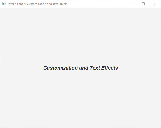
Additionally, the Font class allows you to specify the font style (e.g., bold, italic) and weight. You can create fonts with different styles using the appropriate FontPosture and FontWeight enum values:
import javafx.application.Application;
import javafx.scene.Scene;
import javafx.scene.control.Label;
import javafx.scene.layout.StackPane;
import javafx.scene.text.Font;
import javafx.scene.text.FontPosture;
import javafx.scene.text.FontWeight;
import javafx.stage.Stage;

public class Main extends Application {

    private final StackPane parent = new StackPane();

    @Override
    public void start(Stage stage) throws Exception {
        this.setupStage(stage);
    }

    @Override
    public void init() throws Exception {
        super.init();
        this.buildUI();
    }

    private void buildUI() {

        Label label = new Label("Customization and Text Effects");

        // Set the Label Font
        Font font = Font.font("Arial", FontWeight.BOLD, FontPosture.ITALIC, 20);
        label.setFont(font);

        this.parent.getChildren().addAll(label);

    }

    private void setupStage(Stage stage) {

        Scene scene = new Scene(this.parent, 640.0, 480.0);

        // Sets the stage title
        stage.setTitle("JavaFX Labels: Customization and Text Effects");

        // Set the stage scene
        stage.setScene(scene);

        // Center stage on screen
        stage.centerOnScreen();

        // Show stage on screen
        stage.show();

    }

}
In this example, we create a font that is bold and italic, with a size of 20, using the Font.font() method.
Setting Text Color
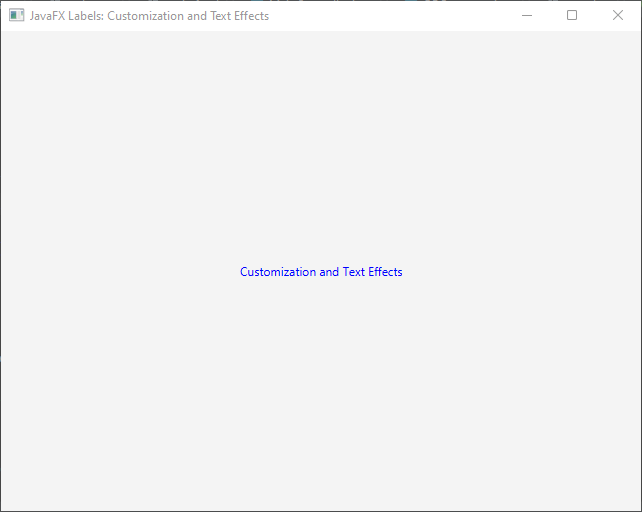
To modify the color of the text displayed within a Label, you can utilize the setTextFill() method and provide a Color object. The Color class offers various ways to specify colors, such as predefined constants or custom RGB values.
Here’s an example of setting the text color for a Label:
import javafx.application.Application;
import javafx.scene.Scene;
import javafx.scene.control.Label;
import javafx.scene.layout.StackPane;
import javafx.scene.paint.Color;
import javafx.stage.Stage;

public class Main extends Application {

    private final StackPane parent = new StackPane();

    @Override
    public void start(Stage stage) throws Exception {
        this.setupStage(stage);
    }

    @Override
    public void init() throws Exception {
        super.init();
        this.buildUI();
    }

    private void buildUI() {

        Label label = new Label("Customization and Text Effects");

        // Set the label text color to BLUE
        label.setTextFill(Color.BLUE);

        this.parent.getChildren().addAll(label);

    }

    private void setupStage(Stage stage) {

        Scene scene = new Scene(this.parent, 640.0, 480.0);

        // Sets the stage title
        stage.setTitle("JavaFX Labels: Customization and Text Effects");

        // Set the stage scene
        stage.setScene(scene);

        // Center stage on screen
        stage.centerOnScreen();

        // Show stage on screen
        stage.show();

    }

}
In this example, we set the text color of the Label to blue by passing the Color.BLUE constant to the setTextFill() method.
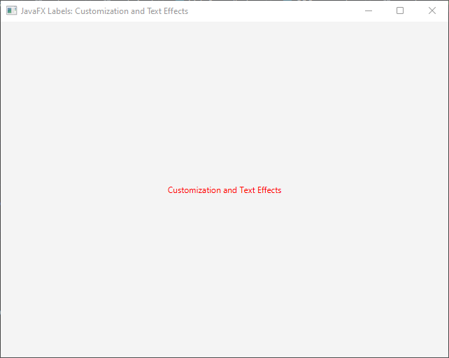
You can also create custom colors using the RGB values:
import javafx.application.Application;
import javafx.scene.Scene;
import javafx.scene.control.Label;
import javafx.scene.layout.StackPane;
import javafx.scene.paint.Color;
import javafx.stage.Stage;

public class Main extends Application {

    private final StackPane parent = new StackPane();

    @Override
    public void start(Stage stage) throws Exception {
        this.setupStage(stage);
    }

    @Override
    public void init() throws Exception {
        super.init();
        this.buildUI();
    }

    private void buildUI() {

        Label label = new Label("Customization and Text Effects");

        // Creates a custom red color
        Color customColor = Color.rgb(255, 0, 0);

        // Set the label text color to a custom RED color
        label.setTextFill(customColor);

        this.parent.getChildren().addAll(label);

    }

    private void setupStage(Stage stage) {

        Scene scene = new Scene(this.parent, 640.0, 480.0);

        // Sets the stage title
        stage.setTitle("JavaFX Labels: Customization and Text Effects");

        // Set the stage scene
        stage.setScene(scene);

        // Center stage on screen
        stage.centerOnScreen();

        // Show stage on screen
        stage.show();

    }

}
By specifying different RGB values, you can create custom colors to suit your UI design.
Background Color
To change the background color of a Label, you can use the setBackground() method and pass a Background object. The Background class provides various options for defining the background, such as applying solid colors, gradients, or even images.
Here’s an example of setting a solid color background:
import javafx.application.Application;
import javafx.geometry.Insets;
import javafx.scene.Scene;
import javafx.scene.control.Label;
import javafx.scene.layout.Background;
import javafx.scene.layout.BackgroundFill;
import javafx.scene.layout.CornerRadii;
import javafx.scene.layout.StackPane;
import javafx.scene.paint.Color;
import javafx.stage.Stage;

public class Main extends Application {

    private final StackPane parent = new StackPane();

    @Override
    public void start(Stage stage) throws Exception {
        this.setupStage(stage);
    }

    @Override
    public void init() throws Exception {
        super.init();
        this.buildUI();
    }

    private void buildUI() {

        Label label = new Label("Customization and Text Effects");

        BackgroundFill backgroundFill = new BackgroundFill(Color.RED, CornerRadii.EMPTY, Insets.EMPTY);

        Background background = new Background(backgroundFill);

        label.setBackground(background);

        label.setTextFill(Color.WHITE);

        this.parent.getChildren().addAll(label);

    }

    private void setupStage(Stage stage) {

        Scene scene = new Scene(this.parent, 640.0, 480.0);

        // Sets the stage title
        stage.setTitle("JavaFX Labels: Customization and Text Effects");

        // Set the stage scene
        stage.setScene(scene);

        // Center stage on screen
        stage.centerOnScreen();

        // Show stage on screen
        stage.show();

    }

}
In this example, we create a BackgroundFill object with a red color and no corner radii or insets. Then, we create a Background object using the BackgroundFill, and finally, we set it as the background of the Label using the setBackground() method.
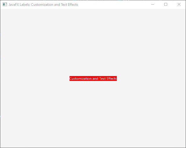
Similarly, you can create gradients or use images as backgrounds by using appropriate classes such as LinearGradient, RadialGradient, or BackgroundImage within the Background object.
Gradients as Background
JavaFX provides two types of gradients: linear and radial. You can create these gradients and use them as backgrounds for Labels.
Linear Gradient
To create a linear gradient background, you can use the LinearGradient class. This class allows you to define the start and end points of the gradient, along with the colors and stops.
Here’s an example of setting a linear gradient background for a Label:
import javafx.application.Application;
import javafx.geometry.Insets;
import javafx.scene.Scene;
import javafx.scene.control.Label;
import javafx.scene.layout.Background;
import javafx.scene.layout.BackgroundFill;
import javafx.scene.layout.CornerRadii;
import javafx.scene.layout.StackPane;
import javafx.scene.paint.Color;
import javafx.scene.paint.CycleMethod;
import javafx.scene.paint.LinearGradient;
import javafx.scene.paint.Stop;
import javafx.stage.Stage;

public class Main extends Application {

    private final StackPane parent = new StackPane();

    @Override
    public void start(Stage stage) throws Exception {
        this.setupStage(stage);
    }

    @Override
    public void init() throws Exception {
        super.init();
        this.buildUI();
    }

    private void buildUI() {

        Label label = new Label("Customization and Text Effects");

        Stop[] stops = new Stop[]{

                new Stop(0, Color.BLUE),
                new Stop(1, Color.GREEN)

        };

        LinearGradient gradient = new LinearGradient(0, 0, 1, 0, true, CycleMethod.NO_CYCLE, stops);

        BackgroundFill backgroundFill = new BackgroundFill(gradient, CornerRadii.EMPTY, Insets.EMPTY);

        Background background = new Background(backgroundFill);

        label.setBackground(background);

        label.setTextFill(Color.WHITE);

        this.parent.getChildren().addAll(label);

    }

    private void setupStage(Stage stage) {

        Scene scene = new Scene(this.parent, 640.0, 480.0);

        // Sets the stage title
        stage.setTitle("JavaFX Labels: Customization and Text Effects");

        // Set the stage scene
        stage.setScene(scene);

        // Center stage on screen
        stage.centerOnScreen();

        // Show stage on screen
        stage.show();

    }

}
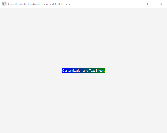
In this example, we define a linear gradient from blue to green by specifying two Stop objects with different colors at 0 and 1 positions. We then create a LinearGradient object, passing the start and end points along with the stops. Finally, we create a Background object using the gradient as the background fill, and set it as the background of the Label using the setBackground() method.
Radial Gradient
To create a radial gradient background, you can use the RadialGradient class. This class allows you to define the center, focus distance, radius, and colors of the gradient.
Here’s an example of setting a radial gradient background for a Label:
import javafx.application.Application;
import javafx.geometry.Insets;
import javafx.scene.Scene;
import javafx.scene.control.Label;
import javafx.scene.layout.Background;
import javafx.scene.layout.BackgroundFill;
import javafx.scene.layout.CornerRadii;
import javafx.scene.layout.StackPane;
import javafx.scene.paint.*;
import javafx.stage.Stage;

public class Main extends Application {

    private final StackPane parent = new StackPane();

    @Override
    public void start(Stage stage) throws Exception {
        this.setupStage(stage);
    }

    @Override
    public void init() throws Exception {
        super.init();
        this.buildUI();
    }

    private void buildUI() {

        Label label = new Label("Customization and Text Effects");

        Stop[] stops = new Stop[]{

                new Stop(0, Color.RED),
                new Stop(1, Color.YELLOW)

        };

        RadialGradient gradient = new RadialGradient(0, 0, 0.5, 0.5, 1, true, CycleMethod.NO_CYCLE, stops);

        BackgroundFill backgroundFill = new BackgroundFill(gradient, CornerRadii.EMPTY, Insets.EMPTY);

        Background background = new Background(backgroundFill);

        label.setBackground(background);

        label.setTextFill(Color.WHITE);

        this.parent.getChildren().addAll(label);

    }

    private void setupStage(Stage stage) {

        Scene scene = new Scene(this.parent, 640.0, 480.0);

        // Sets the stage title
        stage.setTitle("JavaFX Labels: Customization and Text Effects");

        // Set the stage scene
        stage.setScene(scene);

        // Center stage on screen
        stage.centerOnScreen();

        // Show stage on screen
        stage.show();

    }

}
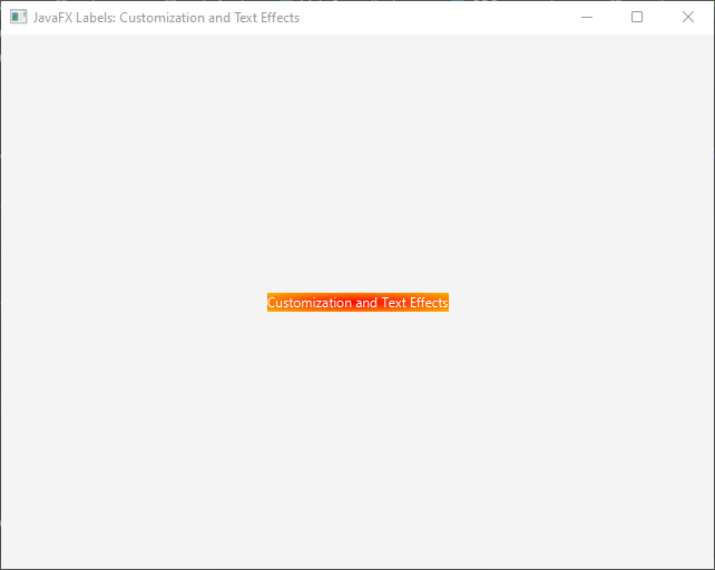
In this example, we define a radial gradient from red to yellow by specifying two Stop objects with different colors at 0 and 1 positions. We then create a RadialGradient object, passing the center, focus distance, radius, and stops. Finally, we create a Background object using the gradient as the background fill and set it as the background of the Label.
Using Images as Background
JavaFX also allows you to use images as backgrounds for Labels by utilizing the BackgroundImage class. This class provides options to set the image, repeat behavior, and positioning.
Here’s an example of setting an image as the background for a Label:
import javafx.application.Application;
import javafx.scene.Scene;
import javafx.scene.control.Label;
import javafx.scene.image.Image;
import javafx.scene.layout.*;
import javafx.stage.Stage;

public class Main extends Application {

    private final StackPane parent = new StackPane();

    @Override
    public void start(Stage stage) throws Exception {
        this.setupStage(stage);
    }

    @Override
    public void init() throws Exception {
        super.init();
        this.buildUI();
    }

    private void buildUI() {

        Label label = new Label("Customization and Text Effects");

        Image image = new Image("image.jpg");

        BackgroundImage backgroundImage = new BackgroundImage(
                image,
                BackgroundRepeat.NO_REPEAT,
                BackgroundRepeat.NO_REPEAT,
                BackgroundPosition.CENTER,
                BackgroundSize.DEFAULT
        );

        Background background = new Background(backgroundImage);

        label.setBackground(background);

        this.parent.getChildren().addAll(label);

    }

    private void setupStage(Stage stage) {

        Scene scene = new Scene(this.parent, 640.0, 480.0);

        // Sets the stage title
        stage.setTitle("JavaFX Labels: Customization and Text Effects");

        // Set the stage scene
        stage.setScene(scene);

        // Center stage on screen
        stage.centerOnScreen();

        // Show stage on screen
        stage.show();

    }

}
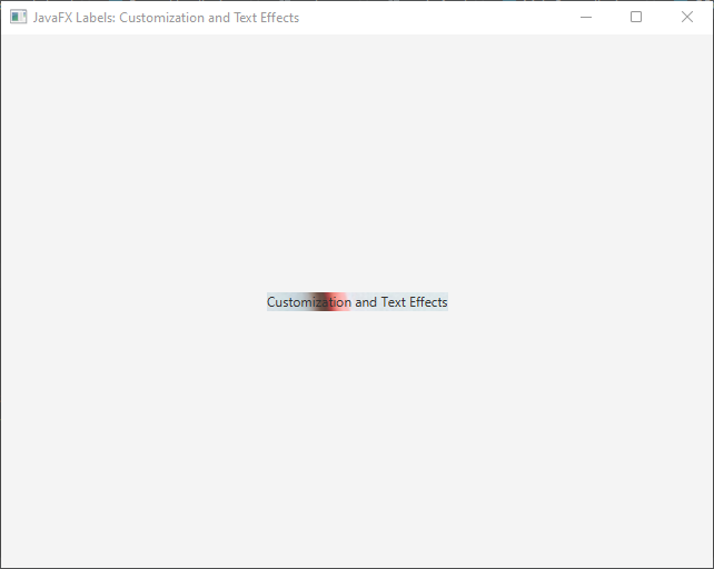
In this example, we create an Image object by specifying the path to the image file. We then create a BackgroundImage object, passing the image, repeat behavior (in this case, no repeat), positioning (centered), and size (default). Finally, we create a Background object using the image as the background image and set it as the background of the Label.
Alignment
JavaFX Labels provide different options for aligning the text within the Label’s boundaries. The setAlignment() method allows you to specify the desired alignment using the Pos enum values. Here’s an example:
import javafx.application.Application;
import javafx.geometry.Pos;
import javafx.scene.Scene;
import javafx.scene.control.Label;
import javafx.scene.layout.*;
import javafx.stage.Stage;

public class Main extends Application {

    private final StackPane parent = new StackPane();

    @Override
    public void start(Stage stage) throws Exception {
        this.setupStage(stage);
    }

    @Override
    public void init() throws Exception {
        super.init();
        this.buildUI();
    }

    private void buildUI() {

        Label label = new Label("Customization and Text Effects");

        label.setAlignment(Pos.CENTER);

        this.parent.getChildren().addAll(label);

    }

    private void setupStage(Stage stage) {

        Scene scene = new Scene(this.parent, 640.0, 480.0);

        // Sets the stage title
        stage.setTitle("JavaFX Labels: Customization and Text Effects");

        // Set the stage scene
        stage.setScene(scene);

        // Center stage on screen
        stage.centerOnScreen();

        // Show stage on screen
        stage.show();

    }

}
In this example, the text within the Label will be centered horizontally and vertically.
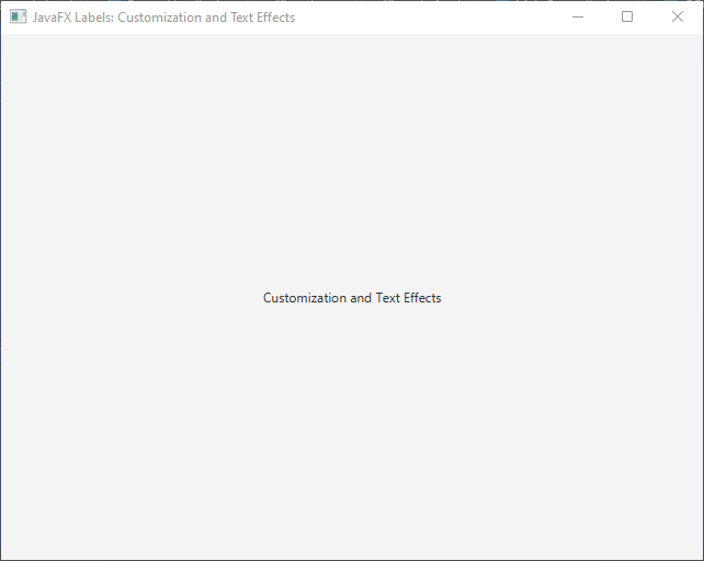
The Pos enum provides various alignment options, including CENTER, TOP_LEFT, TOP_CENTER, TOP_RIGHT, CENTER_LEFT, CENTER_RIGHT, BOTTOM_LEFT, BOTTOM_CENTER, and BOTTOM_RIGHT. You can choose the alignment that best suits your UI design.
Padding
Padding allows you to control the spacing between the text and the boundaries of the Label. You can adjust the padding using the setPadding() method, which takes an instance of the Insets class.
Here’s an example of setting padding for a Label:
import javafx.application.Application;
import javafx.geometry.Insets;
import javafx.scene.Scene;
import javafx.scene.control.Label;
import javafx.scene.layout.*;
import javafx.stage.Stage;

public class Main extends Application {

    private final StackPane parent = new StackPane();

    @Override
    public void start(Stage stage) throws Exception {
        this.setupStage(stage);
    }

    @Override
    public void init() throws Exception {
        super.init();
        this.buildUI();
    }

    private void buildUI() {

        Label label = new Label("Customization and Text Effects");

        label.setPadding(new Insets(10));

        this.parent.getChildren().addAll(label);

    }

    private void setupStage(Stage stage) {

        Scene scene = new Scene(this.parent, 640.0, 480.0);

        // Sets the stage title
        stage.setTitle("JavaFX Labels: Customization and Text Effects");

        // Set the stage scene
        stage.setScene(scene);

        // Center stage on screen
        stage.centerOnScreen();

        // Show stage on screen
        stage.show();

    }

}
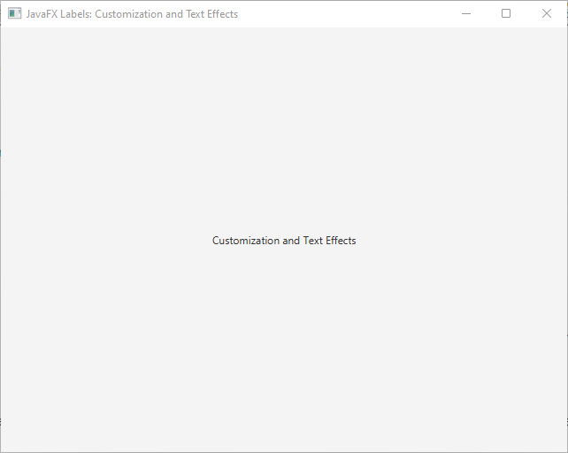
In this example, the padding is set to 10 pixels on all sides of the Label, creating space between the text and the Label’s boundaries. You can customize the padding by specifying different values for each side or use the Insets constructor with separate values for top, right, bottom, and left padding.
Text Effects
JavaFX provides a range of text effects that can be applied to Labels to enhance their visual appeal. Let’s explore some of these effects:
Drop Shadow
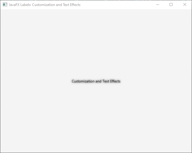
The setEffect() method allows you to apply a drop shadow effect to a Label. By using the DropShadow class, you can customize the color, blur radius, and offset of the shadow. This effect adds depth to the Label, making it stand out from the background.
Applying Drop Shadow Effect
To apply a drop shadow effect to a Label, you can use the setEffect() method and provide an instance of the DropShadow class.
Here’s an example of applying a drop shadow effect to a Label:
import javafx.application.Application;
import javafx.scene.Scene;
import javafx.scene.control.Label;
import javafx.scene.effect.DropShadow;
import javafx.scene.layout.*;
import javafx.stage.Stage;

public class Main extends Application {

    private final StackPane parent = new StackPane();

    @Override
    public void start(Stage stage) throws Exception {
        this.setupStage(stage);
    }

    @Override
    public void init() throws Exception {
        super.init();
        this.buildUI();
    }

    private void buildUI() {

        Label label = new Label("Customization and Text Effects");

        DropShadow dropShadow = new DropShadow();

        label.setEffect(dropShadow);

        this.parent.getChildren().addAll(label);

    }

    private void setupStage(Stage stage) {

        Scene scene = new Scene(this.parent, 640.0, 480.0);

        // Sets the stage title
        stage.setTitle("JavaFX Labels: Customization and Text Effects");

        // Set the stage scene
        stage.setScene(scene);

        // Center stage on screen
        stage.centerOnScreen();

        // Show stage on screen
        stage.show();

    }

}
In this example, we create a new DropShadow object without specifying any parameters. We then set this drop shadow effect to the Label using the setEffect() method.
Customizing Drop Shadow
The DropShadow class provides various properties that can be customized to achieve the desired drop shadow effect. These properties include color, blur radius, offset, and more.
Here’s an example of customizing the drop shadow effect:
import javafx.application.Application;
import javafx.scene.Scene;
import javafx.scene.control.Label;
import javafx.scene.effect.DropShadow;
import javafx.scene.layout.*;
import javafx.scene.paint.Color;
import javafx.stage.Stage;

public class Main extends Application {

    private final StackPane parent = new StackPane();

    @Override
    public void start(Stage stage) throws Exception {
        this.setupStage(stage);
    }

    @Override
    public void init() throws Exception {
        super.init();
        this.buildUI();
    }

    private void buildUI() {

        Label label = new Label("Customization and Text Effects");

        DropShadow dropShadow = new DropShadow();

        dropShadow.setColor(Color.RED);

        dropShadow.setRadius(10);
        dropShadow.setOffsetX(5);
        dropShadow.setOffsetY(5);

        label.setEffect(dropShadow);

        this.parent.getChildren().addAll(label);

    }

    private void setupStage(Stage stage) {

        Scene scene = new Scene(this.parent, 640.0, 480.0);

        // Sets the stage title
        stage.setTitle("JavaFX Labels: Customization and Text Effects");

        // Set the stage scene
        stage.setScene(scene);

        // Center stage on screen
        stage.centerOnScreen();

        // Show stage on screen
        stage.show();

    }

}
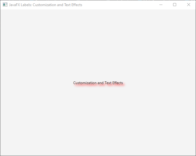
In this example, we customize the drop shadow effect by setting the color to Color.RED, blur radius to 10 pixels, and offset to 5 pixels in the X and Y directions. These values can be adjusted according to your design preferences.
Reflection
With the Reflection class, you can create a reflection effect for a Label. By adjusting the fraction and top opacity properties, you can control the reflection’s size and transparency. This effect can give the Label a sleek and modern look.
Applying Reflection Effect
To apply a reflection effect to a Label, you can utilize the setEffect() method and provide an instance of the Reflection class.
Here’s an example of applying a reflection effect to a Label:
import javafx.application.Application;
import javafx.scene.Scene;
import javafx.scene.control.Label;
import javafx.scene.effect.Reflection;
import javafx.scene.layout.*;
import javafx.stage.Stage;

public class Main extends Application {

    private final StackPane parent = new StackPane();

    @Override
    public void start(Stage stage) throws Exception {
        this.setupStage(stage);
    }

    @Override
    public void init() throws Exception {
        super.init();
        this.buildUI();
    }

    private void buildUI() {

        Label label = new Label("Customization and Text Effects");

        Reflection reflection = new Reflection();
        label.setEffect(reflection);

        this.parent.getChildren().addAll(label);

    }

    private void setupStage(Stage stage) {

        Scene scene = new Scene(this.parent, 640.0, 480.0);

        // Sets the stage title
        stage.setTitle("JavaFX Labels: Customization and Text Effects");

        // Set the stage scene
        stage.setScene(scene);

        // Center stage on screen
        stage.centerOnScreen();

        // Show stage on screen
        stage.show();

    }

}
In this example, we create a new Reflection object without specifying any parameters. We then set this reflection effect to the Label using the setEffect() method.
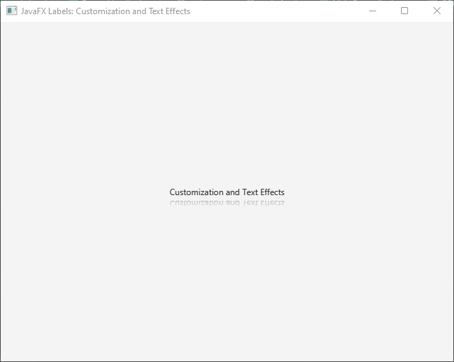
Customizing Reflection
The Reflection class provides properties that can be adjusted to customize the reflection effect. Two important properties to consider are fraction and topOpacity.
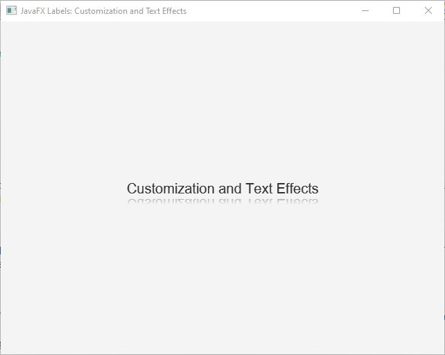
The fraction property determines the size of the reflection relative to the original Label. A value of 0.5, for example, would result in a reflection that is half the height of the Label. The topOpacity property on ther hand, controls the transparency of the reflection at its topmost point. A value of 0 means the reflection is fully transparent at the top, while a value of 1 means it is fully opaque.
Here’s an example of customizing the reflection effect:
import javafx.application.Application;
import javafx.scene.Scene;
import javafx.scene.control.Label;
import javafx.scene.effect.Reflection;
import javafx.scene.layout.*;
import javafx.scene.text.Font;
import javafx.stage.Stage;

public class Main extends Application {

    private final StackPane parent = new StackPane();

    @Override
    public void start(Stage stage) throws Exception {
        this.setupStage(stage);
    }

    @Override
    public void init() throws Exception {
        super.init();
        this.buildUI();
    }

    private void buildUI() {

        Label label = new Label("Customization and Text Effects");
        label.setFont(new Font("Arial", 20));

        Reflection reflection = new Reflection();

        reflection.setFraction(0.5);
        reflection.setTopOpacity(0.5);

        label.setEffect(reflection);

        this.parent.getChildren().addAll(label);

    }

    private void setupStage(Stage stage) {

        Scene scene = new Scene(this.parent, 640.0, 480.0);

        // Sets the stage title
        stage.setTitle("JavaFX Labels: Customization and Text Effects");

        // Set the stage scene
        stage.setScene(scene);

        // Center stage on screen
        stage.centerOnScreen();

        // Show stage on screen
        stage.show();

    }

}
In this example, we set the fraction to 0.5, resulting in a reflection that is half the height of the Label. We also set the topOpacity to 0.5, making the top part of the reflection partially transparent.
Glow
The Glow effect allows you to make a Label emit a soft, glowing light. By specifying the color and level of the glow, you can create eye-catching Labels that attract attention.
Applying Glow Effect
To apply a glow effect to a Label, you can utilize the setEffect() method and provide an instance of the Glow class.
Here’s an example of applying a glow effect to a Label:
import javafx.application.Application;
import javafx.scene.Scene;
import javafx.scene.control.Label;
import javafx.scene.effect.Glow;
import javafx.scene.effect.Reflection;
import javafx.scene.layout.*;
import javafx.scene.text.Font;
import javafx.stage.Stage;

public class Main extends Application {

    private final StackPane parent = new StackPane();

    @Override
    public void start(Stage stage) throws Exception {
        this.setupStage(stage);
    }

    @Override
    public void init() throws Exception {
        super.init();
        this.buildUI();
    }

    private void buildUI() {

        Label label = new Label("Customization and Text Effects");
        label.setFont(new Font("Arial", 20));

        Glow glow = new Glow();

        label.setEffect(glow);

        this.parent.getChildren().addAll(label);

    }

    private void setupStage(Stage stage) {

        Scene scene = new Scene(this.parent, 640.0, 480.0);

        // Sets the stage title
        stage.setTitle("JavaFX Labels: Customization and Text Effects");

        // Set the stage scene
        stage.setScene(scene);

        // Center stage on screen
        stage.centerOnScreen();

        // Show stage on screen
        stage.show();

    }

}
In this example, we create a new Glow object without specifying any parameters. We then set this glow effect to the Label using the setEffect() method.

Customizing Glow
The Glow class provides properties that can be adjusted to customize the glow effect. Two important properties to consider are level and input.
The level property determines the intensity of the glow effect. A higher value increases the brightness and makes the glow more pronounced. The input property allows you to specify the color of the glow effect. This can be achieved by creating an instance of the ColorInput class and setting it as the input for the glow effect.
Here’s an example of customizing the glow effect:
import javafx.application.Application;
import javafx.scene.Scene;
import javafx.scene.control.Label;
import javafx.scene.effect.ColorInput;
import javafx.scene.effect.Glow;
import javafx.scene.layout.*;
import javafx.scene.paint.Color;
import javafx.scene.text.Font;
import javafx.stage.Stage;

public class Main extends Application {

    private final StackPane parent = new StackPane();

    @Override
    public void start(Stage stage) throws Exception {
        this.setupStage(stage);
    }

    @Override
    public void init() throws Exception {
        super.init();
        this.buildUI();
    }

    private void buildUI() {

        Label label = new Label("Customization and Text Effects");
        label.setFont(new Font("Arial", 20));

        Glow glow = new Glow();

        glow.setLevel(0.8);

        ColorInput colorInput = new ColorInput();
        colorInput.setPaint(Color.RED);

        glow.setInput(colorInput);

        label.setEffect(glow);

        this.parent.getChildren().addAll(label);

    }

    private void setupStage(Stage stage) {

        Scene scene = new Scene(this.parent, 640.0, 480.0);

        // Sets the stage title
        stage.setTitle("JavaFX Labels: Customization and Text Effects");

        // Set the stage scene
        stage.setScene(scene);

        // Center stage on screen
        stage.centerOnScreen();

        // Show stage on screen
        stage.show();

    }

}
In this example, we set the level to 0.8, resulting in a relatively strong glow effect. We also create a ColorInput object with a red color and set it as the input for the glow effect, making the glow appear in a red hue.
Inner Shadow
The InnerShadow effect creates a shadowed, recessed effect inside the boundaries of a Label. You can customize the color, blur radius, and offset to achieve the desired result. This effect adds depth and dimension to the Label.
Applying Inner Shadow Effect
To apply an inner shadow effect to a Label, you can utilize the setEffect() method and provide an instance of the InnerShadow class.
Here’s an example of applying an inner shadow effect to a Label:
import javafx.application.Application;
import javafx.scene.Scene;
import javafx.scene.control.Label;
import javafx.scene.effect.InnerShadow;
import javafx.scene.layout.*;
import javafx.scene.text.Font;
import javafx.stage.Stage;

public class Main extends Application {

    private final StackPane parent = new StackPane();

    @Override
    public void start(Stage stage) throws Exception {
        this.setupStage(stage);
    }

    @Override
    public void init() throws Exception {
        super.init();
        this.buildUI();
    }

    private void buildUI() {

        Label label = new Label("Customization and Text Effects");
        label.setFont(new Font("Arial", 20));

        InnerShadow innerShadow = new InnerShadow();

        label.setEffect(innerShadow);

        this.parent.getChildren().addAll(label);

    }

    private void setupStage(Stage stage) {

        Scene scene = new Scene(this.parent, 640.0, 480.0);

        // Sets the stage title
        stage.setTitle("JavaFX Labels: Customization and Text Effects");

        // Set the stage scene
        stage.setScene(scene);

        // Center stage on screen
        stage.centerOnScreen();

        // Show stage on screen
        stage.show();

    }

}
In this example, we create a new InnerShadow object without specifying any parameters. We then set this inner shadow effect to the Label using the setEffect() method.
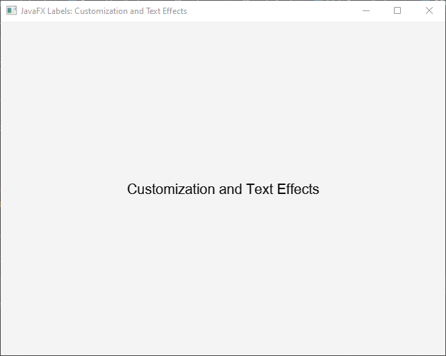
Customizing Inner Shadow
The InnerShadow class provides properties that can be adjusted to customize the inner shadow effect. Some key properties to consider are color, radius, offsetX, and offsetY.
The color property determines the color of the inner shadow effect. You can set it to any Color object to achieve the desired shadow color. The blur radius property controls the blurriness of the inner shadow. A higher value results in a more blurred shadow.And the offsetX and offsetY properties determine the distance of the shadow’s offset in the X and Y directions, respectively. By adjusting these values, you can control the position of the inner shadow.
Here’s an example of customizing the inner shadow effect:
import javafx.application.Application;
import javafx.scene.Scene;
import javafx.scene.control.Label;
import javafx.scene.effect.InnerShadow;
import javafx.scene.layout.*;
import javafx.scene.paint.Color;
import javafx.scene.text.Font;
import javafx.stage.Stage;

public class Main extends Application {

    private final StackPane parent = new StackPane();

    @Override
    public void start(Stage stage) throws Exception {
        this.setupStage(stage);
    }

    @Override
    public void init() throws Exception {
        super.init();
        this.buildUI();
    }

    private void buildUI() {

        Label label = new Label("Customization and Text Effects");
        label.setFont(new Font("Arial", 20));

        InnerShadow innerShadow = new InnerShadow();
        innerShadow.setColor(Color.DARKGRAY);
        innerShadow.setRadius(5);
        innerShadow.setOffsetX(2);
        innerShadow.setOffsetY(2);

        label.setEffect(innerShadow);

        this.parent.getChildren().addAll(label);

    }

    private void setupStage(Stage stage) {

        Scene scene = new Scene(this.parent, 640.0, 480.0);

        // Sets the stage title
        stage.setTitle("JavaFX Labels: Customization and Text Effects");

        // Set the stage scene
        stage.setScene(scene);

        // Center stage on screen
        stage.centerOnScreen();

        // Show stage on screen
        stage.show();

    }

}
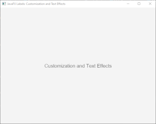
In this example, we customize the inner shadow effect by setting the color to Color.DARKGRAY, blur radius to 5 pixels, and offset to 2 pixels in both the X and Y directions. These values can be adjusted to achieve the desired shadowed and recessed effect.
Advanced Customization with CSS
JavaFX provides robust support for using Cascading Style Sheets (CSS) to customize the appearance of UI components, including Labels. CSS allows for a separation of concerns, where the visual design can be defined separately from the application logic. This separation enables developers to easily modify the look and feel of Labels and achieve a high level of flexibility and customization.
Defining CSS Styles
To apply CSS styles to JavaFX Labels, you can create a separate CSS file or define inline styles directly in the code. Let’s look at both approaches:
External CSS File
You can create a separate CSS file, such as styles.css, and define styles for Labels within it. Here’s an example:
.labelStyle {

    -fx-font-family: "Arial";
    -fx-font-size: 18px;
    -fx-text-fill: #333333;
    -fx-background-color: #FFFFFF;
    -fx-effect: dropshadow(gaussian, rgba(0,0,0,0.4), 10, 0, 0, 0);

}
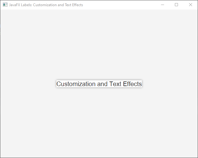
In this example, the .labelStyle class is defined with various CSS properties, such as font-family, font-size, text-fill, background-color, and effect. These properties modify the font, text color, background color, and apply a drop shadow effect to the Labels.
To apply this style to a Label, you can add the appropriate class to the Label’s style class list:
import javafx.application.Application;
import javafx.scene.Scene;
import javafx.scene.control.Label;
import javafx.scene.layout.*;
import javafx.stage.Stage;

public class Main extends Application {

    private final StackPane parent = new StackPane();

    @Override
    public void start(Stage stage) throws Exception {
        this.setupStage(stage);
    }

    @Override
    public void init() throws Exception {
        super.init();
        this.buildUI();
    }

    private void buildUI() {

        Label label = new Label("Customization and Text Effects");
        label.getStyleClass().add("labelStyle");

        this.parent.getChildren().addAll(label);

    }

    private void setupStage(Stage stage) {

        Scene scene = new Scene(this.parent, 640.0, 480.0);

        // Load the style sheet
        scene.getStylesheets().addAll("styles.css");

        // Sets the stage title
        stage.setTitle("JavaFX Labels: Customization and Text Effects");

        // Set the stage scene
        stage.setScene(scene);

        // Center stage on screen
        stage.centerOnScreen();

        // Show stage on screen
        stage.show();

    }

}
By linking the CSS file to your JavaFX application, the defined styles will be automatically applied to the Labels that have the corresponding style class.
Inline Styles
Alternatively, you can apply CSS styles directly in the code using the setStyle() method. Here’s an example:
import javafx.application.Application;
import javafx.scene.Scene;
import javafx.scene.control.Label;
import javafx.scene.layout.*;
import javafx.stage.Stage;

public class Main extends Application {

    private final StackPane parent = new StackPane();

    @Override
    public void start(Stage stage) throws Exception {
        this.setupStage(stage);
    }

    @Override
    public void init() throws Exception {
        super.init();
        this.buildUI();
    }

    private void buildUI() {

        Label label = new Label("Customization and Text Effects");

        label.setStyle("-fx-font-family: 'Arial'; " +
                "-fx-font-size: 18px; " +
                "-fx-text-fill: #333333; " +
                "-fx-background-color: #FFFFFF; " +
                "-fx-effect: dropshadow(gaussian, rgba(0,0,0,0.4), 10, 0, 0, 0);");

        this.parent.getChildren().addAll(label);

    }

    private void setupStage(Stage stage) {

        Scene scene = new Scene(this.parent, 640.0, 480.0);

        // Sets the stage title
        stage.setTitle("JavaFX Labels: Customization and Text Effects");

        // Set the stage scene
        stage.setScene(scene);

        // Center stage on screen
        stage.centerOnScreen();

        // Show stage on screen
        stage.show();

    }

}
In this approach, the CSS styles are specified as a string within the setStyle() method call.

Animations and Transitions
CSS in JavaFX also allows you to define animations and transitions for Labels, adding dynamic behavior to the UI. Using keyframes, you can specify different states for the Label at different points in time.
Here’s an example of animating the color of a Label:
.labelAnimation {

    -fx-text-fill: red;
    -fx-transition: all 5s ease-out;

}

.labelAnimation:hover {

    -fx-text-fill: blue;
    -fx-scale-x: 1.5;
    -fx-scale-y: 1.5;
    -fx-rotate: 45deg;

}
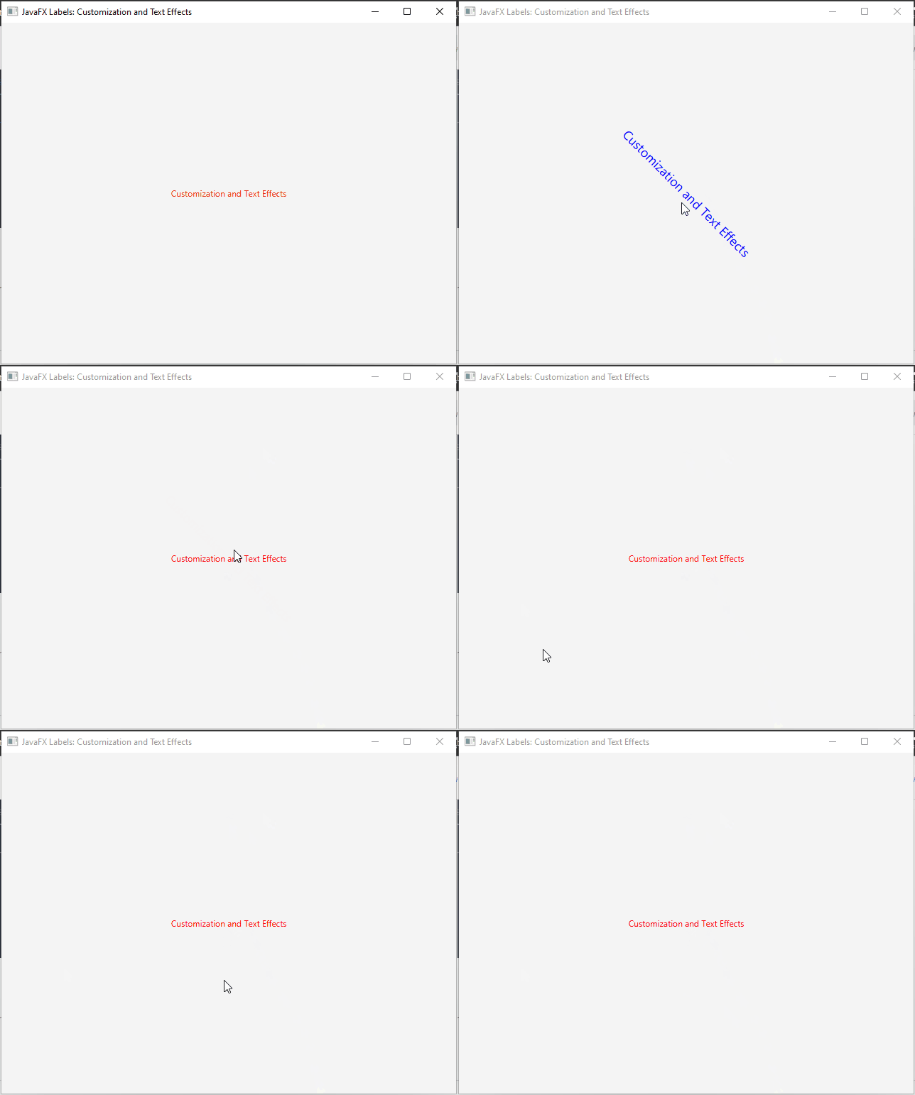
In this example, the .labelAnimation class is defined with an initial text-fill color and a 1-second transition. When the mouse hovers over the Label, the color transitions to blue.
To apply this animation to a Label, you can add the appropriate class to the Label’s style class list:
import javafx.application.Application;
import javafx.scene.Scene;
import javafx.scene.control.Label;
import javafx.scene.layout.*;
import javafx.stage.Stage;

public class Main extends Application {

    private final StackPane parent = new StackPane();

    @Override
    public void start(Stage stage) throws Exception {
        this.setupStage(stage);
    }

    @Override
    public void init() throws Exception {
        super.init();
        this.buildUI();
    }

    private void buildUI() {

        Label label = new Label("Customization and Text Effects");
        label.getStyleClass().add("labelAnimation");

        this.parent.getChildren().addAll(label);

    }

    private void setupStage(Stage stage) {

        Scene scene = new Scene(this.parent, 640.0, 480.0);

        // Load the CSS File
        scene.getStylesheets().addAll("styles.css");

        // Sets the stage title
        stage.setTitle("JavaFX Labels: Customization and Text Effects");

        // Set the stage scene
        stage.setScene(scene);

        // Center stage on screen
        stage.centerOnScreen();

        // Show stage on screen
        stage.show();

    }

}
When the Label is rendered, it will animate its color transition according to the defined CSS animation.
Conclusion
JavaFX labels offer a wide range of customization options and text effects to enhance their visual appeal and create engaging user interfaces. By applying techniques like font customization, color schemes, alignment, and padding, you can tailor your labels to match the desired aesthetics of your application. Additionally, text effects such as drop shadows, reflections, glows, and animations can further elevate the impact of your labels.
Experiment with different combinations and unleash your creativity to make your JavaFX labels truly unique. By customizing and applying text effects, you can deliver an immersive user experience and captivate your audience with visually appealing labels.
I hope you found this code informative and useful. If you would like to receive more content, please consider subscribing to our newsletter!


