JavaFX is a versatile and powerful framework for creating rich and interactive user interfaces. Among its many features, JavaFX provides a wide range of visual effects to enhance the aesthetics of your applications. One such effect is the DropShadow effect, which adds depth and dimension to your user interface elements. In this article, we will explore the DropShadow Effect, its various properties and how to use them to create stunning visual effects in your JavaFX applications.
What is the DropShadow Effect?
The DropShadow effect is a visual enhancement that simulates the appearance of a light source casting a shadow on an object. It can give your UI elements a 3D look and feel, making them appear as if they’re floating above the screen. This effect is achieved by specifying various properties that control how the shadow is rendered. Let’s dive into these properties and see how they work.
Properties of the DropShadow Effect
Blur Type
The blurType property determines the algorithm used to blur the shadow. It can be set to one of three values: BlurType.GAUSSIAN, BlurType.ONE_PASS_BOX, or BlurType.THREE_PASS_BOX. Each type yields a different visual result, allowing you to achieve your desired shadow effect.
Blur Type: From Sharp to Soft Shadows
The blurType property is crucial in defining the character of your shadow. You can choose from three different blur types:
- BlurType.GAUSSIAN: A Gaussian blur kernel is used to blur the shadow with very high quality.
- BlurType.ONE_PASS_BOX: A single pass of a box filter is used to blur the shadow.
- BlurType.TWO_PASS_BOX: Two passes of a box filter are used to blur the shadow for a slightly smoother effect.
- BlurType.THREE_PASS_BOX: Three passes of a box filter are used to blur the shadow for an effect that is almost as smooth as a Gaussian filter.
Choosing the appropriate blurType depends on your application’s requirements and the desired visual effect.
Color
The color property defines the color of the shadow. You can specify the shadow color using JavaFX’s Color class, providing a wide array of color options to match your application’s style.
Offset X and Offset Y
These properties, offsetX and offsetY, control the horizontal and vertical positioning of the shadow. By adjusting these values, you can place the shadow precisely where you want it.
Radius
The radius property sets the extent of the shadow’s blur. A larger radius creates a softer, more diffused shadow, while a smaller value results in a sharper, more defined shadow.
Width and Height
The width and height properties allow you to specify the dimensions of the shadow effect. You can use these properties to create elongated or stretched shadows for specific visual effects.
Spread
The spread property controls how the shadow spreads. A value of 0 creates a shadow with sharp edges, while a larger value creates a softer and more extended shadow.
Creating the DropShadowEffect Application
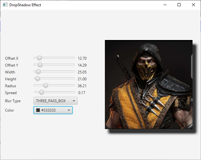
To illustrate the use of the DropShadow effect, we’ll work with a simple JavaFX application that displays an image with the DropShadow applied. Let’s take a look at the example application code:
import javafx.application.Application;
import javafx.geometry.Insets;
import javafx.geometry.Pos;
import javafx.scene.Scene;
import javafx.scene.effect.DropShadow;
import javafx.scene.image.Image;
import javafx.scene.image.ImageView;
import javafx.scene.layout.BorderPane;
import javafx.stage.Stage;

public class DropShadowEffectExampleApp extends Application {

    private static final double WIDTH = 640;
    private static final double HEIGHT = 480;

    /* The parent layout manager */
    private final BorderPane parent = new BorderPane();

    @Override
    public void start(Stage stage) throws Exception {

        Scene scene = new Scene(this.parent, WIDTH, HEIGHT);

        // Sets the stage title
        stage.setTitle("DropShadow Effect");

        // Set the stage scene
        stage.setScene(scene);

        // Center stage on screen
        stage.centerOnScreen();

        // Show stage on screen
        stage.show();

    }

    @Override
    public void init() throws Exception {
        super.init();

        Image image = new Image("scorpion.jpg");

        ImageView imageView = new ImageView(image);
        imageView.setPreserveRatio(true);
        imageView.setFitWidth(280);

        // Create the DropShadow
        DropShadow dropShadow = new DropShadow();

        // Create the Control Panel for the DropShadow
        DropShadowControlPanel controlPanel = new DropShadowControlPanel(dropShadow);

        // Apply the DropShadow Effect to the ImageView
        imageView.setEffect(dropShadow);

        /* Add the ImageView to the BorderPane center region */
        this.parent.setCenter(imageView);
        BorderPane.setAlignment(imageView, Pos.CENTER_LEFT);
        BorderPane.setMargin(imageView, new Insets(20));

        /* Add the DropShadowControlPanel to the BorderPane left region */
        this.parent.setLeft(controlPanel);

    }

}
In this example, we create a JavaFX application with an image (“scorpion.jpg”) displayed in the center of a BorderPane. A DropShadow effect is applied to the image to add a shadowing effect. Additionally, there is a control panel on the left side to adjust various properties of the DropShadow effect.
The DropShadow Control Panel
In the example application, a DropShadowControlPanel class is used to create a user-friendly control panel for modifying the DropShadow properties. This control panel consists of UI elements such as sliders, color pickers, and a combo box for selecting the blur type.
Here is the code for the DropShadowControlPanel class:
import javafx.beans.property.DoubleProperty;
import javafx.collections.FXCollections;
import javafx.collections.ObservableList;
import javafx.geometry.Insets;
import javafx.geometry.Pos;
import javafx.scene.Node;
import javafx.scene.control.ColorPicker;
import javafx.scene.control.ComboBox;
import javafx.scene.control.Label;
import javafx.scene.control.Slider;
import javafx.scene.effect.BlurType;
import javafx.scene.effect.DropShadow;
import javafx.scene.layout.HBox;
import javafx.scene.layout.VBox;
import javafx.scene.paint.Color;

public class DropShadowControlPanel extends VBox {

    public DropShadowControlPanel(DropShadow dropShadow) {
        super(5);

        // Create BlurTypes Collection
        ObservableList<BlurType> blurTypes = FXCollections.observableArrayList(
                BlurType.GAUSSIAN,
                BlurType.ONE_PASS_BOX,
                BlurType.TWO_PASS_BOX,
                BlurType.THREE_PASS_BOX
        );

        // Create BlurType ComboBox, and provide the created BlurTypes
        ComboBox<BlurType> blurTypeComboBox = new ComboBox<>(blurTypes);
        blurTypeComboBox.getSelectionModel().selectFirst(); // Select the first BlurType

        // Bind the DropShadow blurTypeProperty to the ComboBox valueProperty
        dropShadow.blurTypeProperty().bind(blurTypeComboBox.valueProperty());

        // Create the HBox to arrange the Label, and BlurType ComboBox
        HBox blurTypeContainer = this.createLabeledNode(5, blurTypeComboBox, "Blur Type");


        // Create the ColorPicker, and set BLACK as the default color
        ColorPicker colorPicker = new ColorPicker(Color.BLACK);

        // Create the HBox to arrange the Label, and the ColorPicker
        HBox colorContainer = this.createLabeledNode( 13, colorPicker, "Color" );

        // Bind the DropShadow colorProperty to the ColorPicker valueProperty
        dropShadow.colorProperty().bind(colorPicker.valueProperty());

        // Create a VBox to arrange Sliders, the BlurType ComboBox, and the ColorPicker
        this.getChildren().addAll(
                this.createLabeledBoundSlider(dropShadow.offsetXProperty(),"Offset X", 0, 100, 0),
                this.createLabeledBoundSlider(dropShadow.offsetYProperty(),"Offset Y", 0, 100, 0),
                this.createLabeledBoundSlider(dropShadow.widthProperty(), "Width", 0, 255, 21),
                this.createLabeledBoundSlider(dropShadow.heightProperty(),"Height",0, 255, 21),
                this.createLabeledBoundSlider(dropShadow.radiusProperty(), "Radius",0, 127, 10),
                this.createLabeledBoundSlider(dropShadow.spreadProperty(), "Spread",0.0, 1.0, 0.0),
                blurTypeContainer,
                colorContainer
        );

        this.setAlignment(Pos.CENTER_LEFT);
        this.setPadding(new Insets(15));

    }

    private HBox createLabeledBoundSlider(DoubleProperty property, String label, double min, double max, double defaultValue) {

        Slider slider = new Slider(min, max, defaultValue);
        property.bind(slider.valueProperty());

        Label value = new Label();
        value.setMinWidth(50);

        // Format the slider value with two decimal places
        value.textProperty().bind(slider.valueProperty().asString("%.2f"));

        Label lblLabel = new Label(String.format("%-20s", label));
        lblLabel.setMinWidth(80);
        lblLabel.setAlignment(Pos.CENTER_RIGHT);

        // Create the HBox to arrange UI components

        return new HBox(5, lblLabel, slider, value);

    }

    private HBox createLabeledNode(double spacing, Node node, String label) {

        HBox container = new HBox(
                spacing,
                new Label(String.format("%-20s", label)),
                node
        );

        container.setAlignment(Pos.CENTER_LEFT);

        return container;

    }

}
The DropShadowControlPanel class includes controls for each DropShadow property, allowing users to interactively adjust the shadow’s appearance. These controls are bound to the corresponding DropShadow properties, ensuring that changes made in the control panel instantly update the shadow effect on the image.

Conclusion
The DropShadow effect in JavaFX is a valuable tool for enhancing the visual appeal of your applications. By manipulating its properties, you can create striking visual effects that add depth and dimension to your UI components. This article has provided an in-depth exploration of the DropShadow effect, from its key properties to a hands-on example, showcasing its practical application. With this knowledge, you are now well-equipped to leverage the power of the DropShadow effect in your JavaFX projects, bringing them to life with captivating shadows and highlights.
I hope you found this article informative and useful. If you would like to receive more content, please consider subscribing to our newsletter.


