Flutter is a tool that lets you build apps for phones, computers, and websites all using the same code. One of the best things about Flutter is that it makes creating layouts (how your app looks on the screen) easy and flexible.
In this article, we’ll start by building simple layouts and then explore more advanced topics like improving your layouts, reacting to user actions (like clicking buttons), and making sure your app looks good on all devices. Finally, we’ll share some tips to keep your layouts clean, fast, and easy to update.
By the end, you’ll be able to create great-looking apps that work well on any device.
Understanding Flutter Layouts
In Flutter, layouts are created using widgets, which are the building blocks of every app. There are many different types of widgets, each helping you create different parts of your app’s layout. These widgets can be simple, like a button or text, or more complex, like a column or a row to arrange items on the screen. Understanding how to use these widgets lets you build flexible and beautiful layouts for your app.
Introduction to Widgets
In Flutter, everything is a widget. Widgets tell Flutter how to display parts of your app based on their current settings and state. There are two main types of widgets:
- Stateless Widgets: These are widgets that don’t change over time. Once they’re built, they stay the same throughout the app’s life. For example, a button with a fixed label.
- Stateful Widgets: These widgets can change while the app is running. They can update themselves when something in the app changes, like a button that shows a new message when clicked.
Understanding the difference helps you decide which widget to use depending on whether you need your widget to stay the same or change over time.
Single-child Layout Widgets
Single-child layout widgets are used when you want to place just one widget inside another. Here are a few common ones you’ll use often:
- Container: This widget is like a box that can hold one widget. You can change its size, color, and add space around it. It’s very useful for different things.
- Center: This widget makes sure whatever you put inside it stays in the middle of the screen. It’s great when you want to center things like text or images.
- Padding: Padding adds space around a widget, giving it some room. For example, if you have text, you can use padding to keep it away from the edges of the screen.
These widgets help you organize and arrange your app’s elements just the way you want.
Multi-child Layout Widgets
Multi-child layout widgets are used when you want to place more than one widget inside a parent. Here are some commonly used ones:
- Column: This widget arranges its children vertically, like stacking items on top of each other. It’s useful when you want to show things one after another, like text and buttons.
- Row: This widget arranges its children horizontally, placing items next to each other. It’s helpful when you want things to appear side by side, like icons or buttons.
- Stack: This widget allows you to layer widgets on top of each other. You can use it when you want things to overlap, like placing a button over an image.
These widgets help you organize your app by arranging multiple elements in the way you need.
By understanding these basic concepts, you’re now ready to start building simple layouts in Flutter. You can begin creating and arranging your widgets to make your app look the way you want.
Building a Simple Layout
Let’s start by building a simple layout in Flutter using the Container widget. This is a great way to learn how to organize things on the screen.
Using Container for Layout
The Container widget is one of the most popular widgets in Flutter. It’s like a box that you can change in many ways, such as its size, the space inside it (called padding), the space around it (called margin), and even its color or decoration. It helps you organize your app’s content in a neat way.
Code Example: Creating a Simple Layout
To create a simple layout using the Container widget, follow these steps:
- Open the
lib/main.dartFile: This is the main entry point for your Flutter application. - Write the Code: Replace the existing code with the following code to create a simple layout:
import 'package:flutter/material.dart';
void main() {
runApp(const MyApp());
}
class MyApp extends StatelessWidget {
const MyApp({super.key});
@override
Widget build(BuildContext context) {
return MaterialApp(
home: Scaffold(
appBar: AppBar(
title: const Text('Simple Layout Example'),
),
body: Center(
child: Container(
width: 200,
height: 200,
color: Colors.blue,
child: const Center(
child: Text(
'Hello, Flutter!',
style: TextStyle(color: Colors.white, fontSize: 20),
),
),
),
),
),
);
}
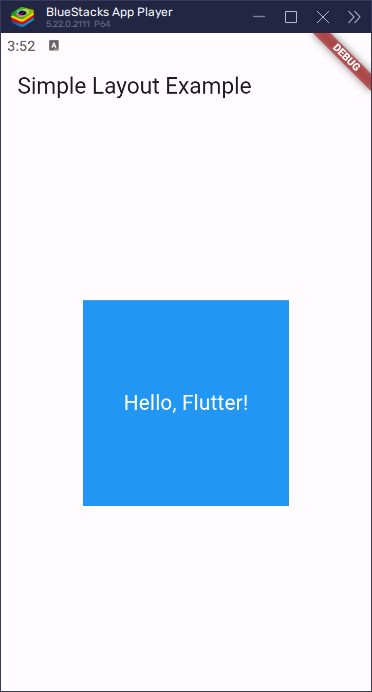
}What’s Happening Here?
- The
Containerwidget has a blue background, a width of 250 and a height of 150. - It also has padding inside the container to add space around the text.
- The Text widget displays “Hello, Flutter!” in white color, and it is centered inside the container.
When you run the app, you’ll see a blue box with the text “Hello, Flutter!” in the center.
Advanced Layout Techniques
Flutter has some really cool layout widgets like Row and Column that let you arrange things in more creative ways. You can use a Row to place items next to each other (horizontally) or a Column to stack them on top of each other (vertically). These widgets make it easy to organize your app’s content the way you want.
Using Row and Column for Flexible Layouts
The Row and Column widgets help you arrange your widgets in a flexible way. You can use a Row to line up things next to each other (horizontally) or a Column to stack things on top of each other (vertically). These widgets are very helpful because they allow you to control how things are lined up and how much space is between them.
Code Examples: Advanced Layouts with Row and Column
To create advanced layouts using Row and Column widgets, follow these steps:
- Open the
lib/main.dartFile: This is the main entry point for your Flutter application. - Write the Code: Replace the existing code with the following code to create advanced layouts:
import 'package:flutter/material.dart';
void main() {
runApp(const MyApp());
}
class MyApp extends StatelessWidget {
const MyApp({super.key});
@override
Widget build(BuildContext context) {
return MaterialApp(
home: Scaffold(
appBar: AppBar(
title: const Text('Advanced Layout Example'),
),
body: Column(
children: [
Row(
mainAxisAlignment: MainAxisAlignment.center,
children: [
Container(
width: 100,
height: 100,
color: Colors.red,
child: const Center(
child: Text(
'Box 1',
style: TextStyle(color: Colors.white),
),
),
),
Container(
width: 100,
height: 100,
color: Colors.green,
child: const Center(
child: Text(
'Box 2',
style: TextStyle(color: Colors.white),
),
),
),
],
),
Container(
width: 200,
height: 100,
color: Colors.blue,
child: const Center(
child: Text(
'Box 3',
style: TextStyle(color: Colors.white),
),
),
),
],
),
),
);
}
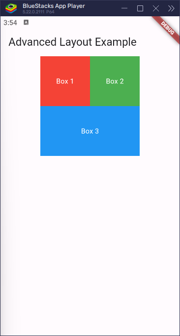
}What’s Happening Here?
In this example, we use a Column widget to arrange things in a vertical line. Inside the Column, we use a Row widget to line things up horizontally (next to each other).
- The
Rowwidget contains twoContainerwidgets (Box 1 and Box 2), each with a size of 100×100, different colors (red and green), and centered text that says “Box 1” and “Box 2.” - Below the
Row, we add anotherContainer(Box 3) that is 200×100, with a blue background and centered text that says “Box 3.”
By following these steps, you’ve created a flexible layout using Row and Column widgets in Flutter. In the next sections, we’ll see how to customize and improve the look of your layouts.
Customizing Layouts
Customizing the appearance of your layouts is important to make your app look the way you want. Flutter gives you many tools and options to change the style and look of your layout. You can adjust things like colors, sizes, spacing, and much more to fit your app’s design.
Styling Widgets
In Flutter, you can change how widgets look using different properties. Some of the most common ways to style widgets include adjusting:
- Padding: Adds space inside a widget.
- Margin: Adds space outside a widget.
- Decoration: Allows you to add things like colors, borders, or shadows to a widget.
The Padding widget and Container widget are often used to make these changes to the appearance of your app’s layout.
Code Examples: Customizing Appearance with Padding and Margin
To customize the appearance of layouts using padding and margin, follow these steps:
- Open the
lib/main.dartFile: This is the main entry point for your Flutter application. - Write the Code: Replace the existing code with the following code to customize the appearance of layouts:
import 'package:flutter/material.dart';

void main() {
  runApp(const MyApp());
}

class MyApp extends StatelessWidget {

  const MyApp({super.key});

  @override
  Widget build(BuildContext context) {

    return MaterialApp(

      home: Scaffold(
        appBar: AppBar(
          title: const Text('Customized Layout Example'),
        ),
        body: Center(
          child: Container(
            padding: const EdgeInsets.all(20),
            margin: const EdgeInsets.all(10),
            decoration: BoxDecoration(
              color: Colors.blue,
              borderRadius: BorderRadius.circular(10),
              boxShadow: [
                BoxShadow(
                  color: Colors.black.withOpacity(0.5),
                  offset: const Offset(2, 2),
                  blurRadius: 5,
                ),
              ],
            ),
            child: const Text(
              'Styled Container',
              style: TextStyle(color: Colors.white, fontSize: 20),
            ),
          ),
        ),
      ),
    );

  }

}
What’s Happening Here?
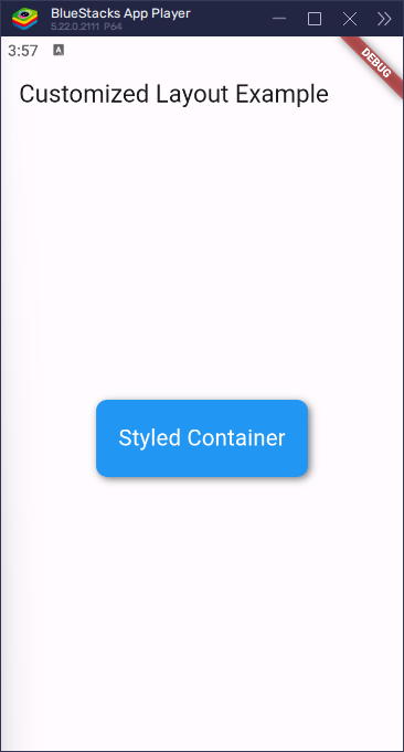
In this example, we are using a Container widget to create a styled box with some cool features:
- Padding: Inside the container, we added padding of 20 pixels. This creates some space between the edges of the container and the text, so the text doesn’t touch the sides.
- Margin: We added a margin of 10 pixels outside the container. This makes sure the container is spaced away from other widgets or the edges of the screen.
- Decoration: The container has several visual styles applied:
- The background color is set to blue.
- The corners of the container are rounded with a radius of 10 pixels.
- A shadow is added to make the container appear like it’s floating. The shadow has a black color and a slight blur effect, which gives it a soft look.
When you run the app, you will see a nicely styled blue box with some space inside and outside it, a smooth shadow, and text centered in the middle. This demonstrates how to customize the appearance of a container in Flutter.
Handling User Interactions
User interactions are what make your app fun and engaging. Flutter lets you easily add interactive features like buttons, taps, and gestures. With widgets like TextButton, ElevatedButton, and GestureDetector, you can make your app respond to user actions.
- Buttons: Buttons allow users to interact with your app. When pressed, they can trigger actions like changing text, navigating to another screen, or updating the UI. Flutter provides various button types, such as
TextButton,ElevatedButton, andOutlinedButton.
- GestureDetector: The
GestureDetectorwidget helps your app recognize different gestures, like taps, swipes, and pinches. It allows you to make more advanced interactions, like dragging elements on the screen or reacting to a user’s touch in creative ways.
In this section, we will show you how to use buttons and gestures to make your app respond to user input and become more interactive.
Adding Interactivity to Layouts
To make your app interactive, you can use widgets like GestureDetector, InkWell, and different types of buttons. These widgets help your app respond to user actions, such as taps or swipes.
- GestureDetector: This widget detects different gestures, like taps, swipes, or long presses. It lets you add custom reactions when the user interacts with parts of your app.
- InkWell: The
InkWellwidget adds a ripple effect when a user taps on a widget. This gives a nice visual feedback that the app is responding to the touch.
- Buttons: Buttons, like
TextButton,ElevatedButton, andOutlinedButton, allow users to interact with your app. When a button is pressed, it can trigger actions, such as showing a message or navigating to another screen.
These widgets make your app more dynamic by responding to user actions and creating a more engaging experience.
Code Examples: Handling Button Presses and Gestures
To handle user interactions in your layouts, follow these steps:
- Open the
lib/main.dartFile: This is the main entry point for your Flutter application. - Write the Code: Replace the existing code with the following code to handle user interactions:
import 'package:flutter/material.dart';

void main() {
  runApp(const MyApp());
}

class MyApp extends StatelessWidget {
  const MyApp({super.key});

  @override
  Widget build(BuildContext context) {

    return MaterialApp(
      home: Scaffold(
        appBar: AppBar(
          title: const Text('Button, Gesture, and InkWell Example'),
        ),
        body: Center(
          child: Column(
            mainAxisAlignment: MainAxisAlignment.center,
            children: [
              // ElevatedButton with better styling
              ElevatedButton(
                style: ElevatedButton.styleFrom(
                  backgroundColor: Colors.orange, // Button color
                  foregroundColor: Colors.white, // Text color
                  padding: const EdgeInsets.symmetric(horizontal: 30, vertical: 15),
                ),
                onPressed: () {
                  print("ElevatedButton Pressed!");
                },
                child: const Text("Press Me"),
              ),
              const SizedBox(height: 20),

              // GestureDetector with a better color
              GestureDetector(
                onTap: () {
                  print("Container Tapped!");
                },
                child: Container(
                  padding: const EdgeInsets.all(20),
                  decoration: BoxDecoration(
                    color: Colors.deepPurple,
                    borderRadius: BorderRadius.circular(10),
                  ),
                  child: const Text(
                    'Tap Me',
                    style: TextStyle(color: Colors.white, fontSize: 20),
                  ),
                ),
              ),
              const SizedBox(height: 20),

              // InkWell with ripple effect
              Material(
                color: Colors.indigo, // Background color
                borderRadius: BorderRadius.circular(10), // Rounded edges
                child: InkWell(
                  splashColor: Colors.amber, // Ripple color
                  borderRadius: BorderRadius.circular(10),
                  onTap: () {
                    print("InkWell Tapped!");
                  },
                  child: const Padding(
                    padding: EdgeInsets.all(20),
                    child: Text(
                      'Tap with Ripple',
                      style: TextStyle(color: Colors.white, fontSize: 20),
                    ),
                  ),
                ),
              ),
            ],
          ),
        ),
      ),
    );
  }
}
What’s Happening in the Code?
- ElevatedButton: This button responds when it’s pressed. When the button is tapped, the message
"ElevatedButton Pressed!"is printed in the console. - GestureDetector: This widget makes the container respond to taps. When you tap the container, the message
"Container Tapped!"is printed in the console. - InkWell: This widget adds a ripple effect when the container is tapped, giving it a smooth visual effect, just like material design buttons. When tapped, it prints
"InkWell Tapped!"in the console.
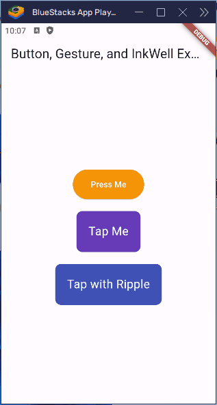
By using ElevatedButton, GestureDetector, and InkWell, you can add interactivity to your app, making it respond to user actions with visual effects and messages. This helps create a more engaging experience for the users.
Responsive Layouts
A responsive layout helps your app look great on different devices like phones, tablets, and even desktops. It adjusts itself to fit various screen sizes and orientations, making sure your app is always easy to use and looks awesome no matter the device.
Flutter gives you powerful tools to make your app responsive. By using widgets like MediaQuery, LayoutBuilder, and Flexible, you can create layouts that change based on the size of the screen. This makes sure that your app adapts smoothly to all kinds of devices.
Making Layouts Responsive
To make your layouts responsive, you can use widgets like Flexible, Expanded, and MediaQuery. These widgets help adjust your layout depending on the screen size, making your app look great everywhere.
- Flexible: Helps widgets adjust to the available space.
- Expanded: Takes up extra space in a layout.
- MediaQuery: Gives information about the screen size and orientation, allowing you to change the layout dynamically.
By combining these tools, you can ensure your app provides a good user experience across all devices.
Code Examples: Building Adaptive UIs
To build responsive layouts in Flutter, follow these steps:
- Open the
lib/main.dartFile: This is the main entry point for your Flutter application. - Write the Code: Replace the existing code with the following code to create responsive layouts:
import 'package:flutter/material.dart';
void main() {
runApp(const MyApp());
}
class MyApp extends StatelessWidget {
const MyApp({super.key});
@override
Widget build(BuildContext context) {
return MaterialApp(
home: Scaffold(
appBar: AppBar(
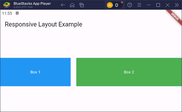
title: const Text('Responsive Layout Example'),
),
body: const ResponsiveLayout(),
),
);
}
}
class ResponsiveLayout extends StatelessWidget {
const ResponsiveLayout({super.key});
@override
Widget build(BuildContext context) {
// Use MediaQuery to get the screen width and height
var screenWidth = MediaQuery.of(context).size.width;
return Center(
child: LayoutBuilder(
builder: (context, constraints) {
// If the screen width is smaller than 600, use a single column layout
if (screenWidth < 600) {
return Column(
mainAxisAlignment: MainAxisAlignment.center,
children: [
Container(
color: Colors.blue,
height: 100,
width: double.infinity,
child: const Center(
child: Text('Box 1', style: TextStyle(color: Colors.white))
),
),
const SizedBox(height: 20),
Container(
color: Colors.green,
height: 100,
width: double.infinity,
child: const Center(
child: Text('Box 2', style: TextStyle(color: Colors.white))
),
),
],
);
} else {
// For larger screens, use a row layout with flexible boxes
return Row(
mainAxisAlignment: MainAxisAlignment.center,
children: [
Flexible(
flex: 2,
child: Container(
color: Colors.blue,
height: 100,
child: const Center(
child: Text('Box 1', style: TextStyle(color: Colors.white))
),
),
),
const SizedBox(width: 20),
Flexible(
flex: 3,
child: Container(
color: Colors.green,
height: 100,
child: const Center(
child: Text('Box 2', style: TextStyle(color: Colors.white))
),
),
),
],
);
}
},
),
);
}
}What’s Happening Here?
- MediaQuery: This is used to check the width of the screen and adjust the layout accordingly. If the screen width is smaller than 600 pixels (like on a phone), we use a vertical layout (Column). If it’s larger, like on a tablet or desktop, we use a horizontal layout (Row).
- LayoutBuilder: This widget allows us to adjust the layout based on the parent widget’s size. It rebuilds the layout when the constraints change, making it perfect for responsive designs.
- Flexible: In the
Row, theFlexiblewidget is used to control the space each child occupies. Theflexproperty tells how much space each child should take. In this case, Box 1 takes up 2 parts of the available space, and Box 2 takes up 3 parts. - Expanded: If you wanted to make each box take up equal space in the
Row, you could replaceFlexiblewithExpanded, which forces each widget to take up the available space equally.
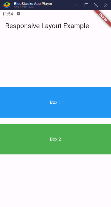
This code example ensures that the layout is responsive, switching between a column layout for smaller screens and a row layout for larger screens.
Best Practices for Building Layouts
When building layouts in Flutter, it’s important to follow some simple rules to make sure your app works well and looks great.
Common Mistakes to Avoid
- Too Many Nested Widgets: Putting too many widgets inside each other can make your code hard to understand and messy. Try not to make your code too complicated. Instead of nesting too many widgets, use other helpful widgets like
StackorWrapwhen you need to arrange things in a complex way.
- Not Thinking About Different Screen Sizes: Your app should look good on both small phones and large tablets. If you don’t think about screen sizes, your app might look strange on some devices. Use things like
MediaQueryorLayoutBuilderto make sure your app fits all kinds of screens.
- Using Fixed Sizes: If you set fixed sizes for things like width or height, your app might look odd on different devices. Try using flexible sizes with widgets like
ExpandedandFlexibleso everything adjusts properly.
- Not Using Padding and Margin: Without space between your widgets, everything can look too tight or crowded. Make sure to use padding and margins to give your widgets some breathing room and make your app feel nicer to use.
- Making Your App Slow: If you put too many widgets or make things too complicated, your app might become slow. To make sure your app runs fast, keep the layout simple and avoid too many extra widgets. You can also use special tools like
RepaintBoundaryto help with performance.
By following these simple rules and avoiding these mistakes, you’ll create a layout that is easy to work with, looks great, and works well on any device.
Tips for Effective Layout Design
- Use the Right Layout Widgets: Pick the best layout widget for what you need. For simple layouts, use
RowandColumn. For overlapping widgets, tryStack, and if you want flexible layouts, useFlex.
- Keep Things Simple and Reusable: If your layout is complicated, break it down into smaller parts. This helps you manage and update your code easily.
- Test on Different Devices: Make sure your app looks great on different devices, whether it’s a phone or a tablet. Test it on both emulators and real devices.
- Follow Design Rules: Stick to good design practices like keeping things aligned, consistent, and spaced well. Flutter’s built-in design tools can help make your app look clean and nice.
By following these tips and avoiding mistakes, you can build Flutter apps that are easy to maintain, user-friendly, and look great on all devices.
Conclusion
In this article, we learned how to create layouts in Flutter. We started by understanding the basics and creating simple layouts using Container, Row, and Column widgets. We also learned how to customize the look of layouts, handle user interactions, and create layouts that work well on different screen sizes.
We also talked about some important best practices to help you avoid common mistakes and build clean and user-friendly layouts.
The concepts and examples from this article give you a great start for building layouts in Flutter. There’s still a lot more to explore. Try experimenting with different layout widgets, styles, and animations to make your app unique. The more you try, the better your app will become.
Additional Resources for Learning Flutter
If you want to keep learning Flutter and become even better at it, here are some resources that can help:
- Flutter Documentation: The official Flutter documentation is a great place to find detailed guides and examples. You can find it at Flutter Docs.
- Flutter YouTube Channel: Flutter’s official YouTube channel has helpful videos for beginners and advanced learners alike. Check it out at Flutter YouTube.
- Flutter Community: Join the Flutter community on platforms like Flutter Dev Reddit or Flutter Community on Discord.
- Flutter Courses on Udemy: There are many great courses on Udemy that teach Flutter step by step. Look for highly-rated courses for both beginners and more experienced developers.
- Flutter Packages: Explore useful packages to enhance your app’s functionality. Visit pub.dev to find packages and libraries for Flutter.
- Books: Books like “Flutter for Beginners” by Alessandro Biessek and “Flutter in Action” by Eric Windmill can be great for in-depth learning. They provide comprehensive coverage of Flutter concepts and best practices.
Keep practicing and building projects to get hands-on experience. The more you code, the better you’ll get at Flutter.