Have you ever used an app that pops up a little box asking you something like “Are you sure you want to delete this?” or “Do you want to save changes?” That little box is called an Alert Dialog.
In Flutter, the AlertDialog widget helps you create these types of pop-ups. They are useful when you want the user to make a quick decision or when you need to show an important message that can’t be ignored.
Think of an alert dialog like a friendly gatekeeper. It pauses everything else on the screen and says, “Hey! Please answer this before we continue.” This makes sure the user sees and responds to something important, like a warning or a question.
In this article, we’ll explore how to build alert dialogs in Flutter, how to customize them, and even how to get values back when the user taps a button. Whether you’re just starting out or already building cool apps, this guide will help you make your dialogs smart, useful, and nice to look at.
What is an AlertDialog?
An AlertDialog is a small pop-up box that appears on top of your app to show a message or ask a question. It helps you get the user’s attention, especially when something important needs to be said or decided.
Imagine you’re about to delete a file. Suddenly, a box pops up asking, “Are you sure you want to delete this?” That’s an alert dialog! It pauses everything else until you choose what to do.
In Flutter, the AlertDialog widget makes it easy to create these helpful pop-ups. Let’s see a real example:
import 'package:flutter/material.dart';

void main() {
  runApp(MyApp());
}

class MyApp extends StatelessWidget {
  const MyApp({super.key});

  @override
  Widget build(BuildContext context) {
    return MaterialApp(home: AlertDialogExample());
  }
}

class AlertDialogExample extends StatelessWidget {
  const AlertDialogExample({super.key});

  void showMyDialog(BuildContext context) {
    showDialog(
      context: context,
      builder: (BuildContext context) {
        return AlertDialog(
          title: Text('Exit App'),
          content: Text('Are you sure you want to leave?'),
          actions: [
            TextButton(
              onPressed: () {
                Navigator.pop(context); // Closes the dialog
              },
              child: Text('Cancel'),
            ),
            TextButton(
              onPressed: () {
                Navigator.pop(context); // Closes the dialog
                // Add exit logic here if needed
              },
              child: Text('Yes'),
            ),
          ],
        );
      },
    );
  }

  @override
  Widget build(BuildContext context) {
    return Scaffold(
      appBar: AppBar(title: Text('AlertDialog Example')),
      body: Center(
        child: ElevatedButton(
          onPressed: () {
            showMyDialog(context);
          },
          child: Text('Show Alert'),
        ),
      ),
    );
  }
}
What’s Happening Here?
- When you press the “Show Alert” button, a dialog pops up.
- The dialog has:
- A title that says “Exit App”
- A message asking, “Are you sure you want to leave?”
- Two buttons: “Cancel” and “Yes”
- Tapping any button closes the dialog using
Navigator.pop(context).
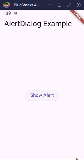
This is a basic way to use AlertDialog, but it’s powerful because it helps you talk to the user at the right time.
Creating a Basic AlertDialog
Creating an alert dialog in Flutter is kind of like making a mini message box. You tell it what to say, what buttons to show, and Flutter handles the rest.
Let’s build yet another simple dialog that says “Hello!” and has just one button to close it.
import 'package:flutter/material.dart';

void main() {
  runApp(MyApp());
}

class MyApp extends StatelessWidget {
  const MyApp({super.key});

  @override
  Widget build(BuildContext context) {
    return MaterialApp(home: BasicAlertDialogDemo());
  }
}

class BasicAlertDialogDemo extends StatelessWidget {
  const BasicAlertDialogDemo({super.key});

  void showHelloDialog(BuildContext context) {
    showDialog(
      context: context,
      builder: (BuildContext context) {
        return AlertDialog(
          title: Text('Hello!'),
          content: Text('This is a simple alert dialog.'),
          actions: [
            TextButton(
              onPressed: () {
                Navigator.pop(context); // Close the dialog
              },
              child: Text('OK'),
            ),
          ],
        );
      },
    );
  }

  @override
  Widget build(BuildContext context) {
    return Scaffold(
      appBar: AppBar(title: Text('Basic AlertDialog')),
      body: Center(
        child: ElevatedButton(
          onPressed: () {
            showHelloDialog(context);
          },
          child: Text('Show Dialog'),
        ),
      ),
    );
  }
}
What’s Happening Here?
- We create a button labeled “Show Dialog”.
- When it’s pressed,
showHelloDialog()is called. - This opens an
AlertDialogwith:- A title: “Hello!”
- Some content: a friendly message.
- One OK button that closes the dialog.
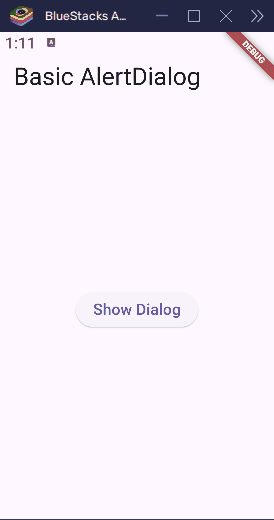
It’s like writing a quick note to the user and handing it to them. They read it, click “OK”, and go back to using the app.
Customizing the AlertDialog
A basic alert dialog is nice, but sometimes you want it to match your app’s style—or just make it stand out more. The good news is that Flutter gives you lots of options to change how your AlertDialog looks and feels.
You can customize things like:
- The icon at the top
- The colors and shapes
- The padding and text styles
- And even the alignment and elevation
Let’s try creating a custom dialog that’s more colorful and stylish!
import 'package:flutter/material.dart';

void main() {
  runApp(MyApp());
}

class MyApp extends StatelessWidget {
  const MyApp({super.key});

  @override
  Widget build(BuildContext context) {
    return MaterialApp(home: CustomAlertDialogDemo());
  }
}

class CustomAlertDialogDemo extends StatelessWidget {
  const CustomAlertDialogDemo({super.key});

  void showCustomDialog(BuildContext context) {
    showDialog(
      context: context,
      builder: (BuildContext context) {
        return AlertDialog(
          icon: Icon(Icons.warning, color: Colors.red, size: 40),
          title: Text(
            'Warning!',
            style: TextStyle(
              fontWeight: FontWeight.bold,
              fontSize: 22,
              color: Colors.redAccent,
            ),
          ),
          content: Text(
            'This action cannot be undone.',
            style: TextStyle(fontSize: 16),
          ),
          backgroundColor: Colors.yellow[100],
          shape: RoundedRectangleBorder(
            borderRadius: BorderRadius.circular(20),
          ),
          elevation: 10,
          actionsPadding: EdgeInsets.symmetric(horizontal: 10),
          actions: [
            TextButton(
              onPressed: () {
                Navigator.pop(context);
              },
              child: Text('Cancel'),
            ),
            TextButton(
              onPressed: () {
                Navigator.pop(context);
                // Handle the action here
              },
              child: Text('Proceed'),
            ),
          ],
        );
      },
    );
  }

  @override
  Widget build(BuildContext context) {
    return Scaffold(
      appBar: AppBar(title: Text('Custom AlertDialog')),
      body: Center(
        child: ElevatedButton(
          onPressed: () {
            showCustomDialog(context);
          },
          child: Text('Show Custom Dialog'),
        ),
      ),
    );
  }
}
What’s Customized Here?
- Icon: A red warning icon appears at the top.
- Title style: The title is bold, red, and a bit larger.
- Background color: Soft yellow to match the warning theme.
- Shape: Rounded corners make it feel smoother.
- Elevation: A soft shadow under the dialog.
- Button padding: Gives buttons some breathing room.
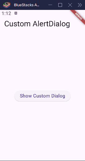
By adjusting these options, you can match your dialog to the theme of your app or the mood of your message—serious, fun, calm, or bold.
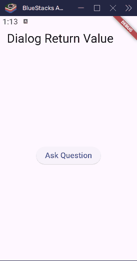
Returning Values from an AlertDialog
Sometimes, you want to know what the user chose — like “Yes” or “No” — and do something based on that. You can return a value from the dialog using Navigator.of(context).pop(value).
Here’s how to do that:
import 'package:flutter/material.dart';

void main() => runApp(MyApp());

class MyApp extends StatelessWidget {
  const MyApp({super.key});

  @override
  Widget build(BuildContext context) {
    return MaterialApp(title: 'Return Value from Dialog', home: HomePage());
  }
}

class HomePage extends StatelessWidget {
  const HomePage({super.key});

  Future<void> _askUser(BuildContext context) async {
    bool? result = await showDialog<bool>(
      context: context,
      builder: (context) {
        return AlertDialog(
          title: Text('Confirm'),
          content: Text('Do you want to continue?'),
          actions: [
            TextButton(
              onPressed: () => Navigator.of(context).pop(false),
              child: Text('No'),
            ),
            TextButton(
              onPressed: () => Navigator.of(context).pop(true),
              child: Text('Yes'),
            ),
          ],
        );
      },
    );

    if (result == true) {
      ScaffoldMessenger.of(
        context,
      ).showSnackBar(SnackBar(content: Text('You chose: YES')));
    } else if (result == false) {
      ScaffoldMessenger.of(
        context,
      ).showSnackBar(SnackBar(content: Text('You chose: NO')));
    } else {
      ScaffoldMessenger.of(
        context,
      ).showSnackBar(SnackBar(content: Text('Dialog dismissed')));
    }
  }

  @override
  Widget build(BuildContext context) {
    return Scaffold(
      appBar: AppBar(title: Text('Dialog Return Value')),
      body: Center(
        child: ElevatedButton(
          onPressed: () => _askUser(context),
          child: Text('Ask Question'),
        ),
      ),
    );
  }
}
What’s Happening Here?
- The dialog returns
trueorfalsedepending on the user’s choice. await showDialog()waits until the user chooses.- After that, we show a SnackBar with the result.
Here’s another example:
import 'package:flutter/material.dart';

void main() {
  runApp(MyApp());
}

class MyApp extends StatelessWidget {
  const MyApp({super.key});

  @override
  Widget build(BuildContext context) {
    return MaterialApp(home: DialogReturnValueDemo());
  }
}

class DialogReturnValueDemo extends StatefulWidget {
  const DialogReturnValueDemo({super.key});

  @override
  DialogReturnValueDemoState createState() => DialogReturnValueDemoState();
}

class DialogReturnValueDemoState extends State<DialogReturnValueDemo> {
  String userChoice = 'No selection yet';

  Future<void> showDecisionDialog() async {
    final result = await showDialog<String>(
      context: context,
      builder: (BuildContext context) {
        return AlertDialog(
          title: Text('Delete File'),
          content: Text('Are you sure you want to delete this file?'),
          actions: [
            TextButton(
              onPressed: () {
                Navigator.pop(context, 'Cancel');
              },
              child: Text('Cancel'),
            ),
            TextButton(
              onPressed: () {
                Navigator.pop(context, 'Delete');
              },
              child: Text('Delete'),
            ),
          ],
        );
      },
    );

    // Use the result
    if (result != null) {
      setState(() {
        userChoice = 'You chose: $result';
      });
    }
  }

  @override
  Widget build(BuildContext context) {
    return Scaffold(
      appBar: AppBar(title: Text('Return Value from Dialog')),
      body: Center(
        child: Column(
          mainAxisAlignment: MainAxisAlignment.center,
          children: [
            ElevatedButton(
              onPressed: showDecisionDialog,
              child: Text('Show Dialog'),
            ),
            SizedBox(height: 20),
            Text(userChoice),
          ],
        ),
      ),
    );
  }
}
What’s Happening Here?
- We show a dialog with two buttons: Cancel and Delete.
- Each button uses
Navigator.pop(context, 'value')to send back a different result. - The
showDialog()function returns that result usingawait. - After the dialog closes, we check what the user chose and update the screen.
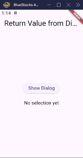
Why Is This Useful?
Returning values from a dialog lets your app make smart decisions. For example:
- If the user says “Delete,” remove the file.
- If they choose “Cancel,” do nothing.
It’s like asking a friend a question, waiting for their answer, and then doing something based on what they said.
Using AlertDialog with Custom Widgets
By default, an AlertDialog can show simple text and buttons, but what if you want to add something more exciting? Flutter lets you put any widget inside the AlertDialog, like images, forms, or even custom layouts!
Imagine asking the user for their email address inside a dialog, or showing an image before they make a decision. With custom widgets, the possibilities are endless!
Let’s create a dialog with a form where the user can enter their name and email address.
import 'package:flutter/material.dart';

void main() {
  runApp(MyApp());
}

class MyApp extends StatelessWidget {
  const MyApp({super.key});

  @override
  Widget build(BuildContext context) {
    return MaterialApp(home: CustomWidgetDialogDemo());
  }
}

class CustomWidgetDialogDemo extends StatelessWidget {
  final TextEditingController nameController = TextEditingController();
  final TextEditingController emailController = TextEditingController();

  CustomWidgetDialogDemo({super.key});

  void showCustomFormDialog(BuildContext context) {
    showDialog(
      context: context,
      builder: (BuildContext context) {
        return AlertDialog(
          title: Text('Enter Your Info'),
          content: Column(
            mainAxisSize:
                MainAxisSize.min, // Makes sure the dialog isn't too tall
            children: [
              TextField(
                controller: nameController,
                decoration: InputDecoration(labelText: 'Name'),
              ),
              TextField(
                controller: emailController,
                decoration: InputDecoration(labelText: 'Email'),
              ),
            ],
          ),
          actions: [
            TextButton(
              onPressed: () {
                Navigator.pop(context); // Close the dialog
              },
              child: Text('Cancel'),
            ),
            TextButton(
              onPressed: () {
                String name = nameController.text;
                String email = emailController.text;
                Navigator.pop(context); // Close the dialog
                showDialog(
                  context: context,
                  builder: (BuildContext context) {
                    return AlertDialog(
                      title: Text('Info Submitted'),
                      content: Text('Name: $name\nEmail: $email'),
                      actions: [
                        TextButton(
                          onPressed: () {
                            Navigator.pop(context); // Close the dialog
                          },
                          child: Text('OK'),
                        ),
                      ],
                    );
                  },
                );
              },
              child: Text('Submit'),
            ),
          ],
        );
      },
    );
  }

  @override
  Widget build(BuildContext context) {
    return Scaffold(
      appBar: AppBar(title: Text('Custom Widgets in AlertDialog')),
      body: Center(
        child: ElevatedButton(
          onPressed: () {
            showCustomFormDialog(context);
          },
          child: Text('Show Form Dialog'),
        ),
      ),
    );
  }
}
What’s Happening Here?
- The dialog contains two text fields where the user can type their name and email.
- The “Submit” button gets the values from the text fields and shows them in a new dialog.
- We’re using Flutter’s
TextFieldwidget to create input fields inside the alert.
Why Use Custom Widgets?
This makes your dialogs interactive and dynamic! Instead of just showing a message, you can ask questions, get answers, and even show more complex data or visuals.
You could add things like:
- Images (like a logo or a warning symbol)
- Sliders (to select a value)
- Checkboxes (to agree to terms)
In other words, you have complete flexibility to design the dialog to fit your needs.
Creating Scrollable AlertDialogs
Sometimes, the content inside an AlertDialog can be so long that it doesn’t fit on the screen. If that happens, you want to make sure the user can scroll through the content without it getting cut off.
Flutter makes this super easy by adding a scrollable feature to the dialog. We just need to wrap the content in a SingleChildScrollView widget.
Let’s create a dialog with long text that will be scrollable, so users can read all the content.
import 'package:flutter/material.dart';

void main() {
  runApp(MyApp());
}

class MyApp extends StatelessWidget {
  const MyApp({super.key});

  @override
  Widget build(BuildContext context) {
    return MaterialApp(home: ScrollableAlertDialogDemo());
  }
}

class ScrollableAlertDialogDemo extends StatelessWidget {
  const ScrollableAlertDialogDemo({super.key});

  void showScrollableDialog(BuildContext context) {
    showDialog(
      context: context,
      builder: (BuildContext context) {
        return AlertDialog(
          title: Text('Important Information'),
          content: SingleChildScrollView(
            // Makes the content scrollable
            child: Column(
              children: [
                Text(
                  'This is a very long message that will not fit on the screen. ' *
                      5,
                  style: TextStyle(fontSize: 16),
                ),
              ],
            ),
          ),
          actions: [
            TextButton(
              onPressed: () {
                Navigator.pop(context); // Close the dialog
              },
              child: Text('OK'),
            ),
          ],
        );
      },
    );
  }

  @override
  Widget build(BuildContext context) {
    return Scaffold(
      appBar: AppBar(title: Text('Scrollable AlertDialog')),
      body: Center(
        child: ElevatedButton(
          onPressed: () {
            showScrollableDialog(context);
          },
          child: Text('Show Scrollable Dialog'),
        ),
      ),
    );
  }
}
What’s Happening Here?
- The
SingleChildScrollViewwidget is used to wrap theColumncontaining the text. This makes the dialog’s content scrollable. - The dialog has a very long message (we repeated the text to make it long enough).
- Even though the content is too big for the screen, the user can now scroll up and down to read it.
Why Is This Useful?
When your dialog has a lot of information (like a legal agreement or long instructions), scrolling ensures that all the content is accessible to the user. Without it, some parts of the message might be hidden, making the dialog incomplete or hard to read.
This feature is a game-changer for showing large amounts of text or images inside your dialogs!
Conclusion
In this article, we learned how to create and customize AlertDialog in Flutter. You can use AlertDialog to show messages, ask questions, and get responses from users. We also covered how to return values from the dialog, add custom widgets like text fields or images, and make dialogs scrollable when the content is long.
To use AlertDialog effectively, avoid overusing it—too many dialogs can overwhelm users. Keep the content simple and clear, and make sure the choices are easy to understand. Customizing your dialog to fit your app’s design will also provide a better user experience. Lastly, test your dialogs on different devices to ensure they work well on all screen sizes.
“Note: I used
Navigator.pop(context, 'value')in one place andNavigator.of(context).pop('value')in another. Both work the same, so feel free to use either. I’m showing you both to demonstrate the different ways you can achieve the same result.”