When it comes to creating modern and visually appealing user interfaces in Java applications, JavaFX is a powerful framework that offers a wide range of tools and components. One such component that plays a significant role in arranging and structuring the layout of your application is the JavaFX BorderPane. The BorderPane provides a flexible and convenient way to divide your user interface into five distinct areas: top, bottom, left, right, and center. This division enables you to create complex and organized layouts with ease. In this article, we’ll explore the BorderPane layout and provide you with comprehensive code examples to demonstrate its usage.
Understanding the BorderPane Layout
The BorderPane is a layout manager in JavaFX that divides its content into five distinct regions: top, bottom, left, right, and center. This division allows you to place different UI components in specific areas of the BorderPane, providing a structured and organized layout for your application.
Here’s a brief overview of each region:
- Top: This region is located at the top of the BorderPane and is typically used for titles, headers, or menus.
- Bottom: The bottom region is positioned at the bottom of the BorderPane. It’s commonly used for status bars, buttons, or other controls.
- Left: The left region is located on the left side of the BorderPane. It’s often utilized for navigation menus or sidebars.
- Right: The right region is placed on the right side of the BorderPane. Like the left region, it’s suitable for additional navigation or supplementary content.
- Center: The central region occupies the remaining space in the BorderPane and is generally used for the main content of the UI.
Creating a Simple BorderPane
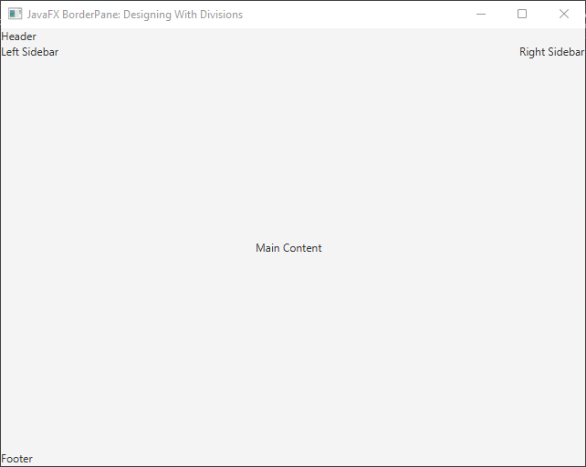
Let’s start by creating a simple JavaFX application that demonstrates the usage of the BorderPane layout. We will create a UI with a header, a sidebar on the left, a main content area, and a footer. Here’s the code:
import javafx.application.Application;
import javafx.scene.Scene;
import javafx.scene.control.Label;
import javafx.scene.layout.*;
import javafx.stage.Stage;

public class Main extends Application {

    private final BorderPane parent = new BorderPane();

    @Override
    public void start(Stage stage) throws Exception {
        this.setupStage(stage);
    }

    @Override
    public void init() throws Exception {
        super.init();
        this.buildUI();
    }

    private void buildUI() {

        // Create nodes for each region
        Label header = new Label("Header");
        Label leftSidebar = new Label("Left Sidebar");
        Label content = new Label("Main Content");
        Label rightSidebar = new Label("Right Sidebar");
        Label footer = new Label("Footer");

        // Set nodes in respective regions
        this.parent.setTop(header);
        this.parent.setLeft(leftSidebar);
        this.parent.setCenter(content);
        this.parent.setRight(rightSidebar);
        this.parent.setBottom(footer);

    }

    private void setupStage(Stage stage) {

        Scene scene = new Scene(this.parent, 640, 480);

        // Set the stage title
        stage.setTitle("JavaFX BorderPane: Designing With Divisions");

        // Set the stage scene
        stage.setScene(scene);

        // Center the stage on the screen
        stage.centerOnScreen();

        // Show the stage on the screen
        stage.show();

    }

}
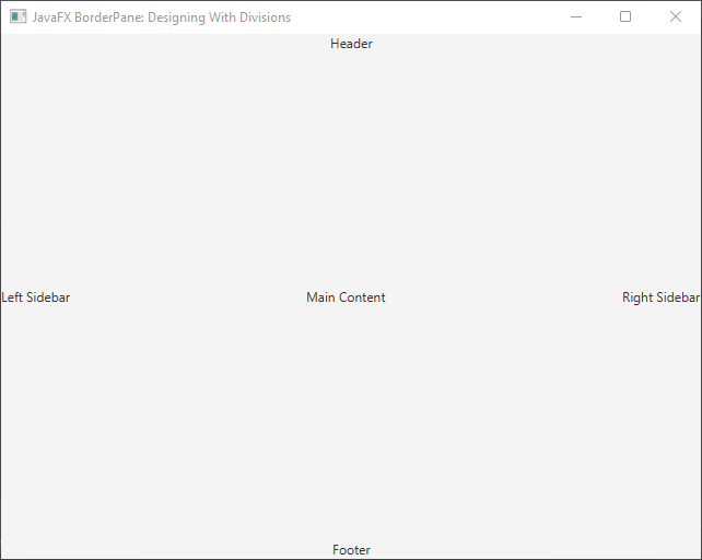
In this example, we’ve created a simple UI with labels representing each region. The BorderPane is configured to place these labels in their respective regions. You can see how the BorderPane automatically manages the layout and positioning of the UI components.
Customizing BorderPane Spacing
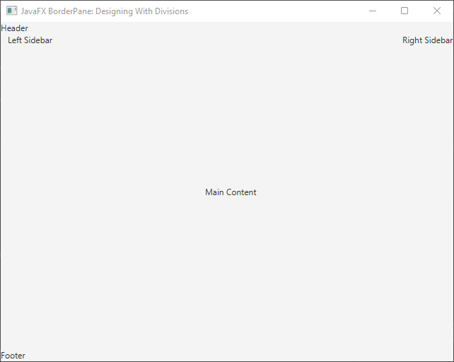
The BorderPane layout also allows you to customize the spacing between the regions using the setMargin(node, insets) method. Here’s how you can add spacing to the left region:
import javafx.application.Application;
import javafx.geometry.Insets;
import javafx.scene.Scene;
import javafx.scene.control.Label;
import javafx.scene.layout.*;
import javafx.stage.Stage;

public class Main extends Application {

    private final BorderPane parent = new BorderPane();

    @Override
    public void start(Stage stage) throws Exception {
        this.setupStage(stage);
    }

    @Override
    public void init() throws Exception {
        super.init();
        this.buildUI();
    }

    private void buildUI() {

        // Create nodes for each region
        Label header = new Label("Header");
        Label leftSidebar = new Label("Left Sidebar");
        Label content = new Label("Main Content");
        Label rightSidebar = new Label("Right Sidebar");
        Label footer = new Label("Footer");

        // Set nodes in respective regions
        this.parent.setTop(header);
        this.parent.setLeft(leftSidebar);
        this.parent.setCenter(content);
        this.parent.setRight(rightSidebar);
        this.parent.setBottom(footer);

        // Add spacing to the left region
        BorderPane.setMargin(leftSidebar, new Insets(0, 10, 0, 10));

    }

    private void setupStage(Stage stage) {

        Scene scene = new Scene(this.parent, 640, 480);

        // Set the stage title
        stage.setTitle("JavaFX BorderPane: Designing With Divisions");

        // Set the stage scene
        stage.setScene(scene);

        // Center the stage on the screen
        stage.centerOnScreen();

        // Show the stage on the screen
        stage.show();

    }

}
In this example, we’ve added a 10-pixel margin to the left region to create some spacing around the sidebar.
Changing Node Alignment
The BorderPane layout also provides the ability to customize the alignment of the content within those regions. This feature enables you to fine-tune the appearance and positioning of UI components to match your design requirements. JavaFX provides alignment constants within the Pos class to specify alignment options. These constants include CENTER, TOP_LEFT, TOP_CENTER, TOP_RIGHT, CENTER_LEFT, CENTER_RIGHT, BOTTOM_LEFT, BOTTOM_CENTER, and BOTTOM_RIGHT.
Here’s an example of how you can customize the alignment of regions within a BorderPane:
import javafx.application.Application;
import javafx.geometry.Pos;
import javafx.scene.Scene;
import javafx.scene.control.Label;
import javafx.scene.layout.*;
import javafx.stage.Stage;

public class Main extends Application {

    private final BorderPane parent = new BorderPane();

    @Override
    public void start(Stage stage) throws Exception {
        this.setupStage(stage);
    }

    @Override
    public void init() throws Exception {
        super.init();
        this.buildUI();
    }

    private void buildUI() {

        // Create nodes for each region
        Label header = new Label("Header");
        Label leftSidebar = new Label("Left Sidebar");
        Label content = new Label("Main Content");
        Label rightSidebar = new Label("Right Sidebar");
        Label footer = new Label("Footer");

        // Set nodes in respective regions
        this.parent.setTop(header);
        this.parent.setLeft(leftSidebar);
        this.parent.setCenter(content);
        this.parent.setRight(rightSidebar);
        this.parent.setBottom(footer);

        // Customize alignment of regions
        BorderPane.setAlignment(header, Pos.CENTER);
        BorderPane.setAlignment(leftSidebar, Pos.CENTER);
        BorderPane.setAlignment(content, Pos.CENTER);
        BorderPane.setAlignment(rightSidebar, Pos.CENTER);
        BorderPane.setAlignment(footer, Pos.CENTER);

    }

    private void setupStage(Stage stage) {

        Scene scene = new Scene(this.parent, 640, 480);

        // Set the stage title
        stage.setTitle("JavaFX BorderPane: Designing With Divisions");

        // Set the stage scene
        stage.setScene(scene);

        // Center the stage on the screen
        stage.centerOnScreen();

        // Show the stage on the screen
        stage.show();

    }

}
In this example, we’ve customized the alignment of each region within the BorderPane. The setAlignment(node, alignment) method is used to specify the alignment for a specific node within the layout.
Conclusion
The BorderPane layout in JavaFX provides a straightforward way to create structured and visually appealing user interfaces by dividing the UI into five distinct regions. By utilizing the BorderPane class and its methods, you can easily arrange and organize your UI components in a way that fits your application’s design. Additionally, the ability to customize node alignment and spacing between regions adds a layer of flexibility to your UI design. JavaFX’s BorderPane is a powerful tool for building responsive and well-organized user interfaces in Java applications.
Sources:
I hope you found this code informative and useful. If you would like to receive more content, please consider subscribing to our newsletter!
