In the world of modern software development, creating user-friendly and intuitive interfaces is paramount. Users often appreciate applications that guide them through their interactions and provide helpful information along the way. JavaFX, a popular user interface toolkit for Java applications, offers a range of features to enhance user experience, and one such feature is the Tooltip.
Learn C Programming For Free on Windows
A beginner-friendly course that teaches real C programming using a Windows compiler. Learn arrays, pointers, functions, and file handling step by step with practical lessons.
Start Learning C ProgrammingTooltips are small, informational pop-ups that appear when a user hovers their mouse pointer over a UI element, such as a button or an image. These unobtrusive hints provide context, descriptions, or additional details about the element, helping users understand its purpose or function. Implementing tooltips in your JavaFX application is straightforward and can significantly improve usability.
Creating a Basic Tooltip
Let’s start by creating a basic JavaFX application with a Button that has a tooltip associated with it. We will display a simple message when the user hovers over the button.
import javafx.application.Application;
import javafx.scene.Scene;
import javafx.scene.control.*;
import javafx.scene.layout.*;
import javafx.stage.Stage;

public class Main extends Application {

    private final BorderPane parent = new BorderPane();

    @Override
    public void start(Stage stage) throws Exception {
        this.setupStage(stage);
    }

    @Override
    public void init() throws Exception {
        super.init();
        this.buildUI();
    }

    private void buildUI() {

        // Create a Button
        Button button = new Button("Hover Me!");

        // Create a Tooltip and set its content
        Tooltip tooltip = new Tooltip("Hello, I am a Tooltip!");

        // Associate the Tooltip with the Button
        button.setTooltip(tooltip);

        // Add the Button to the BorderPane layout manager
        this.parent.setCenter(button);

    }

    private void setupStage(Stage stage) {

        Scene scene = new Scene(this.parent, 640.0, 480.0);

        // Set the stage title
        stage.setTitle("JavaFX Tooltip: Enhancing User Interface with Informative Hints");

        // Set the stage scene
        stage.setScene(scene);

        // Center the stage on the screen
        stage.centerOnScreen();

        // Show the stage on the screen
        stage.show();

    }

}
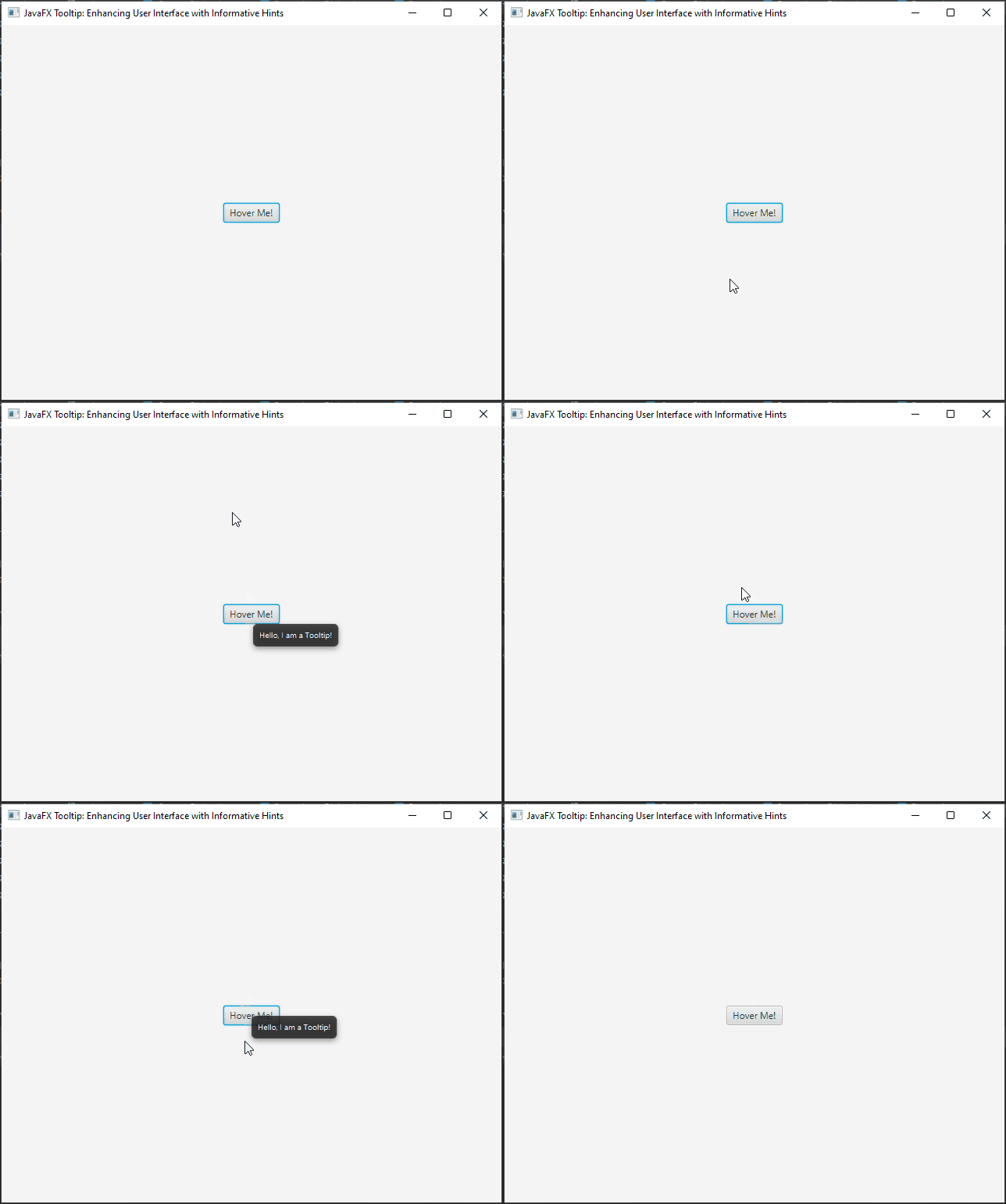
In the above code, we create a simple JavaFX application with a single button labeled “Hover Me!”. We then create a Tooltip instance, set its content to “Hello, I am a Tooltip!”, and associate the Tooltip with the button using the setTooltip() method. When the user hovers the mouse pointer over the button, the Tooltip will pop up, displaying the message we set.
Customizing Tooltip Appearance
JavaFX provides various ways to customize the appearance of tooltips. You can set the font, background color, text color, and more to match the overall theme of your application.
Let’s see an example of how to customize the Tooltip’s appearance:
import javafx.application.Application;
import javafx.scene.Scene;
import javafx.scene.control.*;
import javafx.scene.layout.*;
import javafx.stage.Stage;

public class Main extends Application {

    private final BorderPane parent = new BorderPane();

    @Override
    public void start(Stage stage) throws Exception {
        this.setupStage(stage);
    }

    @Override
    public void init() throws Exception {
        super.init();
        this.buildUI();
    }

    private void buildUI() {

        // Create a Button
        Button button = new Button("Hover Me!");

        // Create a Tooltip and set its content
        Tooltip tooltip = new Tooltip("Hello, I am a Tooltip!");

        // Customize the appearance of the Tooltip
        tooltip.setStyle("-fx-background-color: #336699; -fx-text-fill: white; -fx-font-size: 14px;");

        // Associate the Tooltip with the Button
        button.setTooltip(tooltip);

        // Add the Button to the BorderPane layout manager
        this.parent.setCenter(button);

    }

    private void setupStage(Stage stage) {

        Scene scene = new Scene(this.parent, 640.0, 480.0);

        // Set the stage title
        stage.setTitle("JavaFX Tooltip: Enhancing User Interface with Informative Hints");

        // Set the stage scene
        stage.setScene(scene);

        // Center the stage on the screen
        stage.centerOnScreen();

        // Show the stage on the screen
        stage.show();

    }

}
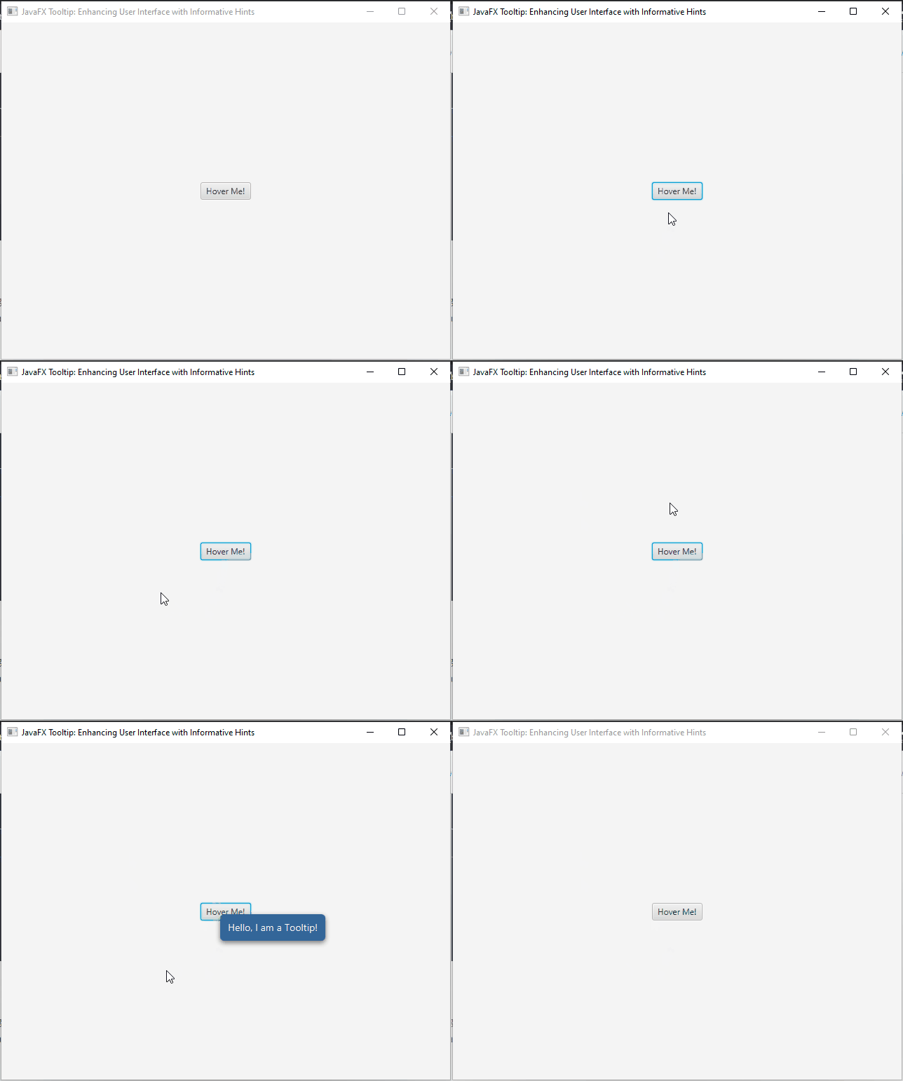
In this example, we have set the background color to #336699, the text color to white, and increased the font size to 14 pixels. You can customize the Tooltip’s appearance further by applying CSS styling or modifying other properties.
Handling Long Text in Tooltips
Sometimes, the content you want to display in a Tooltip might be lengthy. However, by default, JavaFX tooltips are single-lined and might truncate the text if it’s too long. To enable multiline tooltips, you can set the wrapText property to true.
Let’s see an example of handling long text in tooltips:
import javafx.application.Application;
import javafx.scene.Scene;
import javafx.scene.control.*;
import javafx.scene.layout.*;
import javafx.stage.Stage;

public class Main extends Application {

    private final BorderPane parent = new BorderPane();

    @Override
    public void start(Stage stage) throws Exception {
        this.setupStage(stage);
    }

    @Override
    public void init() throws Exception {
        super.init();
        this.buildUI();
    }

    private void buildUI() {

        // Create a Button
        Button button = new Button("Hover Me!");

        // Create a tooltip with long text
        String longText = "Lorem ipsum dolor sit amet, consectetur adipiscing elit. "
                + "Nulla facilisi. In eu dolor id nisi condimentum dignissim at nec neque. "
                + "Fusce tempus, mauris at posuere auctor, justo sapien aliquet tortor, "
                + "et egestas libero risus nec quam.";

        Tooltip tooltip = new Tooltip(longText);

        // Customize the appearance of the Tooltip
        tooltip.setStyle("-fx-background-color: #336699; -fx-text-fill: white; -fx-font-size: 14px;");

        // Set Tooltip maximum width
        tooltip.setMaxWidth(300);

        // Enable multiline tooltip
        tooltip.setWrapText(true);

        // Associate the Tooltip with the Button
        button.setTooltip(tooltip);

        // Add the Button to the BorderPane layout manager
        this.parent.setCenter(button);

    }

    private void setupStage(Stage stage) {

        Scene scene = new Scene(this.parent, 640.0, 480.0);

        // Set the stage title
        stage.setTitle("JavaFX Tooltip: Enhancing User Interface with Informative Hints");

        // Set the stage scene
        stage.setScene(scene);

        // Center the stage on the screen
        stage.centerOnScreen();

        // Show the stage on the screen
        stage.show();

    }

}
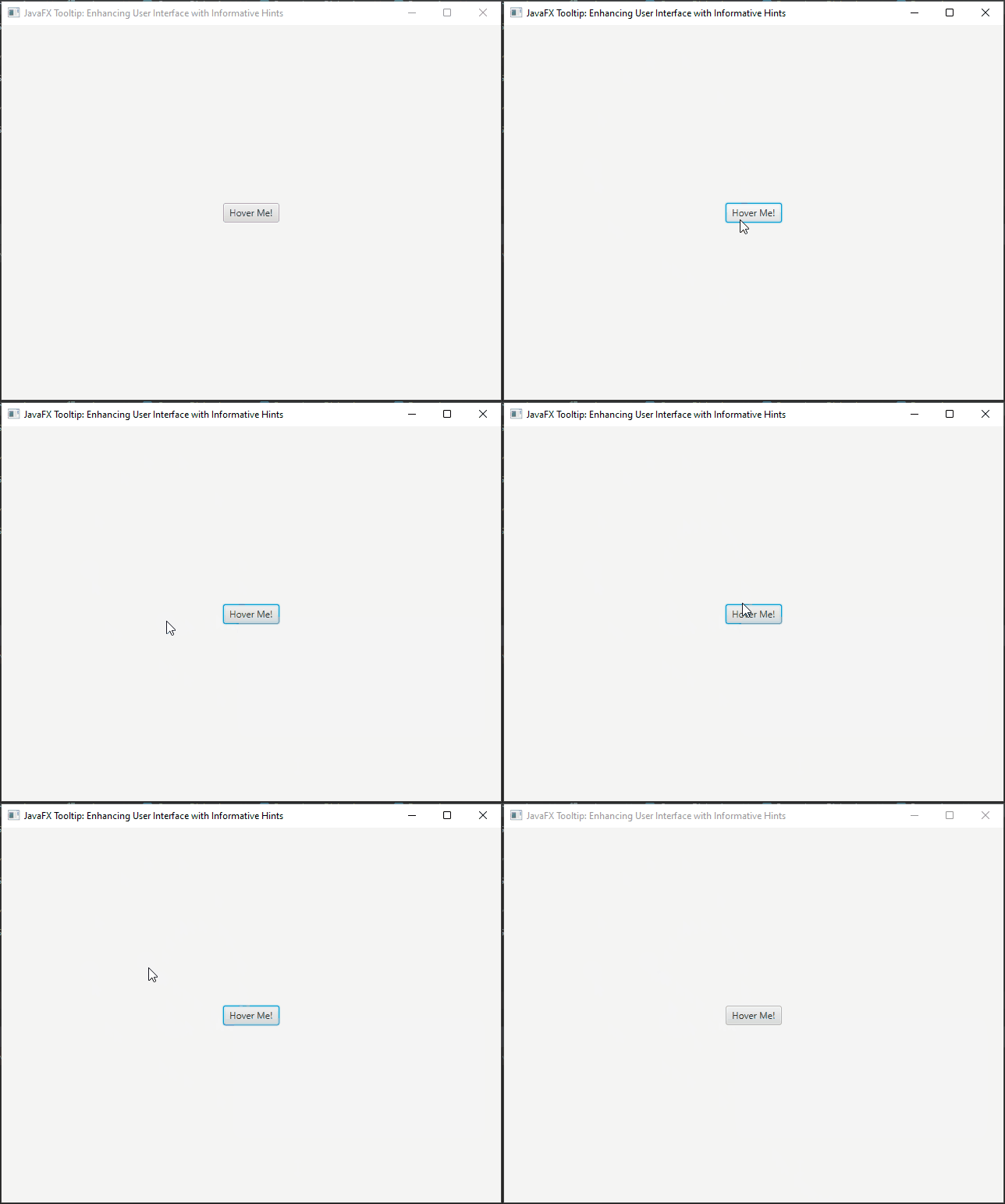
In this example, we create a button with a tooltip containing a long text. By setting the wrapText property of the tooltip to true, the content will be displayed on multiple lines within the tooltip, ensuring that all the information is visible to the user.
By using multiline tooltips, you can provide users with comprehensive descriptions, instructions, or any other lengthy information they may need without compromising on readability. This is especially helpful when dealing with complex UI elements or detailed explanations that require more space than a single line can provide.
Delayed Tooltip
Adding a delay before the tooltip appears can be useful in certain scenarios to avoid tooltips popping up too quickly and overwhelming the user. We can achieve this by using the javafx.animation.PauseTransition class to introduce the desired delay before showing the tooltip. In this example, we will show a tooltip after a 2-second delay.
import javafx.animation.PauseTransition;
import javafx.application.Application;
import javafx.scene.Scene;
import javafx.scene.control.*;
import javafx.scene.layout.*;
import javafx.stage.Stage;
import javafx.util.Duration;

public class Main extends Application {

    private final BorderPane parent = new BorderPane();

    @Override
    public void start(Stage stage) throws Exception {
        this.setupStage(stage);
    }

    @Override
    public void init() throws Exception {
        super.init();
        this.buildUI();
    }

    private void buildUI() {

        // Create a Button
        Button button = new Button("Hover Me!");

        // Create a tooltip
        Tooltip tooltip = new Tooltip("This tooltip appears after a 2-second delay");

        // Set the tooltip to show after a 2-second delay
        PauseTransition delay = new PauseTransition(Duration.seconds(2));
        delay.setOnFinished(e -> Tooltip.install(button, tooltip));
        delay.play();

        // Add the Button to the BorderPane layout manager
        this.parent.setCenter(button);

    }

    private void setupStage(Stage stage) {

        Scene scene = new Scene(this.parent, 640.0, 480.0);

        // Set the stage title
        stage.setTitle("JavaFX Tooltip: Enhancing User Interface with Informative Hints");

        // Set the stage scene
        stage.setScene(scene);

        // Center the stage on the screen
        stage.centerOnScreen();

        // Show the stage on the screen
        stage.show();

    }

}
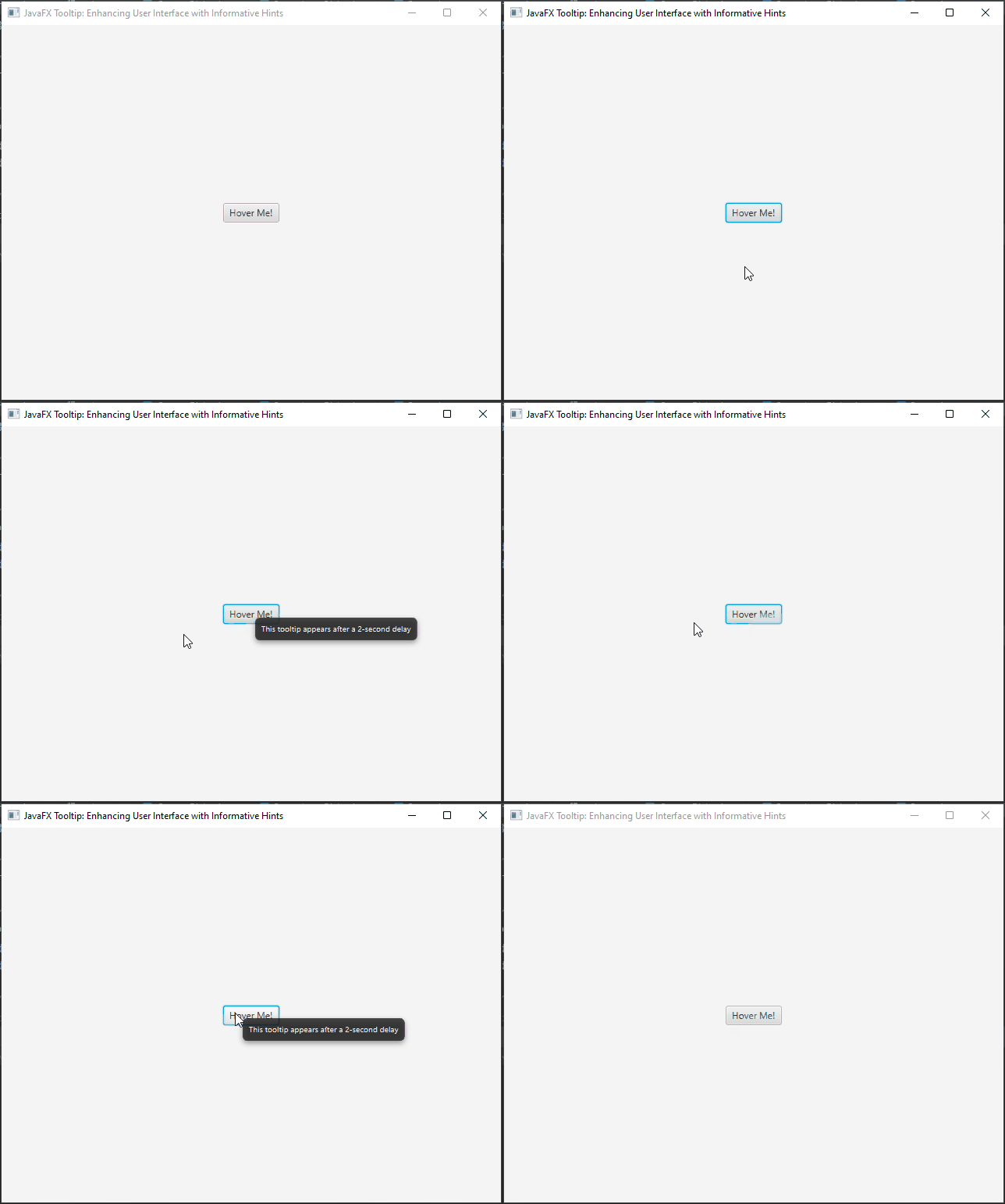
In this example, we create a button with a tooltip that should appear after a 2-second delay. We achieve this by using a PauseTransition with a duration of 2 seconds. When the delay is finished, we use the setOnFinished method to install the tooltip on the button using Tooltip.install(). Finally, we start the delay animation with delay.play().
By introducing a delay before showing the tooltip, you provide users with a more controlled and user-friendly experience. It allows them to focus on the UI element without being interrupted immediately by tooltips, giving them time to absorb the context and decide if they want to engage with the tooltip.
Adding Graphics to Tooltips
You can enhance the appearance of tooltips by adding graphics or images alongside the text. This can be particularly useful when you want to provide users with more visual context or additional information in tooltips. To add graphics to a tooltip, you can utilize the setGraphic() method of the Tooltip class.
Let’s see an example of how to add graphics to tooltips:
import javafx.application.Application;
import javafx.scene.Scene;
import javafx.scene.control.*;
import javafx.scene.image.Image;
import javafx.scene.image.ImageView;
import javafx.scene.layout.*;
import javafx.stage.Stage;

public class Main extends Application {

    private final BorderPane parent = new BorderPane();

    @Override
    public void start(Stage stage) throws Exception {
        this.setupStage(stage);
    }

    @Override
    public void init() throws Exception {
        super.init();
        this.buildUI();
    }

    private void buildUI() {

        // Create a Button
        Button button = new Button("Hover Me!");

        // Replace with your image path
        ImageView imageView = new ImageView(new Image("icon.png"));

        // Create a tooltip with text and a graphic (an image)
        Tooltip tooltip = new Tooltip("This tooltip displays an image.");
        tooltip.setGraphic(imageView);

        button.setTooltip(tooltip);

        // Add the Button to the BorderPane layout manager
        this.parent.setCenter(button);

    }

    private void setupStage(Stage stage) {

        Scene scene = new Scene(this.parent, 640.0, 480.0);

        // Set the stage title
        stage.setTitle("JavaFX Tooltip: Enhancing User Interface with Informative Hints");

        // Set the stage scene
        stage.setScene(scene);

        // Center the stage on the screen
        stage.centerOnScreen();

        // Show the stage on the screen
        stage.show();

    }

}
In this example, we create a button with a tooltip containing both text and an image. First, we create an ImageView to hold the image, and then we create the Tooltip and set its text. Next, we set the ImageView as the graphic of the Tooltip using the setGraphic() method. Finally, we assign the tooltip to the button using button.setTooltip(tooltip).
By adding graphics to tooltips, you can make them more visually appealing and engaging, providing users with both textual and visual cues about the associated UI element. This can be particularly useful when you have icons or images that represent the action or functionality of the UI element, as it helps users quickly understand the purpose of the button or element.

Conclusion
Tooltips provide a simple yet effective way to enhance the user experience of your applications. By offering contextual information and guidance, tooltips empower users to interact with your software confidently. Whether you’re providing explanations for buttons, icons, or other UI elements, tooltips are a valuable tool in your design arsenal. Remember to strike a balance between helpful information and clutter, ensuring that tooltips enhance the user experience without overwhelming them.
By incorporating tooltips into your JavaFX applications, you can create interfaces that are not only visually appealing but also informative and user-friendly. Experiment with different styles, content, and behavior to find the perfect balance that suits your application’s needs. With JavaFX tooltips, you’re one step closer to delivering a polished and intuitive user interface.
I hope you found this code informative and useful. If you would like to receive more content, please consider subscribing to our newsletter!


