Checkboxes are everywhere in apps — when you’re agreeing to terms, choosing your favorite items, or turning settings on or off. In Flutter, checkboxes are super easy to use and very customizable.
In this article, we’ll explore how to create, manage, and customize checkboxes. We’ll also look at how to handle multiple checkboxes and even how to add a “Select All” option.
What Is a Checkbox in Flutter?
A Checkbox in Flutter is a small square that can be either checked (true) or unchecked (false). You can also set it to null if you use tristate. It’s a simple way to let users pick or toggle options.
Checkboxes are stateless, so you’ll usually wrap them in a StatefulWidget to update the UI when the user interacts with them.
The Checkbox widget has two main parts:
value: Aboolthat shows whether it’s checked.onChanged: A function that runs when the checkbox is tapped.
Basic CheckBox Example
Here’s how to make a simple checkbox that toggles when tapped:
import 'package:flutter/material.dart';
void main() => runApp(const MyApp());
class MyApp extends StatelessWidget {
const MyApp({super.key});
@override
Widget build(BuildContext context) {
return MaterialApp(
title: 'Checkbox Widget',
home: Scaffold(
appBar: AppBar(title: Text('Checkbox Widget')),
body: Center(child: MyCheckbox()),
),
);
}
}
class MyCheckbox extends StatefulWidget {
const MyCheckbox({super.key});
@override
State<MyCheckbox> createState() => _MyCheckboxState();
}
class _MyCheckboxState extends State<MyCheckbox> {
bool isChecked = false;
@override
Widget build(BuildContext context) {
return Column(
spacing: 10.0,
mainAxisSize: MainAxisSize.min,
children: [
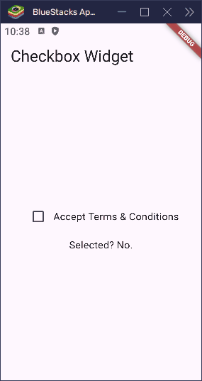
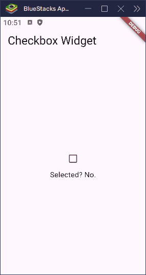
Checkbox(
value: isChecked,
onChanged: (bool? newValue) {
setState(() {
isChecked = newValue!;
});
},
),
Text('Selected? ${isChecked ? 'Yes' : 'No'}.'),
],
);
}
}In this example, we use setState to update the checkbox when it’s tapped.

Adding Labels with the CheckBox
It’s more user-friendly to show a label next to a checkbox. You can do that using a Row or CheckboxListTile.
Here’s how to use a Row:
import 'package:flutter/material.dart';

void main() => runApp(const MyApp());

class MyApp extends StatelessWidget {
  const MyApp({super.key});

  @override
  Widget build(BuildContext context) {
    return MaterialApp(
      title: 'Checkbox Widget',
      home: Scaffold(
        appBar: AppBar(title: Text('Checkbox Widget')),
        body: Center(child: MyCheckbox()),
      ),
    );
  }
}

class MyCheckbox extends StatefulWidget {
  const MyCheckbox({super.key});

  @override
  State<MyCheckbox> createState() => _MyCheckboxState();
}

class _MyCheckboxState extends State<MyCheckbox> {
  bool isChecked = false;

  @override
  Widget build(BuildContext context) {
    return Column(
      spacing: 10.0,
      mainAxisSize: MainAxisSize.min,
      children: [
        Row(
          mainAxisSize: MainAxisSize.min,
          children: [
            Checkbox(
              value: isChecked,
              onChanged: (bool? newValue) {
                setState(() {
                  isChecked = newValue!;
                });
              },
            ),
            const Text('Accept Terms & Conditions'),
          ],
        ),
        Text('Selected? ${isChecked ? 'Yes' : 'No'}.'),
      ],
    );
  }
}
This shows a checkbox next to the label “Accept Terms & Conditions”.
Using CheckBoxListTile
Instead of using Row and Text, Flutter offers a built-in widget: CheckboxListTile.
import 'package:flutter/material.dart';
void main() => runApp(const MyApp());
class MyApp extends StatelessWidget {
const MyApp({super.key});
@override
Widget build(BuildContext context) {
return MaterialApp(
title: 'Checkbox Widget',
home: Scaffold(
appBar: AppBar(title: Text('Checkbox Widget')),
body: Center(child: MyCheckbox()),
),
);
}
}
class MyCheckbox extends StatefulWidget {
const MyCheckbox({super.key});
@override
State<MyCheckbox> createState() => _MyCheckboxState();
}
class _MyCheckboxState extends State<MyCheckbox> {
bool isChecked = false;
@override
Widget build(BuildContext context) {
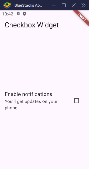
return CheckboxListTile(
title: const Text('Enable notifications'),
subtitle: const Text('You’ll get updates on your phone'),
value: isChecked,
onChanged: (bool? value) {
setState(() {
isChecked = value!;
});
},
);
}
}This widget handles spacing and alignment for you. You can also add secondary icons or place the checkbox on the other side using controlAffinity.
Changing Checkbox Position
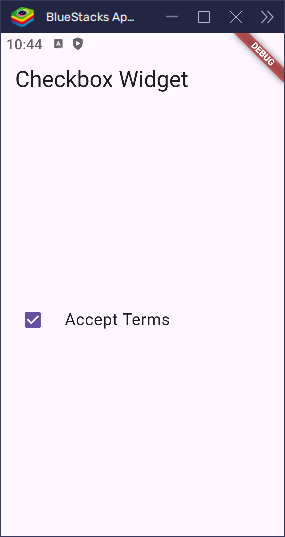
By default, the checkbox appears on the right. You can move it to the left using the controlAffinity property.
import 'package:flutter/material.dart';

void main() => runApp(const MyApp());

class MyApp extends StatelessWidget {
  const MyApp({super.key});

  @override
  Widget build(BuildContext context) {
    return MaterialApp(
      title: 'Checkbox Widget',
      home: Scaffold(
        appBar: AppBar(title: Text('Checkbox Widget')),
        body: Center(child: MyCheckbox()),
      ),
    );
  }
}

class MyCheckbox extends StatefulWidget {
  const MyCheckbox({super.key});

  @override
  State<MyCheckbox> createState() => _MyCheckboxState();
}

class _MyCheckboxState extends State<MyCheckbox> {
  bool isChecked = false;

  @override
  Widget build(BuildContext context) {
    return CheckboxListTile(
      title: const Text('Accept Terms'),
      value: isChecked,
      controlAffinity: ListTileControlAffinity.leading,
      onChanged: (bool? newValue) {
        setState(() {
          isChecked = newValue!;
        });
      },
    );
  }
}
Use ListTileControlAffinity.leading to place the checkbox on the left, ListTileControlAffinity.trailing to place it on the right, or ListTileControlAffinity.platform to use the default position based on the platform.
Disabled CheckBox
If you want a checkbox to be visible but not clickable, just set onChanged to null:
import 'package:flutter/material.dart';
void main() => runApp(const MyApp());
class MyApp extends StatelessWidget {
const MyApp({super.key});
@override
Widget build(BuildContext context) {
return MaterialApp(
title: 'Checkbox Widget',
home: Scaffold(
appBar: AppBar(title: Text('Checkbox Widget')),
body: Center(child: MyCheckbox()),
),
);
}
}
class MyCheckbox extends StatefulWidget {
const MyCheckbox({super.key});
@override
State<MyCheckbox> createState() => _MyCheckboxState();
}
class _MyCheckboxState extends State<MyCheckbox> {
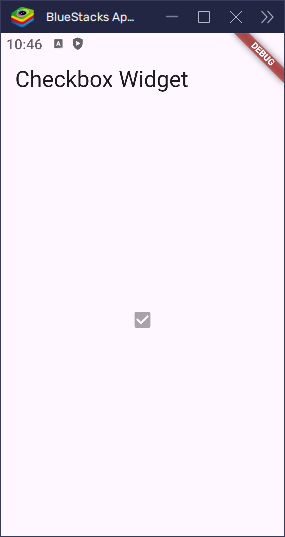
bool isChecked = true;
@override
Widget build(BuildContext context) {
return Checkbox(value: isChecked, onChanged: null);
}
}This disables the checkbox, and it appears dimmed and cannot be toggled.
Tristate Checkbox
If you want your checkbox to have three states — true, false, and null — set tristate: true.
import 'package:flutter/material.dart';

void main() => runApp(const MyApp());

class MyApp extends StatelessWidget {
  const MyApp({super.key});

  @override
  Widget build(BuildContext context) {
    return MaterialApp(
      title: 'Checkbox Widget',
      home: Scaffold(
        appBar: AppBar(title: Text('Checkbox Widget')),
        body: Center(child: MyCheckbox()),
      ),
    );
  }
}

class MyCheckbox extends StatefulWidget {
  const MyCheckbox({super.key});

  @override
  State<MyCheckbox> createState() => _MyCheckboxState();
}

class _MyCheckboxState extends State<MyCheckbox> {
  bool? isChecked = true;

  @override
  Widget build(BuildContext context) {
    return Column(
      mainAxisSize: MainAxisSize.min,
      children: [
        Checkbox(
          value: isChecked,
          tristate: true,
          onChanged: (bool? newValue) {
            setState(() {
              isChecked = newValue;
            });
          },
        ),
        Text(
          'Selected? ${isChecked != null ? (isChecked! ? 'Yes' : 'No') : 'Maybe'}.',
        ),
      ],
    );
  }
}
This is useful for things like “Select All / Some / None” behavior.
Customizing the CheckBox
Flutter makes it easy to customize the appearance of your checkboxes. You can adjust colors, size, and more to match your app’s design.
Changing Colors
You can customize the color of the checkbox when it’s selected (activeColor) and the color of the checkmark (checkColor):
import 'package:flutter/material.dart';
void main() => runApp(const MyApp());
class MyApp extends StatelessWidget {
const MyApp({super.key});
@override
Widget build(BuildContext context) {
return MaterialApp(
title: 'Checkbox Widget',
home: Scaffold(
appBar: AppBar(title: Text('Checkbox Widget')),
body: Center(child: MyCheckbox()),
),
);
}
}
class MyCheckbox extends StatefulWidget {
const MyCheckbox({super.key});
@override
State<MyCheckbox> createState() => _MyCheckboxState();
}
class _MyCheckboxState extends State<MyCheckbox> {
bool isChecked = true;
@override
Widget build(BuildContext context) {
return Column(
mainAxisSize: MainAxisSize.min,
children: [
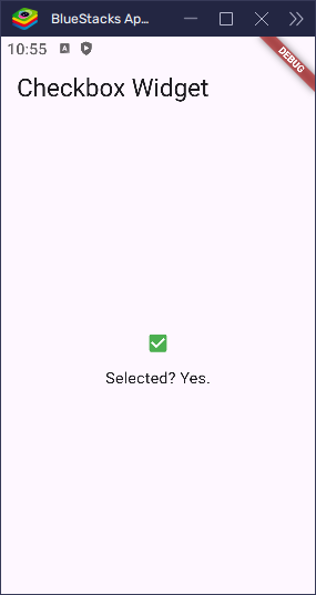
Checkbox(
value: isChecked,
activeColor: Colors.green, // Color of the checkbox when checked
checkColor: Colors.white, // Color of the checkmark
onChanged: (bool? value) {
setState(() {
isChecked = value!; // Update the checked state
});
},
),
Text('Selected? ${isChecked ? 'Yes' : 'No'}.'),
],
);
}
}In this example, the checkbox will turn green when selected, and the checkmark will be white.
Changing the Size
If you want to adjust the size of the checkbox, you can use Transform.scale:
import 'package:flutter/material.dart';

void main() => runApp(const MyApp());

class MyApp extends StatelessWidget {
  const MyApp({super.key});

  @override
  Widget build(BuildContext context) {
    return MaterialApp(
      title: 'Checkbox Widget',
      home: Scaffold(
        appBar: AppBar(title: Text('Checkbox Widget')),
        body: Center(child: MyCheckbox()),
      ),
    );
  }
}

class MyCheckbox extends StatefulWidget {
  const MyCheckbox({super.key});

  @override
  State<MyCheckbox> createState() => _MyCheckboxState();
}

class _MyCheckboxState extends State<MyCheckbox> {
  bool isChecked = true;

  @override
  Widget build(BuildContext context) {
    return Column(
      mainAxisSize: MainAxisSize.min,
      children: [
        Transform.scale(
          scale: 1.5, // Scale factor to increase the size
          child: Checkbox(
            value: isChecked,
            onChanged: (bool? value) {
              setState(() {
                isChecked = value!; // Update the checked state
              });
            },
          ),
        ),
        Text('Selected? ${isChecked ? 'Yes' : 'No'}.'),
      ],
    );
  }
}
Here, the checkbox size will be scaled up by 1.5 times. You can adjust the scale factor to make it larger or smaller according to your needs.
Changing the Shape
To give the checkbox a custom shape, you can use the shape property. Flutter allows you to apply different shapes such as circles, rounded rectangles, and more. For example, to make the checkbox have rounded corners, you can use RoundedRectangleBorder:
import 'package:flutter/material.dart';
void main() => runApp(const MyApp());
class MyApp extends StatelessWidget {
const MyApp({super.key});
@override
Widget build(BuildContext context) {
return MaterialApp(
title: 'Checkbox Widget',
home: Scaffold(
appBar: AppBar(title: Text('Checkbox Widget')),
body: Center(child: MyCheckbox()),
),
);
}
}
class MyCheckbox extends StatefulWidget {
const MyCheckbox({super.key});
@override
State<MyCheckbox> createState() => _MyCheckboxState();
}
class _MyCheckboxState extends State<MyCheckbox> {
bool isChecked = true;
@override
Widget build(BuildContext context) {
return Column(
mainAxisSize: MainAxisSize.min,
children: [
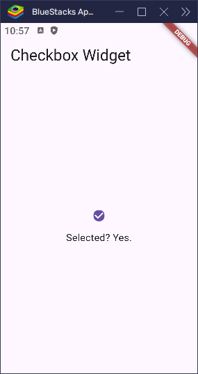
Checkbox(
value: isChecked,
onChanged: (bool? value) {
setState(() {
isChecked = value!;
});
},
shape: RoundedRectangleBorder(
borderRadius: BorderRadius.circular(
8,
), // Rounded corners with 8px radius
),
),
Text('Selected? ${isChecked ? 'Yes' : 'No'}.'),
],
);
}
}In this example, the checkbox will have rounded corners, making it look softer and more modern.
Adding Borders
You can also add borders around the checkbox to enhance its visual appeal. Use the side property to define the border style, width, and color. Here’s an example with a solid black border:
import 'package:flutter/material.dart';
void main() => runApp(const MyApp());
class MyApp extends StatelessWidget {
const MyApp({super.key});
@override
Widget build(BuildContext context) {
return MaterialApp(
title: 'Checkbox Widget',
home: Scaffold(
appBar: AppBar(title: Text('Checkbox Widget')),
body: Center(child: MyCheckbox()),
),
);
}
}
class MyCheckbox extends StatefulWidget {
const MyCheckbox({super.key});
@override
State<MyCheckbox> createState() => _MyCheckboxState();
}
class _MyCheckboxState extends State<MyCheckbox> {
bool isChecked = true;
@override
Widget build(BuildContext context) {
return Column(
mainAxisSize: MainAxisSize.min,
children: [
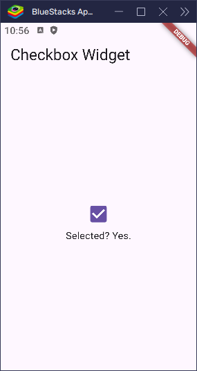
Checkbox(
value: isChecked,
onChanged: (bool? value) {
setState(() {
isChecked = value!;
});
},
activeColor: Colors.redAccent.shade200,
side: BorderSide(
color: Colors.redAccent.shade200, // Border color
width: 2.0, // Border width
),
),
Text('Selected? ${isChecked ? 'Yes' : 'No'}.'),
],
);
}
}In this example, the checkbox will have a black border with a thickness of 2 pixels. You can adjust the color and width of the border to suit your design.

With these customizations, you can easily style your checkboxes to match your app’s aesthetic. Whether you want to change the color, size, shape, or borders, Flutter gives you all the flexibility you need to create a polished user experience.
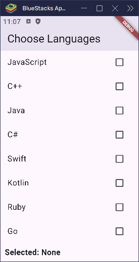
Managing Multiple Checkboxes
Let’s say you want users to select their favorite fruits. You can use a Map or a List to track the state of each checkbox.
import 'package:flutter/material.dart';

void main() => runApp(const MyApp());

class MyApp extends StatelessWidget {
  const MyApp({super.key});

  @override
  Widget build(BuildContext context) {
    return MaterialApp(
      home: Scaffold(
        appBar: AppBar(title: const Text('Choose Languages')),
        body: MyCheckbox(),
      ),
    );
  }
}

class MyCheckbox extends StatefulWidget {
  const MyCheckbox({super.key});

  @override
  State<MyCheckbox> createState() => _MyCheckboxState();
}

class _MyCheckboxState extends State<MyCheckbox> {
  final Map<String, bool> languages = {
    'Dart': false,
    'Python': true,
    'JavaScript': false,
    'C++': false,
    'Java': false,
    'C#': false,
    'Swift': false,
    'Kotlin': false,
    'Ruby': false,
    'Go': false,
  };

  @override
  Widget build(BuildContext context) {
    List<String> selected =
        languages.entries
            .where((entry) => entry.value)
            .map((entry) => entry.key)
            .toList();

    return SingleChildScrollView(
      child: Column(
        crossAxisAlignment: CrossAxisAlignment.start,
        children: [
          ...languages.keys.map((String language) {
            return CheckboxListTile(
              title: Text(language),
              value: languages[language],
              controlAffinity: ListTileControlAffinity.trailing,
              onChanged: (bool? newValue) {
                setState(() {
                  languages[language] = newValue!;
                });
              },
            );
          }),
          Padding(
            padding: const EdgeInsets.symmetric(
              horizontal: 10.0,
              vertical: 8.0,
            ),
            child: Text(
              'Selected: ${selected.isEmpty ? 'None' : selected.join(', ')}',
              style: const TextStyle(fontSize: 16, fontWeight: FontWeight.bold),
            ),
          ),
        ],
      ),
    );
  }
}
Each checkbox in the list updates its own value in the map.
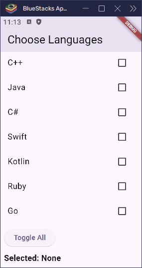
Select All / Deselect All
Want a “Select All” option? Just loop through the map and update all values:
import 'package:flutter/material.dart';

void main() => runApp(const MyApp());

class MyApp extends StatelessWidget {
  const MyApp({super.key});

  @override
  Widget build(BuildContext context) {
    return MaterialApp(
      home: Scaffold(
        appBar: AppBar(title: const Text('Choose Languages')),
        body: MyCheckbox(),
      ),
    );
  }
}

class MyCheckbox extends StatefulWidget {
  const MyCheckbox({super.key});

  @override
  State<MyCheckbox> createState() => _MyCheckboxState();
}

class _MyCheckboxState extends State<MyCheckbox> {
  final Map<String, bool> languages = {
    'Dart': false,
    'Python': true,
    'JavaScript': false,
    'C++': false,
    'Java': false,
    'C#': false,
    'Swift': false,
    'Kotlin': false,
    'Ruby': false,
    'Go': false,
  };

  @override
  Widget build(BuildContext context) {
    List<String> selected =
        languages.entries
            .where((entry) => entry.value)
            .map((entry) => entry.key)
            .toList();

    return SingleChildScrollView(
      child: Column(
        crossAxisAlignment: CrossAxisAlignment.start,
        children: [
          ...languages.keys.map((String language) {
            return CheckboxListTile(
              title: Text(language),
              value: languages[language],
              controlAffinity: ListTileControlAffinity.trailing,
              onChanged: (bool? newValue) {
                setState(() {
                  languages[language] = newValue!;
                });
              },
            );
          }),

          Padding(
            padding: const EdgeInsets.all(8.0),
            child: Column(
              crossAxisAlignment: CrossAxisAlignment.start,
              spacing: 10.0,
              children: [
                ElevatedButton(
                  onPressed: () {
                    bool allSelected = languages.values.every(
                      (selected) => selected,
                    );
                    setState(() {
                      languages.updateAll((key, value) => !allSelected);
                    });
                  },
                  child: const Text('Toggle All'),
                ),

                Text(
                  'Selected: ${selected.isEmpty ? 'None' : selected.join(', ')}',
                  style: const TextStyle(
                    fontSize: 16,
                    fontWeight: FontWeight.bold,
                  ),
                ),
              ],
            ),
          ),
        ],
      ),
    );
  }
}
This button selects all if none are selected, or deselects all if all are selected.
Conclusion
Flutter’s Checkbox is simple but powerful. Here’s what you’ve learned:
- How to use
CheckboxandCheckboxListTile - How to toggle values and manage state
- How to customize look and interaction
- How to manage multiple selections
- How to build a “select all” feature
When building forms, settings, or lists, checkboxes are a handy tool. With Flutter’s flexibility, you can make them look and behave exactly how you need.