When building user interfaces in JavaFX, developers often encounter scenarios where they need to overlay multiple UI elements or create layered layouts. The JavaFX StackPane layout container comes to the rescue in such cases. It’s a versatile container that allows you to easily stack and layer UI elements on top of each other. In this article, we’ll explore the StackPane layout in JavaFX and provide you with various code examples to demonstrate its capabilities.
Understanding the StackPane Layout
The StackPane layout is part of the JavaFX library and is used to arrange its child nodes in a stack-like manner. Each child node is positioned on top of the previous child, effectively creating a layered effect. This layout is particularly useful for creating overlays, dialogs, or scenes where you want to display multiple components on top of each other.
Key features of the StackPane layout:
- Layering Elements: As the primary purpose of StackPane, it excels at layering UI elements to create complex layouts with visually pleasing designs.
- Alignment and Margins: StackPane provides alignment options to control how its children are positioned within the container. It also supports setting margins to provide space around individual elements.
- Resizable Layout: The StackPane adjusts the size of its children to match its own dimensions. This makes it suitable for scenarios where the size of the UI components may change dynamically.
- Depth Management: Elements within a StackPane can overlap, which can lead to situations where certain elements might obscure others. Careful consideration should be given to the order of adding elements to manage their visual hierarchy.
- Flexibility: While StackPane is excellent for layering, it can also be used for simpler layouts, depending on your design needs.
Basic Layering
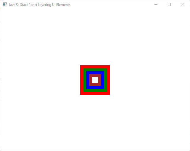
Here’s a simple example of using the StackPane layout in JavaFX. In this example, we’ll stack five colored rectangles on top of each other.
import javafx.application.Application;
import javafx.scene.Scene;
import javafx.scene.layout.*;
import javafx.scene.paint.Color;
import javafx.scene.shape.Rectangle;
import javafx.stage.Stage;

public class Main extends Application {

    private final BorderPane parent = new BorderPane();

    @Override
    public void start(Stage stage) throws Exception {
        this.setupStage(stage);
    }

    @Override
    public void init() throws Exception {
        super.init();
        this.buildUI();
    }

    private void buildUI() {

        StackPane contentPane = new StackPane();

        // Create UI Elements
        Rectangle redRectangle = new Rectangle(100, 100, Color.RED);
        Rectangle greenRectangle = new Rectangle(80, 80, Color.GREEN);
        Rectangle blueRectangle = new Rectangle(60, 60, Color.BLUE);
        Rectangle brownRectangle = new Rectangle(40, 40, Color.BROWN);
        Rectangle whiteRectangle = new Rectangle(20, 20, Color.WHITE);

        // Add UI Elements to the StackPane
        contentPane.getChildren().addAll(redRectangle, greenRectangle, blueRectangle, brownRectangle, whiteRectangle);

        this.parent.setCenter(contentPane);

    }

    private void setupStage(Stage stage) {

        Scene scene = new Scene(this.parent, 640, 480);

        // Set the stage title
        stage.setTitle("JavaFX StackPane: Layering UI Elements");

        // Set the stage scene
        stage.setScene(scene);

        // Center the stage on the screen
        stage.centerOnScreen();

        // Show the stage on the screen
        stage.show();

    }

}
In this example, we’ve created a JavaFX application that uses the StackPane layout to stack five colored rectangles on top of each other. The rectangles are created with different colors and sizes to demonstrate the layering effect. You can see how the StackPane layout makes it easy to create a visually appealing layered UI.

Customizing Alignment and Margins
In the realm of user interface design, achieving precise alignment and managing the spacing between UI elements are crucial aspects that contribute to a polished and professional look. JavaFX’s StackPane not only offers layering capabilities but also provides flexible options for customizing alignment and margins. In this section, we’ll delve into how to harness the potential of StackPane to fine-tune alignment and spacing within your UI layout.
Custom Alignment: Shaping Visual Hierarchy
While the default alignment of StackPane centers its children both horizontally and vertically, you have the power to tailor the alignment according to your design vision. By using the setAlignment(Pos value) method, you can control how the children are positioned within the container.
import javafx.application.Application;
import javafx.geometry.Pos;
import javafx.scene.Scene;
import javafx.scene.layout.*;
import javafx.scene.paint.Color;
import javafx.scene.shape.Rectangle;
import javafx.stage.Stage;

public class Main extends Application {

    private final BorderPane parent = new BorderPane();

    @Override
    public void start(Stage stage) throws Exception {
        this.setupStage(stage);
    }

    @Override
    public void init() throws Exception {
        super.init();
        this.buildUI();
    }

    private void buildUI() {

        StackPane contentPane = new StackPane();

        // Create UI Elements
        Rectangle redRectangle = new Rectangle(100, 100, Color.RED);
        Rectangle greenRectangle = new Rectangle(80, 80, Color.GREEN);
        Rectangle blueRectangle = new Rectangle(60, 60, Color.BLUE);
        Rectangle brownRectangle = new Rectangle(40, 40, Color.BROWN);
        Rectangle whiteRectangle = new Rectangle(20, 20, Color.WHITE);

        // Add UI Elements to the StackPane
        contentPane.getChildren().addAll(redRectangle, greenRectangle, blueRectangle, brownRectangle, whiteRectangle);

        // Align elements to the bottom-right corner
        contentPane.setAlignment(Pos.BOTTOM_RIGHT);

        // Align the Red Rectangle to the top-left corner
        StackPane.setAlignment(redRectangle, Pos.TOP_LEFT);

        this.parent.setCenter(contentPane);

    }

    private void setupStage(Stage stage) {

        Scene scene = new Scene(this.parent, 640, 480);

        // Set the stage title
        stage.setTitle("JavaFX StackPane: Layering UI Elements");

        // Set the stage scene
        stage.setScene(scene);

        // Center the stage on the screen
        stage.centerOnScreen();

        // Show the stage on the screen
        stage.show();

    }

}
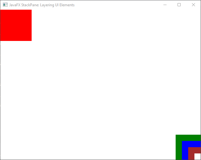
To align the elements, we set the alignment of the entire contentPane to Pos.BOTTOM_RIGHT, ensuring all UI elements are positioned at the bottom-right corner of the StackPane. Additionally, the alignment of the red rectangle is customized using StackPane.setAlignment(redRectangle, Pos.TOP_LEFT), placing it at the top-left corner of the layout.

Adding Margins: Controlling Spacing
To control the space around individual UI elements within the StackPane, you can utilize the setMargin(Node child, Insets value) method. This enables you to define the desired spacing between elements.
import javafx.application.Application;
import javafx.geometry.Insets;
import javafx.geometry.Pos;
import javafx.scene.Scene;
import javafx.scene.layout.*;
import javafx.scene.paint.Color;
import javafx.scene.shape.Rectangle;
import javafx.stage.Stage;

public class Main extends Application {

    private final BorderPane parent = new BorderPane();

    @Override
    public void start(Stage stage) throws Exception {
        this.setupStage(stage);
    }

    @Override
    public void init() throws Exception {
        super.init();
        this.buildUI();
    }

    private void buildUI() {

        StackPane contentPane = new StackPane();

        // Create UI Elements
        Rectangle redRectangle = new Rectangle(100, 100, Color.RED);
        Rectangle greenRectangle = new Rectangle(80, 80, Color.GREEN);
        Rectangle blueRectangle = new Rectangle(60, 60, Color.BLUE);
        Rectangle brownRectangle = new Rectangle(40, 40, Color.BROWN);
        Rectangle whiteRectangle = new Rectangle(20, 20, Color.WHITE);

        // Add UI Elements to the StackPane
        contentPane.getChildren().addAll(redRectangle, greenRectangle, blueRectangle, brownRectangle, whiteRectangle);

        // Align elements to the bottom-right corner
        contentPane.setAlignment(Pos.BOTTOM_RIGHT);

        // Align the Red Rectangle to the top-left corner
        StackPane.setAlignment(redRectangle, Pos.TOP_LEFT);

        // Add margins to Red Rectangle
        StackPane.setMargin(redRectangle, new Insets(50.0));

        this.parent.setCenter(contentPane);

    }

    private void setupStage(Stage stage) {

        Scene scene = new Scene(this.parent, 640, 480);

        // Set the stage title
        stage.setTitle("JavaFX StackPane: Layering UI Elements");

        // Set the stage scene
        stage.setScene(scene);

        // Center the stage on the screen
        stage.centerOnScreen();

        // Show the stage on the screen
        stage.show();

    }

}
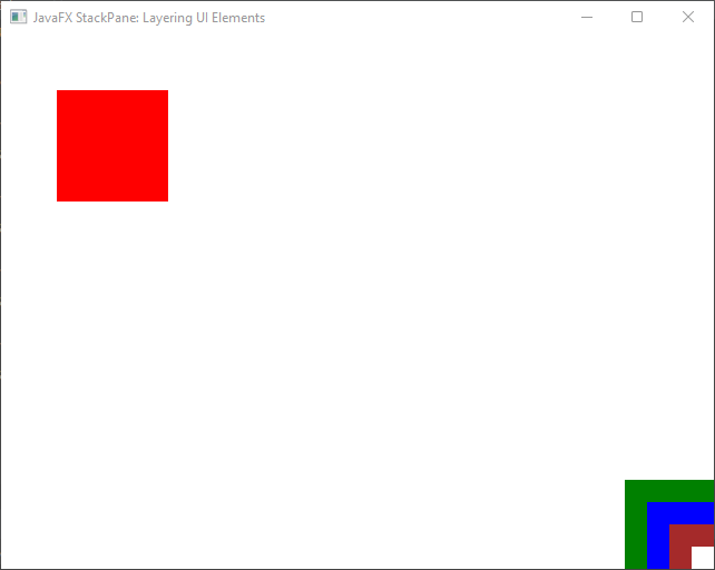
In this example, we added a margin of 50 pixels to the red rectangle using StackPane.setMargin(redRectangle, new Insets(50.0)). The red rectangle will be positioned at the top-left corner with a margin, while the other rectangles will be aligned to the bottom-right corner.

Achieving Precision in Layouts
JavaFX’s StackPane serves as a powerful tool not only for layering UI elements but also for fine-tuning their alignment and spacing. By customizing alignment and margins, you can achieve a high degree of precision in your UI layouts, ensuring that your application’s visual design is both captivating and functional.
As you experiment with different alignment settings and margins, you’ll gain a deeper understanding of how to create visually appealing and well-organized interfaces that elevate the user experience. Utilize the flexibility of StackPane to craft layouts that align with your design goals and enhance the overall aesthetics of your JavaFX applications.
Conclusion
The StackPane layout in JavaFX is a powerful tool for creating layered and overlaid user interfaces. It allows developers to easily stack UI elements on top of each other, resulting in visually engaging and complex layouts. By understanding its alignment and overlapping capabilities, you can take full advantage of the StackPane to create sophisticated user interfaces in your JavaFX applications.
Sources:
I hope you found this code informative and useful. If you would like to receive more content, please consider subscribing to our newsletter!


