When it comes to developing modern and interactive Java applications, JavaFX is a go-to choice for many developers. JavaFX provides a plethora of user interface components that enable developers to create visually appealing and user-friendly applications. One such component that stands out for its versatility and usefulness is the JavaFX ComboBox.
What is a ComboBox?
A ComboBox, also known as a drop-down list or a selection box, is a user interface element that combines the features of a text field and a list. It allows users to select an item from a pre-defined list of options or enter custom text. The selected item is displayed in the ComboBox when it is closed, and users can click on the drop-down arrow to view and select from the available options.
Why Use a ComboBox?
ComboBoxes offer several advantages over other input components, making them a popular choice for various scenarios:
- Space Efficiency: ComboBoxes save screen real estate by displaying a single selected item, which is especially beneficial when there are many options to choose from.
- User-Friendly: They provide a familiar interface that users easily recognize, making it simple for them to interact with your application.
- Customizable: JavaFX ComboBoxes are highly customizable. You can change the appearance, behavior, and content of the ComboBox to match your application’s requirements.
- Data Integrity: By providing a predefined list of options, ComboBoxes help maintain data integrity by preventing users from entering invalid or incorrect data.
- Event Handling: ComboBoxes support event handling, allowing you to respond to user actions and implement dynamic behaviors in your application.
Creating a Basic ComboBox
Creating a basic ComboBox in JavaFX is straightforward. To get started, you’ll need JavaFX installed, and you can use any integrated development environment (IDE) that supports JavaFX development. For example, you can create a ComboBox to select a favorite programming language:
import javafx.application.Application;
import javafx.collections.FXCollections;
import javafx.collections.ObservableList;
import javafx.scene.Scene;
import javafx.scene.control.*;
import javafx.scene.layout.*;
import javafx.stage.Stage;

public class Main extends Application {

    private final BorderPane parent = new BorderPane();

    @Override
    public void start(Stage stage) throws Exception {
        this.setupStage(stage);
    }

    @Override
    public void init() throws Exception {
        super.init();
        this.buildUI();
    }

    private void buildUI() {

        ObservableList<String> languages = FXCollections.observableArrayList(
                "C++", "Java", "JavaScript", "Python"
        );

        // Create a ComboBox and add items to it
        ComboBox<String> languageComboBox = new ComboBox<>();

        // Add languages to the ComboBox
        languageComboBox.getItems().addAll(languages);

        // Set Java as the default value for the ComboBox
        languageComboBox.setValue("Java");

        this.parent.setCenter(languageComboBox);

    }

    private void setupStage(Stage stage) {

        Scene scene = new Scene(this.parent, 640.0, 480.0);

        // Set the stage title
        stage.setTitle("How to Create a ComboBox in JavaFX");

        // Set the stage scene
        stage.setScene(scene);

        // Center the stage on the screen
        stage.centerOnScreen();

        // Show the stage on the screen
        stage.show();

    }

}
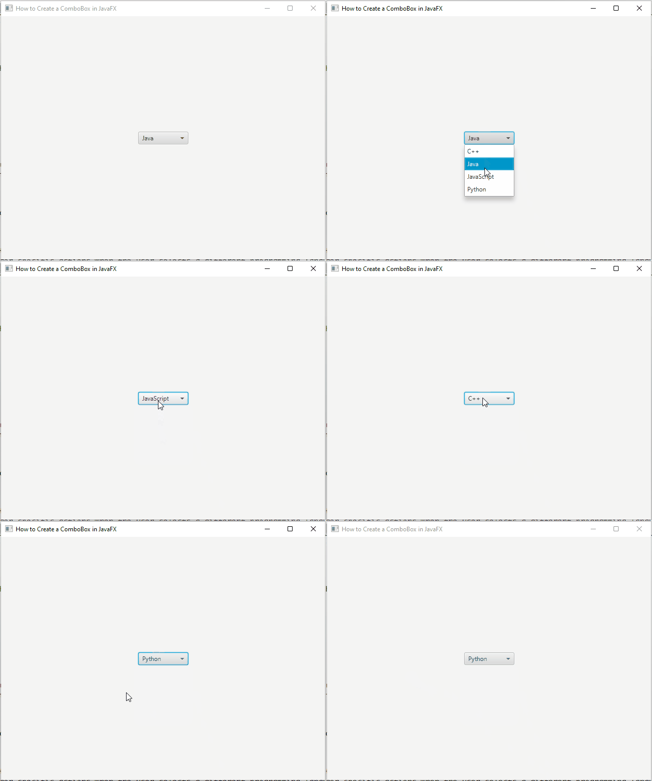
Run the application, and you should see a window displaying the ComboBox with the default value “Java” and a drop-down menu with other programming languages to choose from.

Advanced ComboBox Features
JavaFX ComboBox provides a plethora of features that can take your user interface to the next level:
Event Handling
You can add event handlers to detect changes in the ComboBox selection, enabling you to perform actions based on the user’s choices. For instance, you might want to trigger specific actions when the user selects a different programming language from the ComboBox.
import javafx.application.Application;
import javafx.collections.FXCollections;
import javafx.collections.ObservableList;
import javafx.scene.Scene;
import javafx.scene.control.*;
import javafx.scene.layout.*;
import javafx.stage.Stage;

public class Main extends Application {

    private final BorderPane parent = new BorderPane();

    @Override
    public void start(Stage stage) throws Exception {
        this.setupStage(stage);
    }

    @Override
    public void init() throws Exception {
        super.init();
        this.buildUI();
    }

    private void buildUI() {

        ObservableList<String> languages = FXCollections.observableArrayList(
                "C++", "Java", "JavaScript", "Python"
        );

        // Create a ComboBox and add items to it
        ComboBox<String> languageComboBox = new ComboBox<>();

        // Add languages to the ComboBox
        languageComboBox.getItems().addAll(languages);

        // Set Java as the default value for the ComboBox
        languageComboBox.setValue("Java");

        // Add an event handler to detect selection changes
        languageComboBox.setOnAction(event -> {

            String selectedLanguage = languageComboBox.getValue();

            // Print selected language out to the console
            System.out.println("Selected Language: " + selectedLanguage);

        });

        this.parent.setCenter(languageComboBox);

    }

    private void setupStage(Stage stage) {

        Scene scene = new Scene(this.parent, 640.0, 480.0);

        // Set the stage title
        stage.setTitle("How to Create a ComboBox in JavaFX");

        // Set the stage scene
        stage.setScene(scene);

        // Center the stage on the screen
        stage.centerOnScreen();

        // Show the stage on the screen
        stage.show();

    }

}
In this example, we create a JavaFX application with a ComboBox containing a list of programming languages. We add an event handler to the ComboBox using the setOnAction method, which triggers when the user makes a selection. The lambda expression in the event handler retrieves the selected language and prints it to the console. In a real-world application, you would perform specific actions based on the selected language, such as updating other UI components or triggering operations related to the chosen language.
Customization
ComboBoxes can be customized to match the overall theme and style of your application. You can modify the appearance of the drop-down menu, the selected item’s display, and even the popup content.
Customizing the Drop-Down Menu
By default, the drop-down menu of a ComboBox displays a list of items in a simple format. However, you can customize the appearance of each item in the drop-down menu by using a custom cell factory. The cell factory is responsible for rendering each item in the ComboBox. You can create a custom cell factory by implementing the Callback, ListCell> interface, where T is the type of items in the ComboBox.
Here’s an example of customizing the drop-down menu to display programming languages with their corresponding icons:
import javafx.application.Application;
import javafx.collections.FXCollections;
import javafx.collections.ObservableList;
import javafx.scene.Scene;
import javafx.scene.control.*;
import javafx.scene.image.Image;
import javafx.scene.image.ImageView;
import javafx.scene.layout.*;
import javafx.stage.Stage;
import javafx.util.Callback;

public class Main extends Application {

    private final BorderPane parent = new BorderPane();

    @Override
    public void start(Stage stage) throws Exception {
        this.setupStage(stage);
    }

    @Override
    public void init() throws Exception {
        super.init();
        this.buildUI();
    }

    private void buildUI() {

        ObservableList<String> languages = FXCollections.observableArrayList(
                "C++", "Java", "JavaScript", "Python"
        );

        // Create a ComboBox and add items to it
        ComboBox<String> languageComboBox = new ComboBox<>();

        // Add languages to the ComboBox
        languageComboBox.getItems().addAll(languages);

        // Set Java as the default value for the ComboBox
        languageComboBox.setValue("Java");

        // Customize the appearance of items in the drop-down menu
        languageComboBox.setCellFactory(new Callback<>() {

            @Override
            public ListCell<String> call(ListView<String> param) {

                return new ListCell<>() {
                    @Override
                    protected void updateItem(String item, boolean empty) {
                        super.updateItem(item, empty);

                        if (item != null) {

                            setText(item);
                            setGraphic(getLanguageIcon(item));

                        } else {

                            setText(null);
                            setGraphic(null);

                        }

                    }

                };
            }

        });

        this.parent.setCenter(languageComboBox);

    }

    // Helper method to get the corresponding language icon
    private ImageView getLanguageIcon(String language) {

        String iconPath = language.toLowerCase().replace("++", "pp") + ".png";
        return new ImageView(new Image(iconPath));

    }

    private void setupStage(Stage stage) {

        Scene scene = new Scene(this.parent, 640.0, 480.0);

        // Set the stage title
        stage.setTitle("How to Create a ComboBox in JavaFX");

        // Set the stage scene
        stage.setScene(scene);

        // Center the stage on the screen
        stage.centerOnScreen();

        // Show the stage on the screen
        stage.show();

    }

}
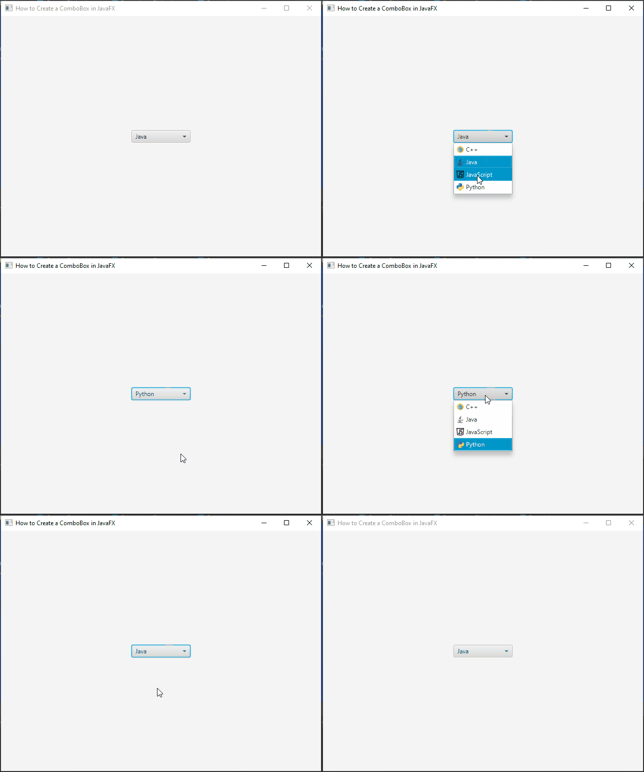
In this example, we use the setCellFactory method of the ComboBox to define a custom cell factory. The custom cell factory creates ListCell instances that display both the text and an icon corresponding to each programming language. The getLanguageIcon method is a helper method that retrieves the appropriate icon image for each language.

Customizing the Selected Item Display
JavaFX allows you to customize the appearance of the selected item that is displayed when the ComboBox is collapsed. This can be achieved using a custom cell factory for the ComboBox’s button cell. The button cell is the visual representation of the selected item when the ComboBox is not expanded.
Here’s an example of customizing the selected item display with a custom graphic:
import javafx.application.Application;
import javafx.collections.FXCollections;
import javafx.collections.ObservableList;
import javafx.scene.Scene;
import javafx.scene.control.*;
import javafx.scene.image.Image;
import javafx.scene.image.ImageView;
import javafx.scene.layout.*;
import javafx.stage.Stage;

public class Main extends Application {

    private final BorderPane parent = new BorderPane();

    @Override
    public void start(Stage stage) throws Exception {
        this.setupStage(stage);
    }

    @Override
    public void init() throws Exception {
        super.init();
        this.buildUI();
    }

    private void buildUI() {

        ObservableList<String> languages = FXCollections.observableArrayList(
                "C++", "Java", "JavaScript", "Python"
        );

        // Create a ComboBox and add items to it
        ComboBox<String> languageComboBox = new ComboBox<>();

        // Add languages to the ComboBox
        languageComboBox.getItems().addAll(languages);

        // Set Java as the default value for the ComboBox
        languageComboBox.setValue("Java");

        // Customize the appearance of the selected item display
        languageComboBox.setButtonCell(new ListCell<>() {

            @Override
            protected void updateItem(String item, boolean empty) {
                super.updateItem(item, empty);

                if (item != null) {

                    setText(item);
                    setGraphic(getLanguageIcon(item));

                } else {

                    setText(null);
                    setGraphic(null);

                }

            }

        });

        this.parent.setCenter(languageComboBox);

    }

    // Helper method to get the corresponding language icon
    private ImageView getLanguageIcon(String language) {

        String iconPath = language.toLowerCase().replace("++", "pp") + ".png";
        return new ImageView(new Image(iconPath));

    }

    private void setupStage(Stage stage) {

        Scene scene = new Scene(this.parent, 640.0, 480.0);

        // Set the stage title
        stage.setTitle("How to Create a ComboBox in JavaFX");

        // Set the stage scene
        stage.setScene(scene);

        // Center the stage on the screen
        stage.centerOnScreen();

        // Show the stage on the screen
        stage.show();

    }

}
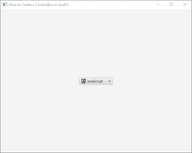
In this example, we use the setButtonCell method of the ComboBox to define a custom button cell. The custom button cell displays the selected item with both the text and an icon, similar to the drop-down menu items.

Sorting and Ordering
JavaFX ComboBox allows you to specify custom sorting and ordering of items in the drop-down menu. By implementing a comparator or using JavaFX’s built-in sorting capabilities, you can arrange the items in a meaningful way, making it easier for users to find and select the desired option.
Let’s explore how to customize sorting and ordering of items in a JavaFX ComboBox:
import javafx.application.Application;
import javafx.collections.FXCollections;
import javafx.collections.ObservableList;
import javafx.scene.Scene;
import javafx.scene.control.*;
import javafx.scene.layout.*;
import javafx.stage.Stage;

public class Main extends Application {

    private final BorderPane parent = new BorderPane();

    @Override
    public void start(Stage stage) throws Exception {
        this.setupStage(stage);
    }

    @Override
    public void init() throws Exception {
        super.init();
        this.buildUI();
    }

    private void buildUI() {

        ObservableList<String> languages = FXCollections.observableArrayList(
                "JavaScript", "C++", "Java", "Python"
        );

        // Create a ComboBox and add items to it
        ComboBox<String> languageComboBox = new ComboBox<>();

        // Add languages to the ComboBox
        languageComboBox.getItems().addAll(languages);

        // Set Java as the default value for the ComboBox
        languageComboBox.setValue("Java");

        // Enable alphabetical sorting (built-in sorting capability)
        languageComboBox.getItems().sort(String::compareToIgnoreCase);

        this.parent.setCenter(languageComboBox);

    }

    private void setupStage(Stage stage) {

        Scene scene = new Scene(this.parent, 640.0, 480.0);

        // Set the stage title
        stage.setTitle("How to Create a ComboBox in JavaFX");

        // Set the stage scene
        stage.setScene(scene);

        // Center the stage on the screen
        stage.centerOnScreen();

        // Show the stage on the screen
        stage.show();

    }

}
In this example, we create an observable list languages that holds a list of programming languages. We then create a ComboBox languageComboBox and bind its items to the observable list using the setItems method.
To implement alphabetical sorting, we use JavaFX’s built-in sorting capabilities. By calling languageComboBox.getItems().sort(String::compareToIgnoreCase), we sort the items alphabetically, ignoring the case. This ensures that the programming languages are displayed in ascending order, making it easier for users to find and select the desired option.
If you prefer a custom sorting order based on specific criteria, you can implement a custom comparator. The custom comparator allows you to define a specific sorting logic to determine the order of items in the ComboBox. Here’s an example of implementing a custom comparator:
import javafx.application.Application;
import javafx.collections.FXCollections;
import javafx.collections.ObservableList;
import javafx.scene.Scene;
import javafx.scene.control.*;
import javafx.scene.layout.*;
import javafx.stage.Stage;

import java.util.Comparator;

public class Main extends Application {

    private final BorderPane parent = new BorderPane();

    @Override
    public void start(Stage stage) throws Exception {
        this.setupStage(stage);
    }

    @Override
    public void init() throws Exception {
        super.init();
        this.buildUI();
    }

    private void buildUI() {

        ObservableList<String> languages = FXCollections.observableArrayList(
                "JavaScript", "C++", "Java", "Python"
        );

        // Create a ComboBox and add items to it
        ComboBox<String> languageComboBox = new ComboBox<>();

        // Add languages to the ComboBox
        languageComboBox.getItems().addAll(languages);

        // Set Java as the default value for the ComboBox
        languageComboBox.setValue("Java");

        // Custom comparator to sort by language length (shortest to longest)
        Comparator<String> languageComparator = Comparator.comparingInt(String::length);

        languageComboBox.getItems().sort(languageComparator);

        this.parent.setCenter(languageComboBox);

    }

    private void setupStage(Stage stage) {

        Scene scene = new Scene(this.parent, 640.0, 480.0);

        // Set the stage title
        stage.setTitle("How to Create a ComboBox in JavaFX");

        // Set the stage scene
        stage.setScene(scene);

        // Center the stage on the screen
        stage.centerOnScreen();

        // Show the stage on the screen
        stage.show();

    }

}
In this example, we define a custom comparator that sorts the items based on the length of the programming languages, from shortest to longest. By calling languageComboBox.getItems().sort(languageComparator), we sort the items according to the custom sorting logic provided by the comparator.
By customizing the sorting and ordering of items in a JavaFX ComboBox, you can present the options in a more organized manner, making it easier for users to find and select the desired item. Whether you use built-in sorting capabilities or implement a custom comparator, the ComboBox becomes more user-friendly and efficient in handling large lists of items.
Conclusion
The JavaFX ComboBox is a powerful and flexible component that significantly enhances user interaction in Java applications. Its ability to combine text input with a drop-down menu makes it an essential element for creating modern, user-friendly interfaces.
In this article, we’ve explored the basics of creating a ComboBox in JavaFX and highlighted some of its advanced features. By mastering the ComboBox and leveraging its capabilities, you can design intuitive and interactive user interfaces that delight your users and elevate your application’s overall experience.
So why wait? Start integrating ComboBoxes into your JavaFX projects today and take your applications to the next level of user interaction!
I hope you found this code informative and useful. If you would like to receive more content, please consider subscribing to our newsletter!


