JavaFX is a powerful framework for creating rich user interfaces in Java applications. It offers a variety of built-in UI controls that simplify the development process. However, there are times when you might need specialized controls that go beyond the standard offerings. This is where third-party libraries like ControlsFX come into play. In this article, we will dive into the ControlsFX Rating Control, which provides an intuitive way to gather user ratings and feedback.
Introducing ControlsFX Rating Control
ControlsFX is an open-source library that extends the JavaFX framework with additional UI controls and features. One of the standout components in ControlsFX is the Rating Control, which allows developers to integrate a customizable star-based rating system into their applications. This is particularly useful for applications that require user reviews, feedback, or ratings.
The Rating Control from ControlsFX is a perfect example of how third-party libraries can enhance the functionality of JavaFX applications without the need for extensive custom coding.
Getting Started
To begin using the ControlsFX Rating Control, you need to add the ControlsFX library to your project. You can do this by downloading the library JAR file from the ControlsFX website or by adding it as a dependency through a build tool like Maven or Gradle.
Assuming you have the ControlsFX library included in your project, let’s explore how to create a simple application that utilizes the Rating Control.
Creating a Basic Rating Control
Let’s start by creating a simple JavaFX application that uses the Rating control. In this example, we’ll display a Rating control that allows users to rate a hypothetical product:
import javafx.application.Application;
import javafx.geometry.Pos;
import javafx.scene.Scene;
import javafx.scene.layout.*;
import javafx.stage.Stage;
import org.controlsfx.control.Rating;

public class Main extends Application {

    private final BorderPane parent = new BorderPane();

    @Override
    public void start(Stage stage) throws Exception {
        this.setupStage(stage);
    }

    @Override
    public void init() throws Exception {
        super.init();
        this.buildUI();
    }

    private void buildUI() {

        // Create a Rating Control
        Rating rating = new Rating();

        // Add the Rating Control to the VBox
        VBox vbox = new VBox(rating);
        vbox.setAlignment(Pos.CENTER);

        // Add the VBox to the BorderPane layout manager
        this.parent.setCenter(vbox);

    }

    private void setupStage(Stage stage) {

        Scene scene = new Scene(this.parent, 640, 480);

        // Set the stage title
        stage.setTitle("Creating a Basic Rating Control");

        // Set the stage scene
        stage.setScene(scene);

        // Center the stage on the screen
        stage.centerOnScreen();

        // Show the stage on the screen
        stage.show();

    }

}
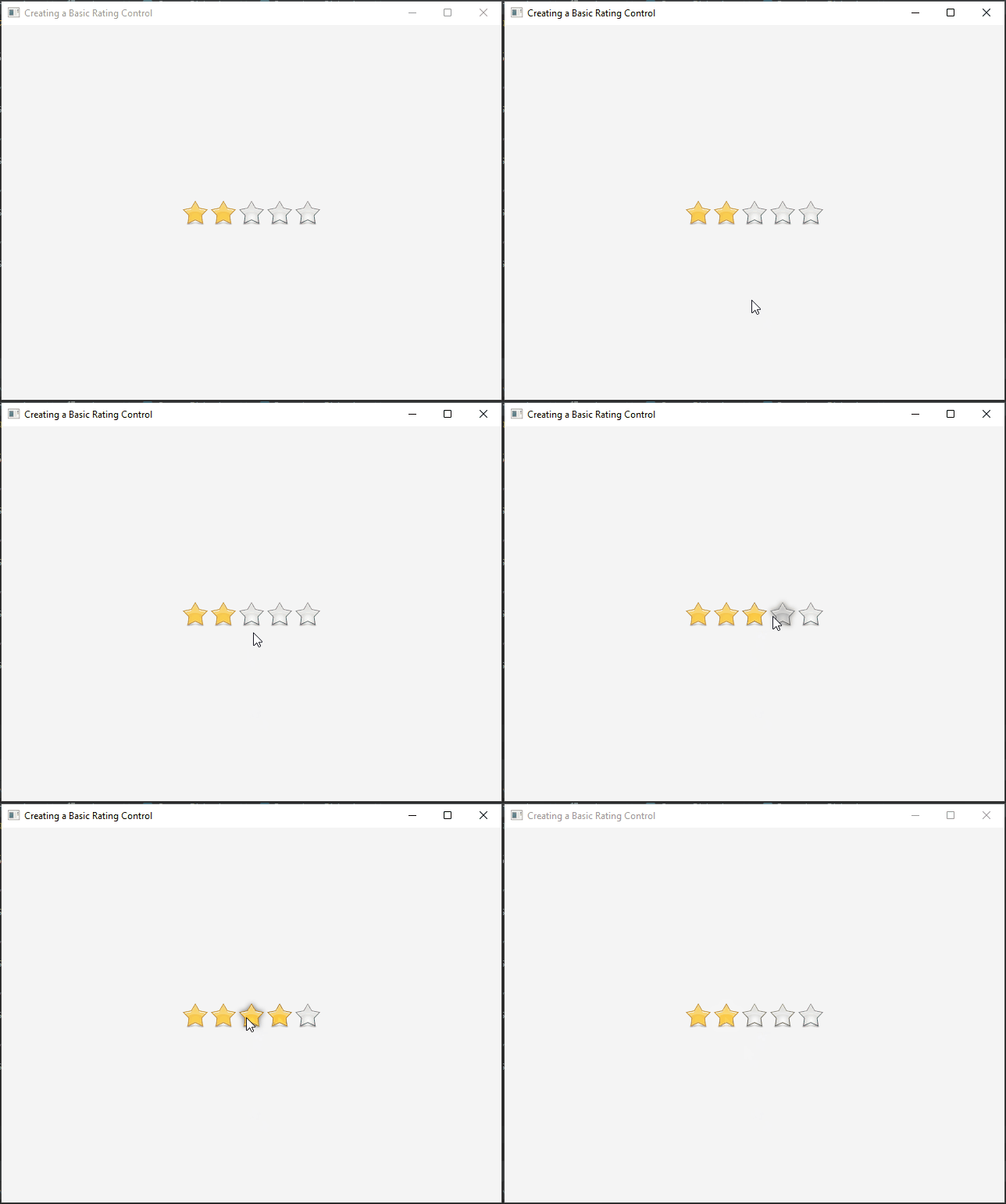
Build and run your application. You should see a window with a Rating Control that displays a row of stars. Users can hover over the stars to highlight and select a rating value.
Customizing the Rating Control
The ControlsFX Rating Control is highly customizable. You can adjust various properties to tailor the appearance and behavior of the control to your needs. Here are a few examples:
Setting the Number of Stars
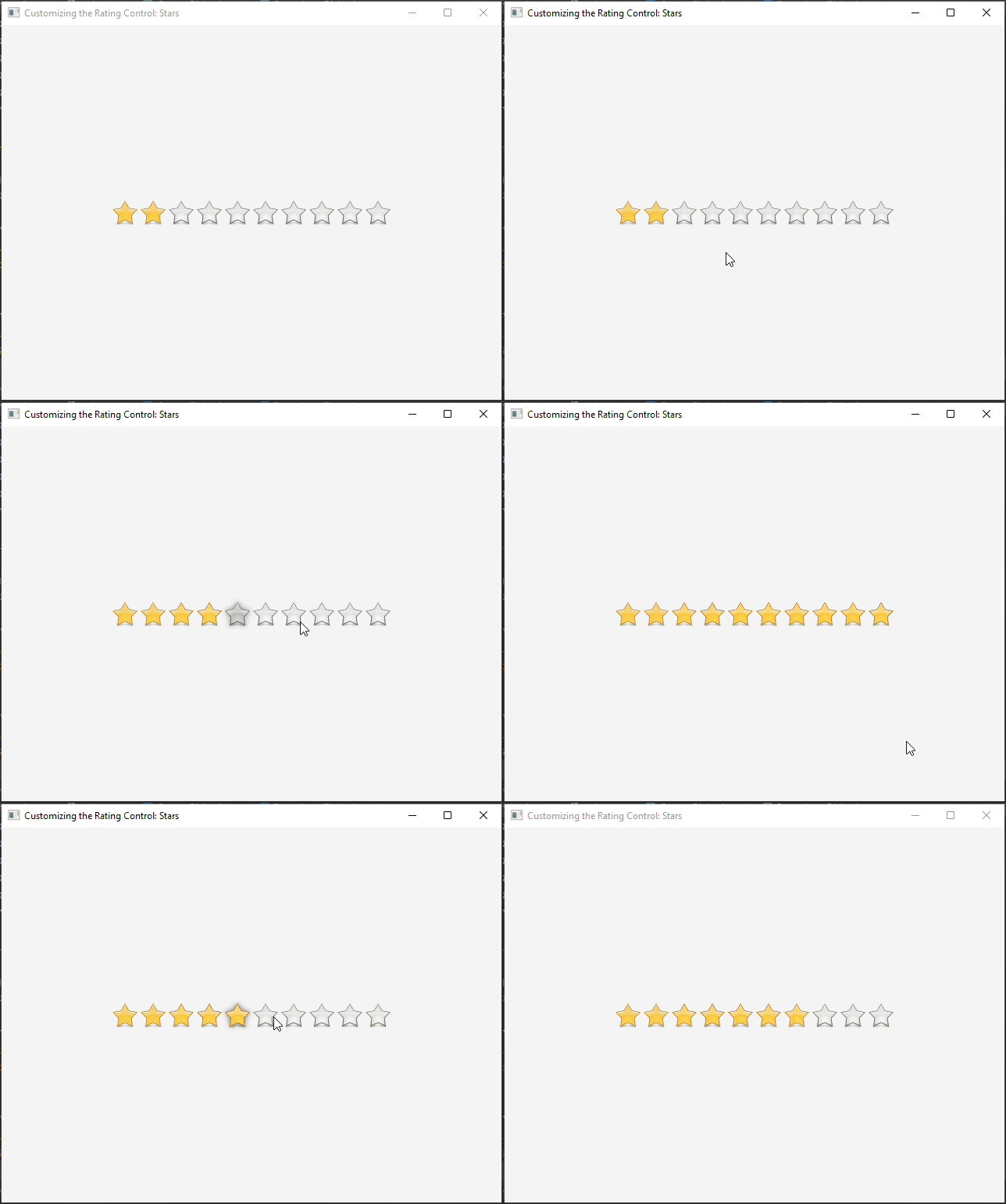
You can set the number of stars displayed in the Rating Control using the setMax method:
import javafx.application.Application;
import javafx.geometry.Pos;
import javafx.scene.Scene;
import javafx.scene.layout.*;
import javafx.stage.Stage;
import org.controlsfx.control.Rating;

public class Main extends Application {

    private final BorderPane parent = new BorderPane();

    @Override
    public void start(Stage stage) throws Exception {
        this.setupStage(stage);
    }

    @Override
    public void init() throws Exception {
        super.init();
        this.buildUI();
    }

    private void buildUI() {

        // Create a Rating Control
        Rating rating = new Rating();

        // Set the maximum number of stars to 10
        rating.setMax(10);

        // Add the Rating Control to the VBox
        VBox vbox = new VBox(rating);
        vbox.setAlignment(Pos.CENTER);

        // Add the VBox to the BorderPane layout manager
        this.parent.setCenter(vbox);

    }

    private void setupStage(Stage stage) {

        Scene scene = new Scene(this.parent, 640, 480);

        // Set the stage title
        stage.setTitle("Customizing the Rating Control: Stars");

        // Set the stage scene
        stage.setScene(scene);

        // Center the stage on the screen
        stage.centerOnScreen();

        // Show the stage on the screen
        stage.show();

    }

}
Enable Partial Rating
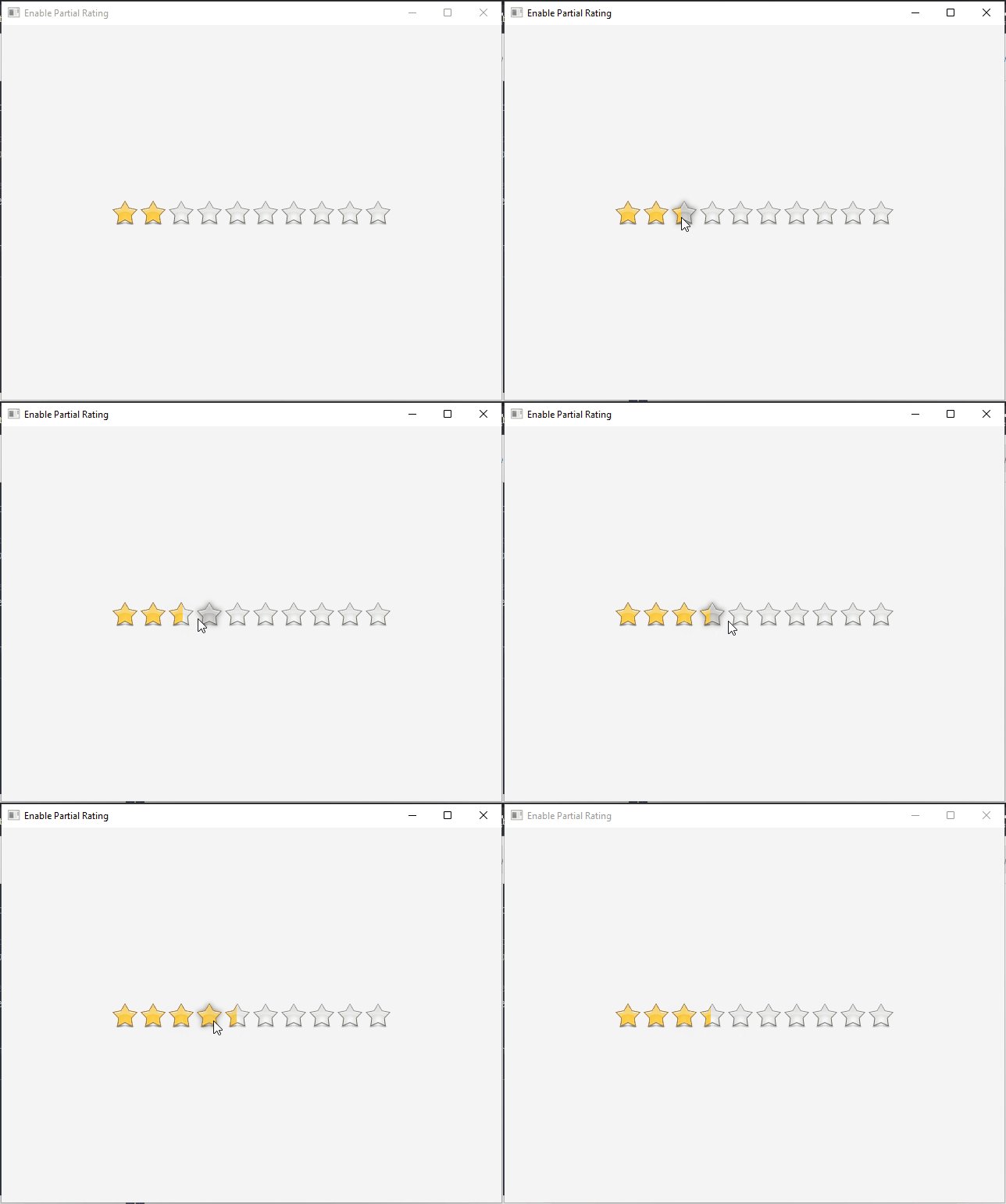
The partialRating property of the Rating control allows users to select ratings that are not limited to whole numbers. Instead, users can choose decimal values between the defined rating symbols. This feature provides more granularity and flexibility when users need to express their opinions accurately, especially in scenarios where the quality of a product or service falls between two whole ratings.
import javafx.application.Application;
import javafx.geometry.Pos;
import javafx.scene.Scene;
import javafx.scene.layout.*;
import javafx.stage.Stage;
import org.controlsfx.control.Rating;

public class Main extends Application {

    private final BorderPane parent = new BorderPane();

    @Override
    public void start(Stage stage) throws Exception {
        this.setupStage(stage);
    }

    @Override
    public void init() throws Exception {
        super.init();
        this.buildUI();
    }

    private void buildUI() {

        // Create a Rating Control
        Rating rating = new Rating();

        // Set the maximum number of stars to 10
        rating.setMax(10);

        // Enable partial rating
        rating.setPartialRating(true);

        // Add the Rating Control to the VBox
        VBox vbox = new VBox(rating);
        vbox.setAlignment(Pos.CENTER);

        // Add the VBox to the BorderPane layout manager
        this.parent.setCenter(vbox);

    }

    private void setupStage(Stage stage) {

        Scene scene = new Scene(this.parent, 640, 480);

        // Set the stage title
        stage.setTitle("Enable Partial Rating");

        // Set the stage scene
        stage.setScene(scene);

        // Center the stage on the screen
        stage.centerOnScreen();

        // Show the stage on the screen
        stage.show();

    }

}
In this example, we create a Rating control and enable the partialRating property by setting it to true. By doing so, we allow users to select decimal values between the defined rating symbols. The setMax method specifies the maximum rating value, which in this case is set to 10.
Update Rating on Hover
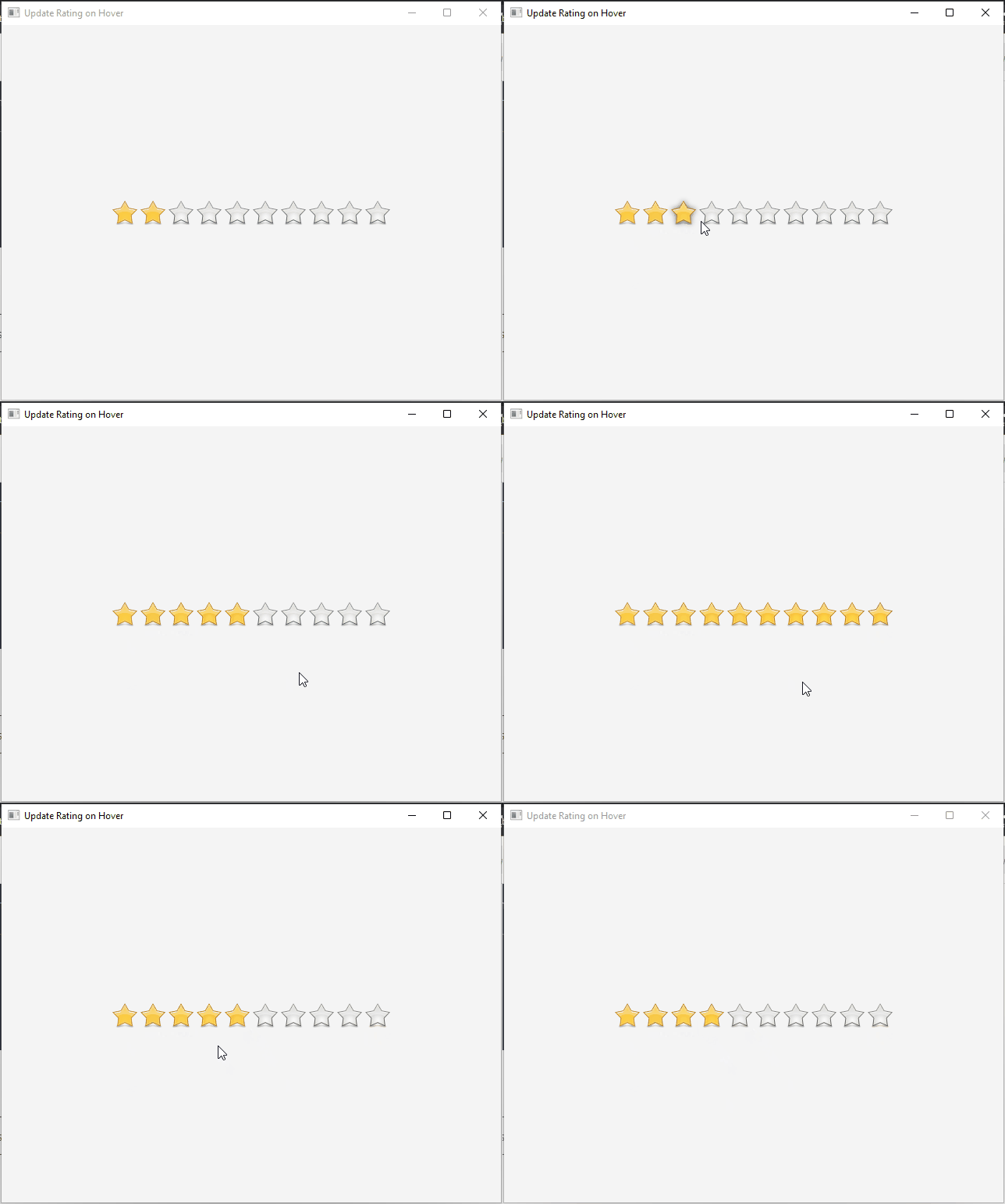
The updateOnHover feature is an ingenious addition to the JavaFX ControlsFX Rating control. It enhances the user experience by allowing users to see an immediate preview of the rating value they are about to give when they hover their mouse over the control. This real-time feedback provides users with a clear understanding of how their interaction will impact the rating they’re assigning.
import javafx.application.Application;
import javafx.geometry.Pos;
import javafx.scene.Scene;
import javafx.scene.layout.*;
import javafx.stage.Stage;
import org.controlsfx.control.Rating;

public class Main extends Application {

    private final BorderPane parent = new BorderPane();

    @Override
    public void start(Stage stage) throws Exception {
        this.setupStage(stage);
    }

    @Override
    public void init() throws Exception {
        super.init();
        this.buildUI();
    }

    private void buildUI() {

        // Create a Rating Control
        Rating rating = new Rating();

        // Set the maximum number of stars to 10
        rating.setMax(10);

        // Enable updateOnHover
        rating.setUpdateOnHover(true);

        // Add the Rating Control to the VBox
        VBox vbox = new VBox(rating);
        vbox.setAlignment(Pos.CENTER);

        // Add the VBox to the BorderPane layout manager
        this.parent.setCenter(vbox);

    }

    private void setupStage(Stage stage) {

        Scene scene = new Scene(this.parent, 640, 480);

        // Set the stage title
        stage.setTitle("Update Rating on Hover");

        // Set the stage scene
        stage.setScene(scene);

        // Center the stage on the screen
        stage.centerOnScreen();

        // Show the stage on the screen
        stage.show();

    }

}
In this example, we set the updateOnHover property of the Rating control to true. This enables the feature that updates the displayed rating value based on the user’s mouse position. As the user hovers over different parts of the control, the rating value will dynamically change to reflect the hovered position.
Changing the Orientation
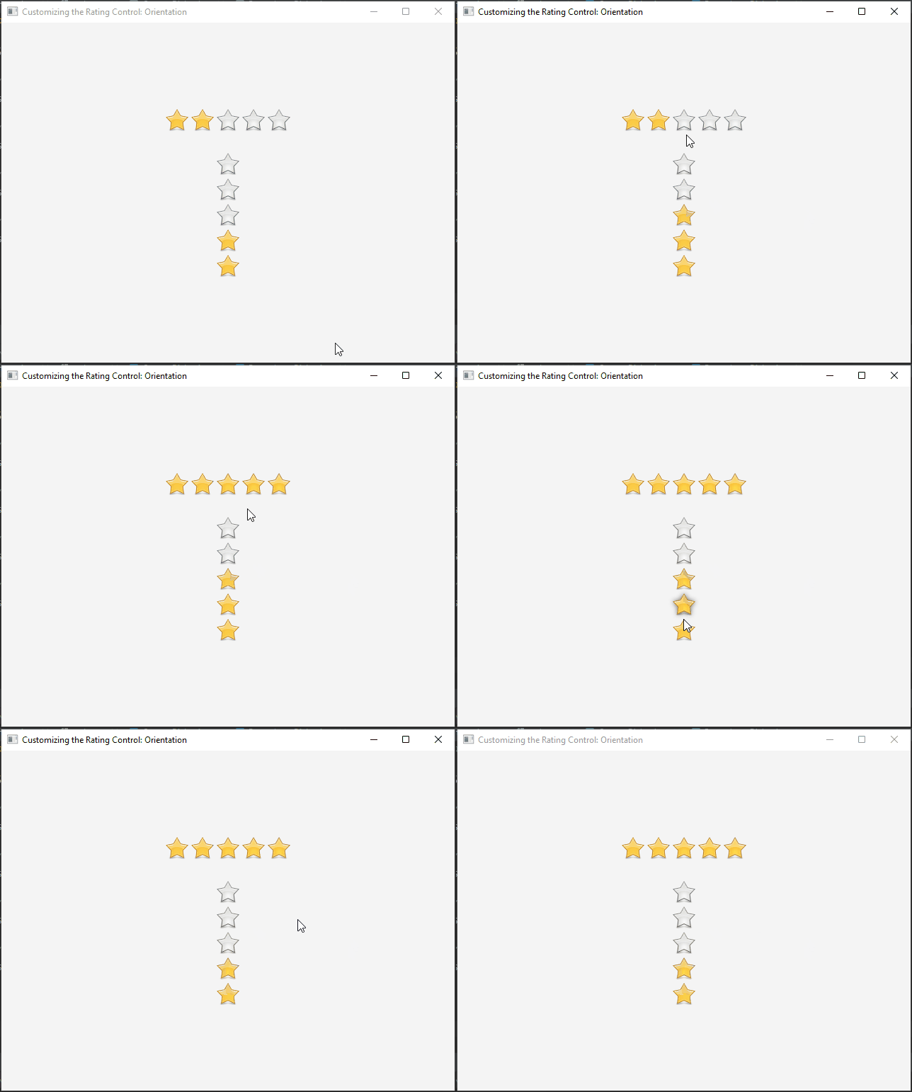
The orientation property of the Rating control allows you to define how the control’s visual elements are arranged. By default, the Rating control displays its rating symbols horizontally. However, you can easily change this orientation to vertical, enabling you to seamlessly integrate the control into various layouts and scenarios.
import javafx.application.Application;
import javafx.geometry.Orientation;
import javafx.geometry.Pos;
import javafx.scene.Scene;
import javafx.scene.layout.*;
import javafx.stage.Stage;
import org.controlsfx.control.Rating;

public class Main extends Application {

    private final BorderPane parent = new BorderPane();

    @Override
    public void start(Stage stage) throws Exception {
        this.setupStage(stage);
    }

    @Override
    public void init() throws Exception {
        super.init();
        this.buildUI();
    }

    private void buildUI() {

        // Create a Horizontal Rating Control
        Rating hrating = new Rating();
        hrating.setOrientation(Orientation.HORIZONTAL);

        // Create a Vertical Rating Control
        Rating vrating = new Rating();
        vrating.setOrientation(Orientation.VERTICAL);

        // Add the Rating Controls to the VBox
        VBox vbox = new VBox(30, hrating, vrating);
        vbox.setAlignment(Pos.CENTER);

        // Add the VBox to the BorderPane layout manager
        this.parent.setCenter(vbox);

    }

    private void setupStage(Stage stage) {

        Scene scene = new Scene(this.parent, 640, 480);

        // Set the stage title
        stage.setTitle("Customizing the Rating Control: Orientation");

        // Set the stage scene
        stage.setScene(scene);

        // Center the stage on the screen
        stage.centerOnScreen();

        // Show the stage on the screen
        stage.show();

    }

}
In this example, we create two Rating controls: one with a horizontal orientation and another with a vertical orientation. By setting the orientation property to Orientation.HORIZONTAL and Orientation.VERTICAL, respectively, we control how the rating symbols are displayed.
Handling Rating Changes
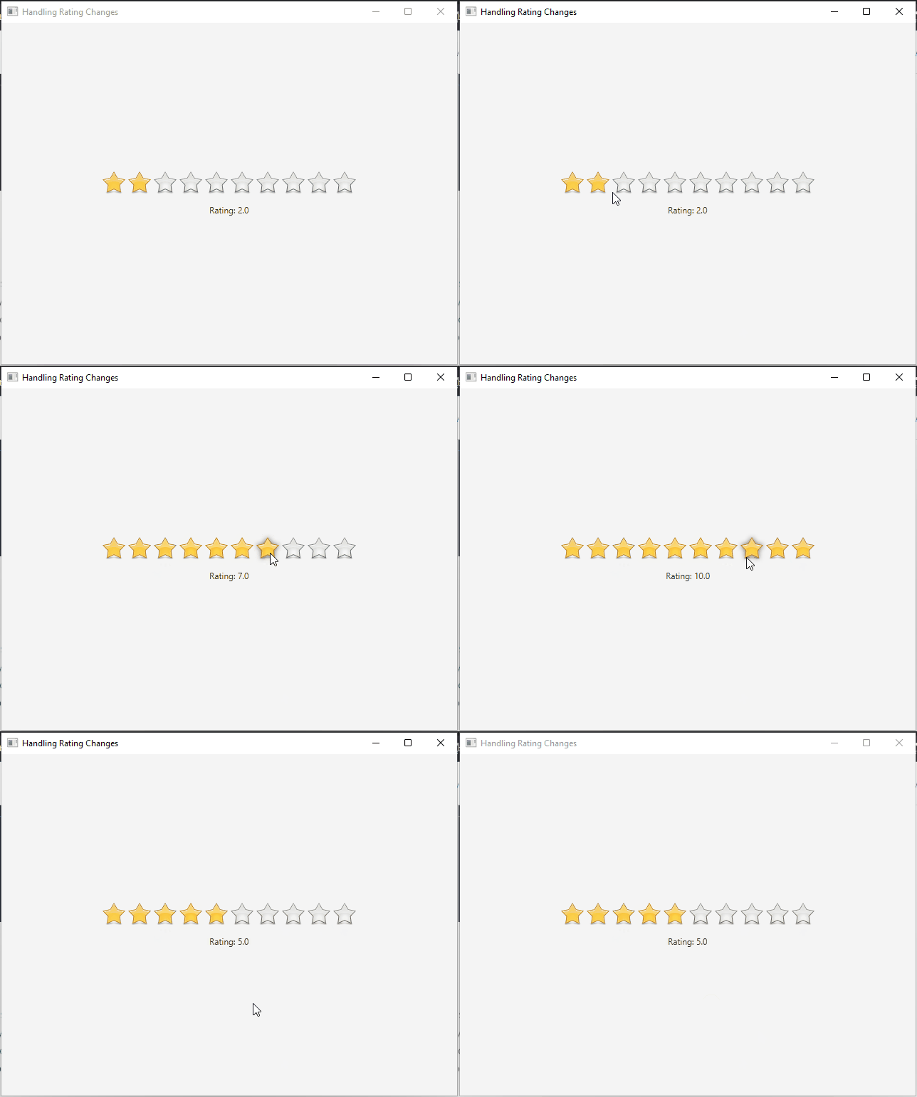
You can also respond to rating changes made by the user. For example, you might want to update the displayed rating value elsewhere in your application. Here’s how you can achieve that:
import javafx.application.Application;
import javafx.geometry.Pos;
import javafx.scene.Scene;
import javafx.scene.control.Label;
import javafx.scene.layout.*;
import javafx.stage.Stage;
import org.controlsfx.control.Rating;

public class Main extends Application {

    private final BorderPane parent = new BorderPane();

    @Override
    public void start(Stage stage) throws Exception {
        this.setupStage(stage);
    }

    @Override
    public void init() throws Exception {
        super.init();
        this.buildUI();
    }

    private void buildUI() {

        // Create a Rating Control
        Rating rating = new Rating();

        Label ratingLabel = new Label("Rating: " + rating.getRating());

        // Set the maximum number of stars to 10
        rating.setMax(10);

        rating.ratingProperty().addListener((observable, oldValue, newValue) -> {
            ratingLabel.setText("Rating: " + newValue);
            // Update other parts of your application based on the new rating
        });

        // Add the Rating Control to the VBox
        VBox vbox = new VBox(15, rating, ratingLabel);
        vbox.setAlignment(Pos.CENTER);

        // Add the VBox to the BorderPane layout manager
        this.parent.setCenter(vbox);

    }

    private void setupStage(Stage stage) {

        Scene scene = new Scene(this.parent, 640, 480);

        // Set the stage title
        stage.setTitle("Handling Rating Changes");

        // Set the stage scene
        stage.setScene(scene);

        // Center the stage on the screen
        stage.centerOnScreen();

        // Show the stage on the screen
        stage.show();

    }

}
Conclusion
The JavaFX ControlsFX Rating Control is a valuable tool for incorporating star-based rating systems into your applications. Its customizable appearance, interactivity, and listener support make it a powerful addition to your JavaFX toolbox. By following the examples provided in this article, you can easily integrate the Rating Control into your projects and enhance user engagement through ratings and reviews. Remember to explore the ControlsFX documentation for further customization options and advanced features.
I hope you found this code informative and useful. If you would like to receive more content, please consider subscribing to our newsletter!

